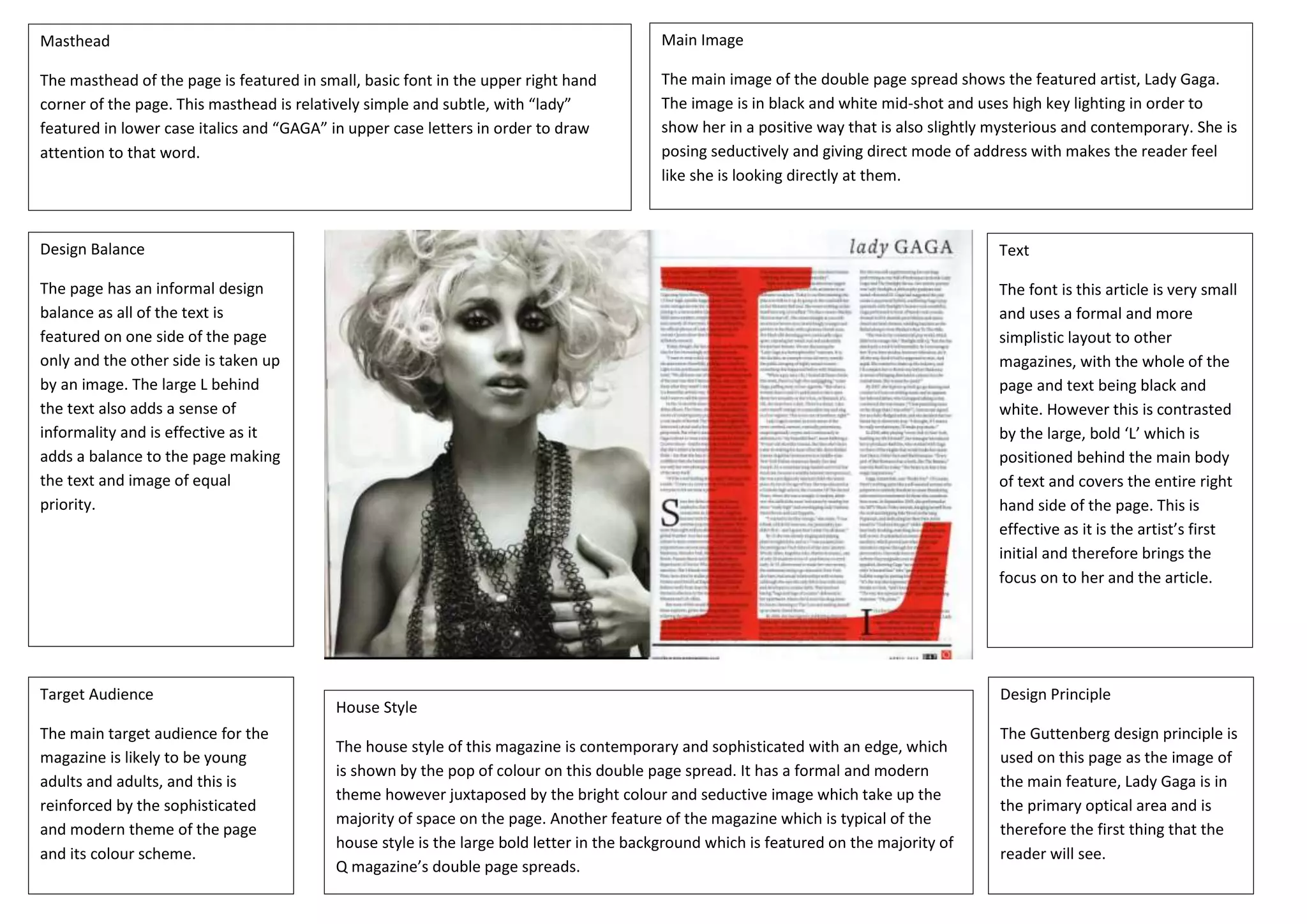
Masthead
The masthead of the page is featured in small, basic font in the upper right hand
corner of the page. This masthead is relatively simple and subtle, with “lady”
featured in lower case italics and “GAGA” in upper case letters in order to draw
attention to that word.
Main Image
The main image of the double page spread shows the featured artist, Lady Gaga.
The image is in black and white mid-shot and uses high key lighting in order to
show her in a positive way that is also slightly mysterious and contemporary. She is
posing seductively and giving direct mode of address with makes the reader feel
like she is looking directly at them.
Design Balance
The page has an informal design
balance as all of the text is
featured on one side of the page
only and the other side is taken up
by an image. The large L behind
the text also adds a sense of
informality and is effective as it
adds a balance to the page making
the text and image of equal
priority.
Text
The font is this article is very small
and uses a formal and more
simplistic layout to other
magazines, with the whole of the
page and text being black and
white. However this is contrasted
by the large, bold ‘L’ which is
positioned behind the main body
of text and covers the entire right
hand side of the page. This is
effective as it is the artist’s first
initial and therefore brings the
focus on to her and the article.
Design Principle
The Guttenberg design principle is
used on this page as the image of
the main feature, Lady Gaga is in
the primary optical area and is
therefore the first thing that the
reader will see.
Target Audience
The main target audience for the
magazine is likely to be young
adults and adults, and this is
reinforced by the sophisticated
and modern theme of the page
and its colour scheme.
House Style
The house style of this magazine is contemporary and sophisticated with an edge, which
is shown by the pop of colour on this double page spread. It has a formal and modern
theme however juxtaposed by the bright colour and seductive image which take up the
majority of space on the page. Another feature of the magazine which is typical of the
house style is the large bold letter in the background which is featured on the majority of
Q magazine’s double page spreads.

Magazine Inner Pages Research 1

  • 1.
    Masthead The masthead ofthe page is featured in small, basic font in the upper right hand corner of the page. This masthead is relatively simple and subtle, with “lady” featured in lower case italics and “GAGA” in upper case letters in order to draw attention to that word. Main Image The main image of the double page spread shows the featured artist, Lady Gaga. The image is in black and white mid-shot and uses high key lighting in order to show her in a positive way that is also slightly mysterious and contemporary. She is posing seductively and giving direct mode of address with makes the reader feel like she is looking directly at them. Design Balance The page has an informal design balance as all of the text is featured on one side of the page only and the other side is taken up by an image. The large L behind the text also adds a sense of informality and is effective as it adds a balance to the page making the text and image of equal priority. Text The font is this article is very small and uses a formal and more simplistic layout to other magazines, with the whole of the page and text being black and white. However this is contrasted by the large, bold ‘L’ which is positioned behind the main body of text and covers the entire right hand side of the page. This is effective as it is the artist’s first initial and therefore brings the focus on to her and the article. Design Principle The Guttenberg design principle is used on this page as the image of the main feature, Lady Gaga is in the primary optical area and is therefore the first thing that the reader will see. Target Audience The main target audience for the magazine is likely to be young adults and adults, and this is reinforced by the sophisticated and modern theme of the page and its colour scheme. House Style The house style of this magazine is contemporary and sophisticated with an edge, which is shown by the pop of colour on this double page spread. It has a formal and modern theme however juxtaposed by the bright colour and seductive image which take up the majority of space on the page. Another feature of the magazine which is typical of the house style is the large bold letter in the background which is featured on the majority of Q magazine’s double page spreads.