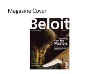
Magazine Analysis 
Jeppe Laursen
Magazine Cover
Analysis (Shot Type & Angle) 
This a medium close up, part of her body is shown 
and her head is shown even though her face is 
hidden. Its between a mid shot and a close up. This 
gives the audience a connection with the woman. 
The angle is slightly low but close to straight on 
which shows to the audience she is thoughtful and 
you can see she is very focused.
Analysis (Mise-en-scene) 
• The setting of this picture is laidback but a focus 
towards the woman working and the stress she is 
going through. Her costume is very relaxed and the 
colors are very calm. The props are the paper and 
pen which indicates she is hard at work. The 
lighting sets the mood to be like there is no rush.
Analysis (Depth of field & Realistic 
or Artificial Looking) 
• The cover has a shallow depth of field taking most 
of the focus towards the woman and her action. 
Most of the background is faded and black so the 
audience only pays attention to the woman. 
• This picture is realistic as there are no obvious 
picture manipulation or added objects, this helps 
express the attitude of the woman towards the 
audience
Analysis (Single Image or Collage 
& Soft or Hard Focus) 
• It is a single picture as only the woman and her 
props, this once again gives her all the attention 
from the viewers. 
• There is a hard focus at the woman but mostly at 
her working and not her face, shows emphasis to 
her dedication o her work.
Analysis (Direct or Indirect Mode of 
Address & Color Palette & Lighting) 
• I find the mode of address to be slightly indirect as 
there is no product shown only the college but 
many messages can be picked up from this image 
depending on the target group. 
• The colors are mostly dark with some showing of 
dark green and yellow. 
• The lighting is also we dark as there is not many 
bright areas of the picture.
Analysis (Text Choices) 
• The font style is very neutral with the main text 
having opposing colors to the background colors 
with makes it stand out more, also the main text 
has larger size than the rest. The subheadings are 
represented in yellow differentiating them from 
rest of the text.
Analysis (Representation) 
• This picture represents are woman whos busy 
doing her work and were focused. Most the focus is 
lead towards her work efforts and not the woman 
herself. With the point being to represent a college, 
this sends a strong message that students are very 
engaged and serious with their work.

Magazine Cover Analysis Media

  • 1.
  • 2.
  • 3.
    Analysis (Shot Type& Angle) This a medium close up, part of her body is shown and her head is shown even though her face is hidden. Its between a mid shot and a close up. This gives the audience a connection with the woman. The angle is slightly low but close to straight on which shows to the audience she is thoughtful and you can see she is very focused.
  • 4.
    Analysis (Mise-en-scene) •The setting of this picture is laidback but a focus towards the woman working and the stress she is going through. Her costume is very relaxed and the colors are very calm. The props are the paper and pen which indicates she is hard at work. The lighting sets the mood to be like there is no rush.
  • 5.
    Analysis (Depth offield & Realistic or Artificial Looking) • The cover has a shallow depth of field taking most of the focus towards the woman and her action. Most of the background is faded and black so the audience only pays attention to the woman. • This picture is realistic as there are no obvious picture manipulation or added objects, this helps express the attitude of the woman towards the audience
  • 6.
    Analysis (Single Imageor Collage & Soft or Hard Focus) • It is a single picture as only the woman and her props, this once again gives her all the attention from the viewers. • There is a hard focus at the woman but mostly at her working and not her face, shows emphasis to her dedication o her work.
  • 7.
    Analysis (Direct orIndirect Mode of Address & Color Palette & Lighting) • I find the mode of address to be slightly indirect as there is no product shown only the college but many messages can be picked up from this image depending on the target group. • The colors are mostly dark with some showing of dark green and yellow. • The lighting is also we dark as there is not many bright areas of the picture.
  • 8.
    Analysis (Text Choices) • The font style is very neutral with the main text having opposing colors to the background colors with makes it stand out more, also the main text has larger size than the rest. The subheadings are represented in yellow differentiating them from rest of the text.
  • 9.
    Analysis (Representation) •This picture represents are woman whos busy doing her work and were focused. Most the focus is lead towards her work efforts and not the woman herself. With the point being to represent a college, this sends a strong message that students are very engaged and serious with their work.