The document summarizes the production process for the front cover of a magazine. It describes 4 steps:
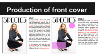
1) Editing the background photo in Photoshop and choosing fonts from DaFont.com for the title and masthead.
2) Adding shapes for coverlines and continuing to search for fonts. Adjusting lighting levels.
3) Adding the main coverlines including an interview and focusing on style, beauty and high street fashion topics.
4) Adding drawn flowers for detail, removing extra shapes, and including a barcode for conventions.


![Screen shots of front cover]](https://cdn.slidesharecdn.com/ss_thumbnails/screenshotsoffrontcover-130307044929-phpapp01-thumbnail.jpg?width=640&height=640&fit=bounds)


