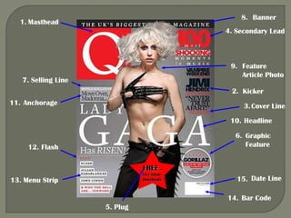
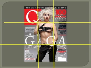
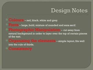
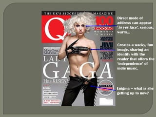
Student Copy
What you get on front covers
FREE  – Live music downloads 1. 2. 3. 4. 5. 6. 7. 8. 9. 11. 12. 13. 14. 15. Masthead Kicker Cover Line Secondary Lead Plug Graphic Feature Selling Line Banner Feature Article Photo Anchorage Flash Menu Strip Bar Code Date Line 10. Headline
Simple colour scheme of red, black and white. The central image has been layered over much of the text, including the masthead, in order to create depth and a 3-Dimensional appearance.  All fonts are large and bold in order to stand out and catch the reader’s eye. The name of the cover star, Lady Gaga, is the biggest font on the page meaning it’s the first thing the reader sees upon picking up the issue.
How front covers are conceived and laid out
 
Colours   – red, black, white and grey. Fonts   – large, bold, mixture of rounded and sans serif. Photographic Manipulation  –   cut away from natural background in order to layer over the top of certain pieces of the text. Organising the elements  – simple layout, fits well into the rule of thirds. Consistency
How a magazine ‘speaks’ to its readers
Direct mode of address can appear ‘ in yer face’ , serious, warm… Creates a wacky, fun image, sharing an identity with the reader that offers the ‘independence’ of indie music. Enigma – what is she getting up to now?
Reader relationship (mode of address) Attitude Language (words and phrases) Enigmas

Magazine Conventions

  • 1.
  • 2.
    What you geton front covers
  • 3.
    FREE –Live music downloads 1. 2. 3. 4. 5. 6. 7. 8. 9. 11. 12. 13. 14. 15. Masthead Kicker Cover Line Secondary Lead Plug Graphic Feature Selling Line Banner Feature Article Photo Anchorage Flash Menu Strip Bar Code Date Line 10. Headline
  • 4.
    Simple colour schemeof red, black and white. The central image has been layered over much of the text, including the masthead, in order to create depth and a 3-Dimensional appearance. All fonts are large and bold in order to stand out and catch the reader’s eye. The name of the cover star, Lady Gaga, is the biggest font on the page meaning it’s the first thing the reader sees upon picking up the issue.
  • 5.
    How front coversare conceived and laid out
  • 6.
  • 7.
    Colours – red, black, white and grey. Fonts – large, bold, mixture of rounded and sans serif. Photographic Manipulation – cut away from natural background in order to layer over the top of certain pieces of the text. Organising the elements – simple layout, fits well into the rule of thirds. Consistency
  • 8.
    How a magazine‘speaks’ to its readers
  • 9.
    Direct mode ofaddress can appear ‘ in yer face’ , serious, warm… Creates a wacky, fun image, sharing an identity with the reader that offers the ‘independence’ of indie music. Enigma – what is she getting up to now?
  • 10.
    Reader relationship (modeof address) Attitude Language (words and phrases) Enigmas