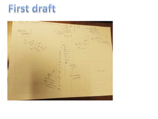
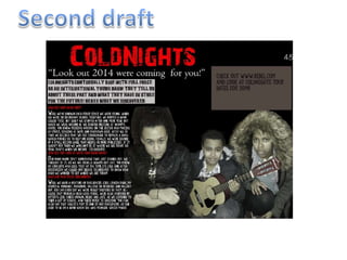
The document discusses drafts of a double-page magazine spread design. The first draft outlines placing a main image on the left and text on the right, with a large, red diagonal title/quote at the top. The second draft keeps this layout and adds a bold title, quote from the band, and introduction. Feedback on the second draft compliments the professional layout but suggests filling empty space above the image and changing the plain quote font for visual interest.