
![Thank You Alex Harris www.AlexDesigns.com [email_address] 954-240-4980](https://image.slidesharecdn.com/04-1210204978809880-8/85/Landing-Page-Design-Optimization-39-320.jpg)

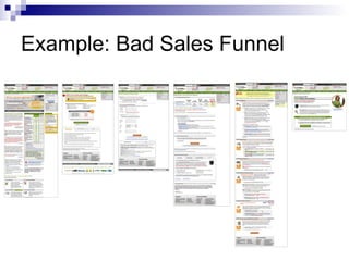
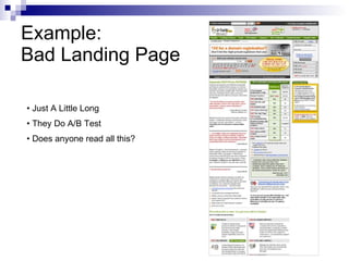
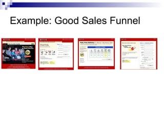
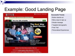
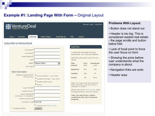
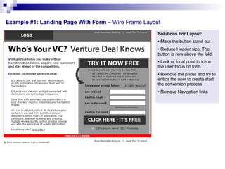
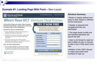
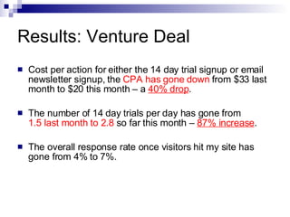
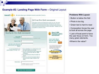
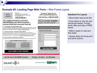
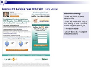
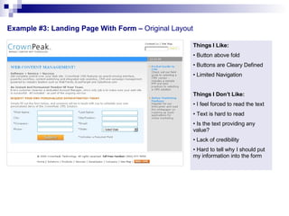
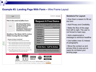
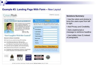
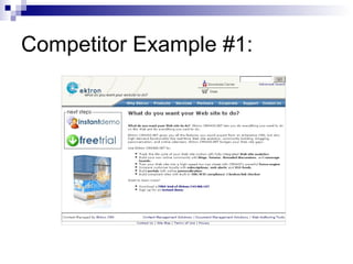
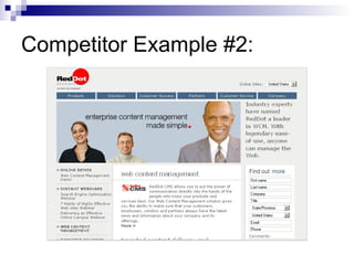
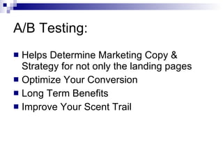
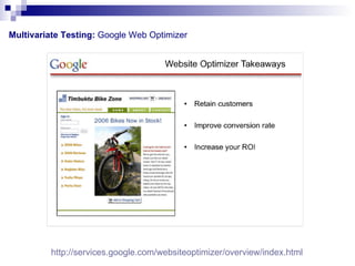
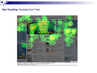
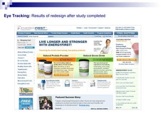
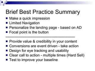
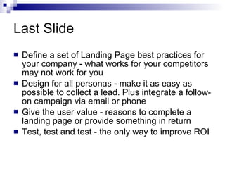
The document outlines best practices for designing effective landing pages, including giving the user value, testing designs, and focusing on usability factors like focal points and calls to action. It provides examples of good and bad page designs, and recommends making a quick impression, limiting distractions, personalizing content, and using techniques like eye tracking and A/B testing to improve conversions.