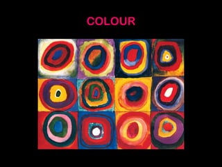
COLOUR
COLOUR is one of the most important and appealing picture elements:
it is seen everywhere, and can give pleasure and liveliness, atmosphere
and expression!
There would be no COLOUR if
we were to live in a world
without LIGHT. Look at what
will happen when pure
white light comes in through a
prism:
When (white) light falls through a prism, the light will break up
and ‘fall apart’: we can see every colour of the rainbow.
This process can also be reversed: this is one of the reasons
why we think of WHITE (or BLACK) as being no colour at all!
COLOURS often have MEANING:
The colour BLUE has a cool atmosphere: an experiment pointed
this out, using a person entering a blue room first, and then a
room that had been painted red. The temperature in both rooms
was exactly the same. After some time, people got more chilly in
the blue room, but felt a bit hot and sweaty in the room that was
completely red!
This shows that COLOUR can do something to you
(or to your mind)!
The German painter and artist, Johannes Itten, came up with a
system in which every colour has it’s own place and function:
the COLOUR WHEEL.
In this COLOUR WHEEL there are twelve different (colour)
segments, but they are all made up out of three basic colours:
RED, YELLOW and BLUE. Itten named these colours ‘PRIMARY
COLOURS’.
(With these three colours, you can make almost any colour you like).
Mixing two PRIMARY COLOURS will give you another colour: a second-
or SECONDARY COLOUR
SECO
NDARY
CO
LO
UR
SECONDARY
COLOUR
SECONDARY
COLOUR
It is very rare for colours to be ‘on their own’: they usually come in
pairs, and mostly you will see a lot of them together, at the same
time. That is why it is important to know that colours can influence
one another (they react to one another):
In order for you to
experience how a colour
‘works’, you will need to see
it next to another colour!
It is time to talk about:
COLOURCONTRASTS
There are at least 7 different colour contrasts, but for now, we
will only be looking at the three most important ones.
They are:
1) HOT and COLD contrast
2) COLOUR –TO- COLOUR contrast
3) COMPLEMENTARY contrast
Each and every one of us experiences COLOUR in a
different way…one of the most famous ‘colour
experiences’ is the colour TURQUOISE:
Some people think of this colour
as being related to BLUE
(whereas others think of it to be
a shade of GREEN)!
…but most of the time we all agree on the atmosphere of very clear
and contrary colours.
In this picture by Dutch artist Piet Mondriaan, you can clearly see him
having made good use of the HOT and COLD CONTRAST
‘The red tree’ -1908 (Piet Mondriaan)
Another contrast is the COLOUR –TO- COLOUR CONTRAST:
this contrast gives a picture a very lively and cheerful
atmosphere!
“One Thousand and One Nights” (Henri Matisse)
One of the most powerful colour contrasts however, is the
COMPLEMENTARY CONTRAST. This is when we look at two colours on
opposite sides of the colour wheel
COMPLEMENTARY means
‘reinforcing’ or
‘helping’:.There are three
pairs of complementary
colours:
1) YELLOW-PURPLE
2) RED-GREEN
3) BLUE-ORANGE
In nature you can very often experience this specific contrast:
This is how the COMPLEMENTARY CONTRAST works: RED
becomes even more RED when placed opposite to GREEN (the
colour becoming ‘less red’ when placed opposite to blue, or any
other colour)
In shops and supermarkets we can sometimes experience the
same effect. Just look at the meat (left) or look at the way the
photographer uses colour in this citrus fruit advert!
…and why do you think there is a blue fish next to a
Clown fish in ‘Finding Nemo’ ?
COMPLEMENTARY CONTRAST is used to great effect in more
‘serious’ works of art:
‘The red room’ – (Henri Matisse)
Can you name some COLOUR CONTRASTS in this painting?
‘Swimming pool’ – David Hockney
There are only SATURATED COLOURS in the Colour wheel.
SATURATED COLOURS are colours in their most pure and bright
form.
If you were to mix these colours with either WHITE or BLACK,
then their colour-brightness would diminish… the ‘pureness’ of
the colour has gone and the colours are now UNSATURATED.
SATURATED COLOURS UNSATURATED COLOURS
(you could almost say
‘Pastel shades’)
GLOSSARY
-COLOUR WHEEL (kleurencirkel)
-PRIMARY COLOURS (primaire kleuren)
-SECONDARY COLOURS (secundaire kleuren)
-COLOUR CONTRAST (kleurcontrast)
-CONTRARY COLOURS (tegengestelde kleuren)
-HOT-AND-COLD CONTRAST (warm/koud contrast)
-COLOUR-TO-COLOUR CONTRAST (kleur tegen kleur contrast)
-COMPLEMENTARY CONTRAST (complementair kleurcontrast)
-SATURATED COLOUR (verzadigde kleur)
-UNSATURATED COLOUR (onverzadigde kleur)
-PASTEL (SHADE) (pastelkleur)

Presentation picture element colour (1)

  • 1.
  • 2.
    COLOUR is oneof the most important and appealing picture elements: it is seen everywhere, and can give pleasure and liveliness, atmosphere and expression! There would be no COLOUR if we were to live in a world without LIGHT. Look at what will happen when pure white light comes in through a prism:
  • 3.
    When (white) lightfalls through a prism, the light will break up and ‘fall apart’: we can see every colour of the rainbow. This process can also be reversed: this is one of the reasons why we think of WHITE (or BLACK) as being no colour at all!
  • 4.
  • 5.
    The colour BLUEhas a cool atmosphere: an experiment pointed this out, using a person entering a blue room first, and then a room that had been painted red. The temperature in both rooms was exactly the same. After some time, people got more chilly in the blue room, but felt a bit hot and sweaty in the room that was completely red! This shows that COLOUR can do something to you (or to your mind)!
  • 6.
    The German painterand artist, Johannes Itten, came up with a system in which every colour has it’s own place and function: the COLOUR WHEEL.
  • 7.
    In this COLOURWHEEL there are twelve different (colour) segments, but they are all made up out of three basic colours: RED, YELLOW and BLUE. Itten named these colours ‘PRIMARY COLOURS’.
  • 8.
    (With these threecolours, you can make almost any colour you like). Mixing two PRIMARY COLOURS will give you another colour: a second- or SECONDARY COLOUR SECO NDARY CO LO UR SECONDARY COLOUR SECONDARY COLOUR
  • 9.
    It is veryrare for colours to be ‘on their own’: they usually come in pairs, and mostly you will see a lot of them together, at the same time. That is why it is important to know that colours can influence one another (they react to one another): In order for you to experience how a colour ‘works’, you will need to see it next to another colour! It is time to talk about: COLOURCONTRASTS
  • 10.
    There are atleast 7 different colour contrasts, but for now, we will only be looking at the three most important ones. They are: 1) HOT and COLD contrast 2) COLOUR –TO- COLOUR contrast 3) COMPLEMENTARY contrast
  • 11.
    Each and everyone of us experiences COLOUR in a different way…one of the most famous ‘colour experiences’ is the colour TURQUOISE: Some people think of this colour as being related to BLUE (whereas others think of it to be a shade of GREEN)!
  • 12.
    …but most ofthe time we all agree on the atmosphere of very clear and contrary colours. In this picture by Dutch artist Piet Mondriaan, you can clearly see him having made good use of the HOT and COLD CONTRAST ‘The red tree’ -1908 (Piet Mondriaan)
  • 14.
    Another contrast isthe COLOUR –TO- COLOUR CONTRAST: this contrast gives a picture a very lively and cheerful atmosphere!
  • 15.
    “One Thousand andOne Nights” (Henri Matisse)
  • 16.
    One of themost powerful colour contrasts however, is the COMPLEMENTARY CONTRAST. This is when we look at two colours on opposite sides of the colour wheel COMPLEMENTARY means ‘reinforcing’ or ‘helping’:.There are three pairs of complementary colours: 1) YELLOW-PURPLE 2) RED-GREEN 3) BLUE-ORANGE
  • 17.
    In nature youcan very often experience this specific contrast:
  • 18.
    This is howthe COMPLEMENTARY CONTRAST works: RED becomes even more RED when placed opposite to GREEN (the colour becoming ‘less red’ when placed opposite to blue, or any other colour)
  • 19.
    In shops andsupermarkets we can sometimes experience the same effect. Just look at the meat (left) or look at the way the photographer uses colour in this citrus fruit advert!
  • 20.
    …and why doyou think there is a blue fish next to a Clown fish in ‘Finding Nemo’ ?
  • 22.
    COMPLEMENTARY CONTRAST isused to great effect in more ‘serious’ works of art:
  • 23.
    ‘The red room’– (Henri Matisse)
  • 24.
    Can you namesome COLOUR CONTRASTS in this painting? ‘Swimming pool’ – David Hockney
  • 25.
    There are onlySATURATED COLOURS in the Colour wheel. SATURATED COLOURS are colours in their most pure and bright form. If you were to mix these colours with either WHITE or BLACK, then their colour-brightness would diminish… the ‘pureness’ of the colour has gone and the colours are now UNSATURATED.
  • 26.
    SATURATED COLOURS UNSATURATEDCOLOURS (you could almost say ‘Pastel shades’)
  • 27.
    GLOSSARY -COLOUR WHEEL (kleurencirkel) -PRIMARYCOLOURS (primaire kleuren) -SECONDARY COLOURS (secundaire kleuren) -COLOUR CONTRAST (kleurcontrast) -CONTRARY COLOURS (tegengestelde kleuren) -HOT-AND-COLD CONTRAST (warm/koud contrast) -COLOUR-TO-COLOUR CONTRAST (kleur tegen kleur contrast) -COMPLEMENTARY CONTRAST (complementair kleurcontrast) -SATURATED COLOUR (verzadigde kleur) -UNSATURATED COLOUR (onverzadigde kleur) -PASTEL (SHADE) (pastelkleur)