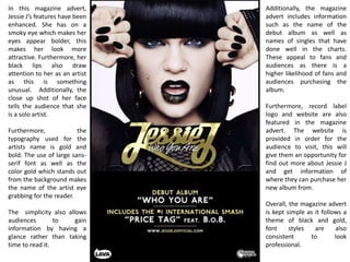
1. In this magazine advert,
Jessie J’s features have been
enhanced. She has on a
smoky eye which makes her
eyes appear bolder, this
makes her look more
attractive. Furthermore, her
black lips also draw
attention to her as an artist
as this is something
unusual. Additionally, the
close up shot of her face
tells the audience that she
is a solo artist.
Furthermore, the
typography used for the
artists name is gold and
bold. The use of large sans-
serif font as well as the
color gold which stands out
from the background makes
the name of the artist eye
grabbing for the reader.
The simplicity also allows
audiences to gain
information by having a
glance rather than taking
time to read it.
Additionally, the magazine
advert includes information
such as the name of the
debut album as well as
names of singles that have
done well in the charts.
These appeal to fans and
audiences as there is a
higher likelihood of fans and
audiences purchasing the
album.
Furthermore, record label
logo and website are also
featured in the magazine
advert. The website is
provided in order for the
audience to visit, this will
give them an opportunity for
find out more about Jessie J
and get information of
where they can purchase her
new album from.
Overall, the magazine advert
is kept simple as it follows a
theme of black and gold,
font styles are also
consistent to look
professional.