
Recommended
More Related Content
What's hot
What's hot (20)
Viewers also liked
Viewers also liked (20)
Similar to Issue41
Similar to Issue41 (20)
Issue41
- 1. £4.00 41
- 2. Robert Bird (1975) Construction with brown and yellows mixed media construction in wood, hessian, aluminium and Perspex H 535 x W 440 x D 82mm See feature article on page 20 Photograph:CliveRichards
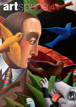
- 3. www.LSA-artists.co.uk Editorial by Charlotte Yeung ArtSpace is the journal of Leamington Studio Artists Winter 2014/15 Editor Charlotte Yeung Editorial team Clive Engwell Dave Phillips Art direction Clive Richards Produced by Magenta Advertising Reviews 2 Anya Simmons: a beautiful view and a mouse on the moon 3 Driven! An automotive art show 7 Anselm Kiefer at the Royal Academy of Arts Features 6 Espresso with Gabriele Polizzi 10 Hats off to Dick Whall 14 Alan Dyer at 70 20 Bob Bird my pal News 24 Art in the Park is born 26 Art news miscellany Local art scene 28 LSA members’ work LSA in focus 30 Chair’s report 31 LSA members 32 LSA organisation Contents I would like to introduce myself as the new editor of ArtSpace! I am very excited to be joining the team and LSA. Please do not hesitate to get in touch if you would like to contribute to the journal. Congratulations to our previous editor Chloe Booyens, who graduated earlier this year and is now studying at the University of Cambridge. Chloe, we send our warmest wishes for the future and would like to thank you for your enthusiasm and hard work for ArtSpace. This issue includes two reviews of local artists and two exhibition reviews, one of our own at Gallery 150, and one further afield of Anselm Kiefer at the Royal Academy in London. Inside you will also find the second and final instalment of our feature on the highly complex Dick Whall. Our cover artist is Alan Dyer, who has recently exhibited solo at Gallery 150, and whose huge, overflowing canvases meant we had to add an extra double spread to his article to do them justice. In addition, we have decided to make the local art scene pages a regular feature. In this version, there are thoughts on the recent highly successful Art in the Park event written by its very own coordinator, and for each edition, the editorial board will continue to select works by LSA members to include along with a short biography of each artist. On behalf of the ArtSpace team, I wish you all a very Merry Christmas and look forward to hearing from you in the new year, 2015! n The ArtSpace journal was first published in 1998 The views expressed by the individual authors featured in this journal are their own and do not necessarily represent the views of ArtSpace or the Leamington Studio Artists Unless otherwise stated the copyright of the articles and images contained in this journal are the property of the named authors and artists.The LSA endeavours to seek necessary permissions and give appropriate credits. We will always acknowledge in subsequent issues any errors or omissions that are drawn to our attention ISSN:1754-9612 ArtSpace Gallery 150 Regent Court Shopping Centre 10 Livery Street Leamington Spa CV32 4NP 41 Cover image: Detail of Alan Dyer's Ten Birds. See feature article on page 14
- 4. 2 Anya Simmons: a beautiful view and a mouse on the moon by Lottie Adcock H aving been born in Uganda and lived in Kenya for over a decade before moving to the UK, you would expect Anya Simmons’ work to be full of African themes, and she assures me it was for a time – “I held my first exhibition in 2004 and it was full of ethnic inspired pieces.” However in spite of this, if you search for Anya Simmons’ work nowadays, you’d find something which is remarkably…British. Castles set in rolling hills and chocolate box sea-side towns all seem a million miles away from Anya’s early more tribal work, but as she objected when I asked her to choose a favourite piece, “it is all part of the journey.” Although she is clearly inspired by her surroundings, it is certainly not fair to say that her work represents a typical picture of British landscape. Her pieces are completely unique both in their use of colour and the textural quality of the work. Using gesso as part of the finished images produces the mottled effect of some of her pieces. This, then layered with washes of acrylic ink colouring, creates a remarkable effect on the canvas which adds to the quirkiness of Anya’s compositions. There are two very different sides to Anya’s work. First are her more traditional land and seascapes, although ‘traditional’ is certainly not the right description for these vibrant scenes. Influenced by many real locations across Britain, Anya captures the magic of rolling fields, quaint seaside towns and the ever- changing sky. Aiming to create a sense of calm, they remind the onlooker of happy memories of family holidays in the country and day trips to the seaside. In Anya’s work, only positive feelings are evoked as the bright colours flow together to create a cheerful atmosphere that will transport you back to your childhood (you can almost taste the ice cream!). Far from ordinary painting, these pieces are filled with romance and nostalgia seen through the eyes of someone who so clearly loves the seaside towns and tempered landscapes of Britain. More recently Anya started a new series of worlds and moons. They feature creatures or places in a cartoon-like style and engage the viewer’s imagination. It is in this work that Anya’s life as a teacher and mother really shines through.With the quirky buildings and adorable creatures, it is easy to see how they could work together in a children’s book – something Anya would like to do in the future.The world series depicts the most important aspects of a place positioned around an image of the world; meaning you can take home a unique ‘portrait’ of a place, evoking both nostalgia and joy. Although she claims these compositions are difficult to get right, I guarantee the end result will put a smile on your face. A full list of venues Anya is exhibiting in can be found on her website: www.anyasimmons.co.uk. Below: Polperro (2011) mixed media Bottom left: Over the Moon (2009) mixed media 500 x 500mm Bottom right: London World (2013) mixed media 400 x 400mm
- 5. Reviews ArtSpacejournalnumber41Autumn2014www.LSA-artists.co.uk 3 by James Callaghan I f you manage to read all of this article you’ll realise why I decided to be a photographer rather than a writer. To borrow from Morecambe and Wise… “All the right words but not necessarily in the right order.” A few years ago (I think it was 2010), I happened to notice there was an exhibition going on at the old library in Leamington organised by the LSA.This was the first time I’d ever heard of them. I went and had a look around and it gave me the idea that maybe I could have an exhibition myself, something I’ve never done, which is surprising considering I’ve been a photographer for over 30 years. I thought maybe I should join… and as it has a habit of doing, time passed, and as I have a habit of doing, I did nothing.Then as luck would have it, one day I was walking through Regent Court when I noticed Gallery 150, in such a great location, I joined immediately and soon had a few pictures on one panel and eventually my own exhibition in 2011 titled Personally. It was a great experience that I’d recommend all artists to try at least once. I donated all profits to Myton Hospice. What has all this got to do with DRIVEN!? Well, it explains how I became involved with Gallery 150 to the point where I’m now a director. I guess it must be because of my background as an automotive photographer and ex-racing mechanic that when Tony Cartwright, Kate Livingston and myself had a brainstorming meeting way back in late 2013 to discuss the coming year’s exhibitions, I suggested maybe an automotive themed one would be a good idea? Both Tony and myself had worked at Jaguar cars in the past, so it was ideal for us, and Kate agreed it could be a popular show so off we went! We wanted the show to combine art and the automobile.The title DRIVEN! perfectly encapsulated both worlds; a passion for art and the automotive.We felt inspired by the resurgence of the motor industry both in Warwickshire and further afield, and felt that as Leamington now has a large number of motor industry employees living here it would be a popular event.The words “be careful what you wish for” would cross my Hot rod James Callaghan (2014) photomontage
- 6. Reviews ArtSpacejournalnumber41Winter2014/15www.LSA-artists.co.uk 4 mind many times in the coming months… Our plans were simple, there would be a few cars outside the gallery to help with publicity, and a young car designer competition. Oh, and it would be nice to have a Formula One car to hang on the wall. All profits were to be donated to BEN, the automotive charity. Before we knew it we were planning to close the parade in Leamington for a day to have a car show! What a great idea! A car show in the centre of Leamington! It could even become an annual event, and with Jaguar Land Rover and Aston Martin on our doorstep, finding cars to fill the parade would only be a formality… we thought. It’s strange how things don’t turn out to be as simple as you imagine. Despite getting a grant from Warwick District Council (thanks to advice from Andy Savage and the hard work of Kate Livingston), they decided not to give us permission to close the parade for a day, so it was back to Plan A. My typing skills improved immeasurably through the following weeks from countless e-mails sent to various organisations, car clubs, manufacturers and museums, etc. Tony, through his contacts at Jaguar cars, persuaded Jaguar Heritage to bring three beautiful cars for the opening weekend. Between us we managed to organise a superb and varied display of cars throughout the show, ranging from an Austin 7 special, through classic Americana to a McLaren supercar.We almost had our Formula One car in the gallery, sadly it was just too wide to get through the doors, but we did manage to get a beautiful scale model F1 car, courtesy of Jaguar Heritage again. Maria, the manager of Regent Court at the time, was very enthusiastic, and arranged a Formula One simulator for the opening weekend, which turned out to be very popular, with lots of people young and old trying their hand at setting the fastest lap around Silverstone. The show itself was well supported, with artwork kindly donated by Bentley and paintings loaned by Jaguar Cars.This, along with stunning work from our own members, created a show that was different and memorable.There was even an amazing, wall-sized painting of a Bugatti Veyron, from graffiti artist Kem Twentyone, which was organised by Gallery Manager and curator Kate. TheYoung Designer competition saw some highly imaginative creations – whether any of the ideas will make it onto future cars, we’ll have to wait and see. Maybe our judge, top Jaguar designer Julian Thompson, will be adding some to Jaguars of the future! The winner of the ‘Best in Show’ was judged by TV personality Mike Brewer from Wheeler Dealers, with the presentation being made on the official opening night of DRIVEN! It turned out to be a beautiful summer’s evening so the presentation took place outside the gallery in Regent Court to winner Hilary Roberts. It was a night to remember. Sadly for me I missed most of the evening because, ironically, I had to do a shoot for Bentley. You can see all the winners at www.gallery150.co.uk/Gallery150/ DRIVEN!_Award_Winners Looking back I’m happy to say the show was a great success, it brought something new to Leamington and has the potential to grow to be an annual event, especially if we manage to close the Parade next year. The highlight for me? Getting fastest lap in the simulator – of course!. Right: Kem Twentyone Bugatti Veyron graffiti art on board Below: Sean Bull (left) receives Young Artists Award (17–21) from Julian Thompson of Jaguar
- 7. 5 Gallery 150 is indebted to and would like to thank all those who helped make DRIVEN! the success it became. They include: Andy Savage BENThe Automotive Industry Charity Bentley Motors Heritage Motor Centre Jaguar Heritage Jaguar Cars John Malley Paul Crawford Regent Court Richard Clarke Rybrook Hockley Heath Rybrook Warwick Sam Burbury The Open Road Classic Car Hire Warwick District Council Left: Hilary Roberts receives Driven Award 2014 from Mike Brewer Bottom: Chevrolet Bel Air Below: Opening night in Livery Street Photographs:TonyCartwrightandJamesCallaghan
- 8. FeaturesArtSpacejournalnumber41Winter2014/15www.LSA-artists.co.uk 6 Espresso with Gabriele Polizzi by Charlotte Yeung Below left: Fig 1. Pensiero Esclamativ (2013) acrylic and newspaper on canvas 400 x 1000mm Below: Fig 2. Human Track (2014) acrylic on canvas 610 x 760mm B orn in Italy and having moved to Leamington only 5 months ago, Gabriele Polizzi’s work is inspired by his travels to the USA, Spain and Romania. He is actually an engineer and has no formal artistic training, but has practiced art since the age of 6. He has exhibited all over the world – Rome, Milan,Turin, London, Melbourne and Shanghai. GaPo (as is his stage name) is an interesting artist in many ways. I asked him which artists he was influenced by, and he said due to his photographic memory he tried to expose himself to as few artists and images as possible, to retain the originality of his style. Looking at some of his work it would be easy to compare it to other iconic works and draw conclusions, but others are truly unique and made me wonder – why didn’t I think of that? He has experimented using coffee (he was impressed that I, an English girl, could handle his espresso) but some of his most innovative works involve the use of invisible fluorescent acrylic paints. In daylight, the canvas appears to be empty, but come night- time and the addition of ultraviolet light they are transformed with bright neon colours.These must be constructed in the negative, that is to say assuming the blank canvas will be black in the dark and starting with the palest colours. GaPo says he uses these paints often to insert hidden messages into his other works. Many of his series of works are also linked in meaning.The trio of paintings Pioggia Di Informazioni, Il Potere È Donna and Waiting For AWord as well as being related in subject (they are all moments in the figure’s personal time) are related by size: the ratio of the size of the canvas (61cm x 198.2cm) denotes the artist’s date of birth, giving the paintings a much more personal significance, something I would never have guessed. I wonder what other secrets are hidden in his works that he has declined to tell us. He has painted abstractly all his life, and it is only recently that he has begun experimenting with figurative forms. His most popular works each represent a person and the ‘rain of information,’ made up of words and patches of colour pouring onto them represents all the information in their environment at the time, displaying the richness of modern life (Fig 1). Acting as a collection of these moments or a lifespan are his other abstract colour field works, such as Human Track (Fig 2).They look like shapes of musical noise: GaPo is also inspired by blues music and has played bass guitar in a band for ten years.When he creates one of these, GaPo is thinking of a specific person, and recording all the ups and downs in their life. Similarly, Relationship depicts two people’s lifetimes side by side, with the dots transgressing the two showing the events they shared together.When working on a commission, he likes to visit the patron’s house to observe the environment in which the picture will hang to make sure his picture will match, and to gather information about the person before starting, a courtesy few artists offer. He will feature in the 2014 Christmas exhibition at G150..
- 9. Reviews ArtSpacejournalnumber41Winter2014/15www.LSA-artists.co.uk 7 Anselm Kiefer at the Royal Academy of Arts, London by Peter McCarthy Royal Academy, London, 27 September 2014 – 14 December 2014 A nselm Kiefer’s solo show at the Royal Academy begins dramatically in the courtyard with a flotilla of sinister looking miniature submarines that bring to mind his equally audacious teetering tower of concrete cells that threatened to squash the cars below when it was installed there a number of years ago.The most significant public showing in the UK before that was at the Whitechapel Gallery in 1982 with his series of straw paintings as a memorable feature.There were even bits of it on the floor that I didn’t think to gather up at the time and stuff into my pockets as a souvenir. I was not yet a fan. Kiefer’s inclusion of extraneous materials in his paintings has always been a defiant, antiaesthetic gesture.What was impressive then and remains impressive now is the seriousness of his early paintings, the way he dealt unflinchingly with subject matter that addressed uncomfortable aspects of German history. Right from the start he was prepared to brush aside the dogmas and assumptions of a painting mainstream that saw narrative painting and the use of perspective as anachronisms and the development of surface and loose handling as examples of the untidier aspects of Modernism. What also came across then as now was the intelligence and supreme confidence of an artist who has always been clear about his intentions.There are examples here in a famous 1970s series where he doesn’t bother to disguise the illustrative flimsiness of his treatment of the human figure or the unconvincing, paper thin rendering of the landscapes and interiors they inhabit.The technical niceties of representation are dispensed with in favour of bolder and sometimes quirkier ways of delivering a message that appears to be affirming content as the key ingredient in a period when subject matter had largely disappeared from the painting mainstream to be replaced by an American process dominated approach that encouraged the development of flat, uniform colour field abstraction. It is not surprising therefore that he gained notoriety when he showed Anselm Kiefer Osiris and Isis [Osiris und Isis] (1985–87) Oil and acrylic emulsion with additional three- dimensional media, 381 x 560.07 x 16.51cm San Francisco Museum of Modern Art. Purchased through a gift of Jean Stein by exchange, the Mrs. Paul L. Wattis Fund, and the Doris and Donald Fisher Fund Photo San Francisco Museum of Modern Art / © Anselm Kiefer The image has been removed due to copyright retrictions. It is available to view in original printed copies.
- 10. 8 a series of images of himself making the Nazi salute in various locations around Europe as it was illegal to do so in post-war Germany.The work received an understandably mixed reception when it was first shown in his home country. It was of course the subject matter rather than the crude, casual rendering of these paintings that created ripples. Any reservations that his first audience might have had about his draughtsmanship or his skills with a paint brush would have paled into insignificance in comparison with the effrontery of subject matter that was still pretty much an anathema. Kiefer’s boldness of approach was no doubt further reinforced when he became a student of Joseph Beuys at the Düsseldorf Academy in the early 1970s. His influence comes through not just in Kiefer’s choice of subject matter but in his attitude to every aspect of image-making. Beuys work is famous for the way it dwells on and mythologizes his rescue after the plane he was piloting came down in a field during the Second World War. Kiefer’s references to war are also important. He was born during the war and as he himself puts it, “grew up amongst wreckage.” His references are understandably more second-hand and generic than Beuys’ reflections on his supposed rescue. But there is an echo of Beuys in a series of loosely handled landscapes in which Kiefer seems to be depicting the aftermath of conflict. In Maikafer Flieg, the best of the series, the first verse of the Maikafer rhyme is inscribed across the horizon line of a smouldering, blackened field like an army in retreat. But perhaps the real legacy of these encounters with his famous teacher lies in the sculptural physicality of his mid-career and more recent assemblages and the notion of image making as performance. He claimed in a 1980s interview that he started painting as a reaction to conceptual and performance art which were the internationally dominant movements during his formative period. But staged performances are a key element of the subject matter of his early paintings and photographs, particularly so in the Hitler salute series.There is also a debt to a generation of German neo- expressionist painters. Georg Baselitz for instance comes to mind, as do Rainer Fetting, Bernd Koberling and Markus Lupertz.They took the language of abstract expressionism and applied it to subject matter that was quintessentially German. Kiefer had followed suit until by the late 1970s his methodology was approaching an almost sculptural extreme and ceasing to be a question of style and handling.The show illustrates this well with the inclusion of a good number of these hybrid works. It also shows how his painting style had been established in all its physicality and his methodology reinforced by the selective incorporation of found objects that might include anything from lengths of charred wood to artists’ palettes, photographs, sand, shellac, rocks, Anselm Kiefer Margarethe, (1981) Oil, acrylic, emulsion, and straw on canvas, 292.1 x 401.3 x 15.3cm The Doris and Donald Fisher Collection Photo The Doris and Donald Fisher Collection / © Anselm Kiefer The image has been removed due to copyright retrictions. It is available to view in original printed copies.
- 11. Reviews ArtSpacejournalnumber41Winter2014/15www.LSA-artists.co.uk 9 pairs of lead wings and giant, home- grown, sunflowers. It was around this time that the Whitechapel show took place.The exhibition contained Maikafer Flieg, the painting referred to previously. It is one of the first paintings in which he creates a convincingly recessional landscape that contains narrative substance without this compromising the expressive freedom of the paint handling. One of Kiefer’s great gifts is an unshakeable self-belief that allows him to work undaunted even in the face of impending failure. He doesn’t seem to feel the need to operate within familiar parameters. His paintings often teeter on the edge of a disastrous extreme having survived exposure to frost, rain and burial even. In Für Chlebnicov, for instance, a massive boulder hangs precariously against the canvas surface.There is a story (probably apocryphal) that one such boulder fell off during a reception in an American collector’s house and broke a bone in a guest’s foot. Be that as it may, there is always a sense in Kiefer’s work of the precariously hybrid nature of his methodology with pictorial and sculptural elements coexisting in uncomfortable alliance and his space frames acting as nothing more than armatures for the development of the work. Born out of this development, materials often ‘stand in’ for their illusionistic equivalents – tar becomes mud and straw becomes hair as in Margarethe, (1981). Books that look as if they could contain declamatory statements are in fact made out of lead and unexpectedly contain images of fragile plants.This morphological shift is governed by his interest in alchemical practices that he transposes metaphorically as a way of intensifying the expressive potential of the materials used. It’s what gives the works their tension and their capacity to carry the weight of all that meaning, all that history. He describes it as negotiating a path between the two extremes of order and chaos, making sure that neither state prevails. Time and location are also important features of many of his works. Kiefer’s fame has given him the resources to establish a succession of massive studio complexes and the staff to go with them – most famously an abandoned brick factory at Odenwald in South West Germany and later on a 200 acre site, La Ribotte, in the South of France. In terms of subject-matter two of the best paintings in the exhibition bear all the hallmarks of their locations. The extraordinary four by seven metre, Ash Flower, which was fourteen years in the making, dominates one of the Academy’s largest galleries. An incredibly long, dried sunflower, grown at Le Ribotte, hangs from top to bottom of this spectacularly encrusted image of the vast interior of a rectilinear building that echoes the scale and style of Hitler’s favourite architect, Albert Speer. It is a gloriously implausible work, ‘painted’ as it is with the use of oil, emulsion, acrylic, clay, earth and ash. Kiefer has produced paintings of a number of these Speer-type interiors over the years ruffling feathers along the way but Ash Flower is simply magnificent – a decaying, weathered, ghost of a building that transmutes into a truly impressive multidimensional image. It contains a key aspect of Kiefer’s approach that is evident in many of the other landscapes and interiors in the exhibition where works are imbued with a physical presence that often defies the representational logic of standard pictorial practice to read instead like sculptural relief. This is particularly true of another impressive work, For Paul Celan,Ash Flower, (2006) (which is just as massive at three and a half by seven and a half metres) where a set of burnt books punctuate a perspectival snowy field that becomes a burial ground.The condition of the books needs no explanation but their relocation, embedded here in an icy field, reinforces the reference to this infamous act of Nazi barbarity. In the equally massive yet subtly beautiful painting, The Sand from the Urns (1998–2009), which dominates the next large gallery, the problem of reconciling opposites doesn’t arise. The use of two-point perspective creates a more conventional spatial effect.The imagery of this structurally complex subject, a massive pile of abandoned bricks, emerges from its cracked and eroded surface.This feature lends itself to the recessional orientation of the picture plane with lines of bricks represented at a shallow angle.This gives the spectator a more conventionally illusionistic sense of subject matter that is about as orthodox as Kiefer allows himself to get in pursuit of the monumental. It’s also as near as he is ever likely to get to the production of a gentle, nostalgic image. It bears a structural relationship to the richly painted Osiris and Isis shown nearby which comes from an earlier series featuring ziggurats and pyramids. This too is a luxuriant, heavily structured work but as with The Sand from the Urns, it is handicapped by being the only example of its kind from what had been a substantial and impressive series. But another giant work, For Paul Celan,Ash Flower (2006), does have the benefit of being contextualised by the presence of a similarly themed painting and a generous number of relatively smaller Van Gogh inspired sunflower images and Albert Speer derived interiors. These serve to establish a context for the reading of the imagery that would have been equally helpful in the case of the two architectural paintings had additional works from those two series been available for inclusion. There is however a more unsettling sense of disconnect in a full-scale installation at the end of the show that goes under the title, Rhine, (1982–2013). Here a set of semi-abstract woodcuts that dwell on the character of this famous river are printed on substantial lengths of canvas mounted on large, linked boards that snake around the room. It isn’t able to compete with the tactility and monumentality of the giant paintings or the weight and energy of the principle installations. It could be argued that it doesn’t have to. But its thin, temporary, frieze-like structure makes it look more like a footnote than a finale of an exhibition that in at least a good half of its works reinforces the conviction that here is an artist whose reputation and significance will surely last well into the future. .
- 12. Hats off to Dick Whall L’Appareil, Presently Absent and other drawings: an analysis by Nick Smale Features ArtSpacejournalnumber41Winter2014/15www.LSA-artists.co.uk 10 Presently Absent in an English Country Garden (5/5/2012 – 23/8/2013). Pencil on cartridge paper, collage and calibrated border 1250 x 1000mm In an English Country Garden (8/10/2008 – 1/9/2011) Pencil, watercolour, gouache, conte, chalk, charcoal and white emulsion on cartridge paper 1250 x 1000mm T he joy of drawing is in its execution.”1 At first this might seem an unlikely heading to accompany an introduction to a Dick Whall exhibition, but in the context of his show at the University of Aberystwyth in 2013, it made perfect sense.The exhibition included two large drawings; In an English Country Garden (2008–2011) and Presently Absent in an English Country Garden (2012–2013) together with a series of preparatory perspective drawings, compositional studies, drawings of the garden seen from the window of the artist’s studio, and twenty-six closely observed self-portraits.Without that special ingredient, the ‘joy of drawing’, it is difficult to imagine how the two large images, rendered for the most part in a meticulously detailed style, might have been accomplished. The drawings, at first sight, seem strangely at odds with Whall’s earlier art installation, L’Appareil Pedagogique avec ses Apanages, or The Enigma In ArtSpace 40 we featured the perspective construction used by DickWhall to create his drawing, Presently Absent (see right). Here we feature an analysis of the work of this important artist following his exhibition at the University of Aberyswyth, 2013 Machine together with its Bombs (1969– 1996). If the recent drawings appeal to the senses, which they certainly do, the play of light and shadow, the rich variety of form and pattern and the expressiveness of the self-portraits, then L’Appareil engaged the mind. It was as a result of Whall’s contact, in the early 1960s, with the work of “
- 13. L’Appareil Pedagogique avec ses Apanages or The Enigma Machine together with its ‘Bombs’, (1969 – 1987) Installation, Ikon Gallery, Birmingham (18/1/1984 – 18/2/1984) Planametrical Drawing (18/1/1984 – 20/9/1987) 1330 x 1000mm. Mixed media on tracing paper. Plan for the L’Appareil installation at the Ikon Gallery, Birmingham 1984 Marcel Duchamp (1887–1968), in particular with the iconic Large Glass, that Whall’s own work underwent a fundamental change. Duchamp had rejected ‘retinal art’, he believed that art should appeal to the mind, rather than the eye, and had declared to Brancusi that “painting is washed up.”2 For Whall it meant “The end of modernism and a need for reflective revisionism.” Standing before the drawing, Presently Absent, the viewer sees, in all its wonderful complexity, a contained and concentrated image. It succeeds as Whall hoped and intended it should; it has “cohesiveness and configurational intensity… mood, atmosphere” but on close inspection a great deal more which links the drawing to Whall’s earlier work. To have stood at the entrance to an exhibition of L’Appareil (last exhibited in 1996) was to see an array of many disparate elements situated on the walls and across the gallery: drawings, photographs, diagrams, text, and on the floor an assemblage of three-dimensional constructions. As with Duchamp’s Large Glass, the relationship between the diverse elements and their significance as part of the whole installation would not have been readily apparent to many visitors. In Duchamp’s view an artwork was only completed after the spectator has made his or her own contribution to the creative act. He wrote, “The creative act is not performed by the artist alone, the spectator brings the work in contact with the external world by deciphering and interpreting its inner qualifications and this adds his [her] contribution to the creative act.”3 Whall would agree, but would also add that the artist “[has] a responsibility to assist in the deciphering process.” The backbone of L’Appareil (since 1996 it has existed in digital form in an Apple Macintosh HyperCard) is a geographical feature, the Great Ridgeway (the Ridgeway Path and Icknield Way combined), the chalk spine of Southern England that connects the notable prehistoric settlement at Windmill Hill in Wiltshire with Grimes Graves, the Neolithic flint mine, near Thetford in Norfolk.The linkage between the two sites refers to the trade that existed during prehistoric times in high quality flint stones required for tool making.The Great Ridgeway is represented by the ‘Long line’, a black cord stretched across the gallery floor. Associated with this are geographical, archaeological and cultural features, artworks, representing earthworks, hills, villages and the flint mine. Although the central features, the essence of the installation, remained unchanged over the twenty-six years of its physical existence, it continued to grow and evolve by the steady accretion of new artworks. Some of the new additions, such as Cultural Sedimentation Drawing 1978–1980) and Planametrical Drawing (1984– 1987) may have been prompted by the increasing complexity of L’Appareil and a perceived loss of clarity. Both the above drawings bring together, within the confines of a frame, the main features of L’Appareil at different stages in its evolution.The forms, signs and symbols, the ‘signifiers’, become juxtaposed in the viewer’s near field of vision.The drawings have “cohesiveness and configurational intensity”, even a certain “mood, atmosphere.”The viewer, however, must still decipher and interpret, albeit with the assistance of Whall’s comprehensive notes. For the purposes of transferring L’Appareil into an ‘art-hyperdocument,’ the Documentum De Transmutatio (1996), the essentials of the installation have been incorporated into an annotated image entitled, Charniere for the Parataxis of Correspondances. Initially the diction may cloud clarity but in the end it illuminates and does not obscure. There is perhaps no greater pleasure than the exercise of the imagination, for past visitors at an exhibition of L’Appareil to piece together the connections between things, to decipher, interpret and discover their particular significance, how they might relate to their own experience; to see the ‘Long line’ as symbolising the transfer of knowledge, learning, as well as the trade in flint stones; how geography, geology, history (social, industrial and cultural) are interconnected; how the ‘Long line’ may symbolise a journey or passage, not only physically but spiritually. A visitor may become fascinated by the way metaphors transfer meaning, connect things that are normally seen as separate and unrelated, and explore the concept of ‘correspondences’; how it may offer a sense of interrelatedness and interdependency, if not unity and wholeness. It is quite easy to see how L’Appareil (its precursor was titled The Education Machine) was an integral part of Whall’s teaching practice. He writes, “There were many instances where the two [L’Appareil and pedagogy] were inseparable, indistinguishable!” As an artist,Whall’s instinct was towards inclusiveness and a belief in cumulative theory. Of the latter he Photograph:EricWebster.CollectionofProfessorCliveandMrsDeeRichards
- 14. 12 ‘Charniere’ for a parataxis of ‘correspondances’ (4/12/1995 – 23/2/1996) 295 x 420mm. A digital print-assembly; a model for the hypertext Documentum de Transmutatio (edition of 15) Auto-tableau: Artist/Teacher of Art with Crossed References. (2/1977 – 6/1977) ‘R’ready-mades’ and art ‘n educational props. 3060 x 3060 x 2440mm writes: “Accumulation of any kind, in any circumstance… the slow accretion of palimpsest on a chalk black board, the incised marks in a refectory table, patina, the maturing of a garden, the ageing process. Cumulatively, the growth or development of a drawing.”This is clearly seen in the development and evolution of L’Appareil and his other works post 1996.Whall’s inclusive approach to art practice, like that of his teaching, was attested at an exhibition of L’Appareil at the Icon Gallery, Birmingham in 1984, when he recalled watching the apparent movement of the stars at night and experienced simultaneously the physical sensation of the earth turning. This anecdote serves to illustrate an aspect of Whall’s work that is perhaps less obvious in his art installations, but is most clearly evident in all his later work, that is Whall’s constant reference to the natural world.This should not surprise us.The material evidence and inspiration for L’Appareil was, according to Whall, the result of “much field work… researching at the chalk face” and subsequently, “much walking, searching, historical, geological and archaeological study.” In other words, experience on many levels, of the earth beneath his feet, under his hand and when he looked up to see a distant landscape; sensations consciously recorded or unconsciously stored in the memory. Much later in the evolution of the installation, true to his instinct for inclusiveness,Whall’s family, his wife and children, who had accompanied him on ‘field trips’ became part of L’Appareil.They took the form of a composite, androgynous figure that was raised up on steps to overlook the art installation, the Great Ridgeway, the ‘Long line’. On retiring from Coventry University in 1996,Whall moved to North Norfolk where he became immersed in the natural rural environment. He explored and recorded the coastal landscape, cliff and water’s edge in many small notebooks and sketch books; assembled objects from bric-a- brac collected from the beach and composed small two-dimensional constructions from coloured debris washed up by the sea. Whall writes movingly of David Jones (1895–1974), an artist he has always admired: “David Jones is not simply, conveniently, a ‘visual artist’, he is a poet, a typographer, a painter, draughtsperson, a story teller, his work is rich in narrative, sub-narratives, emotional, sensual, intellectual… A renaissance man.” Written in the present, as if he were still alive, this homage indicates how important David Jones was and remains as an exemplar and touchstone for Whall. Despite embracing conceptual art it seems he was never prescriptive as regards ‘retinal art’. Whall writes further of David Jones’ “quintessentially English subject matter” and with a degree of envy (which he freely admits to) of “A tumble or seeming free- for-all of non-sequential imagery graphically assembled, jumbled by apparent free association.”Whall’s most recent drawings entitled, Temporal Transience, Seasonal Garden Drawings, (2013–2014), express the bleak clarity of winter, the lightness and airiness of spring foliage and the rich profusion of summer vegetation. Whall writes, “I am attempting to not put intellectual constraints upon the Spring Garden drawing… I am drawing freely and almost mindlessly whilst feeling (sensually) the airiness of Spring.”There remains, of course, a conceptual element in these drawings, in the ghostly ‘self-portrait CollectionofProfessorCliveRichardsPhotograph:EricWebster.
- 15. 13 Features ArtSpacejournalnumber41Winter2014/15www.LSA-artists.co.uk Opposite: Winter Garden No.1, Gryngolet, Gresham, Norfolk (25/10/2013 – 6/3/2014) Pencil on cartridge paper 420 x 300mm Left: Summer Garden with a Portrait of the Artist as an Elderly Scarecrow, Gresham, Norfolk (22/5/2014 –.../9/2014) Pencil and mixed media 450 x 320mm Two drawings from a series titled Temporal Transience: Seasonal Garden Left: Cirrus or ‘Mare’s Tail’ and cumulus, looking south from Sheringham (19/4/2004) Notebook drawing in ball point pen 150 x 203mm Below: Marqueterie No.18 (19/6/2000 – 23/6/2000) Assembled sea-debris 210 x 210mm of an elderly scarecrow’, that stares back through the window at the artist as he draws; the marginal notations, mostly dates and short lines of text, that record the progress of the drawing from day to day. Here ‘retinal art’ and the conceptual component complement one another as two voices.The notations, recording the passage of time, reinforce by contrast the expressiveness, poignancy, and sensuality for example, of a garden in Spring. But to return to the two large drawings exhibited at Aberystwyth University in 2013: the earlier of the two, In an English Country Garden, is notable for the way Whall has drawn the form and habit of the trees and vegetation.The scaled up grid that underlies the drawing, together with the use of a window mask enabled Whall, rather like a surgeon in an operating theatre, to focus on each of the 30mm squares to the exclusion of all else.With the assistance of photographs, drawings, studies of plant forms and the knowledge gained over many years of landscape observations and recordings, every branch and twig appears to have been drawn faithfully and in forensic detail, yet, the character of the whole is miraculously achieved, effortlessly it seems, without any sense of being overworked. Although Presently Absent in an English Country Garden at first sight conveys a sense of naturalistic pictorial unity, the considerable conceptual underpinning soon becomes evident.The drawing, apart from the garden furniture and the standing figure, has been executed in a range of graphic, ‘pseudo- modernist’ styles, from Impressionism through to Pointillism and Abstract Expressionism for the rendering of the lawn; “Cubism, Synthetic Cubism and Post-cubist Suprematism” to represent the upper foliage, whilst other passages of foliage are drawn naturalistically and photo-realistically. The scaled up grid that underlies the drawing is clearly visible in places and careful inspection reveals that the individually drawn squares of the grid do not always match up. The illusionistic realism is further undermined and even negated by a scrap of paper that appears to be pinned to the surface but which has a shadow that is at odds with the rest of the image. Sharp, geometric white lines cutting across foliage also contradict the illusory impression of spatial depth. Presently Absent achieves all that Whall hoped it would: “Compositional harmony. Overall spatial, illuminative and tonal control…The ‘presence’ of all that was believed to be ‘absent’. The elusiveness of the narrative, the subject, and the signifiers. The darkness of solitude, and the psychological/emotional recognition of the approaching end game.” On a grand scale, Presently Absent combines most completely and effectively the conceptual and the pictorial; cumulative theory/ inclusiveness and clarity; sensuality and the habit of scrupulous observation and record taking. It appeals equally to the mind and the senses.The drawing has a wealth of detail, a multiplicity of form and pattern. In places it is reminiscent of Japanese painting, structure and function, the hidden forces that underlie the surface of things, which, in the drawing, creates a magical world.The whole work seems to be alive with lights and shadows, a space and time where different worlds meet. Shakespeare’s The Tempest, the magic isle, springs to mind: “Be not afeard; the isle is full of noises, sounds, and sweet airs, that give delight and hurt not.” Caliban to Stephano, Act 3, Scene 2.. CollectionofProfessorCliveandMrsDeeRichards Notes 1. From the Artist's Statement, accompanying Dick Whall's Exhibition of Drawings 2007–2013, University of Aberystwyth, September 2013. 2. From a letter by Marcel Duchamp to Constantin Brancusi, 1912. See:Thierry de Duve. (2005) Pictorial Nominalism. On Marcel Duchamp's Passage from Painting to the Readymade. [Forward by John Rajchman and translation by Dana Polan] University of Minnesota Press, p.110. 3. From ‘Marcel Duchamp:The Creative Act’, a short paper presented to the Convention of the American Federation of Arts, Houston, 1957. See: Robert Lebel (1959) Marcel Duchamp. NewYork: Paragraph Books, pp. 77–78. Other quotations not attributed are by DickWhall in correspondence with Nick Smale. Nick wishes to express his gratitude to Dick for his generous co-operation in the preparation of this feature article.
- 16. 14 Alan Dyer at 70 by John Yeadon U pside down people falling from the sky, angry dogs, birds flying with toy aeroplanes, flying kites, strange families, plump women, men in suits, awkward children caught embarrassingly as if in a 1950s family album, black cats, hedges with attitude, clouds with personality, wiggly roads and daft cars that reside next to abstract motifs and formal devices.These paintings seem familiar yet, not so. At times they are powerfully unexpected.They seem to fall within the canon of British figurative painting and yet, spill over that canon. Executed with references to Modernism and Post Modernism, what seems to be the whole of 20th century painting – from Hogarth to Hockney, Kandinsky to Alan Davey, Klee to Basquiat, Stanley Spencer to Clemente and Dubuffet to Paladino (Figs. 1, 2). Alan Dyer’s paintings, full of ironic humour, seem easy to enjoy and easy to appreciate. But how do we categories these works? What do they mean? If they are narrative works, what is the story? These are not the usual painting themes. They are not classical mythology or history painting. Is this Lancashire, friends and family? Are the paintings objective and detached or are they the work of a passionate expressionist? Are these happy paintings or troubled and melancholic works? Is this a wry attitude to the people portrayed or empathic? Do we laugh at the people or do we feel sorry for them? Alan’s treatment of people has been described as having a critical, yet sympathetic rigour. A modern Hogarth then? A commentary on Britain today or nostalgia for how it was? Or are these paintings, as George Shaw once put it, “somewhere between autobiography and fiction.” But Perhaps it is Alan’s more ‘abstract’ paintings and drawings on canvas which he describes as ‘free association’ work, a method derived from psychoanalysis, that better reveals his real intentions, vision and creative process (Figs. 3, 4). When both Alan and myself were art students in the late 1960s Modernism dominated. However, the art in most art schools and throughout the country was pluralist, but if your paintings were not hard-edge and abstract they rarely got a look in – representation was out! By the mid-60s many of us young figurative painters who rejected the American influence on British art saw that hard-edge abstract painting and Minimalism had become the new academism. Modernism seemed out of touch with the realities of the time. How, for example, could this abstract form address Vietnam? It was too self-referential, too optimistic, too ivory tower.We had been a decade too early. By the late 70s and early 80s Right: Figure 1. People in a Park (2012) Oil on linen 152 x 152cm Below: Figure 2. Fish (2012) Oil on linen 168 x 152cm This article follows Alan Dyer’s exhibition in Gallery 150 15 September –5 October 2014
- 17. figurative painting had become the new ‘rock & roll’ with The New Spirit in Painting exhibition at the Royal Academy in 1981 and the Zeitgeist International exhibition, Berlin, in 1982.This reintroduction of figurative imagery was a new discordant and overtly expressive imagery, capable of representing the ideas of our time.The New Painting embraced literature, history and story-telling, but that’s another story. Apart from the dominance of abstraction, Modernism also had its primitive side – Picasso’s Features ArtSpacejournalnumber41Winter2014/15www.LSA-artists.co.uk 15 appropriation of Iberian sculpture and African masks and his fondness for Henri Rousseau; Ben Nicholson’s admiration for the untutored Alfred Wallis; Paul Klee’s return to basics and John Cage’s experimental works wiping the slate clean and starting again. Like Klee, Alan admired the art of children and strove to achieve a similar, untutored simplicity – sometimes referred to as the ‘innocent eye’. He developed a theoretical interest in geometrical forms, symmetry and asymmetry, order and disorder that connected with Rhoda Kellogg’s research into children’s drawings and the fundamental forms that are the basic building blocks of their early attempts at representation.This research nourished his developing interest in Art Brut and Outsider Art and in the work of the self-taught artist, the naif, in art therapy and child art. Art Brut was outside the boundaries of conventional culture, art institutions and the established art scene (this was long before Outsider Art became a marketing category and an international fashion). As with Dubuffet, Alan is far from being the naive visionary and predictably conflicts occurred in his work. By the time he began his postgraduate fine art studies at Reading University in 1970 his theoretical research and his painting processes began to part company. He found that his explorations of order and disorder in pictorial representation could no longer be continued through the making of paintings. Like other artists who Left: Figure 3. Monochrome 1 (2013) Charcoal and acrylic on linen 152 x 137cm Above: Figure 4. Blue Painting (2014) Charcoal, acrylic and oil on linen 137 x 137cm
- 18. 16 at that time were moving away from traditional media and looking for new and more effective ways to express their ideas, Alan began to study visual perception and the psychology of art. He abandoned his fine art MA and embarked on an MPhil research degree, replacing practice with theory. His subsequent research at Birmingham University Medical School focused on the neural mechanisms underlying visual form perception. In retrospect this separation of theoretical research from the practice of painting has allowed his subsequent paintings to be free of intellectual and theoretical concerns to develop an interest in a ‘low art’ that eschews traditional notions of beauty in favour of a more authentic and humanist approach to painting. His theoretical studies in child art and Gestalt Psychology have acted as a scaffold allowing him to go back to his beginnings in painting. Consequently there has been no need to refer back to the theory when painting.What was theory was theory, what was painting was painting. During the 1980s, while lecturing at Coventry University on the psychology of art, Alan began to develop text-based notation sheets as a way of working through his ideas, often using encaustic wax to give texture and a physicality to the images (Fig. 5).These densely worked notation sheets, incorporate his research papers, note-books, essays and lectures and are documented with diagrams, charts and fields of text. Alan’s text-based theoretical work has a long history relating to visual perception and pictorial form and, latterly, to quantum theory in relation to light, vision and consciousness (Fig. 6, 7). Throughout Alan’s academic and artistic career he has tried ‘to make sense of’ the world around him and, although his intellectual curiosity and research has the respectability of academia, the processes and results of his painting might be surprising and puzzling. In his paintings the viewpoint is similar to that of Bruegel. Bruegel painted pictures as if he was up a tree.This imaginary high viewpoint allowed him to look down on a larger area of land – a greater opening of the landscape than conventional perspective would allow, where half of the painting would be sky and only the ground being available for narrative. Sky doesn’t bother Alan Dyer. His skies are full of incident – planes, clouds, birds, even people and dogs. But, like Bruegel, he tips up the landscape with a ‘northern’ high horizon making all of the canvas open for activity and narrative.This, on the one hand becomes a Modernist, shallow space by bringing the ground up almost to the picture plane but on the other hand it creates more space for pictorial events to occur over the entire surface of the canvas. Children can use the whole page for drawing, not bothering about the ‘window on the world’ pictorial conventions. Alan’s pictorial depth cues similarly are typical of the medieval or Chinese isometric spatial constructions where the narrative space could continue on forever without an horizon or needing distant objects to become smaller. In fact small can be in the foreground where the rules of perspective are turned on their head. Alan incorporates or collides this ‘representational’ spatial structure with a Modernist abstract pictorial concern. As we have seen, he synthesizes many different and often opposing strategies into his personal view. Drawing has always been fundamental to Alan’s working procedure and free-association technique. Although free-association as a drawing method might appear to produce random, nonsensical, chaotic or irrational results his way of working is far from irrational and chaotic.Working with the unstudied manner of an everyday craftsman he projects drawings and doodles from the sketch books he has produced over the years. He then carefully, even mechanically, traces Above: Figure 5. Red Circle (1985) Ink and encaustic on paper 59 x 69cm
- 19. Features ArtSpacejournalnumber41Winter2014/15www.LSA-artists.co.uk 17 parts of drawings onto the canvases, building up these unpredictable and serendipitous relationships. He uses easily recognised motifs – boys, dogs, birds, trees, cars, clouds, and a vocabulary of abstract forms – as his basic materials, some of which might be seen as autobiographical but not intentionally so.Yet the kid’s snake belt, the school cap, short trousers and kipper ties are redolent of a childhood in the 50s and 60s.These might hint at autobiography but if deep Freudian or unconscious insights are released by his use of free-association, Alan is not aware or conscious of this.These figurative and abstract motifs probably have no meaning in themselves other than that they are useful and familiar elements to construct paintings from. Alan is able to talk at length about his academic research and his text-based works, how they developed and their theoretical underpinning, but he has difficulty in talking about his free-association paintings.This is understandable since these paintings are the antithesis of the academic and theoretical research work. In some ways they are an antidote to the theory. Explaining what the work is about is not the artist’s job. Looking is the experience and a painting’s meaning can radically change, the artist often having little control over the meaning, over what the viewer thinks. Nor should we expect the artist to specify or try to control the viewer’s personal experience. Audiences will always see what they bring to the work. Alan has created a pictorial world that exists on its Opposite left: Figure 6. Perception Notations (2002) Ink on paper 59 x 56cm Left: Figure 7. Quantum Notations (2002) Ink and collage on paper 79 x 70cm own terms – a slightly daft, distorted world of activity that at times could be a bit sinister but is generally playful, a world that is uniquely his, a world inhabited by his own creations. However, fundamentally they are paintings about making paintings, about the language of painting, about developing this vocabulary and making all sorts of decisions about characters, dogs, devils, clouds, distortions, colours, forms, doodles, space, depth, things on the picture plane, things behind, placement, things upside down, things in the wrong place, making things in the wrong place look normal, composition, details, all-over interest, knots of activity and making all this work as a whole where both abstract and figurative forms carry the same weight and have the same narrative intention. When is a painting resolved? What is ‘finish’? Alan has devised a decision-making process that randomly places his motifs beyond the artists’ usual need to control or organise. His more ‘abstract’ paintings appear to be deconstructions of the ‘finished’ narrative ones. However, the paintings that look ‘finished’ are simply the ones which have been worked on the longest and have gone through a process of ‘secondary elaboration’ – the process of identifying a clear pictorial structure and narrative which takes the paintings to a new and At the far left Alan Dyer discusses his work with LSA Chairman Clive Engwell during Alan’s private view at Gallery 150. The author of this present feature, John Yeadon, can be see in the centre wearing the Panama hat PanoramicPhotograph:CliveRichards
- 20. 18 possibly dreamlike resolution (Fig. 8). Rather than the more ‘abstract’ paintings being deconstructions of the elaborated works they represent the early stages which are often left incomplete but which are, in their own way, complete.The abstract works have an ‘unfinished’ look that makes them more open to the viewer, more open to interpretation and that offer an opportunity for the viewer’s imagination to wander.This ambiguity invites us to be involved as if we are collaborators in the creative process or finishers of the unfinished works (Fig. 9). At the age of 70, Alan’s exhibition at Gallery 150, 2014, in Leamington Spa is the first painting exhibition he has had since the 1970s. His creative work throughout this period had been theoretical, conceptual and text and diagram based. Around 2010 he returned to painting and this exhibition, represents the work he has produced over the past two years. Alan has returned to the free-association work he was doing as a student and has managed to bridge the long gap in his practice and to pick up where he left off in 1970 (Fig. 10). We are glad that he has decided to take up painting and drawing once more and decided to share these private dialogues and most recent works with us. Above: Figure 8. Ten Birds (2002) Oil on linen 152 x 137cm Above right`: Figure 9. Untitled (A) (2002) Acrylic and oil on linen 152 x 137cm
- 21. Features ArtSpacejournalnumber41Winter2014/15www.LSA-artists.co.uk 19 This feature’s author, John Yeadon, studied fine art at Hornsey College of Art in the late 1960s and then gained an MA at the Royal Collage of Art, London, in 1972. He was a senior lecturer in fine art and a colleague of Alan Dyer at Coventry University for 30 years. He was Course Leader for the MA in Fine Art. John took early retirement in 2002 in order to concentrate on his painting, exhibiting and writing. He is a cellist in several regional orchestras. To find out more about John Yeadon and his work visit www.johnyeadon.com Above: Figure 10. Untitled (1970) Etching 45 x 59cm
- 22. 20 Features ArtSpacejournalnumber41Winter2014/15www.LSA-artists.co.uk I first met Bob Bird when he appointed me as a lecturer in art history at Newcastle-on-Tyne in the early 1960s. And here comes a little bit of the history of English art schools, which all artists should know! The 60s were a turbulent time for art schools as educational policy had swung in favour of establishing art and design courses with degree equivalent status.The thinking was that more government money would then be available for art colleges, and this proved to be the case. Bob Bird my pal by Dave Phillips The Coldstream Report, 1960 (Sir Nicholas Coldstream, artist and Head of the Slade School of Art) was instrumental in the formulation of the parameters of the new courses. He with his peers decided to send groups of artists around colleges to see whether they were able to run the newly formulated courses. One of the key factors was the introduction of art and design theory and history taking up 20% of the course, with an art related final year dissertation of around 15,000 words. In order to fulfil the requirements Bob swung into action as Head of the Fine Art Department at Newcastle College of Art and Design, and advertised for an art historian, viz, me.The visiting inspection team recognised Bob’s aspirations to fulfil the new academic requirements and the college was one of the first to run such courses.The art historian who formed part of the visiting team was Aaron Scharf, a most charming man, now deceased, who wrote the pioneering book Art and Photography Below: White Lilies 400 x 500mm oil on canvas Opposite: Fishing Village 260 x 360mm oil on board
- 23. Features 23 (1960), showing in what ways many artists had used photography, since its inception in the 1820s. He assured me that recognition of the newly recognised Newcastle’s Dip AD course at degree level, depended on the provision of funds being available for me to build up the art library and slide collection, and so they were. Most art colleges didn’t have either, and things were very poor then in the sixties, in that respect.This, though, was the beginning of the dynamic era where art schools in the 60s and 70s became pivotal in the cultural transformation of society. Nor should it be forgotten now that they represent the creative force underpinning the present volcanic eruption of the visual arts today. Art was the consuming passion of Bob’s life, apart from that of his daughter Jane, and wife Liz, whose superb portraits of her, which he painted still reminds him of her presence. Now in his nineties he has retired from the world to a nursing home, and sadly Liz is dead. He is an artist, whose heroic and dreadful war experiences involved him in the liberation of concentration camps, including Belsen. How horrific was that? As a man, his astuteness came from a quiet persona, seemingly diffident and taciturn, but with a subtle sense of humour. He appeared aware of the zeitgeist of his era, moving to more senior positions as the decades unfolded, ending his career as Head of Department at Stoke-on-Trent Art College, part of the new Polytechnic, later to become a University, and playing an influential part in the development of art education in this country. For example, he established the first History of Art department in Art Schools at Stoke, and I was the first appointee! So our paths crossed again. He was Chairman of West Midlands Fine Art Advisory Panel, an advisor for the Arts Council of Great Britain, and had many other roles at the heart of art administration, in the 70s and 80s. Never did he neglect his own art production though, and he had innumerable exhibitions in this and various other countries. Turning to Bob’s art one discovers that he initially trained as a graphic designer, only to have his studies interrupted by the war. On his return to Birmingham Art School he switched to fine art, and studied painting under some distinguished artists, such as the late Bernard Fleetwood-Walker RA. Bob’s early work is a delight, as seen in his sketch books and paintings of the 1950s and 60s, full of the most inventive and lovely imagery, ranging from exquisite landscape and flower studies to inventive life drawings. From such he moved to painting nudes, landscapes and flower paintings.Then his inclination turned to the gradual exclusion of representation. In the first instance landscape was pared down to areas, which were essentially the balancing of form and colour. The height of his development in the 1970/80s, (possibly under the influence of Constructivism as practised by Victor Pasmore), lay in the fabrication of artefacts made of metal and plastic, set in a framed box. He made the whole ensemble and the workmanship was superb.The intention was to investigate the nature of form, in order to offer an aesthetic experience, without the distraction of any reference, such as landscape, portrait or narrative.This was his conclusion after much thought, of his understanding of the purity and essence of art. He faced the question fearlessly, how far can an artist reduce down and still retain significance.The distinctive work of his constructions, (see page 22), was his answer. Here in Thin Red Line, and other such work, we are responding to finesse, where the surface, in this case smoothed aluminium, set within a hessian lined box is balanced by an insertion in the form of a knife edged red plastic. Everything is Pages from Bob’s sketch books
- 24. Features ArtSpacejournalnumber41Winter2014/15www.LSA-artists.co.uk 22 done with minimum means and his mature work is characterised by the play of form, interacting in a variety of formulations, which demand the response of a heightened aesthetic sensibility. As he put it himself pithily, “I wanted to make work, which had its own complete existence without the need to ask – what does that represent? My works do not represent any other thing.They are simply objects which are made from the Constructionsofthe1970sshownhere representtheessenceofBobBird’sart. Seealsotheinsidefrontcover. TotherightofthisseriesistheThinRedLine referredtointhetext materials that I have chosen.” The famous Mayor Gallery in Cork Street, London showed his work for a number of years. On retirement, surprisingly, Bob returned to flower painting. It was as if he was tired of the burden of trying to convince others of the seriousness of his work. They too though are striking works of the genre, as can be seen on page 20.The work has a singular character and a boldness with a balancing of the constituent parts, acting as if in a dance. A further development was Bob’s appointment as art critic of The Sentinel, the local paper for Stoke on Trent, where he lived. If only he had lived in Leamington Spa we should all have been enriched by his expertise, knowledge and commitment. Not only did he attend to his own work, he gave also so much to the art community, as do our dedicated members.The reviews he wrote over the 80s and 90s, were published in the main body of the paper, (unlike now, where much art criticism is confined to the web page).These were searching accounts of the work of the artists of the area. Few exhibitions escaped his keen and critical eye over a period of twenty years or so. Nor should one forget the series of informed and measured public lectures he gave, usually a series of ten with carefully selected slides, at the University and elsewhere in the region, mainly on the developments of post war art. Bob became a major cultural icon. Like many devoted and serious artists of quality, his art was his life, without reaching any high level of fame, but distinguished, enjoying and cherishing the accolades of his family and friends, and fellow artists, collectors and critics and the public generally.The work shown speaks for itself, and is testimony to a serious, dedicated and much loved artist. There are many such within our own community but I write of Bob, as I had the privilege of knowing and working with him.. Left: Life study 500 x 350mm acrylic on art paper
- 25. We offer a wide variety of full and part time courses in the creative arts Part time and leisure courses include: Art Therapy Adobe Creative Suits and Interactive Media Ceramics Furniture Workshops and Woodturning Glass & Jewellery Interiors Life Drawing & Painting and Drawing Photography Sewing, Dressmaking, Textiles, Creative Workshops Upholstery and Soft Furnishings Call us on: 01926 318233 or visit warwickshire.ac.uk to find out more
- 26. 24 I n 2010 Mo Finnesey went to Oxford’s Art in Action, an event in its 36th year with 400 demonstrating artists, teachers, musicians and performers. She came back enthused, inspired and determined that Leamington should have its own Art in the Park. Mo knocked on a lot of doors until the Leamington Studio Artists saw the potential of this idea and agreed to back it. After all, we have the Food Festival, the Peace Festival and the carnival is now back in town, so why didn’t we have our own weekend arts festival? Leamington Spa clearly has a growing and active community of talented artists as demonstrated by Gallery 150, Arts Trail Studios, Warwickshire College, Althorpe Studios and Warwickshire Open Studios to name just a few. After much discussion a date and location was set – August 2nd and 3rd in Jephson Gardens – and I agreed to run the event with an Art in the Park committee. Clearly the LSA could not fund this on its own, so extensive work was undertaken to gain new sponsors. Small grants came from the LSA,Warwickshire District Council, Leamington Round Table,Wright Hassall and from Magenta Advertising, Signworks, Bid Leamington and many others. Any event requires a huge organisational and voluntary effort. LSA member David Lewis wielded his brush and created the elegant event logo, while Tony Cartwright used his technical whizz to create a booking system. Clive Engwell and his team created the marquee display boards, Gallery 150 volunteers took stall bookings, David Phillips measured the railings and Sarah Silver took charge of all the PR including regular newspaper features, tweets and Facebook posts to the masses, while Mo spread the word on the ground. An infrastructure was in place: now it was time to see if anyone wanted to take part? The response was incredible and overwhelming, with eightytwo artists signing up to support this inaugural event.Thirty booked to demonstrate and sell art in the main marquee, fifty brought their own gazebos and two hung their art on the park railings. And it wasn’t just these wonderful artists who made the event so special. Shanade Morrow lined up twelve performers to create a musical treat, Heartbreak Productions staged a magnificent Macbeth, Morgan Lee Forth put on a dazzling dance performance bathed in paint, CJ Events provided food stalls and Mo Enright organised St Mary’s tea and cake tent.Warwickshire Council sponsored Graham Jones to wield his chainsaw and share his infamous wood sculpting techniques. Gabrielle Rucinski organised pot firing for Art in the Park is born by Carole Sleight Right: Founder of Art in the Park Mo Finnesey (pictured right) with artist Sonia Bublaitis Photographs:LindaScannell.
- 27. News ArtSpacejournalnumber41Winter2014/15www.LSA-artists.co.uk 25all, Becca Woodbine-Cushdin ran a helium balloon art competition and Chrissie Markham and Warwickshire students ran t-shirt design work shops. Sarah Horne hung a stunning pod from her award winning Chelsea Flower Show design and Sonia Bublaitis created a beautiful living wood sculpture, which will take permanent residence in the park in the new year. Phew…what a list and just in case you happened to be walking through the Pump Room Gardens and were unaware that Art in the Park was happening, then BRINK Events had 4 artists working on 6ft high live murals which led you into Jephson Gardens, where Mary Partiger’s witty pavement talcum stencils greeted you. On Friday 1st Howard Manttan oversaw the project marquee and gazebo setup with one eye on the vehicles entering the park and one on the dark clouds gathering above. On Saturday 2nd Deputy Town Mayor Councillor Amanda Stevens and Mo cut the ribbon to the melodic ukulele tunes of the Spa Strummers, accompanied by not so much a pitter patter but a deluge of rain. Despite this inclement weather the crowds still came, bought art, took part and generated a great atmosphere. Sunday was the day every outdoor event organiser prays for - sunshine, live salsa dance classes with Amanda, art being purchased, cake and music, laughter and comments flying around such as “Great use of the Park”, “this feels so different to any other Leamington event”, “I’ve just spent £200”, “I’ll definitely take part next year”, “Music made it for me” and most importantly “When are you taking bookings for 2015?” It was a massive, enjoyable and creative success.The seed had been planted, we had learnt a lot so felt confident to book Art in the Park 2015 on August 1st and 2nd. Art has always had an important role to play for the community in Leamington Spa as it continues to grow as an active, creative and prosperous town.To ensure the success of next years event there will, during the forthcoming months of the new year, be a series of meetings held for people to share their ideas, become a sponsor, volunteer or to book a demonstration etc. Bookings for participation next Summer, within the marquee, individual or group pitches etc., will open on December 15th on a first come first served basis at bookings@ lsa-artists.co.uk or you can email Meurig Hughes on meurig@ artinpark.co.uk Meanwhile if you'd like to be part of the Art in the Park committee or have any ideas or inspirations to share please email me at carole@ artinpark.co.uk Art in the Park 2014 could not have happened without the LSA and cannot happen again without more sponsors and helping hands. So let’s all work together to put Royal Leamington Spa’s Art in the Park firmly on the Warwickshire Arts calendar in 2015..
- 28. 26 Art news miscellany by Dave Phillips This column brings selected art news 1. Warwickshire Open Studios this year (28th June – 13th July 2014) saw even more artists’ studios open to the public. It is fast becoming a must on everyone’s cultural calendar. I managed only twelve venues this year as I was hampered by an unexpected summer cold, which laid me low for part of the time. One artist’s work I did see and was impressed by was Jane Williams. Her speciality is pictures of musicians, which seem to capture the essence of any such occasion. Her reputation is high in this respect and you can see why as shown above. It is a moment of ethereality, with the musicians totally obsessed with their rendition, whilst elevated on a mysterious stage, as if floating on an ambient cloud, taking the surrounding audience away with them.The tonal contrast, the lyricism of line and the background punctured with starlight dots contains the definitive message of a musical experience. Another artist of note whose work I saw is Lizzie Cariss, whose trip to Australia led to the discovery of the wreckage of the boats of would be settlers in the 19th century.These hulks were shown as brooding presences, enveloped by a dark ground of blue or grey, icons of tragic events forgotten by history but here in her work smouldering reminders. Other images of landscapes and evocative references to the past made up the overall ensemble, shown to good effect in her studio at home. A further artist to note was Brian Kelly whose landscapes light up a room, so effective is the use of colour.The images are warm and glowing and you feel well in their presence. He has taken Seurat’s colour dot technique and used it so that one part of the composition will be totally yellow, another blue or green.These are usually motifs of fields, sky or farms or country cottages. It is all worked out carefully and cleverly so that you are disarmed by the simplicity and balance, and enchanted by the colour combinations. It is happy painting and life enhancing. Do not be fooled by its apparent simplicity for it constitutes sophisticated naivety, and requires a high degree of creative thought and skill. One can simply bask in the warmth and colour of Brian’s paintings. These appreciative comments are simply indicative of the excellent work on display, and the trouble artists have taken to show their work to the public. Warwickshire can be truly proud of the commitment and quality of the artists and the art.The other nine artists I saw were equally serious in their intentions and next year I hope we might be able to cover more work shown. 2. Alas, it has to be reported that The Gallery Upstairs at Henley- in-Arden has closed after 29 years. It is a great loss to the artists of Warwickshire, for the exhibitions were varied and spirited to include ceramics and textiles. Apart from sales, much fun was had by all who attended the gallery, and the hospitality was extensive.Thanks are extended to the Moon family and in particular Carey and Paul, and many others, for their contribution to the local art scene. 3. A further twist has occurred in the Lucian Freud saga, (book review, ArtSpace No 39), even after death, with his son Paul contesting the legality of his will. Freud died in 2011 at the age of 88, leaving £95.9m, but ostensibly nothing to his 14 children. It has now been revealed, owing to this action, that a secret trust was established of £42m to be run by Rose Pearce (one of his daughters) and a solicitor, Diana Rawston. It is a mystery as to what is to be done with this money as they have declined repeated requests to provide particulars as to the purposes of the trust.The judge rejected the submission, and the trust was considered to be an acceptable arrangement.Whether we shall ever know the final resolution to this matter is debatable but the whole episode is characteristic of Freud’s secrecy, and the bizarre nature of his mind. 4. The guiding principle and legal position is that our National Galleries and Museums allow free entry to the public. But what seems to be creeping Below: Jane Williams Celebrating Mozart (2008) acrylic on paper 700mm x 1080mm
- 29. News ArtSpacejournalnumber41Winter2014/15www.LSA-artists.co.uk 27 into the equation is that entry to special exhibitions is chargeable: the Matisse exhibition at Tate Modern was £18.00: the Viking at the British Museum £16.50; David Bailey at the National Portrait gallery cost £14.50. Such prices are maybe okay for tourists, and the well off middle classes but for ordinary punters such specialist shows are getting costly. Even if you want to get around such charges and become members of the Tate or the Royal Academy, which allows you ‘free’ entry into ‘specials’, it’ll cost you circa £90.00 pa. On the other hand as mentioned previously (‘Art News’, ArtSpace No 38) such institutions have suffered appalling staff losses and their budgets cruelly cut. If you want to see the best then there seems no alternative, but to pay for it. Art has become big business and society at large now takes it seriously. Artists need no longer starve in attics, although many do, and present prices for art have stunned the markets. Galleries and dealers have proliferated and art is now considered a subject worth taking seriously.There is one way forward for the impoverished and that is to see what local artists can provide, as in the LSA Gallery 150 in Regent Court, Leamington Spa, where there is no admission charge or ever will be. These artists are the soil, out of which the flower grows, and you can search Below: Brian Kelly Tranquil Cottage (2014) oil on canvas 460mm x 610mm for the flower among them. Mind you, paying to see art is dirt cheap, compared with the price of some football tickets! 5. I should like to draw attention to a small booklet which has appeared recently called NeighbourhoodWatch by Colin Dick. It consists of sketches, such as the ones illustrated which captures life around Stoke Green, Coventry. Above right portrays, a scavenging dog, the freedom of the girl on the bike and two sets of mums with their children, making haste somewhere. All the sketches have this immediacy, involving a keen eye and consummate skill, creating a moving picture of the non-famous, ‘the struggling masses’, with humour, compassion and love. It is a testimony to his life as an artist, now well into his eighties, on a mobility scooter, he gives us an insight into humanity, through a catalogue of tender, insightful images..
- 30. Kim & Paul Duo Happy Hour (2014) Photo Montage The meeting of Kim and Paul five years ago started a creative process that literally took them on a photographic journey together. They very soon discovered their own unique ability to entertain and amuse with their somewhat unique photographic work. Well known for their series of quirky animal images, designed to make people look and bring smiles to their faces, there are also their more personal Going images, asking the viewer to look twice. Greatly admired, the animal images are magically produced with the aid of modern photo shop techniques and the Going images are authentic pieces of art, which we are told have the utmost personal importance to both Kim and Paul. Today they have no idea where their clash of personalities will lead them next! 28 Clive Engwell introduces work by LSA members T here are many examples of the creative efforts of LSA members to utilize some of the more unusual materials and media available, other than just painting and photography.The desire to produce beautiful and satisfying art from the ‘unusual’, is clearly as active today as it has ever been, as the examples of members’ work shown here clearly illustrate. The artists, whose work is shown in these two pages, were chosen by random recommendation.The interesting variety that they have submitted does show a fascinating and entirely accidental mix of technique and materials. From the ancient and historic use of encaustic art using beeswax to the delightful sight of a menagerie of wild animals bathing at the local pub, from cutting up old books to produce a beautiful image to painting on glass and decorating an old wooden log. The list is endless. This eclectic mix demonstrates so clearly that the choice of media to feed the creative juices of our members can be found anywhere. The joy that can be found in creating art is clearly available to all. Moreover it is also satisfying for the soul and extremely rewarding. Edward Black Cityscape 2 (2014) Acrylic on canvas 600 x 800mm Originally from County Down in Northern Ireland, and following a career in the Royal Air Force with time stationed in the Australian Outback, Edward retired to RAF Gaydon near Leamington Spa. After buying a book on Mondrian and taking up the painting hobby, Edward tried his hand at the Mondrian style, creating his own canvases. Experimenting with many styles he loves to return to his striking colourful abstracts of cityscapes. As a relatively new artist, his work and his cheerful personality are much admired. Gabrielle is a materials artist. She uses clay, glass and metals to express her ideas and feelings into her elegant designs. After many years of teaching, Gabrielle returned to University to complete a BA in Contemporary Crafts. Experimenting with many materials and techniques to develop her artistic expression, fine porcelain became her preferred clay of choice. The challenge was to pursue its properties of translucency, shadow and light together with its interaction with other materials. Gabrielle now exhibits frequently and delights us, and her many clients, with these delicate and exclusive designs. Gabrielle Rucinski Blown in the Wind (2014) Hand formed pots, fine Porcelain, screen printed
- 31. Localartscene AArtSpacejournalnumber41Winter2014/15www.LSA-artists.co.uk 29 Meurig Hughes Surf’s up (2014) Acrylic on canvas 280 x 420mm A regular and highly regarded LSA volunteer, Meurig enjoys creating art across a broad range of media. Joining the LSA three years ago, he has exhibited watercolours, acrylics, pencil and photo montage. This painting reflects Meurig’s passion for the sea and he says it was inspired by fond memories of family surfing holidays in Bude, Cornwall. He painted it at a recent local Art uncorked event – for him an ideal opportunity to meet with fellow artists in an enjoyable social setting. As a relative newcomer he is keen to develop as an artist and regularly gleans ideas from the vast knowledge and experience of fellow members. Sonia Bublaitis is a well loved, and forever smiling, local artist who practices in her Artstrail studio in Livery Street. Her extremely popular abstract paintings on various media - mostly glass and perspex - are highly sought-after. Sonia won the 'People's Choice' prize at the LSA Renewal show in the Spring of 2014, and sold the work Telepathy (120cm x 50cm on Perspex) at that time. The stunning Living Sculpture, shown here, was created by Sonia during the recent Art in the Park event and she is delighted that it will now be permanently displayed in Jephson Gardens. Worth a visit! Tony has been a member of LSA and a gallery exhibitor for just eight few months. He is a passionate advocate and enthusiast of Encaustic Art. This ancient form of painting was first used by the Greeks some 2500 years ago and uses pigmented beeswax applied by hot rods to an appropriate medium, mostly wood. The technology was passed on to the Romans and Egyptians and may be seen in many museums on artefacts such as burial coffins and wooden plaques. Tony works exclusively in this media and at the moment uses a soldering iron, a flat iron and coloured blocks of beeswax for his work. Some striking and colourful images are produced as can be seen here. Tony hopes to demonstrate this unique process to LSA members and, in due course, create some converts from those who currently resist this unique art process. Tony Dobson Blue Blades (2014) Beeswax on board 200 x 250mm Bronia Sawyer Blue Book (2014) Paper Sculpture 260 x 120 x 280mm Bronia says she doesn't take drugs, drink alcohol, caffeine or smoke. She adds that her addiction is not something that can be consumed; you can’t eat it, drink it or inject it, but it is always on her mind and it consumes her. Her addiction is creating beautiful works of art! Bronia uses all forms of the creative process: painting, photography, ceramics, drawing, sculpture, craft, jewellery and many more. Known for her brilliant and very creative book sculptures Bronia has been drawn to this area for many reasons particularly since the medium (old books and magazines) are freely available and she loves paper not only as a material but for the texture, strength and versatility of it. Interestingly she finds the repetitive nature of folding paper as highly creative and meditative. Often in art it is not just the finished piece that is important but the therapy derived from making it. Sonia Bublaitis Living Sculpture (2014) Oil on discarded trunk section
- 32. 30 Chair’s report W e held the 17th Annual General Meeting of the LSA on the Tuesday 21st October. In light of this, I am using the opportunity here to record some of the highlights of a busy and challenging period for your trustees and for our association. Your current trustees offered themselves for a further term in office and were re- elected. During the year your trustees have sought to improve the LSA in a variety of ways and actions. l A significant issue occupied the early part of 2014, when concerns that the directors of Gallery 150 had not formally incorporated the membership of LSA into their company as had been promised at the previous AGM. It was not until August 2014, 10 months later and after enormous and persistent efforts by Tony Cartwright and James Callaghan, that this matter was resolved. I am pleased to report that three of our trustees Tony, James and Hilary Roberts have now been appointed as directors of your gallery. All members of LSA are now voting members of G150 Ltd. l The HMRC registration and action to claim gift aid and other benefits available through our charitable status has been initiated. l The new and simplified membership fee structure including the introduction of the new family membership, which was announced at the beginning of the year, has been successfully introduced. l The decision was made to distribute your journal ArtSpace, through the mail. l The successful restoration and launch of improved websites for both LSA and Gallery 150.These are now fully operational thanks to a tremendous amount of work by Tony Cartwright. l Successful applications were made for Arts Development grants to support Art in the Park and the highly successful DRIVEN! projects. l Commission rates payable by artists have been reduced and payments to our artists and our suppliers are now made on time. l We continue to help many less able members/artists to show their work. l Most importantly, your committee has sought to engender a vital spirit into our gallery and other activities so that it remains fun and satisfying to volunteer. Members will know that the occupation of our gallery in Livery Street is due to the generosity of the owners of the Regents Court Shopping precinct and its support of our charitable objects. After nearly four years of occupation of number nine we were asked to make way for their new tenant serving Japanese food.We were offered alternative accommodation in 10 Livery Street and moved into our new gallery in September this year.We are seriously indebted for their largesse. Lest we forget Our primary objectives are to represent the visual arts in Leamington Spa and to foster and improve the public education, interest and appreciation of, and access to, all forms of visual arts. In all of the above respects the gallery is a vital tool.The exhibitions began with Phyllis Davies’s wonderful Studio 14 show where her very talented students put on an amazing and mixed display. Studio 14 was followed by the members Christmas and NewYear showcases and then by the exciting and utterly amazing Kem & Mef show of street and graffiti art, along with Cult Zero. Other art organisations showing during the year included the Cubbington Art Group, the Coventry and Warwickshire Society of Artists, the Association of Midland Artists and a group of 11 individual artists who chose to use our gallery as their Warwickshire Open Studios.We must not forget our own very successful LSA Summer Show. Individual shows of art, photography and sheer magic included Ian Preece’s remarkable Indian Collection, Matt Howe, Alan Dyer,Terry Dutton’s wonderful Rufus & Friends event and of course, the DRIVEN! motor show which brought Livery Street to a halt. This last year has been a truly remarkable achievement for the whole team. Art in the Park Art in the Park was the brain child of Mo Finnesey. We were fortunate to persuade a skilled and dedicated project manager, Carole Sleight, to be our lead person for this important event. We also gained permission to use the top field of the beautiful Jephson Gardens to stage it. Carole has written her account of the event, and together with some great images, it appears in this issue. Enjoy! I would like to thank Mo for the terrific idea, Carole for the enormous amount of work that she undertook, and the Warwick District Council Arts Development fund and other sponsors for their support. Volunteers I will do my best to continue to represent and support the membership of this association during my final year as Chair. I trust that by then, a whole host of folk who might wish to undertake this role will emerge – please! I am also finding that, along with some others, I need to reduce the number of volunteer hours that I am able spend with the LSA.This is despite the fact that I love what we do and my involvement in it. If you love ART and want to help others to introduce themselves to ART, please volunteer and give some of your spare time to the LSA. Better still, if you are retired, give a half or whole day each week or a few hours on a regular basis. It will be most welcome and you’ll love it. My thanks and best wishes to all the members of Leamington Studio Artists during this festive season. Clive Engwell Chair, Leamington Studio Artists
- 33. LSAinfocus AArtSpacejournalnumber41Winter2014/15www.LSA-artists.co.uk 31 Sue Abbott Vanessa Adams Neil Adcock Laura Adkins Robert Aley Eleanor Allitt Rhiannon Alton Emilia Atherton Olivia Atherton Steve Atherton Robin Austin Heather Bailey Patricia Bailey Laura Baker Elizabeth Ballantine Helen Ballantyne Anthony Bannister Mary Bannister Maura Barnett Rupam Barthakur Saffron Barton Martin Baxter Anne Bench Wendy Bicknell Mary Binnersley Keri Bishop Edward Black Trevor Blagg Meryl Blake Lynn Blasdale Yvonne Borlenghi Adrian Bradbury Carmen Brady Clifford Brigden Nigel Briggs Jim Broad David Broadhead Helen Brookes Karen Brooks Mark Brown Sonia Bublaitis Jacky Buckingham Gillian Buick Jan Bunyan Soolie Burke Rosy Burman Debbie Burston Keith Burtonwood David Butcher Deborah Callaghan James Callaghan Josh Callaghan Anthea Callen Marie Calvert Katy Campbell Wendy Campbell- Briggs Eugenio Cappuccio Pat Carpenter Michele Carruthers Tony Cartwright Roger Chamley Dave Chantrey Shirley Cherry Soonoo Choksey Tanaka Choto Vestina Cizevskaja Douglas Clarkson Emily Cleale David Coldron Anne Cole Vanessa Comer Wendy Cook Lauren Corbet Rupert Cordeux Carol Cox Sharon Cresswell Edward Creyton Robert Cunliffe Brenda Currigan John Daly F Dance J Dance Clive Davenport Ben Davies Diana Davies Marianna Davies Phyllis Davies Derrick De Faye John Devane Tony Dobson Cathy Dodd Nora Doherty Ian Dove Natalie Duff Karthikeyan Durairaj Alan Dyer Kay Elliott Liz Ellis Robyn Emery Clive Engwell Robert Ennis Mo Enright Alexander Etter Barrie Etter David Evans Penny Evans Simon Evans-Smith Peter Everitt Emma Falcke Vivien Fearn Mo Finnesey Andrew Flint Joe Fogg Karen Ford Ann Forrester Morgan Forth Mary Frances Chris Freegard-Elmes Wendy Freeman Russell Gain Caroline Gatehouse Jan Gay Janette George Carolyn Gifford Bob Gilhooley Juliet Gladston Peter Godfrey Helena Godwin Clive Gravett Dianne Greenway Jim Griffith Sam Gummer David Haedicke Stephen Hall Michelle Hargreaves Anna Harper Julia Hayes Tom Head Bill Henderson Claire Henley Linda Henry Lucy Hewitt Julie Hill Brenda Hillier Alan Hiorns Bernard Hollis Patricia Hollis Catherine Holmes Jak Hornblow Janella Horne Sarah Horne Sukhbir Hothi Matthew Howe Meurig Hughes John Hunt Mariyah Husayn Danielle Hutson Mark Ilsley Kim Ingvar Paul Ingvar Gillian Irving Phil Ivens Herman Jansen van Vuuren Libby January Robert Jenkins Louise Jennings Peter Jewel Gena Johns Karen Johnson Robert Johnson Roy Johnston Tracy Jolly Catherine Jones Chris Jones Jennifer Jones Paul Jordan Eleanor Kaijaks Jessica Kaijaks Nick Kaijaks Ros Kaijaks John Keen Bryan Kelly Janne Kent Usha Khosla Esther Kinnersley Charlotte Kirkham Christine Knight Edith Kovacs Alison Lambert Lian Lanni Robert Lavers Julie Law Andrew Lawrence Ian Lee Emma Legon David Lewis Peter Lewis Sue Lewis-Blake Anthony Leydon Angus Liddell Rachel Liddell Jill Lloyd Shelley Longford Alison Longwill Sian Love Peter Lovelock Teresa Mantle Howard Manttan Christopher Mason Noreen Mason Peter Massey Bridget Mattingly Ian Mattingly Dorrette McAuslan Jim McGuigan Patrick McHale Ann McKernan David McKernan David Merrett Chris Middleton Rik Middleton Michele Miller Sheila Millward Nicola Monday Christine Moore Sarah Moore Sueli Moreton Louise Morgan David Morphew Cesar Jose Mota da Silva Ann Mount Karl Mountford John Murphy Jennifer Neale Grace Newman Robert Newman Victoria Newman Heather Nicholls Natalie O’Keeffe Christine O’Sullivan Beverley Oxford John Oxford Karen Parker Chris Partridge Mary Partridge Jonathan Peirson Joyce Perrott Zoe Petrie Kathryn Pettitt Anna Philips David Phillips Ed Phillips Neil Phillips Julie Pickering Giuseppe Pittarello Archie Pitts Marianne Pitts Veronika Pock Gabriele Polizzi Jane Powell Philippa Powell Simone Power Ian Preece Rosemary Preen Alex Purse Chris Putt Richard Raby Margaret Ramskill Alan Ranger Maria Rankin Cathy Renken Sophie Renken Clive Richards Gill Richardson Beverley Riddle Linda Ridpath Hilary Roberts Joe Roberts Anni Robinson Frances Robinson Jo Rodgman Ian Roemer Janet Rose Gabrielle Rucinski Leslie Rucinski Bill Sankey Mary Sylvie Sarabia Roger Sargent Malcolm Scale Linda Scannell Adrian Schafer Linda Scherrer Nick Seale Isobel Shackleton Barbara Shackley Annette Sharman Hazel Shaw David Shaw- Richardson Elizabeth Shepherd Gail Sheppard Ray Shields Robert Shuttleworth Anya Simmons John Simpson Mark Skirving Nick Smale DJ Kirby Gerry Smith Joe Smith Kay Smith Patricia Smith Victoria Smith Sophia Smith-Yanez Victoria Sobierski Ray Spence Rebecca Still Tatiana Stirbul Matthew Sugars Anthony Super Jo Sutton Maureen Taylor Hansie Te Velde Bethany Tetley Carl Thompson Mark Tilley Elizabeth Townsend Jonathan Treadwell Jackie Trott David Troughton Janet Tryner Paul Tyler Nancy Upshall Dominica Vaughan Suminder Virk Vicki Walkden Avril Walker Rachel Warren Tina Watkins Lynnette Weaver Henri West Peter N Wharton Edith Whatling Dorothea Wheeler William Wheeler Claire Whitehead Ruth Whitington Christine Wilkinson Jane Williams Hilary Wilson Peter Wilson Bruce Wilton Kate Wiltshire Pete Wiseman Rebecca Woodbine- Cusdin Paul Woollard Giovanna Yanez Julia Yarrow Judith Yates John Yeadon Ann Yeomans Richard Yeomans Charlotte Yeung Noriko Young Andrzej Zawadzki Miriam Zevalking Carol Ziyat LSA members