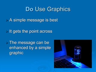
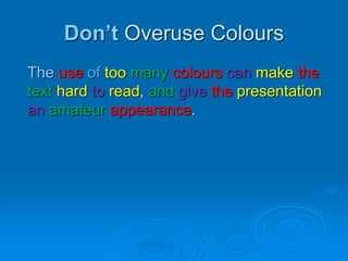
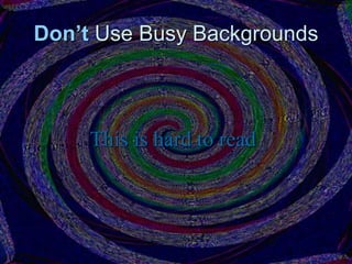
An Introduction to
PowerPoint
Some simple
Do’s and Don’ts
Do Limit Text
 A simple message is best
 It gets the point across
Do Use Graphics
 A simple message is best
 It gets the point across
 The message can be
enhanced by a simple
graphic
Don’t Write Too Much Text
This is my PowerPoint presentation on the
history of computers. The first computer
system was developed in 1931 by Konrad
Zuse. The first computer game was
developed in 1962 and was called
Spacewar Computer Game. WordStar,
the first word processing package was
developed in 1979. In 1985 Microsoft
launched the first version of their popular
operating system called Windows.
Do Use Contrasting Colours
This is readable
This is not readable
Do Use Readable Fonts
This is readable
This is not
readable
Do Use Colours
Colours can be used to highlight key words
and phrases to make them stand out.
Don’t Overuse Colours
The use of too many colours can make the
text hard to read, and give the presentation
an amateur appearance.
Don’t Use Busy Backgrounds
This is hard to read
Do K.I.S.S
Keep it straight and simple
 Keywords only
 No sentences
 Never read your slides, talk freely
Credits
All images licenced under Creative Commons 3.0
 2 kinds of crazy - Version 2 (background) by Generic Brand Productions
 Red lips isolated in white by Tania Saiz

Introduction to PowerPoint

  • 1.
    An Introduction to PowerPoint Somesimple Do’s and Don’ts
  • 2.
    Do Limit Text A simple message is best  It gets the point across
  • 3.
    Do Use Graphics A simple message is best  It gets the point across  The message can be enhanced by a simple graphic
  • 4.
    Don’t Write TooMuch Text This is my PowerPoint presentation on the history of computers. The first computer system was developed in 1931 by Konrad Zuse. The first computer game was developed in 1962 and was called Spacewar Computer Game. WordStar, the first word processing package was developed in 1979. In 1985 Microsoft launched the first version of their popular operating system called Windows.
  • 5.
    Do Use ContrastingColours This is readable This is not readable
  • 6.
    Do Use ReadableFonts This is readable This is not readable
  • 7.
    Do Use Colours Colourscan be used to highlight key words and phrases to make them stand out.
  • 8.
    Don’t Overuse Colours Theuse of too many colours can make the text hard to read, and give the presentation an amateur appearance.
  • 9.
    Don’t Use BusyBackgrounds This is hard to read
  • 10.
    Do K.I.S.S Keep itstraight and simple  Keywords only  No sentences  Never read your slides, talk freely
  • 11.
    Credits All images licencedunder Creative Commons 3.0  2 kinds of crazy - Version 2 (background) by Generic Brand Productions  Red lips isolated in white by Tania Saiz