This document provides tips for improving PowerPoint presentations by reducing text-heavy slides, using images and fonts sparingly, incorporating simple animations and charts, and including interactive elements like quizzes. Before and after examples are given for slides with too much text, images used incorrectly, too many font options, overuse of animations, and complex charts. The document concludes with suggestions for other uses of PowerPoint and alternatives to the program.
![Images: After
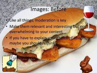
• Like salt, images are great in moderation
• Watermarking is your friend
• So is Flickr (advanced searching)
• Some text + well-chosen images is ideal
http://www.flickr.com/photos/peacockmodern/4501127980/ [by-nc-nd/2.0]](https://image.slidesharecdn.com/powerpointmakeover-101117122550-phpapp02/85/PowerPoint-Makeover-5-320.jpg)
![Font: After
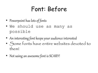
• KISS
• Sans serif is easier to read online
• Let the geniuses at Microsoft help you!
• Font size should be no less than 24
http://www.flickr.com/photos/lwr/52770741/ [by-nc-sa 2.0]](https://image.slidesharecdn.com/powerpointmakeover-101117122550-phpapp02/85/PowerPoint-Makeover-7-320.jpg)