Download to read offline

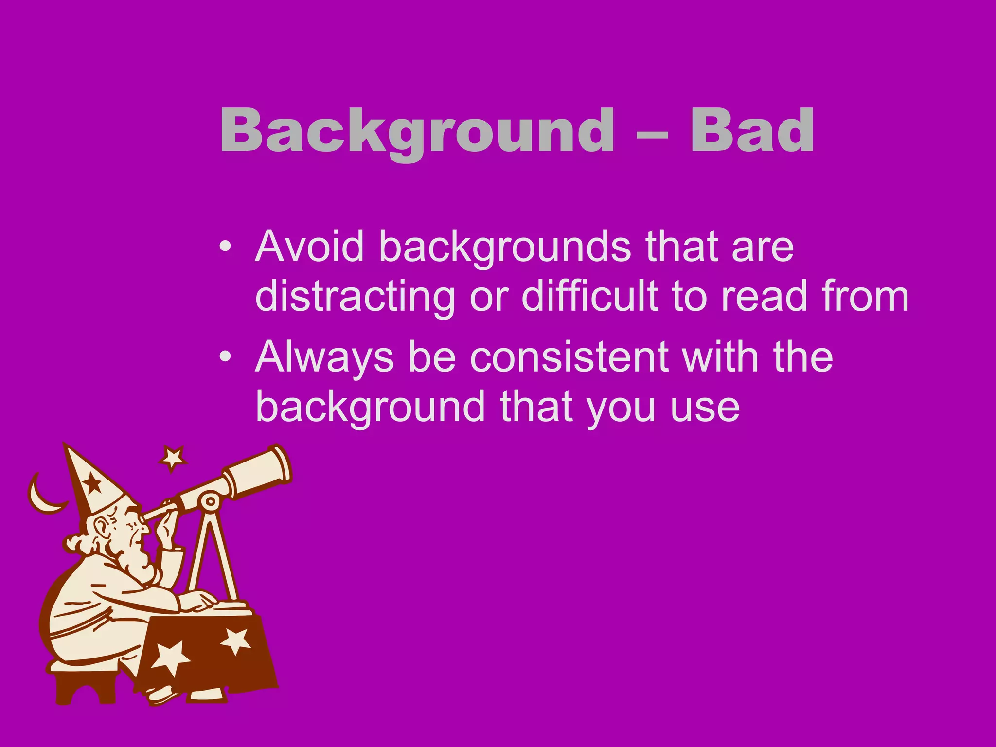
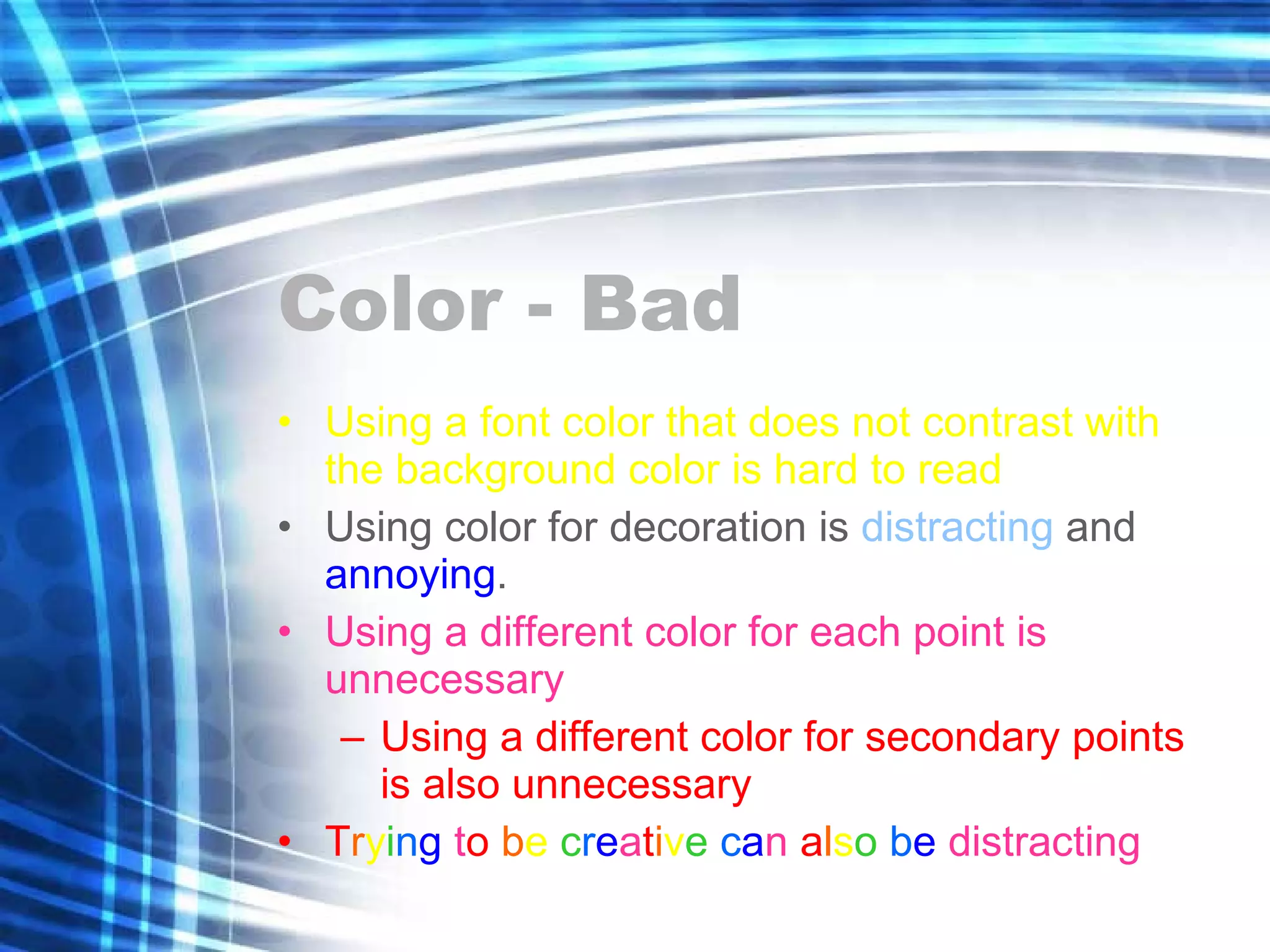


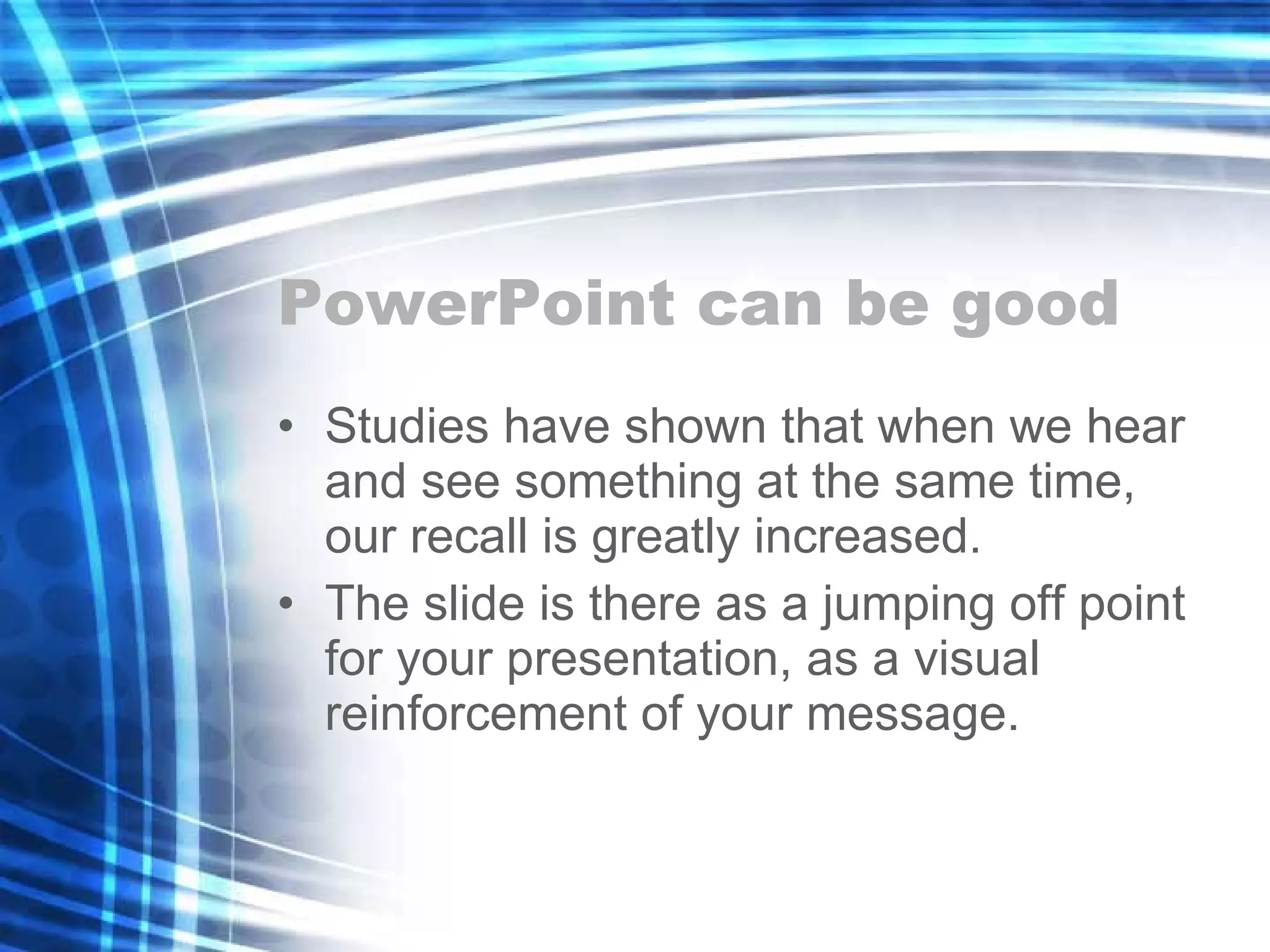

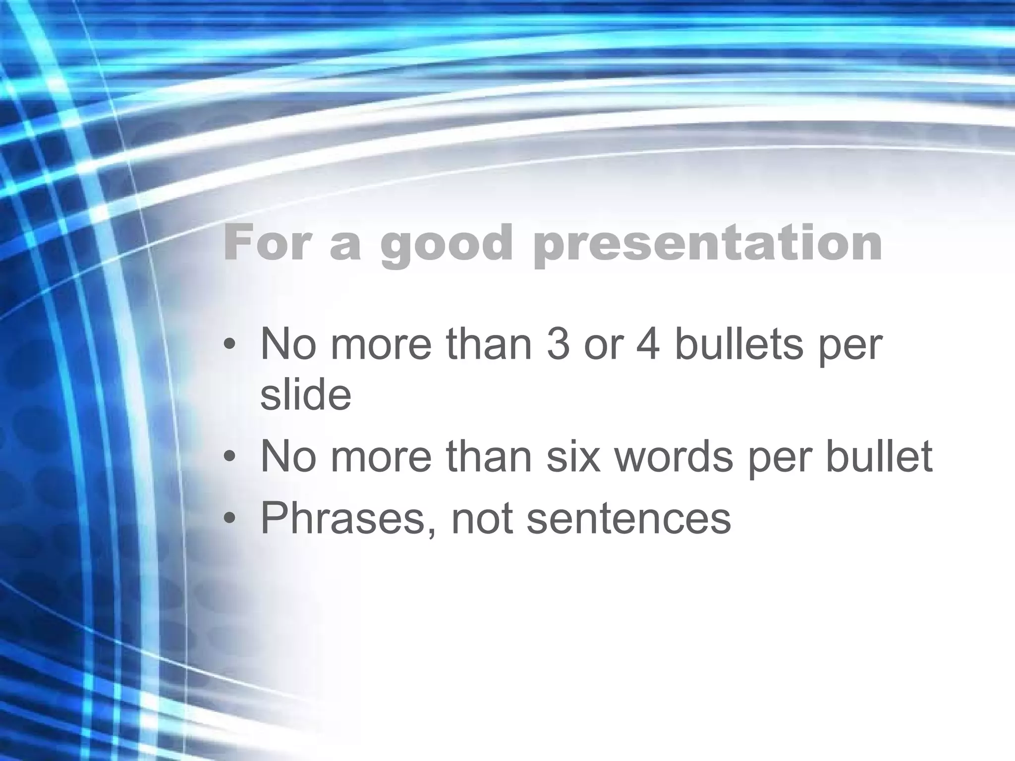
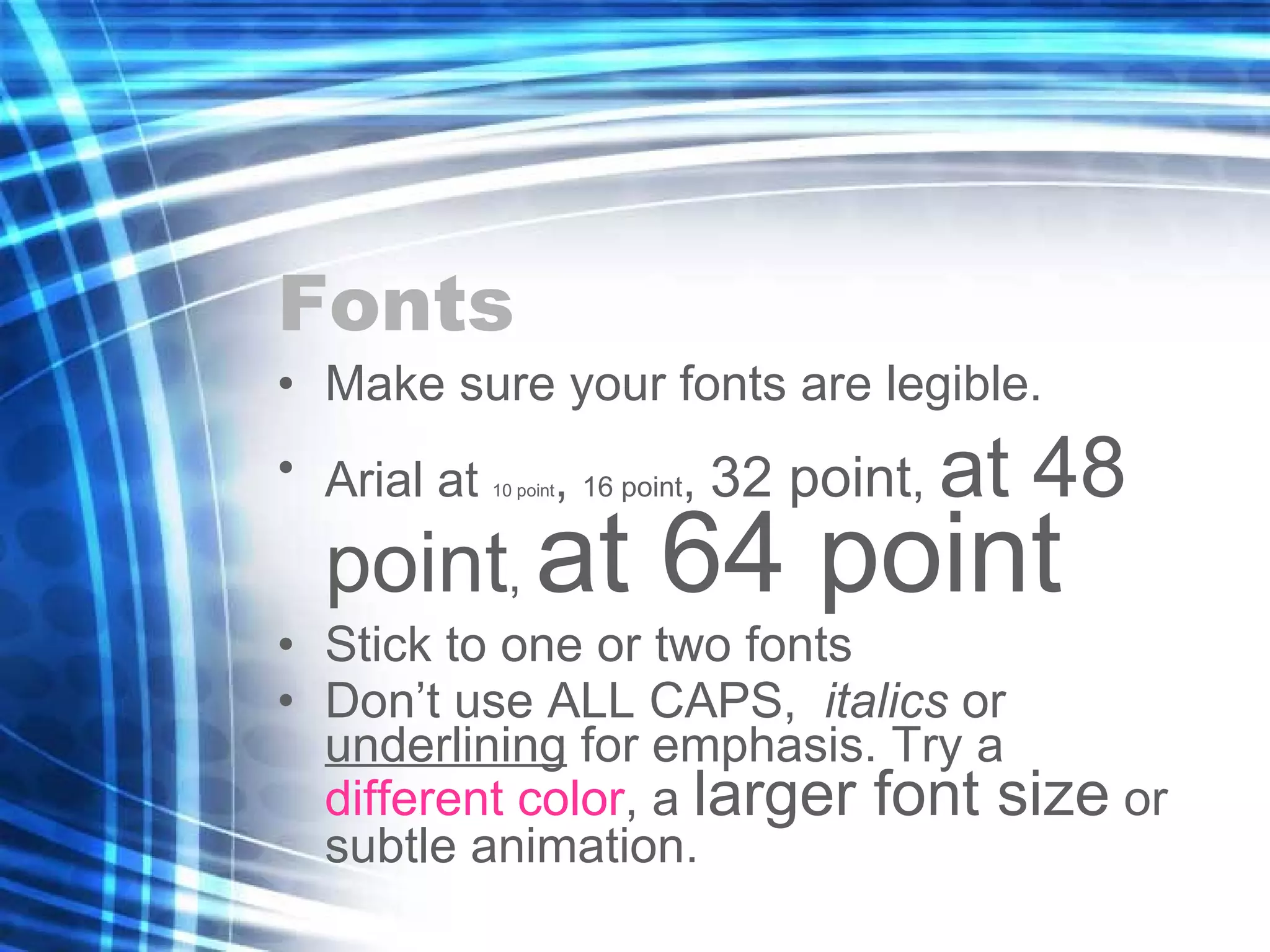
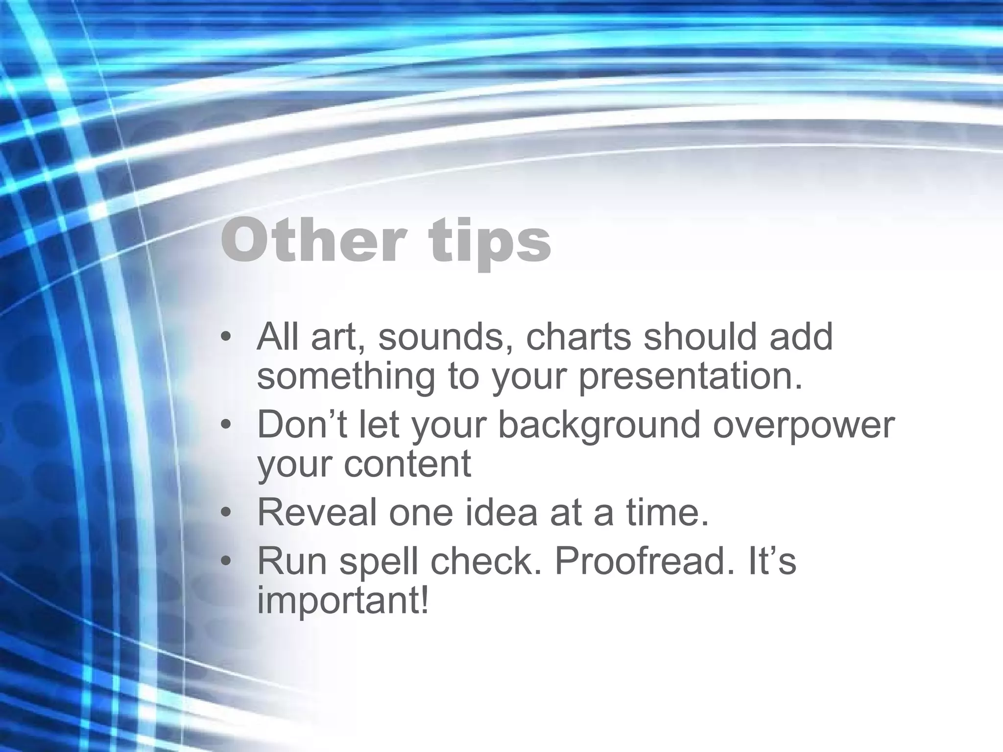
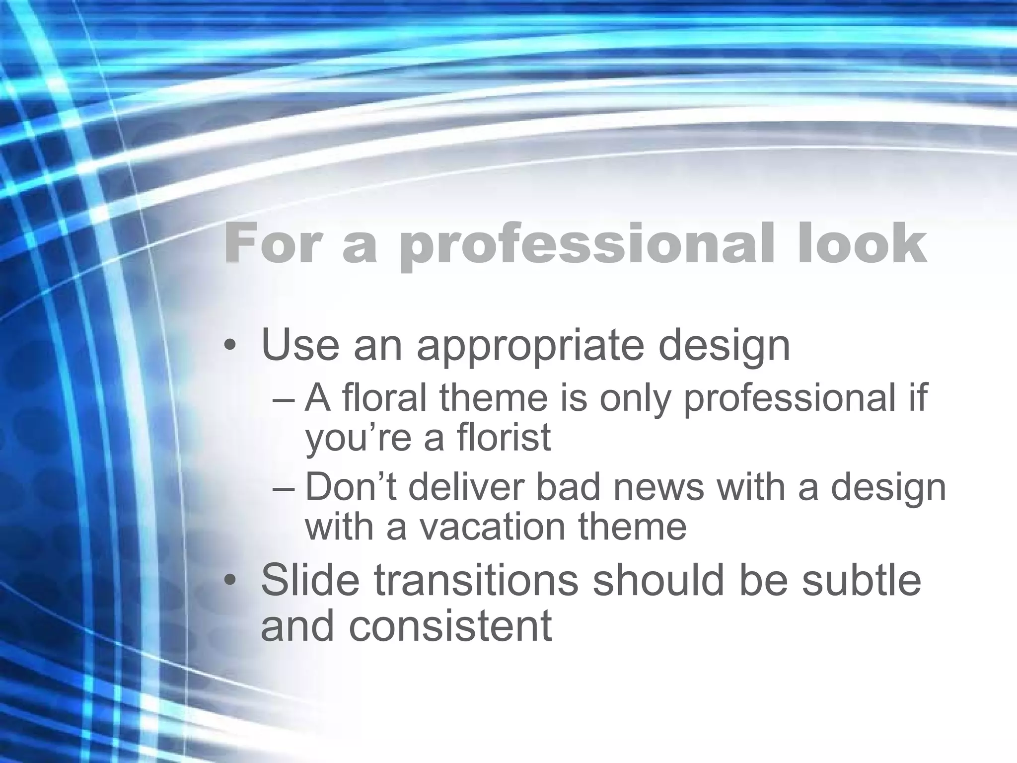


This document provides guidelines for creating effective PowerPoint presentations, emphasizing the importance of simplicity and consistency in design, such as avoiding distracting backgrounds and using legible fonts. It advises on the optimal number of bullet points and words per slide, as well as tips for enhancing presentations with graphics and animations. Additionally, it underscores the significance of proofreading and using an appropriate design theme to maintain professionalism.


![Vibe Coding vs. Spec-Driven Development [Free Meetup]](https://cdn.slidesharecdn.com/ss_thumbnails/vibecodingvsspecdrivendevelopment-251209105622-43f455e7-thumbnail.jpg?width=640&height=640&fit=bounds)


