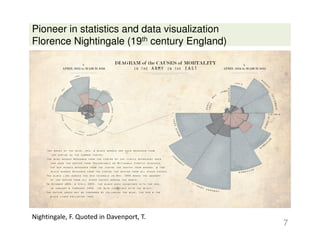
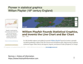
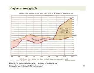
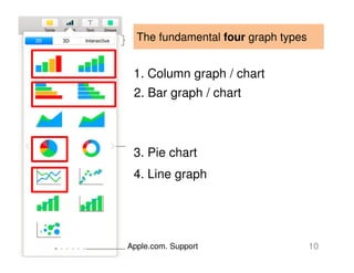
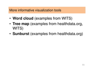
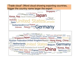
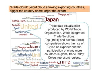
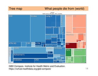
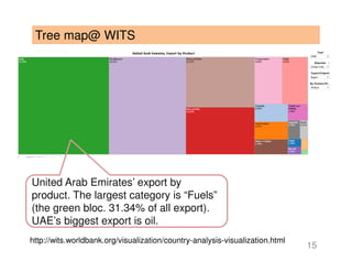
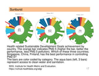
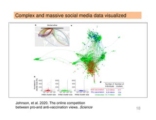
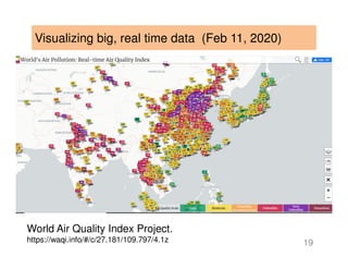
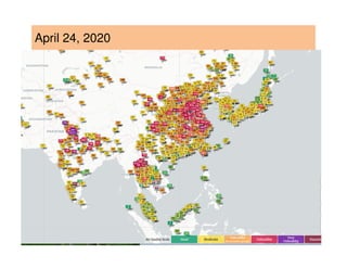
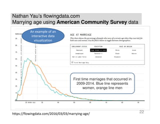
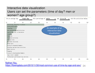
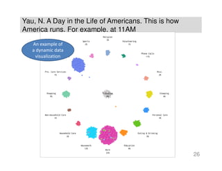
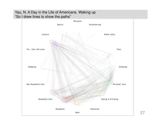
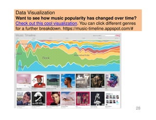
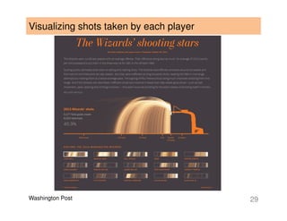
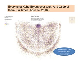
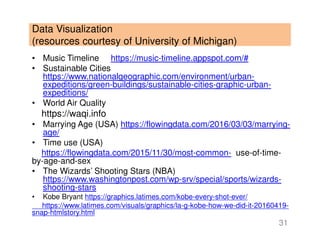
Data Science
Week 2
Data communication and
visualization
1
“Data visualization is the term used
to describe the methods and
technologies used to allow the
exploration and communication of
quantitative information graphically.
Data visualization is a rapidly
growing and evolving discipline,
and visualizations are widely used
to cover politics.” (Rom)
2
Why data visualization (visual analytics)?
• Analytical results must be communicated effectively to
have an impact
• Why analytics in the first place? Actions and decisions
• Without analytics? Fall back on experience and intuition
• Remember the “democratization” of data science? Who
are the target audience of the insights we produce?
• “Simply presenting data in the form of black-and-white
numeric tables and equations is a pretty good way to
have your results ignored…” (Davenport)
• “there should be little question that visual displays of
quantitative information, if appropriately constructed, can
be superior to numerical displays.” (Rom, p.13)
3
«Coronavirus in Italia: 24.747 casi e 1.809 morti. Il
bollettino del 15 marzo»
4Source: Corriere della Sera. Italian ministry of health data.
«I dati e la mappa del contagio del coronavirus in Italia» (March 15, 2020)
5
Source:
Corriere della
Sera. Italian
ministry of
health data.
Where are Corona virus
infections in Italy?
Davenport (2013) and Rom (2015)
• Historical examples of effective and
ineffective communication of scientific and
analytical results
• Visual analytics (or data visualization)
– Traditional four (bar, column, pie, line)
– More advanced tools
• Dynamic, not static (use of time)
• Interactive (Marrying age, use of time)
6
Pioneer in statistics and data visualization
Florence Nightingale (19th century England)
7
Nightingale, F. Quoted in Davenport, T.
Pioneer in statistical graphics
William Playfair (18th century England)
8
Norman, J. History of Information.
https://www.historyofinformation.com
Playfair’s area graph
9
Playfair, W. Quoted in Norman, J. History of Information.
https://www.historyofinformation.com
The fundamental four graph types
10Apple.com. Support
1. Column graph / chart
2. Bar graph / chart
3. Pie chart
4. Line graph
More informative visualization tools
• Word cloud (examples from WITS)
• Tree map (examples from healthdata.org,
WITS)
• Sunburst (examples from healthdata.org)
11
“Trade cloud” (Word cloud showing exporting countries,
bigger the country name larger the export
12
“Trade cloud” (Word cloud showing exporting countries,
bigger the country name larger the export
13
Trade data visualization
produced by World Trade
Organization. World Integrated
Trade Solutions.
Top (1991) and bottom (2018)
comparison shows the rise of
China as exporter and the
participation of many more
countries in global trade today.
Colors represent regions.
Tree map What people die from (world)
14
GBD Compare. Institute for Health Metric and Evaluation.
https://vizhub.healthdata.org/gbd-compare/
Tree map@ WITS
15
http://wits.worldbank.org/visualization/country-analysis-visualization.html
United Arab Emirates’ export by
product. The largest category is “Fuels”
(the green bloc. 31.34% of all export).
UAE’s biggest export is oil.
Tree map is “a diagram representing hierarchical data in
the form of nested rectangles, the area of each
corresponding to its numerical value” (dictionary
definition)
The GBD tree map shows the relative contribution of
each disease to deaths in the world.
The UAE export tree map shows the relative contribution
of product categories (fuels, miscellaneous, stone and
glass, etc) to the country’s total export
16
Sunburst
17
Health related Sustainable Development Goals achievement by
country. The orange bar indicates PM2.5 (higher the bar, better the
performance, less PM2.5 pollution). Which of these three countries;
Singapore, China, Finland; has the best performance in controlling
PM2.5?
The bars are color coded by category. The aqua bars (left, 3 bars)
represent access to clean water and sanitation.
SDG. Institute for Health Metric and Evaluation.
https://vizhub.healthdata.org/sdg/
Complex and massive social media data visualized
18
Johnson, et al. 2020. The online competition
between pro-and anti-vaccination views. Science
Visualizing big, real time data (Feb 11, 2020)
19
World Air Quality Index Project.
https://waqi.info/#/c/27.181/109.797/4.1z
April 24, 2020
20
Data Visualization
“Want to know what ages certain people get married? Check out
this interactive visualization that allows you to understand the
marriage age of different groups of people. “Using data from the
American Community Survey, made more useable by the Integrated
Public Use Microdata Series, I tabulated the ages of people who
married between 2009 and 2014.”
21
Nathan Yau’s flowingdata.com
Marrying age using American Community Survey data
Nathan Yau’s flowingdata.com
Marrying age using American Community Survey data
22
First time marriages that occurred in
2009-2014. Blue line represents
women, orange line men
https://flowingdata.com/2016/03/03/marrying-age/
An example of an
interactive data
visualization
American Time Use Survey is a US government survey. Open data
23
https://www.bls.gov/tus/
Interactive data visualization
Users can set the parameters (time of day? men or
women? age group?)
24
Nathan Yau.
https://flowingdata.com/2015/11/30/most-common-use-of-time-by-age-and-sex/
An example of an
interactive data
visualization
Yau, N. A Day in the Life of Americans. This is how
America runs.
Using American Time Use Survey data
25
“Each dot represents a person, color represents the activity, and time of day is
shown in the top left. As someone changes an activity, say from sleep to a
morning commute, the dot moves accordingly.
Following the timeline of the ATUS, the simulation starts at 4:00am and runs
through 24 hours. The day starts with little movement as people are asleep and
won’t wake up for a few hours. For most, the day starts at 7:00am and then it’s
off to the races (which is especially fun to see on the fast speed).
You see people head to work, run errands, do housework, take care of the kids,
commute, relax, and eat at almost designated times during the day. I stared at
these dots longer than I care to admit.
Although with all 1,000 dots floating around it can be a challenge to keep track
of where all those people went.
So I drew lines to show the paths.
In the graphics that follow, colors represent paths ending in that activity.
Traveling is not included to make activity changes more obvious.”
Yau, N. A Day in the Life of Americans. This is how
America runs. For example, at 11AM
26
An example of
a dynamic data
visualization
Yau, N. A Day in the Life of Americans. Waking up
“So I drew lines to show the paths”
27
Data Visualization
Want to see how music popularity has changed over time?
Check out this cool visualization. You can click different genres
for a further breakdown. https://music-timeline.appspot.com/#
28
Washington Post 29
Visualizing shots taken by each player
Every shot Kobe Bryant ever took. All 30,699 of
them (LA Times. April 14, 2016.)
30
An example of an
interactive data
visualization
Data Visualization
(resources courtesy of University of Michigan)
• Music Timeline https://music-timeline.appspot.com/#
• Sustainable Cities
https://www.nationalgeographic.com/environment/urban-
expeditions/green-buildings/sustainable-cities-graphic-urban-
expeditions/
• World Air Quality
https://waqi.info
• Marrying Age (USA) https://flowingdata.com/2016/03/03/marrying-
age/
• Time use (USA)
https://flowingdata.com/2015/11/30/most-common- use-of-time-
by-age-and-sex
• The Wizards’ Shooting Stars (NBA)
https://www.washingtonpost.com/wp-srv/special/sports/wizards-
shooting-stars
• Kobe Bryant https://graphics.latimes.com/kobe-every-shot-ever/
https://www.latimes.com/visuals/graphics/la-g-kobe-how-we-did-it-20160419-
snap-htmlstory.html
31

Data science week_2_visualization

  • 1.
    Data Science Week 2 Datacommunication and visualization 1
  • 2.
    “Data visualization isthe term used to describe the methods and technologies used to allow the exploration and communication of quantitative information graphically. Data visualization is a rapidly growing and evolving discipline, and visualizations are widely used to cover politics.” (Rom) 2
  • 3.
    Why data visualization(visual analytics)? • Analytical results must be communicated effectively to have an impact • Why analytics in the first place? Actions and decisions • Without analytics? Fall back on experience and intuition • Remember the “democratization” of data science? Who are the target audience of the insights we produce? • “Simply presenting data in the form of black-and-white numeric tables and equations is a pretty good way to have your results ignored…” (Davenport) • “there should be little question that visual displays of quantitative information, if appropriately constructed, can be superior to numerical displays.” (Rom, p.13) 3
  • 4.
    «Coronavirus in Italia:24.747 casi e 1.809 morti. Il bollettino del 15 marzo» 4Source: Corriere della Sera. Italian ministry of health data.
  • 5.
    «I dati ela mappa del contagio del coronavirus in Italia» (March 15, 2020) 5 Source: Corriere della Sera. Italian ministry of health data. Where are Corona virus infections in Italy?
  • 6.
    Davenport (2013) andRom (2015) • Historical examples of effective and ineffective communication of scientific and analytical results • Visual analytics (or data visualization) – Traditional four (bar, column, pie, line) – More advanced tools • Dynamic, not static (use of time) • Interactive (Marrying age, use of time) 6
  • 7.
    Pioneer in statisticsand data visualization Florence Nightingale (19th century England) 7 Nightingale, F. Quoted in Davenport, T.
  • 8.
    Pioneer in statisticalgraphics William Playfair (18th century England) 8 Norman, J. History of Information. https://www.historyofinformation.com
  • 9.
    Playfair’s area graph 9 Playfair,W. Quoted in Norman, J. History of Information. https://www.historyofinformation.com
  • 10.
    The fundamental fourgraph types 10Apple.com. Support 1. Column graph / chart 2. Bar graph / chart 3. Pie chart 4. Line graph
  • 11.
    More informative visualizationtools • Word cloud (examples from WITS) • Tree map (examples from healthdata.org, WITS) • Sunburst (examples from healthdata.org) 11
  • 12.
    “Trade cloud” (Wordcloud showing exporting countries, bigger the country name larger the export 12
  • 13.
    “Trade cloud” (Wordcloud showing exporting countries, bigger the country name larger the export 13 Trade data visualization produced by World Trade Organization. World Integrated Trade Solutions. Top (1991) and bottom (2018) comparison shows the rise of China as exporter and the participation of many more countries in global trade today. Colors represent regions.
  • 14.
    Tree map Whatpeople die from (world) 14 GBD Compare. Institute for Health Metric and Evaluation. https://vizhub.healthdata.org/gbd-compare/
  • 15.
    Tree map@ WITS 15 http://wits.worldbank.org/visualization/country-analysis-visualization.html UnitedArab Emirates’ export by product. The largest category is “Fuels” (the green bloc. 31.34% of all export). UAE’s biggest export is oil.
  • 16.
    Tree map is“a diagram representing hierarchical data in the form of nested rectangles, the area of each corresponding to its numerical value” (dictionary definition) The GBD tree map shows the relative contribution of each disease to deaths in the world. The UAE export tree map shows the relative contribution of product categories (fuels, miscellaneous, stone and glass, etc) to the country’s total export 16
  • 17.
    Sunburst 17 Health related SustainableDevelopment Goals achievement by country. The orange bar indicates PM2.5 (higher the bar, better the performance, less PM2.5 pollution). Which of these three countries; Singapore, China, Finland; has the best performance in controlling PM2.5? The bars are color coded by category. The aqua bars (left, 3 bars) represent access to clean water and sanitation. SDG. Institute for Health Metric and Evaluation. https://vizhub.healthdata.org/sdg/
  • 18.
    Complex and massivesocial media data visualized 18 Johnson, et al. 2020. The online competition between pro-and anti-vaccination views. Science
  • 19.
    Visualizing big, realtime data (Feb 11, 2020) 19 World Air Quality Index Project. https://waqi.info/#/c/27.181/109.797/4.1z
  • 20.
  • 21.
    Data Visualization “Want toknow what ages certain people get married? Check out this interactive visualization that allows you to understand the marriage age of different groups of people. “Using data from the American Community Survey, made more useable by the Integrated Public Use Microdata Series, I tabulated the ages of people who married between 2009 and 2014.” 21 Nathan Yau’s flowingdata.com Marrying age using American Community Survey data
  • 22.
    Nathan Yau’s flowingdata.com Marryingage using American Community Survey data 22 First time marriages that occurred in 2009-2014. Blue line represents women, orange line men https://flowingdata.com/2016/03/03/marrying-age/ An example of an interactive data visualization
  • 23.
    American Time UseSurvey is a US government survey. Open data 23 https://www.bls.gov/tus/
  • 24.
    Interactive data visualization Userscan set the parameters (time of day? men or women? age group?) 24 Nathan Yau. https://flowingdata.com/2015/11/30/most-common-use-of-time-by-age-and-sex/ An example of an interactive data visualization
  • 25.
    Yau, N. ADay in the Life of Americans. This is how America runs. Using American Time Use Survey data 25 “Each dot represents a person, color represents the activity, and time of day is shown in the top left. As someone changes an activity, say from sleep to a morning commute, the dot moves accordingly. Following the timeline of the ATUS, the simulation starts at 4:00am and runs through 24 hours. The day starts with little movement as people are asleep and won’t wake up for a few hours. For most, the day starts at 7:00am and then it’s off to the races (which is especially fun to see on the fast speed). You see people head to work, run errands, do housework, take care of the kids, commute, relax, and eat at almost designated times during the day. I stared at these dots longer than I care to admit. Although with all 1,000 dots floating around it can be a challenge to keep track of where all those people went. So I drew lines to show the paths. In the graphics that follow, colors represent paths ending in that activity. Traveling is not included to make activity changes more obvious.”
  • 26.
    Yau, N. ADay in the Life of Americans. This is how America runs. For example, at 11AM 26 An example of a dynamic data visualization
  • 27.
    Yau, N. ADay in the Life of Americans. Waking up “So I drew lines to show the paths” 27
  • 28.
    Data Visualization Want tosee how music popularity has changed over time? Check out this cool visualization. You can click different genres for a further breakdown. https://music-timeline.appspot.com/# 28
  • 29.
    Washington Post 29 Visualizingshots taken by each player
  • 30.
    Every shot KobeBryant ever took. All 30,699 of them (LA Times. April 14, 2016.) 30 An example of an interactive data visualization
  • 31.
    Data Visualization (resources courtesyof University of Michigan) • Music Timeline https://music-timeline.appspot.com/# • Sustainable Cities https://www.nationalgeographic.com/environment/urban- expeditions/green-buildings/sustainable-cities-graphic-urban- expeditions/ • World Air Quality https://waqi.info • Marrying Age (USA) https://flowingdata.com/2016/03/03/marrying- age/ • Time use (USA) https://flowingdata.com/2015/11/30/most-common- use-of-time- by-age-and-sex • The Wizards’ Shooting Stars (NBA) https://www.washingtonpost.com/wp-srv/special/sports/wizards- shooting-stars • Kobe Bryant https://graphics.latimes.com/kobe-every-shot-ever/ https://www.latimes.com/visuals/graphics/la-g-kobe-how-we-did-it-20160419- snap-htmlstory.html 31