2.How effective is the combination of your main product and your ancillary te...
Inception magazine cover analysis
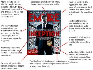
1. Above the title we see Describes it dramatically for effect, Empire is written in the
‘the dark knight returns’ shows there is a lot to read inside biggest font as it’s the
in capital letters, by doing name of the magazine itself
this it advertises the film and the colour red is used
and director as he has had to link in with the inception
previously had a very title
successful film.
The title of the film is
written in bright red to
This is advertising an make it stand out and a
interview from the simple font to make it easy
director of Inception and to read
also very popular The
Dark Knight, this will
entice people to buy the Leonardo is holding a gun
magazine. to help the readers
establish the genre of the
film
Another referral to the
director, this cover uses
the famous director a lot Makes it seem like a limited
to advertise. edition, the use of gold
make it seems special too
and stands out against the
The blue futuristic background makes Leonardo background
Exclusive add-ins in this look secretive and encourages readers to want
edition, encourages people to learn more about him
to purchase a copy