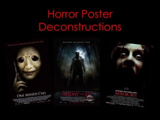
2. The red tagline at the
top of the page
makes it stand out
There is a clever use of a
from the rest of the
mouth and nose here to
page for more
make them look like eyes,
impact.
creates a very eerie
feeling. This also connotes
that there might be a lot
The phone prop of screaming in the film as
links to film title it looks like the mouths
very well. are screaming.
It is a common
convention to have the The black background
subject in the center of connotes suspense
poster as it is the most and mystery, a
effective place. convention of the
genre.
The blurred
effect on the
Having the vital
title connotes
information and the
panic.
movie companies logos
work well small at the
Having the date in red bottom of the page as it
works well as it stands is generally not what the
out from the less audience wants to know
important text. about.
3. It is a very common convention in
horror posters to have a tag line at
the top of the page as it looks very
effective. You can see something in
the reflection of her eyes
which connotes mystery
Like in the other two as we cant tell what it is.
posters, again the subject
is in the middle of poster
as this is the most
effective place.
This large black
They have made the face gap in-between
slightly blurred with the image and text
connotes panic and danger. connotes mystery
as the audience
don’t know what is
The main reason that in this gap.
the text looks so good
is because they used a
wide variety of fonts. They have the most well
known actors in larger writing
to attract the audience.
I think it is very clever
the way that they have
made the film title look It is very important to
like a mirror, in running have the date of release
with the actual name of somewhere so that the
the film. audience know when
they can see it.
4. The tagline gives the In all of the posters that I
audience a clue to what have analysed almost all of
the film is about. the edges are plain black.
This connotes mystery as
you cant see where the
The forest background
poster really ends.
makes the poster a lot
more scary, so I will
make sure that I have a
background in mine . All of the trees are leaning
in towards the subject
which makes the audiences
eyes draw towards him and
places more emphasis than
The weapon him.
connotes
danger.
There is very good attention
to detail in this poster as you
can see from the ground here.
A lot of posters don’t and just Having small amounts of text
choose to have a plain back in red is very popular and also
background which is a lot less very effective. If they had put
effective in my opinion. all of the white text in red as
well it would of made the title
and date a lot less effective.