
Recommended
More Related Content
What's hot
What's hot (20)
Similar to In What Ways Does Your Media Product Use, Develop or Challenge Forms and Conventions of Real Media Products?
Similar to In What Ways Does Your Media Product Use, Develop or Challenge Forms and Conventions of Real Media Products? (20)
Recently uploaded
Recently uploaded (20)
In What Ways Does Your Media Product Use, Develop or Challenge Forms and Conventions of Real Media Products?
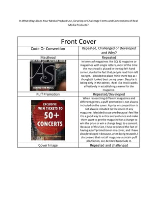
- 1. In What Ways Does Your Media Product Use, Develop or Challenge Forms and Conventions of Real Media Products? Front Cover Code Or Convention Repeated, Challenged or Developed and Why? Masthead Repeated In terms of magazines like GQ, Q magazine or magazines with single letters, most of the time the masthead is placed in the top left hand corner,due to the fact that people readfromleft to right. I decided to place mine there too as I thought it looked best on my cover. Despite it being only in the corner, I feel like it still works effectively in establishing a name for the magazine. Puff Promotion Repeated/Developed When researching different magazines and different genres, a puff promotion is not always included on the cover. A prize or competition is not always included on the cover of any magazine. Idecidedtouse one because Ifeel like it isa good wayto entice andaudience andmake them want to get the magazine for a change to win the prize or win a change to go to a concert. Because of this fact, I have repeated the fact of havinga puff promotionon my cover, and I have alsodevelopeditbecause,afterdoingresearch,I discovered that not all magazines contain puff promotion, so I decided to include it. Cover Image Repeated and challenged
- 2. After doing research I discovered that a slight majority of RnB genre magazines contain male cover stars, usually centred in the middle of the page looking towards the camera, in order to create a sense of eye contactand direct address. The male cover starts are usually wearing somethingstereotypical toblack culture, such as large pieces of jewellery, bomber/leather jackets,vesttops,hoodiesetc.usuallycontaining dark colours in terms of the image. I also found that extremely popular celebrities are usually used for their star appeal (Dyer). I repeated these features by having a male model as the celebrityTravisScott,whoisextremelypopular.I made my model wear a dark bomber jacket on top of a blackhoodie.He iscentredinthe middle of the page, suggesting that he is the centre of attention in my magazine. Despite this, I also challenged these conventions. My cover star is not looking towards the camera. I made my cover star look down, linking it to my story. My main feature talks about Travis Scott (my cover star) talking about how he got to the top of the musicindustry,soI challengedthe conventionto suggest that he is looking down from the top of the musicindustry, to explain how he got there. Varied Sizes/font Challenged I used a variety of different sized fonts to make m magazine more exciting.Iwanted to make my main stories bigger than my story summaries. This would make the stories pop out, from the page, especiallywhenitcomes to the anchorage text for the main feature. That is the biggest, makingitseemlike the more prominentstoryfor thisissue of the paper.I usedsmallertextforthe social media links, as they aren’t necessarily needed to enjoy the magazine; they’re an addition,if the reader wants to continue online. Date/Price/Barcode Repeated
- 3. Whenresearchingdifferent types of magazine, I noticedthattheyall include abarcode, price and date. The barcode is necessary because otherwise the shop clerk cannot sell the item to the customer; however it is not need to the customer so it is always placed at the bottom. The same can be said about the price. When researchingdifferentcommercial magazines,the price tends to be at the bottom of the page, underneath the barcode,alongwithanydates or magazine websites.
- 4. CONTENTS Code or Convention Repeated, Challenged or Developed and Why? Supporting Images Repeated When undergoing research, I discovered that almost every single magazine contains supporting images. They act as a way to give storiesa face,andthey are effective in making a reader want to read their magazine. I chose not to challenge thisconventionasIfeel like this is a good way to bring a page together. It is always visuallyappealingtohave an image supporting a story,as otherwise itwouldjust be justa page of text, which is not really nice nor interesting to read. For example, in my magazine I used an image of Jay Z whentalkingaboutthe possibility of winning tickets to see Jay Z. Pulled Quote Repeated Almost every magazine, no matter the genre or target audience, uses pulled quotes as a way to attract an audience to read the magazine. It’s usually used on any page, whether it’s the front cover, contents page, or double page spread, it can be used anywhere to quickly summarise or geta pointacrossfrom a story.I repeatedthisby usingitto quicklysummarise mymainfeature on my contents page. Puff Promotion Challenged The puff promotion is usually only seen on the cover page of a magazine. I challenged this by including it on not only the cover page, but by going into more detail about the promotion on the contents page. This gives more of a change for the reader to see it and to be intrigued into taking part in it.
- 5. Double-Paged Spread Code or Convention Repeated, Challenger or Developed and Why? Content Challenged Whenlookingatthe differenttypes of magazine double page spreads, not very many of them only have Q&As as their only content. Usually they have a Q&A as an additional part of the content as well as large amount of text. I challengedthisbecause,when researching, I did finda couple of magazine spreadsthatcontained only Q&As and they were much easier and better to read, as there wasn’t that much text Pulled Quote Repeated I useda pulledquote on my double page spread in order to make it seem important. Having important quotes from your story stick out will make people want to read the story more. Quotes like “IT WAS SOMETHING I THOUGHT WOULD NEVER HAPPEN” catch the reader’s attentionandmakes them want to see what the star thought was impossible. Columns Repeated Columns make the text on the double page spread much easier to read. It neatens up the structure of the page, making it look structurally appealing to the eye. It makes the reader actually want to read the text, as it’s not just a large area of text.