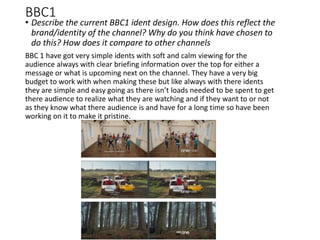
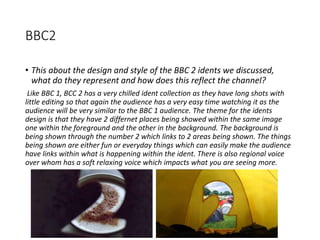
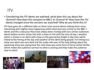
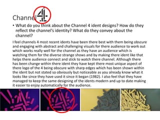
The document discusses television idents for different channels and their design and purpose. It analyzes idents for BBC1, BBC2, ITV, Channel 4, and Channel 5. For BBC1 and BBC2, it notes their simple, calm designs reflect their universal audiences. ITV idents link to shows or time of day. Channel 4 idents are abstract and engaging to match their diverse shows. Channel 5 idents lack a clear identity. It compares opportunities and challenges for BBC1, which must be inclusive, versus Channel 4 appealing to younger audiences. The document evaluates Channel 4 as having the better, more unique idents.

![Purposes Q1
• Outline the core purposes of television idents [e.g. branding/identity for a
channel, conveying the channel’s personality, retaining viewers, informing
viewers, segmentation of broadcasing]
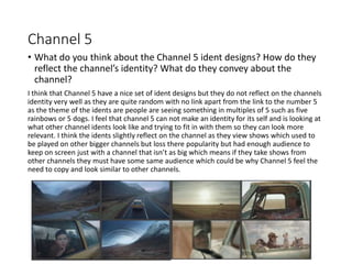
Television idents are used to create an image for a channel which helps us as
viewers to remember them for what they look like so if you are channel surfing
and you scroll past and notice an ident it can remind and sometimes get you to
stay on that channel (the channels identity). The ident will relate to the type of
channel it is such as BBC 1 which has a clear slow shot and just a single or few
shots making it easy to follow and understand, this is because they have a
universal audience being quite young and older so by making it not difficult to
understand with brief information then it helps retain the viewers. If you then look
at a channel such as CHANNEL 4 then they have a different audience due to the
shows they have on the channel so they have very engaging and active idents as
the audience they have connect to a more abstract and challenging ident to
understand which they do by using lots of shots with fast editing and more visuals
so the viewer has more to take in and absorb.](https://image.slidesharecdn.com/idents17thwork-171119211946/85/identwokr-4-320.jpg)
![Learning Outcome 2 - INTRO
Opportunities and Limitations
• This section concerns the opportunities and limitations of onscreen
graphic representations. This section should expand on the points
you made in section 1.
• You should consider more closely the audience and requirements on
the broadcaster to engage with their audience, discussing how they
may have successfully/unsuccessfully achieved this.
• Think about the discussions and examples from the lecture [some
points to consider will be listed in the PP for the lecture]
• Add slides to expand your points and definitely add illustrative stills,
etc!](https://image.slidesharecdn.com/idents17thwork-171119211946/85/identwokr-12-320.jpg)
![TASK 2 - Learning Outcome 2
• Select 2 different channels to look at, each of these channels should
be aimed at different audiences [for example, E4 and BBC4 or CITV
and BBC1, etc].
• You should:
• Outline the style and design of each set of idents [include examples]
• Comment on the visual elements, such as colour, font, imagery, motion and
composition, for each suite of idents
• Explain how each suite supports it’s intended audience
• Consider the restrictions or challenges in trying to develop a brand/ident
package for the selected channel’s audiences
• Compare the sets of idents, what characterstics are similar or different?](https://image.slidesharecdn.com/idents17thwork-171119211946/85/identwokr-13-320.jpg)


![[Pro forma] corporate - live project evaluation](https://cdn.slidesharecdn.com/ss_thumbnails/pro-formacorporate-liveprojectevaluation-180413145338-thumbnail.jpg?width=640&height=640&fit=bounds)
![[Pro forma] wtab theory lo1](https://cdn.slidesharecdn.com/ss_thumbnails/pro-formawtabtheorylo1-180407133833-thumbnail.jpg?width=640&height=640&fit=bounds)
![[Pro forma] corporate lo1-lo2](https://cdn.slidesharecdn.com/ss_thumbnails/pro-formacorporatelo1-lo2-180407103124-thumbnail.jpg?width=640&height=640&fit=bounds)

![[Pro forma] wtab theory lo1](https://cdn.slidesharecdn.com/ss_thumbnails/pro-formawtabtheorylo1-180209133546-thumbnail.jpg?width=640&height=640&fit=bounds)

![[Pro forma] - mographics - case study](https://cdn.slidesharecdn.com/ss_thumbnails/pro-forma-mographics-casestudy-171023110131-thumbnail.jpg?width=640&height=640&fit=bounds)
![[Pro forma] - mographics - case study](https://cdn.slidesharecdn.com/ss_thumbnails/pro-forma-mographics-casestudy-171018184755-thumbnail.jpg?width=640&height=640&fit=bounds)


