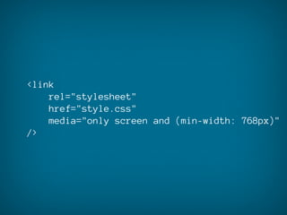
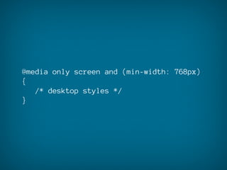
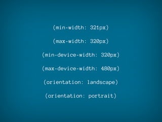
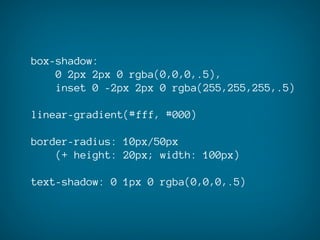
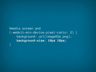
Mobile Web Design
    CODE
   @markodugonjic
HTML5
   CSS3
JavaScript
HTML5
basic structure differences
<!DOCTYPE html>

<meta name="viewport" />

<link rel="stylesheet" media="..." />
video
for mobile
<video src="video.m4v"
    preload
    controls
    poster="image.jpg"></video>
<video src="video.m4v"></video>
clever input fields
<input type="email" />
<input type="phone" />
<input type="url" />
<input type="number" />
<input type="email"
    placeholder="Enter your e-mail" />
<input type="email" required />
http://wufoo.com/html5/
          http://caniuse.com
http://www.quirksmode.org/html5/
         inputs_mobile.html
       http://mobilehtml5.org
CSS3
media queries
<link
    rel="stylesheet"
    href="style.css"
    media="only screen and (min-width: 768px)"
/>
@media only screen and (min-width: 768px)
{
   /* desktop styles */
}
(min-width: 321px)

   (max-width: 320px)

(min-device-width: 320px)

(max-device-width: 480px)

(orientation: landscape)

(orientation: portrait)
(-webkit-min-device-pixel-ratio: 2)

   (min-device-pixel-ratio: 2)
a couple of useful
 CSS properties
a couple of useful
 CSS properties
box-shadow:
    0 2px 2px 0 rgba(0,0,0,.5),
    inset 0 -2px 2px 0 rgba(255,255,255,.5)

linear-gradient(#fff, #000)

border-radius: 10px/50px
    (+ height: 20px; width: 100px)

text-shadow: 0 1px 0 rgba(0,0,0,.5)
-webkit-gradient(
    linear,
    0% 0%,
    0% 100%,
    from(#fff),
    to(#000)
)
button { -webkit-appearance: none; }
@media screen and
(-webkit-min-device-pixel-ratio: 2) {
    background: url(image@2x.png);
    background-size: 10px 10px;
}
keep an eye on
UI performance
The responsive workflow
#1 general typography
#2 vertical rhythm
#3 layout and proportions
JavaScript
keep it simple
confirm(
    'This service will be charged XY.
    Do you accept?'
)

alert(
    'Your transaction was successful.'
)
window.onload = function() {
    setTimeout(function(){
        window.scrollTo(0, 1);
    }, 100);
}
document.getElementById('nav').innerHTML
= '<select 
onchange="document.location=this.value;"
    <option value="#">Home</option>
    <option value="#">Work</option>
    <option value="#">Clients</option>
    <option value="#">Contact</option>
</select>';
Handy tools
http://www.zambetti.com/projects/liveview/
http://www.mozilla.org/en-US/mobile/

http://www.opera.com/developer/tools/mobile/
Back to Work!

   @markodugonjic

Mobile Web Design Code