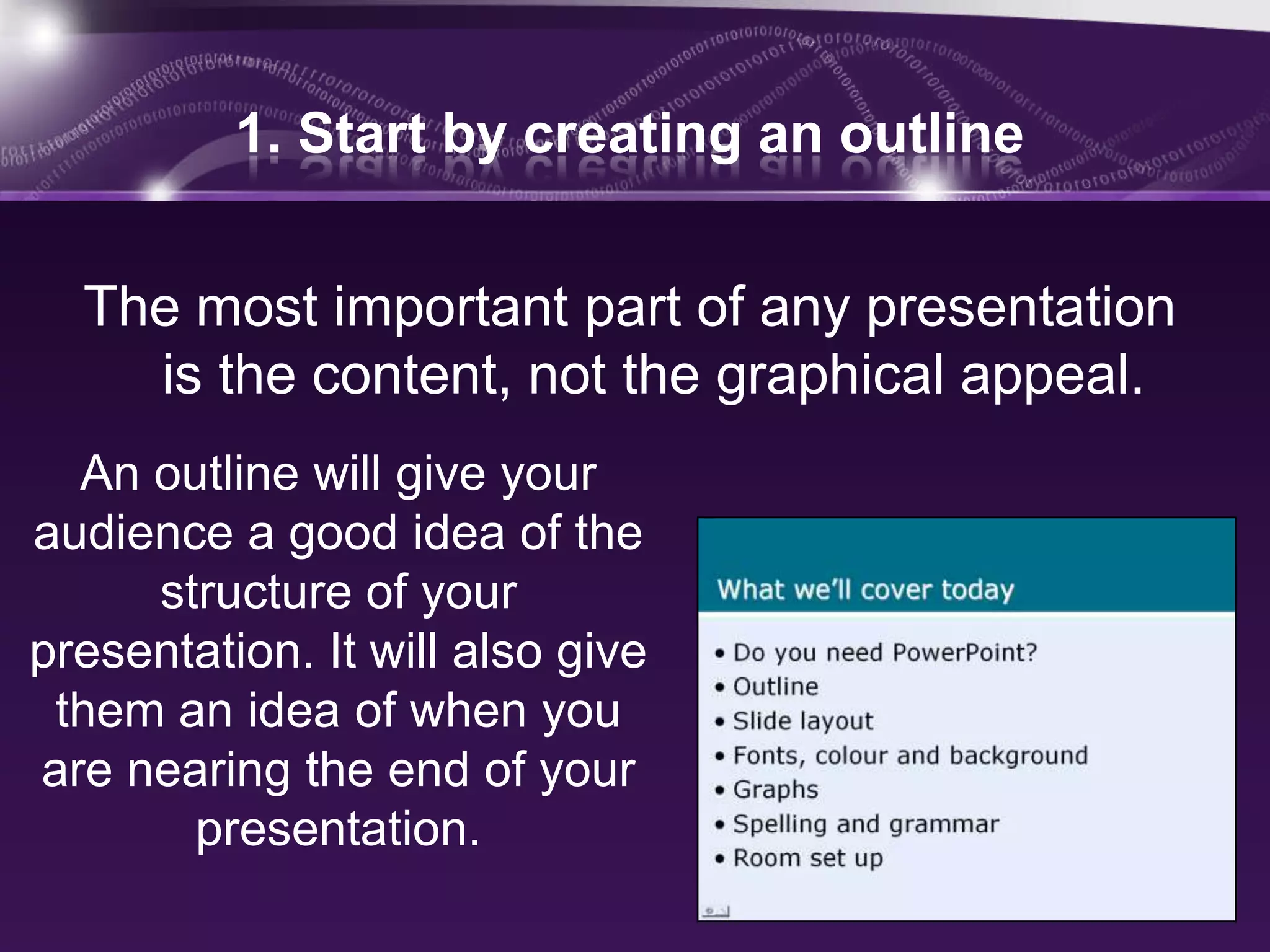
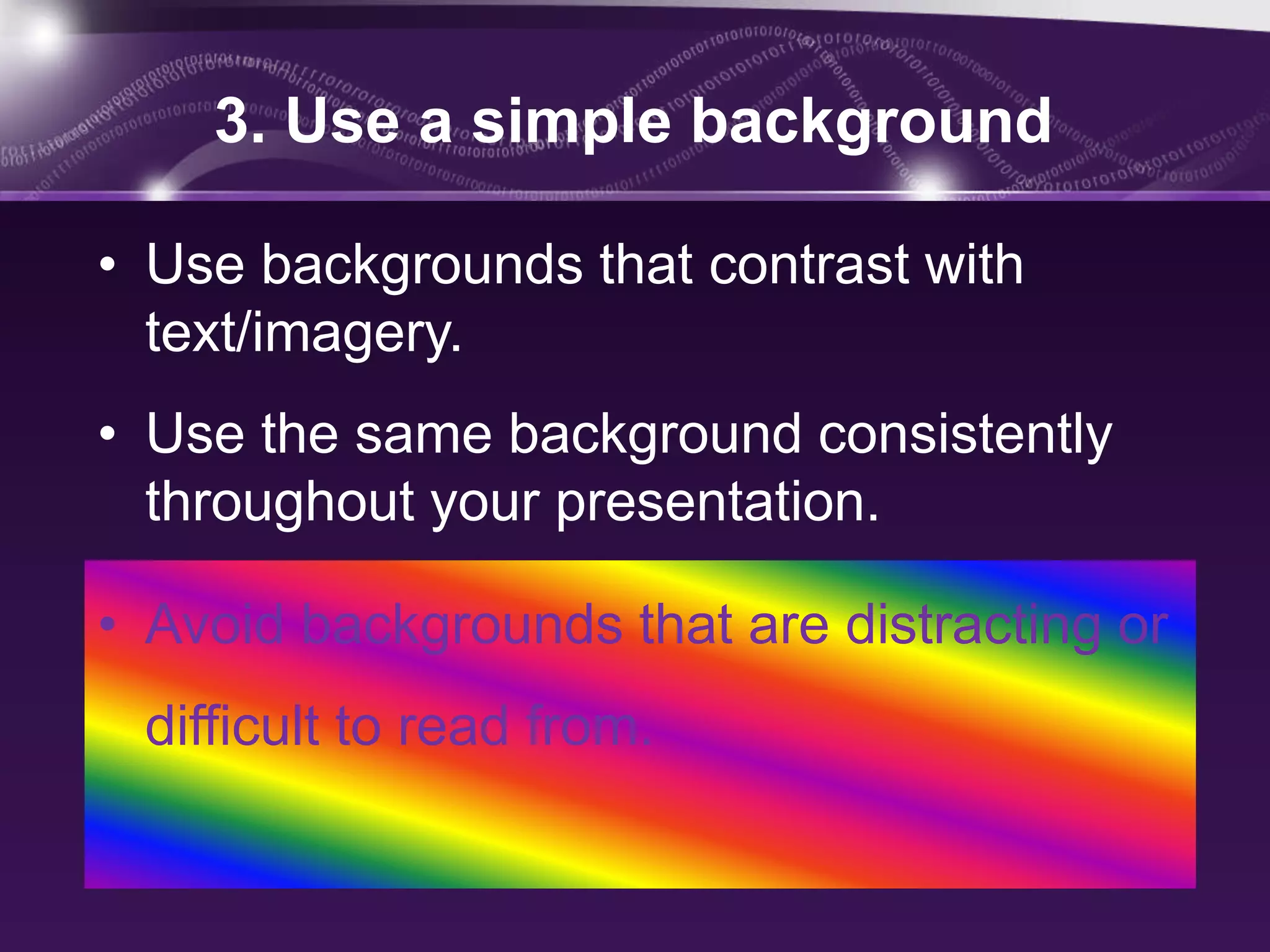
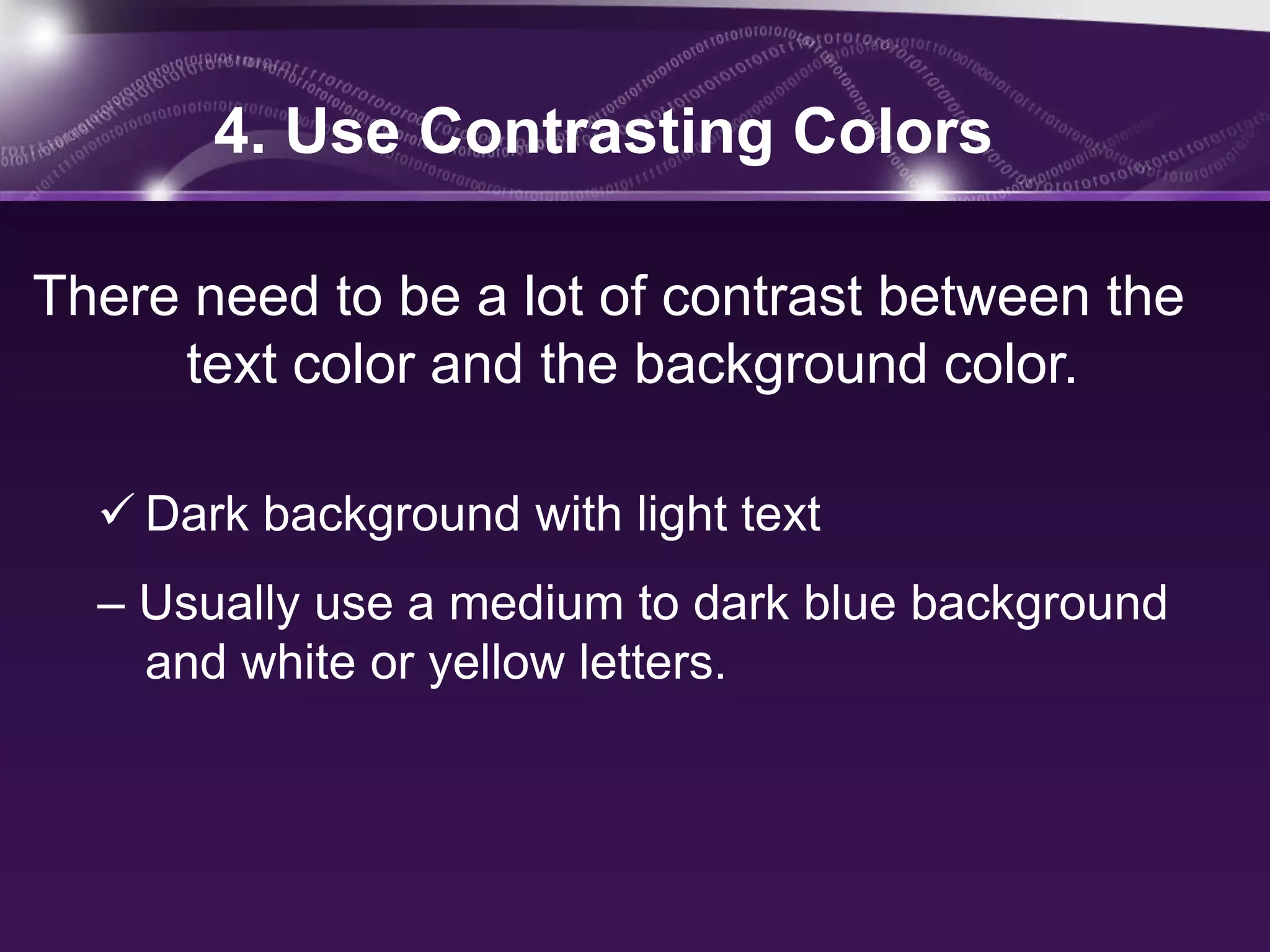
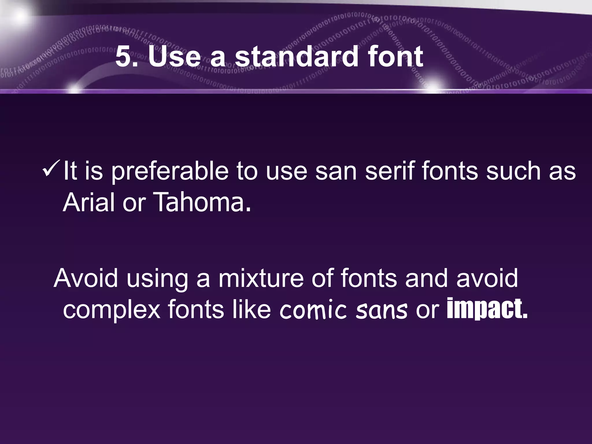
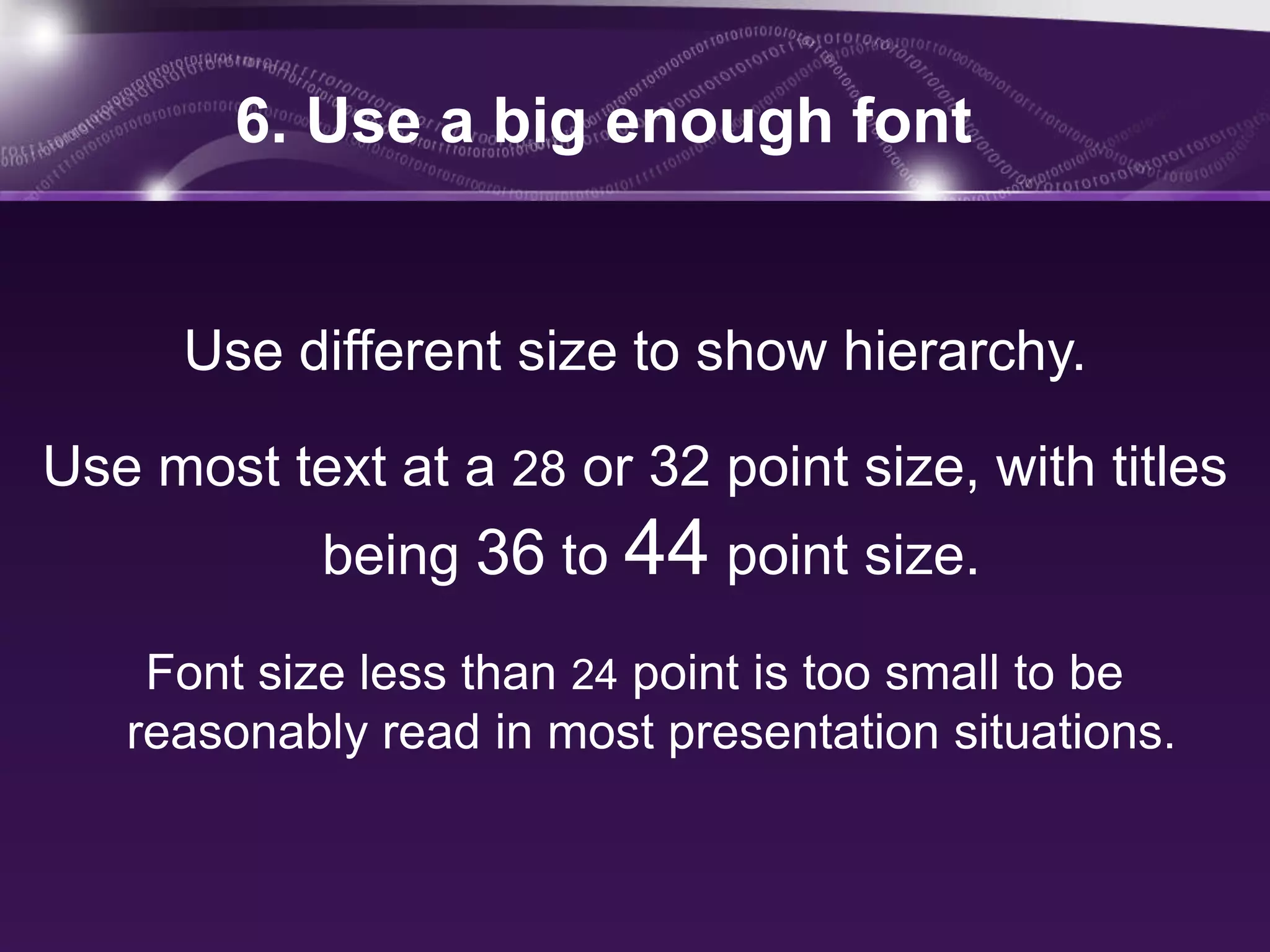
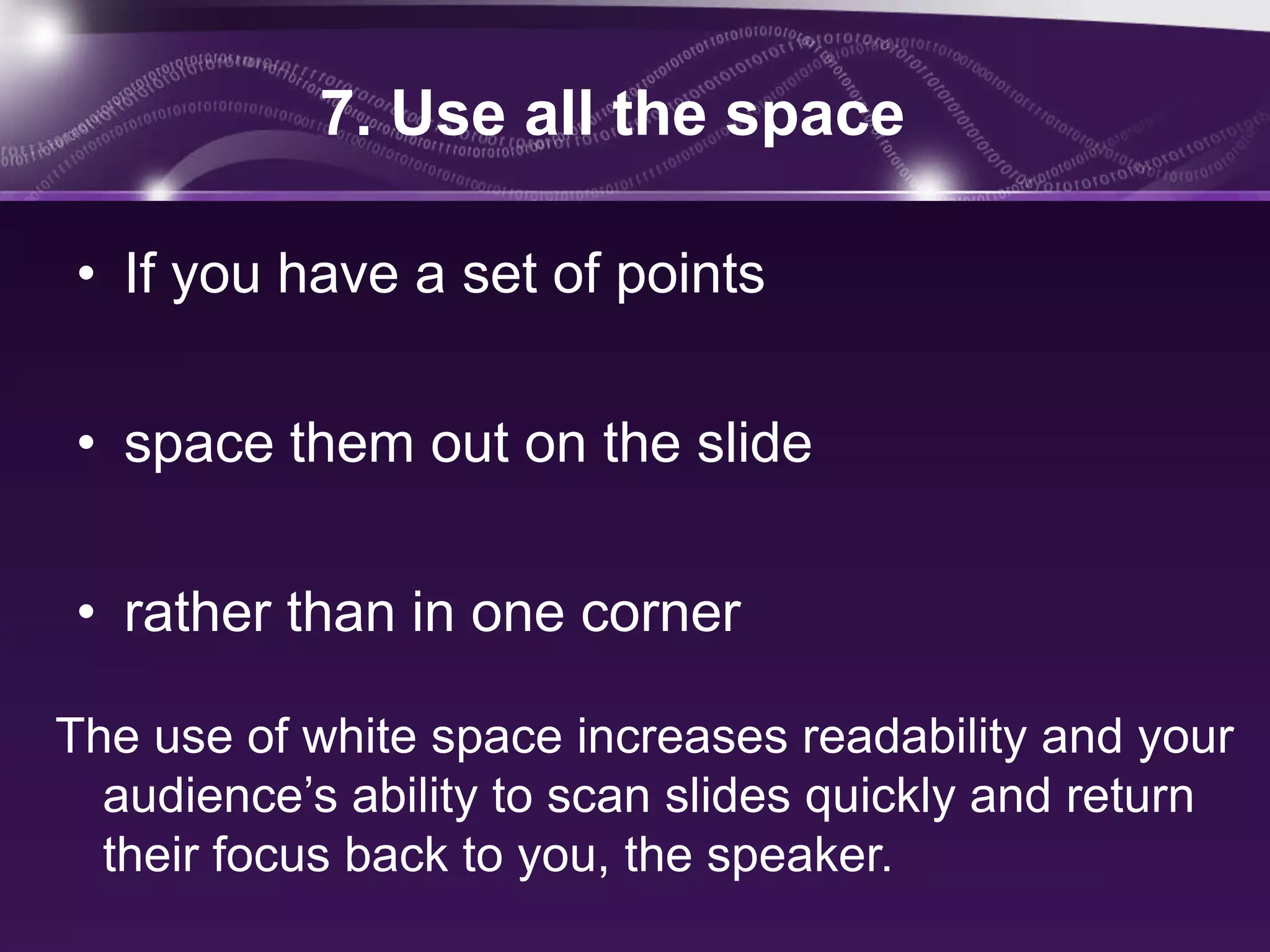
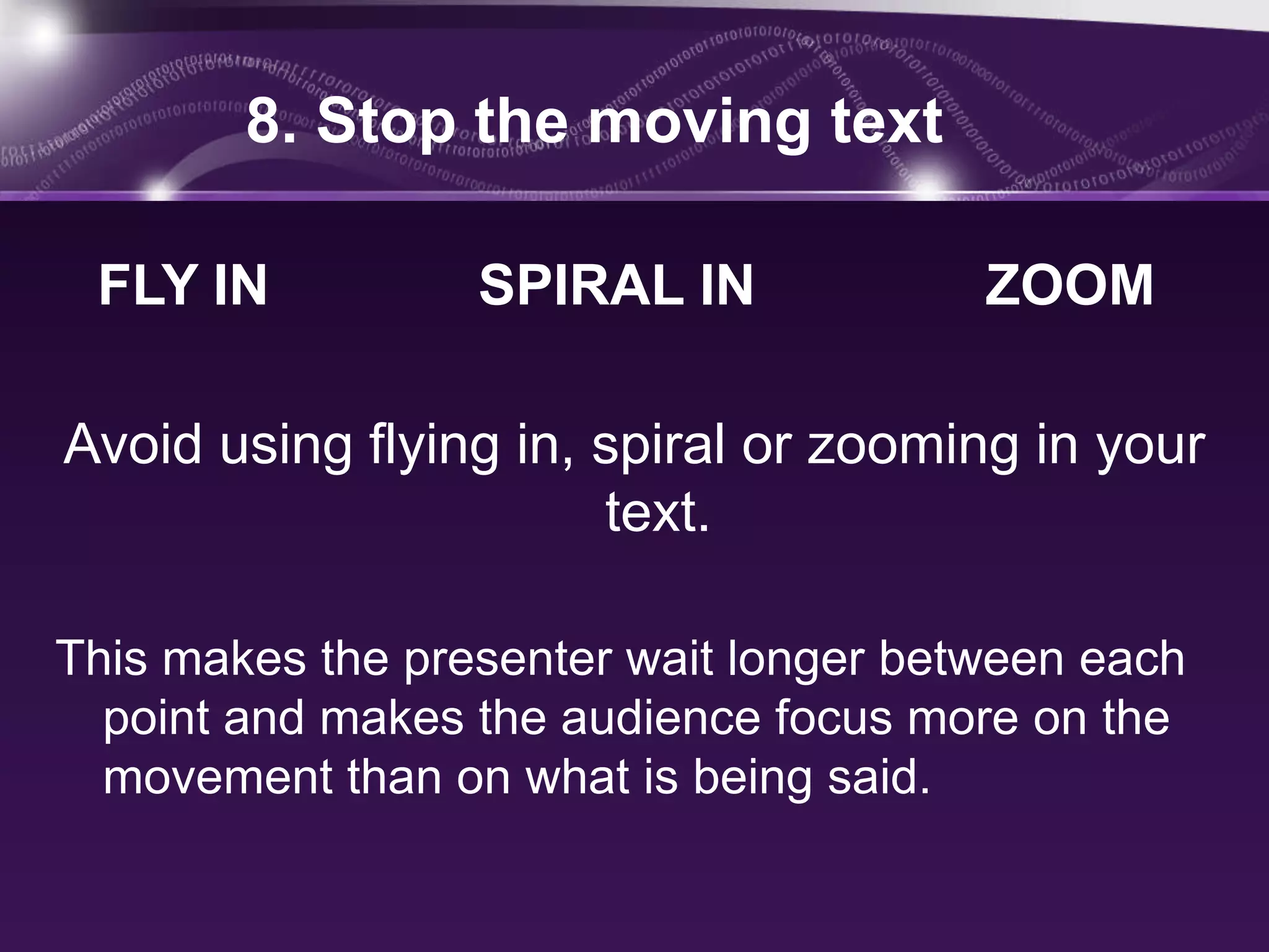
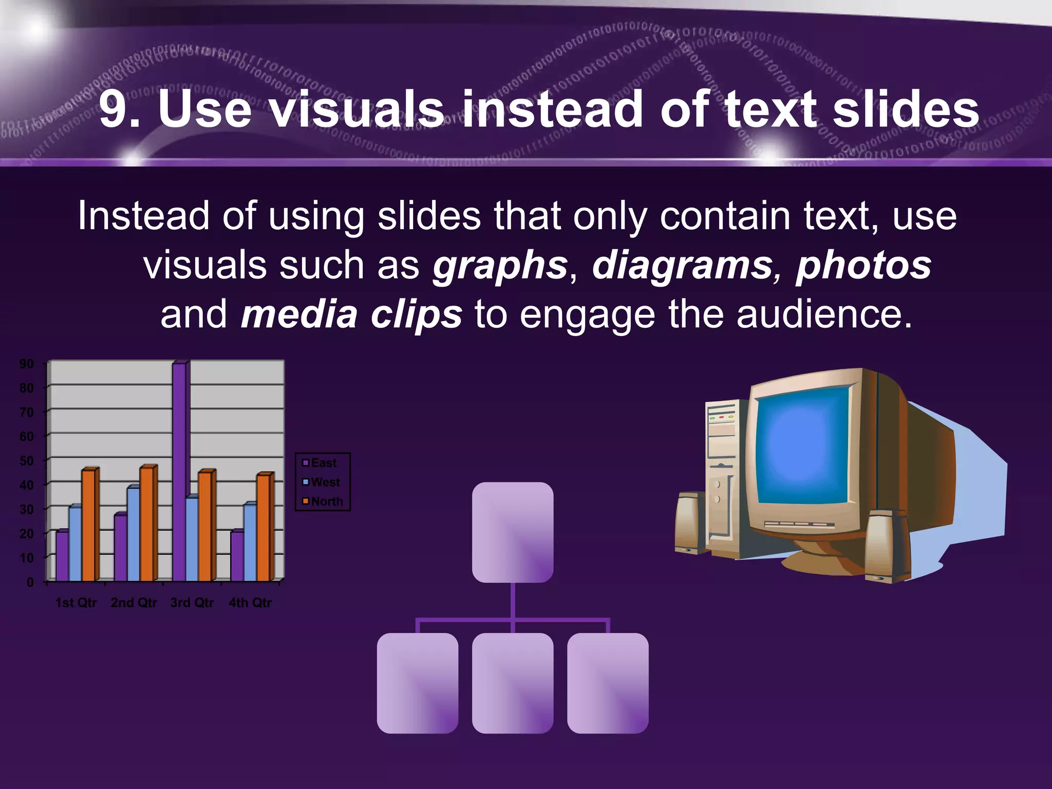
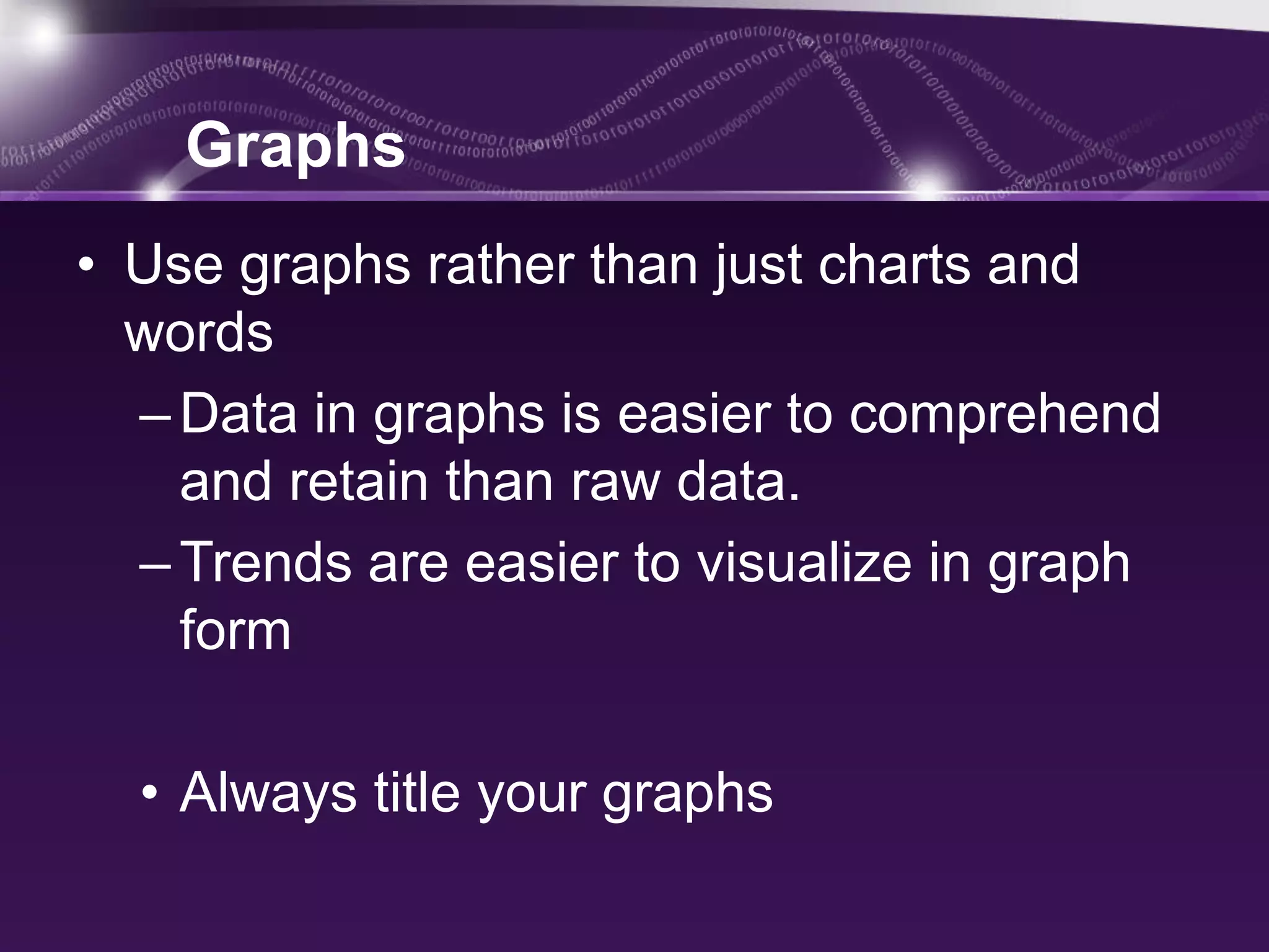
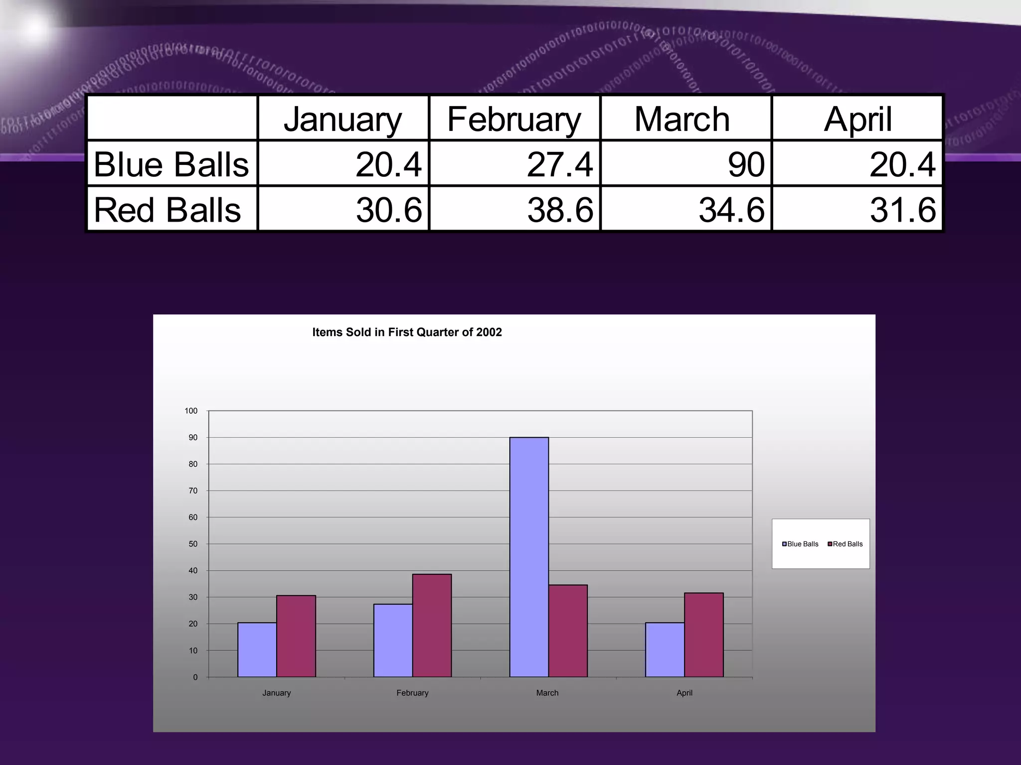
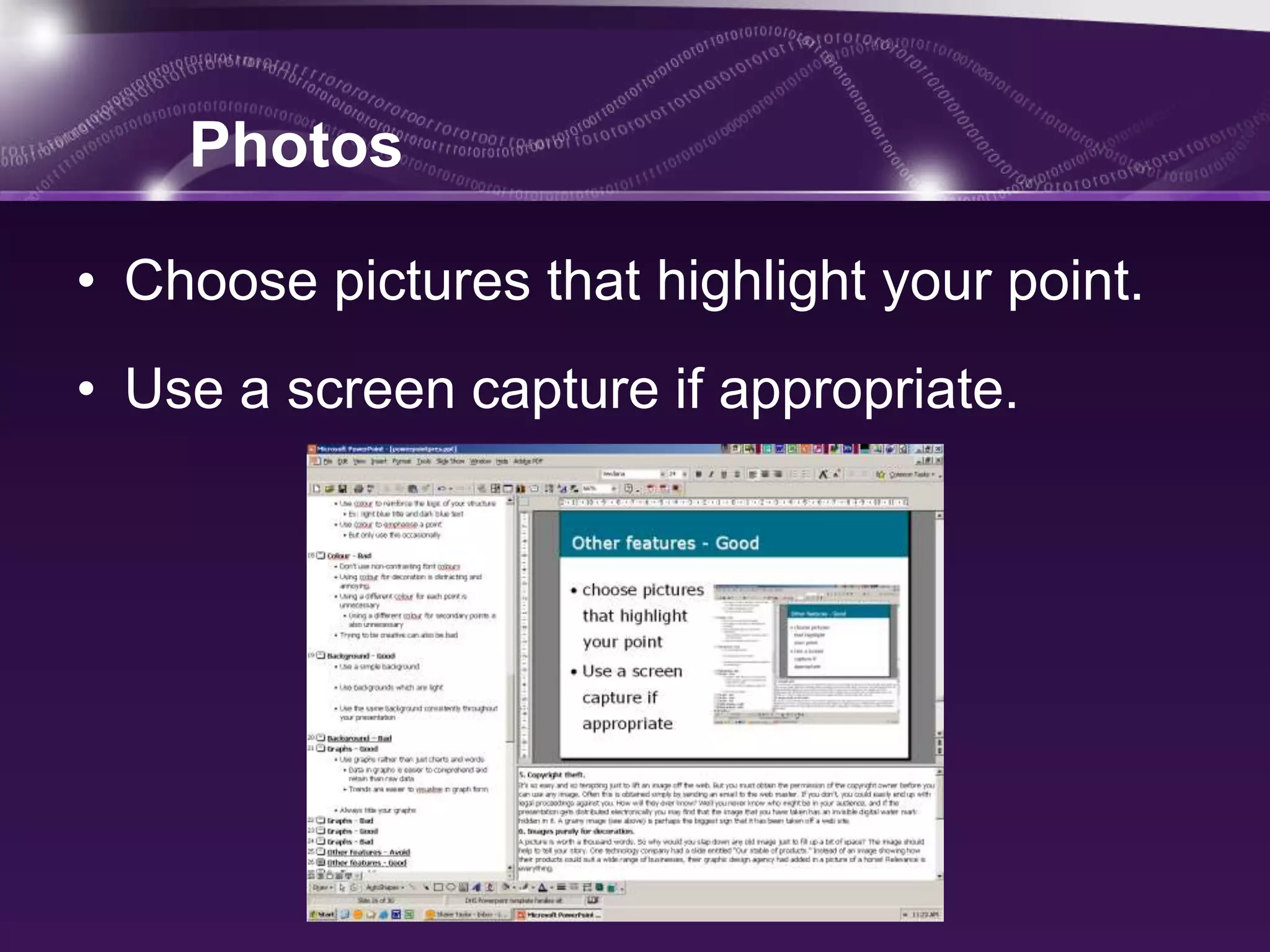
What we’ll cover today
•   PowerPoint
•   Secrets For Using PowerPoint Effectively:
•   Outline
•   Slide layout
•   Background, Color, Font style,Font size
•   Spacing
•   Moving texts
•   Visuals
 PowerPoint can be a highly effective tool
to aid learning, but if not used carefully, may
  instead disengage students and actually
               hinder learning.
Here are some Secrets For
Using PowerPoint Effectively
1. Start by creating an outline


  The most important part of any presentation
    is the content, not the graphical appeal.
  An outline will give your
audience a good idea of the
     structure of your
presentation. It will also give
 them an idea of when you
are nearing the end of your
       presentation.
2. Arrange your slide layout


•   Use point form, not complete sentences
•   Maximum of six points per slide
•   Show one point at a time
•   prevent reading ahead
•   help keep your presentation focused
Slide layout


• Do not use distracting animation

• Do not go overboard with the animation

• Use consistent animation
Slide layout


• Slide transitions should not be distracting

• Be consistent with transitions –

   never Random

• Worst effects – ‘Checkerboard or Comb’
CHECKERBOARD
COMB
3. Use a simple background

• Use backgrounds that contrast with
  text/imagery.
• Use the same background consistently
  throughout your presentation.

• Avoid backgrounds that are distracting or
 difficult to read from.
4. Use Contrasting Colors

There need to be a lot of contrast between the
     text color and the background color.

   Dark background with light text
  – Usually use a medium to dark blue background
    and white or yellow letters.
Light background with dark letters
5. Use a standard font


It is preferable to use san serif fonts such as
 Arial or Tahoma.

 Avoid using a mixture of fonts and avoid
  complex fonts like comic sans or impact.
6. Use a big enough font


      Use different size to show hierarchy.

Use most text at a 28 or 32 point size, with titles
            being 36 to 44 point size.

    Font size less than 24 point is too small to be
   reasonably read in most presentation situations.
7. Use all the space

• If you have a set of points

• space them out on the slide

• rather than in one corner

The use of white space increases readability and your
  audience’s ability to scan slides quickly and return
  their focus back to you, the speaker.
8. Stop the moving text

 FLY IN           SPIRAL IN             ZOOM

Avoid using flying in, spiral or zooming in your
                       text.

This makes the presenter wait longer between each
  point and makes the audience focus more on the
  movement than on what is being said.
9. Use visuals instead of text slides
        Instead of using slides that only contain text, use
            visuals such as graphs, diagrams, photos
             and media clips to engage the audience.
90
80
70
60
50                                         East
40                                         West
                                           North
30
20
10
 0
     1st Qtr   2nd Qtr 3rd Qtr   4th Qtr
Graphs
• Use graphs rather than just charts and
  words
  – Data in graphs is easier to comprehend
    and retain than raw data.
  – Trends are easier to visualize in graph
    form

  • Always title your graphs
January February                                        March                  April
Blue Balls     20.4     27.4                                            90                  20.4
Red Balls      30.6     38.6                                          34.6                  31.6


                     Items Sold in First Quarter of 2002


     100


     90


     80


     70


     60


     50                                                                      Blue Balls   Red Balls


     40


     30


     20


     10


       0
           January                  February               March     April
Photos

• Choose pictures that highlight your point.
• Use a screen capture if appropriate.
Clip Art
• Clip Art used to be a great way of making
  a presentation visual – particularly when
  computers were less powerful.
• Clip art can look very dated compared to a
  colour photograph specific to your
  presentation.
10. Have Slides at the End of Your
            Presentation

The last slide you speak to should not be the
      last slide in your presentation file.

The final slide should be a blank slide so that if you
  go through all the other slides, you have a final
  backup from dropping into the program.
Effective use of powerpoint as a presentation tool

Effective use of powerpoint as a presentation tool

  • 2.
    What we’ll covertoday • PowerPoint • Secrets For Using PowerPoint Effectively: • Outline • Slide layout • Background, Color, Font style,Font size • Spacing • Moving texts • Visuals
  • 3.
     PowerPoint canbe a highly effective tool to aid learning, but if not used carefully, may instead disengage students and actually hinder learning.
  • 4.
    Here are someSecrets For Using PowerPoint Effectively
  • 5.
    1. Start bycreating an outline The most important part of any presentation is the content, not the graphical appeal. An outline will give your audience a good idea of the structure of your presentation. It will also give them an idea of when you are nearing the end of your presentation.
  • 6.
    2. Arrange yourslide layout • Use point form, not complete sentences • Maximum of six points per slide • Show one point at a time • prevent reading ahead • help keep your presentation focused
  • 7.
    Slide layout • Donot use distracting animation • Do not go overboard with the animation • Use consistent animation
  • 8.
    Slide layout • Slidetransitions should not be distracting • Be consistent with transitions – never Random • Worst effects – ‘Checkerboard or Comb’
  • 9.
  • 10.
  • 11.
    3. Use asimple background • Use backgrounds that contrast with text/imagery. • Use the same background consistently throughout your presentation. • Avoid backgrounds that are distracting or difficult to read from.
  • 12.
    4. Use ContrastingColors There need to be a lot of contrast between the text color and the background color.  Dark background with light text – Usually use a medium to dark blue background and white or yellow letters.
  • 13.
  • 14.
    5. Use astandard font It is preferable to use san serif fonts such as Arial or Tahoma. Avoid using a mixture of fonts and avoid complex fonts like comic sans or impact.
  • 15.
    6. Use abig enough font Use different size to show hierarchy. Use most text at a 28 or 32 point size, with titles being 36 to 44 point size. Font size less than 24 point is too small to be reasonably read in most presentation situations.
  • 16.
    7. Use allthe space • If you have a set of points • space them out on the slide • rather than in one corner The use of white space increases readability and your audience’s ability to scan slides quickly and return their focus back to you, the speaker.
  • 17.
    8. Stop themoving text FLY IN SPIRAL IN ZOOM Avoid using flying in, spiral or zooming in your text. This makes the presenter wait longer between each point and makes the audience focus more on the movement than on what is being said.
  • 18.
    9. Use visualsinstead of text slides Instead of using slides that only contain text, use visuals such as graphs, diagrams, photos and media clips to engage the audience. 90 80 70 60 50 East 40 West North 30 20 10 0 1st Qtr 2nd Qtr 3rd Qtr 4th Qtr
  • 19.
    Graphs • Use graphsrather than just charts and words – Data in graphs is easier to comprehend and retain than raw data. – Trends are easier to visualize in graph form • Always title your graphs
  • 20.
    January February March April Blue Balls 20.4 27.4 90 20.4 Red Balls 30.6 38.6 34.6 31.6 Items Sold in First Quarter of 2002 100 90 80 70 60 50 Blue Balls Red Balls 40 30 20 10 0 January February March April
  • 21.
    Photos • Choose picturesthat highlight your point. • Use a screen capture if appropriate.
  • 22.
    Clip Art • ClipArt used to be a great way of making a presentation visual – particularly when computers were less powerful. • Clip art can look very dated compared to a colour photograph specific to your presentation.
  • 23.
    10. Have Slidesat the End of Your Presentation The last slide you speak to should not be the last slide in your presentation file. The final slide should be a blank slide so that if you go through all the other slides, you have a final backup from dropping into the program.