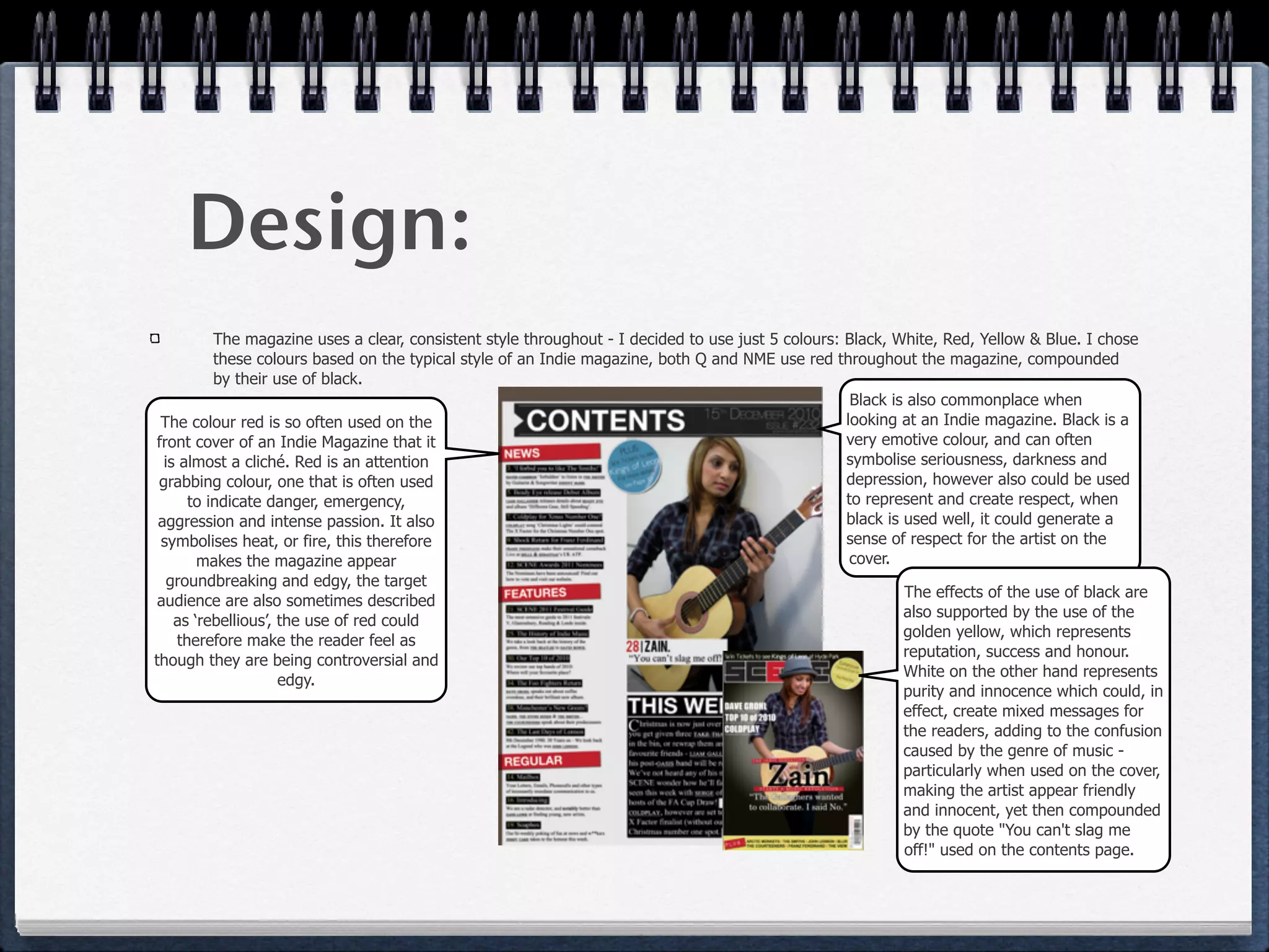
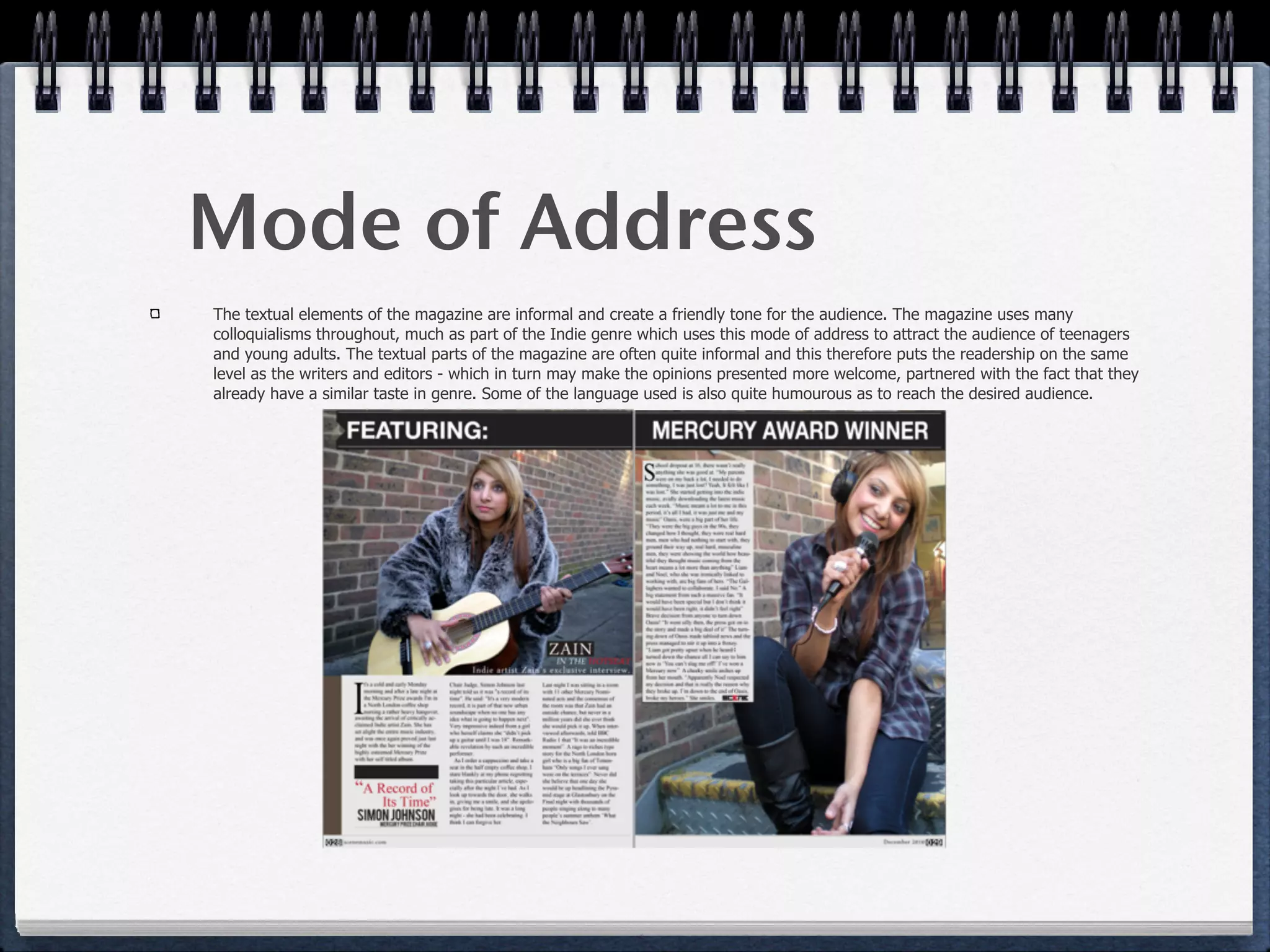
The document discusses how the author attracted their target demographic to their magazine. They focused on design first by researching other similar genre magazines and using 5 consistent colors - black, white, red, yellow, and blue. Red was used on the covers to grab attention as it symbolizes passion and edginess appealing to the rebellious target audience. Black created a serious tone while yellow represented success. Partnering with an established publisher could efficiently attract new audiences through cross-promotion in similar magazines.