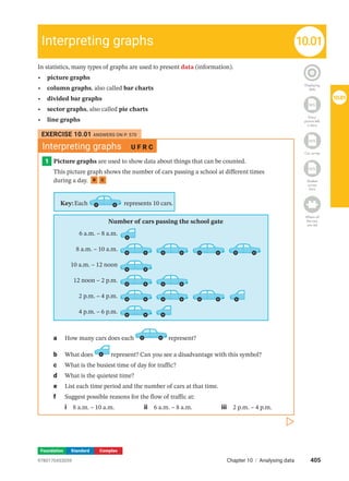
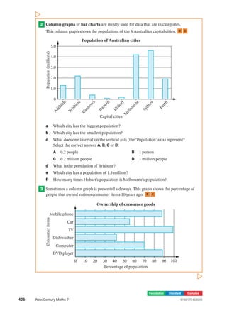
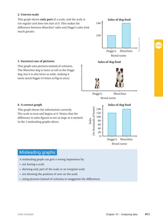
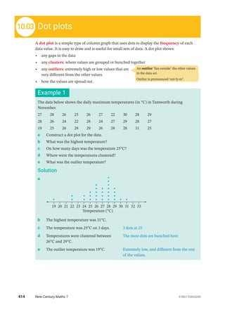
10
ANALYSING DATA
A motor company is releasing a new model of car next year. How do they decide which
colours and features to offer? They could conduct a statistical survey to determine which
car features are popular.
Statistics is the branch of mathematics concerned with collecting, organising,
presenting and analysing data (information). Governments, businesses, research
organisations, financial institutions and sporting groups all use statistics in their planning
and decision-making.
STATISTICS AND PROBABILITY
9780170453059
402 New Century Maths 7
Chapter outline
Working mathematically
10.01 Interpreting graphs U F PS R C
10.02 Misleading graphs U F PS R C
10.03 Dot plots U F C
10.04 Stem-and-leaf plots U F C
10.05 The mean and mode U F PS R C
10.06 The median and range U F PS R C
10.07	
Analysing dot plots and
stem-and-leaf plots
U F PS R C
10.08 Comparing data sets U F PS R C
Wordbank
data set A collection of data about the same subject
dot plot A special column graph of dots for a small set of
numerical data
mean The average value of a data set, found by dividing the sum
of values by the number of values
median The middle value of a data set when the values are
arranged in order, or the average of the 2 middle values
mode The most common value(s) of a data set
outlier An extreme value that is very different from the other
values in a data set
range The difference between the highest value and the lowest
value in a set of data
stem-and-leaf plot A ‘sideways column graph’ used to list
numerical data
U = Understanding | F = Fluency | PS = Problem solving | R = Reasoning | C = Communication
Shutterstock.com/Zoran
Karapancev
9780170453059 403
Chapter 10 | Analysing data
In this chapter you will:
• interpret a variety of statistical graphs, including divided bar graphs, sector graphs and
line graphs
• identify graphs that are misleading
• draw stem-and-leaf plots and dot plots
• calculate the mean, mode, median and range of a set of data, including data presented on
graphs and plots, and interpret these statistical measures
• compare data sets using statistics, including identifying outliers
• use primary and secondary data
SkillCheck ANSWERS ON P. 570
Reading
linear
scales
Statistics
1 Copy and complete each scale and state the size of one interval (unit).
a
60 80 100 120 140 160
b
33 36 39 42 45 48 51
c
70 80 90 100 110 120
d
12 27
24
21
18
15
e
0 12 24 36 48 60
2 Find the average of:
a 42 and 58 b 30 and 39
3 Some students were asked to state their
favourite frozen drink. The results are
displayed in this column graph.
a List the drinks in order of preference,
starting with the most popular.
b How many students preferred
Lime?
c How many students were in the
group?
4 Write each set of numbers in ascending order.
a 31, 28, 22, 11, 24 b 21, 18, 15, 17, 13, 16
5 Write each set of numbers in descending order.
a 6, 11, 18, 17, 5 b 8, 17, 14, 23, 31, 5, 2
Orange Cola Lime Lemonade
Favourite frozen drinks
2
0
6
Number
of
students
8
4
404 New Century Maths 7 9780170453059
Foundation Standard Complex
In statistics, many types of graphs are used to present data (information).
• picture graphs
• column graphs, also called bar charts
• divided bar graphs
• sector graphs, also called pie charts
• line graphs
Displaying
data
Homework
WS
Every
picture tells
a story
Homework
WS
Car survey
Homework
WS
Student
survey
form
Where all
the cars
are red
Interpreting graphs 10.01
EXERCISE 10.01 ANSWERS ON P. 570
Interpreting graphs U F R C
1 Picture graphs are used to show data about things that can be counted.
This picture graph shows the number of cars passing a school at different times
during a day. R C
Key:Each represents 10 cars.
Number of cars passing the school gate
6 a.m. – 8 a.m.
8 a.m. – 10 a.m.
10 a.m. – 12 noon
12 noon – 2 p.m.
2 p.m. – 4 p.m.
4 p.m. – 6 p.m.
a How many cars does each represent?
b What does represent? Can you see a disadvantage with this symbol?
c What is the busiest time of day for traffic?
d What is the quietest time?
e List each time period and the number of cars at that time.
f Suggest possible reasons for the flow of traffic at:
i 8 a.m. – 10 a.m. ii 6 a.m. – 8 a.m. iii 2 p.m. – 4 p.m.
405
Chapter 10 | Analysing data
9780170453059
10.01
Foundation Standard Complex
2 Column graphs or bar charts are mostly used for data that are in categories.
This column graph shows the populations of the 8 Australian capital cities. R C
A
d
e
l
a
i
d
e
B
r
i
s
b
a
n
e
C
a
n
b
e
r
r
a
D
a
r
w
i
n
H
o
b
a
r
t
M
e
l
b
o
u
r
n
e
S
y
d
n
e
y
P
e
r
t
h
Population of Australian cities
Capital cities
1.0
0
3.0
Population
(millions)
4.0
5.0
2.0
a Which city has the biggest population?
b Which city has the smallest population?
c What does one interval on the vertical axis (the ‘Population’ axis) represent?
­
Select the correct answer A, B, C or D.
A 0.2 people B 1 person
C 0.2 million people D 1 million people
d What is the population of Brisbane?
e Which city has a population of 1.3 million?
f How many times Hobart’s population is Melbourne’s population?
3 Sometimes a column graph is presented sideways. This graph shows the percentage of
people that owned various consumer items 10 years ago. R C
Mobile phone
Car
TV
Dishwasher
Computer
DVD player
Percentage of population
Ownership of consumer goods
0 10 20 30 40 50 60 70 80 90 100
Consumer
items
406 New Century Maths 7 9780170453059
Foundation Standard Complex
a What percentage of the population owned:
i a TV? ii a mobile phone? iii a DVD player?
b What item was owned by 42% of the population?
c Did more people own mobile phones or computers?
d What was the percentage difference between people owning a car and people
­
owning a computer?
e How might this column graph be different if it described the ownership of
­consumer items this year?
4 This clustered column graph compares the number of people living in Australian
households in 1996, 2006 and 2016. R C
0
Percentage
of
households
10
20
30
40
Persons per household
1 2 3 and 4 5 and over
Number of people in Australian households
1996
2006
2016
a What scale is used on the vertical axis?
b What percentage of households had more than 2 persons in 1996?
c In which year were 30% of households made up of 2 people?
d Generally, which category of persons per household was the:
i most common? ii least common?
e Which category had the greatest difference between 2006 and 2016?
f True or false? ‘There was a higher percentage of one-person households in 2006
than in 1996.’
407
Chapter 10 | Analysing data
9780170453059
10.01
Foundation Standard Complex
5 Divided bar graphs are rectangular graphs used to compare parts of a whole. This
divided bar graph shows the proportions of motor vehicle accidents at various distances
from the driver’s home. R C
5 km or less
6–10 km
16–25
km
56–100
km
101–200
km
Over
200
km
Proportions of accidents at various distances from home
11–15
km
26–55
km
a What distances from home are accidents most likely to occur?
b What is the total length of this bar graph, in millimetres?
c What fraction of accidents happen within 5 km of home?
d Altogether, what fraction of accidents happen 15 km or less from home?
e What happens as you get farther from home? Suggest a reason why this may be so.
f What fraction of accidents happen more than 100 km from home?
g True or false? ‘More than
3
4
of all accidents occur within 25 km of home.’
h ‘Smart Alec’ says that to avoid having a car accident he should make all of his trips
100 km or more from home. Why is Alec wrong in saying this?
6 This divided bar graph shows the different reasons that various councils gave for having
recycling programs. R C
Meet
community
needs
Decrease
cost
Save
natural
resources
Reduce
pollution Other
Council’s reasons for recycling
a What is the total length of this bar graph, in millimetres?
b What is the most common reason given? What fraction of the graph is this?
c What fraction of the graph represents ‘Save natural resources’?
d List the reasons in order of popularity.
e What are the disadvantages of using a divided bar graph to illustrate this data?
408 New Century Maths 7 9780170453059
Foundation Standard Complex
7 Like divided bar graphs, sector graphs
or pie charts are also used to compare parts
of a whole. This sector graph shows the
results of a class survey of 30 students
regarding their favourite pet. R C
a What is the most popular pet in this survey?
b What is the least popular pet?
c What fraction of students:
i prefer goldfish ii prefer birds?
d How many degrees are there in a revolution?
e How many degrees are there in the angle of the cat sector?
f Do cats and guinea pigs together make up more than half of the preferred pets?
g If the figures from this survey are typical for all students, calculate the number of
each type of pet you would expect to have if 90 students were surveyed.
8 Line graphs are usually drawn to show data measured over time. This line graph shows
Kate’s height over her first 15 years. At birth she is 48 cm tall, and at age 10 she is about
140 cm tall. R C
0
Age (years)
1 2 3 4 5 6 7 8 9 10 11 12 13 14 15
20
40
60
80
100
120
140
160
180
Height
(centimetres)
Kate’s height
a What was Kate’s height:
i on her first birthday? ii at age 7?
b At what age did Kate reach:
i 1 metre? ii 150 cm?
c Between which 2 birthdays did Kate grow the most? Give a possible reason.
d Between which 2 birthdays did Kate grow the least? Give a possible reason.
e How long did it take Kate to double her height from birth?
f How long did it take her to triple her height from birth? Compare this to your
­
answer for the previous question. Why is there a difference?
g What do you think the graph will look like:
i after 15 years? ii after 20 years?
h How might a graph of a boy’s height differ from this one?
cat (8)
dog (9)
bird (4)
guinea pig (6)
Favourite pets
goldfish
(3)
409
Chapter 10 | Analysing data
9780170453059
10.01
When used incorrectly, graphs can give a false or misleading impression.
The following 3 graphs were used by Munchies dog food to compare its sales figures to those of
Doggo’s dog food, but each one is misleading in some way.
1. No scale
This graph does not have a scale on the vertical axis.
You cannot tell how big the difference is between Munchies’
sales and Doggo’s sales.
Homework
WS
Misleading
graphs
Doggo’s
Sales of dog food
Munchies
?
Brand name
Misleading graphs
10.02
Technology
Column graphs
Pet survey
1 Survey the students in your class on their pets. Keep a record of how many of each type
of pet students have.
2 Enter your results into a spreadsheet, as shown.
3 Create a column graph. Select Insert and
2-D clustered column graph. Give the graph
an appropriate title and label the axes.
Travel to school
1 Survey the students in your class on how they travel
to school. Count the types of transport in your survey.
2 Enter your results into a spreadsheet, as shown.
3 Create a horizontal column graph. Select Insert and
create a bar chart. Give the graph an appropriate title
and label the axes.
Technology
Creating a
graph
410 New Century Maths 7 9780170453059
2. Uneven scale
This graph shows only part of a scale, and the scale is
not regular and does not start at 0. This makes the
difference between Munchies’ sales and Doggo’s sales look
much greater.
3. Incorrect use of pictures
This graph uses pictures instead of columns.
The Munchies dog is twice as tall as the Doggo
dog, but it is also twice as wide, making it
seem much bigger (4 times as big in area).
4. A correct graph
This graph shows the information correctly.
The scale is even and begins at 0. Notice that the
difference in sales figures is not as large as it seemed
in the 3 misleading graphs above.
120
140
Doggo’s
Sales of dog food
Munchies
Brand name
Doggo’s
Sales of dog food
Munchies
Brand name
Doggo’s
Sales
(in
thousands
of
boxes)
Munchies
Brand name
20
40
60
80
100
120
140
0
Sales of dog food
Misleading graphs
A misleading graph can give a wrong impression by:
• not having a scale
• showing only part of the scale or an irregular scale
• not showing the position of zero on the scale
• using pictures instead of columns to exaggerate the differences
Shutterstock.com
411
Chapter 10 | Analysing data
9780170453059
10.02
Foundation Standard Complex
EXERCISE 10.02 ANSWERS ON P. 570
Misleading graphs U F R C
1 a	
What is the actual difference in sales figures between Munchies and Doggo’s in the
above example?
b How does the last graph illustrate this difference correctly?
c Why is it misleading to not show the position of 0 on the vertical axis?
d Why is it misleading to use pictures or diagrams on graphs instead of columns? R C
2 This line graph shows Lisa’s heart rate while
she is exercising on a treadmill. C
a What is Lisa’s heart rate after 3 minutes?
b What is the size of one unit on the
­vertical axis?
c What is misleading about this graph?
d Redraw this graph correctly so that it is
not misleading.
3 This graph compares the average weekly wages in
Malvolia ($700) and Australia ($1400). C
a What misleading impression does this graph give?
b Explain 2 things that are wrong about this graph.
c What should be drawn on the graph instead of
­pictures?
d Redraw this graph correctly.
4 Why is this graph difficult to interpret? C
5 a	
Draw a line graph for the profit information in
this table. Place ‘Year’ on the horizontal axis,
and use a scale of 1 cm = $2 million on the
­vertical axis.
b Draw another line graph using the same
­
information, this time using a scale of 1 cm =
$0.5 million, but show only from $2 million to
$4 million on it.
c Which graph looks more impressive? Why? C
1
Heart
rate
(beats
per
minute)
2 3 4
Minutes of exercise
Heart rate and exercise
70
90
110
130
150
50
Malvolia Australia
Average weekly wages
$
$
Population of Australian states
SA
WA
Qld
Vic.
NSW
Year Profit in $ millions
2016 2.5
2017 2.1
2018 3.2
2019 3.5
2020 3.6
2021 3.9
412 New Century Maths 7 9780170453059
Foundation Standard Complex
6 This graph compares the weekly salaries of firefighters in 6 states. C
Per
week
SA WA Vic. ACT Tas. NSW
$1375
$1350
$1325
$1300
$1250
$1200
Firefighter salaries: State by state
State
Shutterstock.com
a Describe 2 ways in which this graph is misleading.
b Redraw this graph correctly.
7 Draw 2 graphs using the figures below for school sport, one that is correct and accurate,
and one that gives a misleading impression. C
School sport Hockey Netball Soccer
Number of players 18 20 15
Did you know?
Top 10 baby names
This table lists the 10 most popular baby names in New South Wales for boys and girls born
in 2010 and 2019:
Boys Girls
2010 2019 2010 2019
1 William 726 Oliver 641 Isabella 609 Charlotte 504
2 Jack 623 Noah 573 Chloe 604 Olivia 483
3 Oliver 558 William 531 Ruby 600 Amelia 467
4 Joshua 549 Jack 468 Olivia 586 Mia 465
5 Thomas 549 Leo 444 Charlotte 550 Isla 408
6 Lachlan 546 Lucas 418 Mia 523 Ava 392
7 Cooper 536 Henry 376 Lily 485 Chloe 353
8 Noah 536 Thomas 370 Emily 480 Grace 323
9 Ethan 535 James 363 Amelia 473 Sophia 319
10 Lucas 502 Liam 357 Sienna 473 Ella 310
Source: © State of New South Wales (Customer Service NSW) CC BY 4.0 Licence (https://creativecommons.
org/licenses/by/4.0/)
What names were on the list in both 2010 and 2019? What about this year?
What is the most common first name for the Year 7 students at your school?
413
Chapter 10 | Analysing data
9780170453059
10.02
A dot plot is a simple type of column graph that uses dots to display the frequency of each
data value. It is easy to draw and is useful for small sets of data. A dot plot shows:
• any gaps in the data
• any clusters: where values are grouped or bunched together
• any outliers: extremely high or low values that are
very different from the other values
• how the values are spread out.
An outlier ‘lies outside’ the other values
in the data set.
Outlier is pronounced ‘out-ly-er’.
Dot plots
10.03
Example 1
The data below shows the daily maximum temperatures (in °C) in Tamworth during
November.
27  28  26  25  26  27  22  30  28  29
28  26  24  22  28  24  27  29  28  27
19  25  26  29  29  26  28  28  31  25
a Construct a dot plot for the data.
b What was the highest temperature?
c On how many days was the temperature 25°C?
d Where were the temperatures clustered?
e What was the outlier temperature?
Solution
a
19 20 21 22 23 24 25 26 27 28 29 30 31 32 33
Temperature (°C)
b The highest temperature was 31°C.
c The temperature was 25°C on 3 days. 3 dots at 25
d Temperatures were clustered between
26°C and 29°C.
The most dots are bunched here
e The outlier temperature was 19°C. Extremely low, and different from the rest
of the values.
414 New Century Maths 7 9780170453059
Foundation Standard Complex
EXERCISE 10.03 ANSWERS ON P. 571
Dot plots U F R C
1 a	
The number of goals that Matias kicked in the soccer games he played last year
are listed. Draw a dot plot to represent this data.
4  5  1  2  3  0  3  8  4  6  5
4  1  1  4  4  2  5  3  1  1  0
b Are there any outliers in this data? If so, what are they?
c Where is the data clustered?
d How many games did Matias play?
2 This dot plot shows the number of students in
each class at Nucentry Public School. R C
a How many students are in the smallest
class?
b How many classes have more than
20 students in them?
c Copy and complete: Class sizes range from _________ to _________.
d What is the most common number of students in a class?
e Are there any outliers in this data?
f How many classes are there at Nucentry Public School?
Select the correct answer A, B, C or D.
A 8 B 18 C 22 D 26
3 a	
The ages of the people exercising at a gym one evening are shown in this dot plot.
What is the most common age of people at the gym? R C
24 26 28 30 32 34 36 38 40
Ages of gym users
b Between which ages are the data clustered?
c Identify any outliers.
d Copy and complete: Ages range from _________ to _________.
e How many people were at the gym that evening?
19 20 21 22 23 24 25 26
18
Number of students in the class
EXAMPLE
1
415
Chapter 10 | Analysing data
9780170453059
10.03
Foundation Standard Complex
4 The number of motor accidents that occurred on the motorway each day was
recorded: C
1  0  0  2  0  3  5
1  0  1  0  2  3  0
a Draw a dot plot for this data.
b What is the most common number of daily accidents?
c Calculate, correct to one decimal place, the average number of accidents per day.
d What is the outlier? Why?
5 This dot plot shows the number of phone calls made by a group of students last night.
0 1 2
Number of calls
3 4 5 6 7
How many students made phone calls? Select A, B, C or D.
A 7 B 19 C 22 D 8
Technology
Olympic winning times
This table shows the gold medal winning times of the women’s 400 m track event for the
Olympic Games from 1972 to 2016.
Year 1972 1976 1980 1984 1988 1992 1996 2000 2004 2008 2012 2016
Time (s) 51.08 49.28 48.88 48.83 48.65 48.83 48.25 49.11 49.41 49.62 49.56 49.44
1 Enter the above data into a spreadsheet as one long table (rows 1 and 2, columns A to M).
2 To create a scatter graph choose Insert and Scatter
(with smooth lines and markers).
3 Give the graph an appropriate title and axes labels. Save the file.
4 On the graph, position the mouse over a data point.
(Do not click on it.) You can view the specific details
of the Olympic year and winning time. For example
(see below), the winning time was 49.28 seconds
in 1976.
416 New Century Maths 7 9780170453059
A stem-and-leaf plot is like a sideways column graph
but one that lists the actual data values on the
horizontal columns. An example is shown, with the
values listed in the leaf column.
The name ‘stem-and-leaf’ comes from the
structure of a plant, where the stem is a
branch or a vine on which the leaves hang.
An ordered stem-and-leaf plot shows:
• all the values, listed from smallest to
largest
• the most common values
• any clusters or outliers
• how the data are spread out
Stem Leaf
5
6
7
8
9
3 4 7 7 8 9
1 1 1 4 8
4
0 1 3 4
2 5 7 8
This leaf means 83.
5 Use your spreadsheet to answer these questions.
a In what year was the fastest gold medal winning time run? In cell A5, enter
=min(B2:M2). In cell B5, enter the year that corresponds to this time.
b In cell A6, type the label ‘Average’. In cell B6, use the formula =average(B2:M2)
to calculate the average winning time for this event, from 1972 to 2016.
c In cell A7, enter =max(B2:M2) to find the slowest winning time in this event.
In cell B7, enter the year that corresponds to this time.
d In cell A8, enter a formula to find the difference between the fastest and slowest
winning times.
e Predict the gold medal time at the 2021 Olympic Games for this event.
Justify your answer, and then research the actual time.
f In cell A9, enter a formula to calculate the speed, in metres per second, of the fastest
women’s 400 m runner, from 1972 to 2016.
g Starting in cell A10, write a paragraph describing the changes in winning times for
this event between 1972 and 2016.
h In cell A15, suggest reasons why the pattern of gold medal times has changed
between 1972 and 2016.
Stem-and-leaf plots
Homework
WS
Stem-and-
leaf plots 1
10.04
Leaves
Stem
Alamy
Stock
Photo/Y
H
Lim
417
Chapter 10 | Analysing data
9780170453059
10.03
Example 2
Use a stem-and-leaf plot to show the following masses (in grams) of 30 avocados.
85 130 150 137 95 85 142 113 98 103
128 128 105 118 174 113 132 150 137 123
113 137 98 140 115 125 130 162 123 140
Solution
The masses range from 85 to 174.
We write 8, 9, 10 up to 17 down the first column to
make the stem.
Stem Leaf
8
9
10
11
12
13
14
15
16
17
The leaves are the single digits written next to the stem,
for example:
• 85 is shown by writing a 5 next to the 8 stem.
• 130 is shown by writing a 0 next to the 13 stem.
• 150 is shown by writing a 0 next to the 15 stem.
• 137 is shown by writing a 7 next to the 13 stem.
Stem Leaf
8
9
10
11
12
13
14
15
16
17
5
0 7
0
Continue in the same manner until all the data has
been entered.
Stem Leaf
8
9
10
11
12
13
14
15
16
17
5 5
5 8 8
3 5
3 8 3 3 5
8 8 3 5 3
0 7 2 7 7 0
2 0 0
0 0
2
4
Presentation
Stem-and-
leaf plots
418 New Century Maths 7 9780170453059
Foundation Standard Complex
It is more useful to rearrange the values in
ascending order.
This results in an ordered stem-and-leaf plot.
Stem Leaf
8
9
10
11
12
13
14
15
16
17
5 5
5 8 8
3 5
3 3 3 5 8
3 3 5 8 8
0 2 7 7 7
0 0 2
0 0
2
4
EXERCISE 10.04 ANSWERS ON P. 571
Stem-and-leaf plots U F R C
1 EXAMPLE
2
This stem-and-leaf plot shows the heights, in
centimetres, of 22 women at a gym.
What is the most common height? Select the correct
answer A, B, C or D.
A 15 cm B 156 cm
C 169 cm D 181 cm
2 The daily number of students served at the school canteen over a 3-week period was: C
105 76 97 88 114 86 124 101
112 98 95 105 117 81 112
a Show this information in an ordered stem-and-leaf plot.
b What were the lowest and highest numbers of students served over the period?
c On how many days were over 100 students served?
d Find the middle value. Select A, B, C or D.
A 95 B 101 C 105 D 112
3 The point scores of all AFL teams in their first 4 rounds of the season are shown in this
stem-and-leaf plot. R C
Stem Leaf
6
7
8
9
10
11
12
13
14
15
4 4 6 6 6 8
0 0 2 2 3 3 7 8 8 9
0 2 3 4 4 6 9 9
3 4 4 4 5 7 7 8 8 9 9 9 9
0 3 4 8 9
0 1 1 2 3 4 8 9
0 7
4 4 5 5 7
2 3
0 0 2 3 4
Stem Leaf
14
15
16
17
18
7 8 8
0 1 2 3 6 6 8
1 5 8 9 9 9
2 3 3 5
1 1
419
Chapter 10 | Analysing data
9780170453059
10.04
Foundation Standard Complex
a How many scores are there altogether?
b How many scores are below 100 points?
c What was the most frequent score?
d Copy and complete: The team scores range from ________ to ________.
e Which stem had the most scores?
f Where are the scores clustered?
4 The heights (in cm) of the students in a PE class are:
155  153  157  166  163  162  154  175
159  157  137  162  171  140  145  168
158  141  170  166  143  175  157  177
a Make a stem-and-leaf plot of these heights.
b What are the shortest and tallest heights?
c How many students were under 150 cm tall?
d What was the most common height?
e What were the 2 middle heights?
f What fraction of the class had heights in the 160s?
g What percentage of the class had heights in the 170s? Answer correct to one
­decimal place.
Mental skills 10: Maths without calculators ANSWERS ON P. 571
Reading linear scales
Understanding and reading the scale on a measuring instrument, on a number line or on the
axis of a graph is an important mathematical skill.
1 Study each example.
a Complete the missing values on this scale.
100 160
120 140 km
• First, choose 2 values on the scale, say 100 and 120.
• Count the number of intervals (‘spaces’) between the 2 values. There are
4 ­
intervals between 100 and 120.
• To find the size of each interval, divide the difference between the 2 values by
the number of intervals:
• Difference = 120 – 100 = 20 km
• Number of intervals = 4
• Size of an interval = 20 ÷ 4 = 5 km
• Use the calculated size of an interval to complete the missing values.
100 105 110 115 160
120 125 130 135 140 145 150 155 km
420 New Century Maths 7 9780170453059
b Complete the values on this scale.
50 80
60 70 Years
• Choose 50 and 60 on the scale.
• Number of intervals (between 50 and 60) = 5
• Difference (between 50 and 60) = 60 – 50 = 10 years
• Size of an interval = 10 ÷ 5 = 2 years.
50 80 82 84
60 70
52 62 72
54 64 74
56 66 76
58 68 78 Years
2 Now copy and complete the following scales.
a
36 40 44 48 52 56 60 64 °C
b
200 mL
240 280 320 360
c
500 g
520 540 560 580
d
160 280
200 240 min
e
30 L
45 75 90 105
60
f
200 kg
300 400 500 600 700
g
120 seconds
180 240 300 360 420
h
100 mL
700
200 300 400 500 600
The mean and mode 10.05
How do you use the word average?
• ‘That was an average film’
• ‘The average person in the street thinks …’
• ‘My average score this year is …’
In statistics, we use the word ‘average’ to mean a typical or central value of a set of data.
The best-known average is the mean. The mean is found by adding all the values and dividing
by the number of values.
Statistical
measures
Looking
for gold
421
Chapter 10 | Analysing data
9780170453059
10.04
The mode is the most common or frequent value (or values). A set of data may have more than
one mode, or no mode at all.
The mean
The symbol for the mean is x.
=
sum of values
number of values
x
The mode
The mode is the value (or values) that occurs the most often; the value with the highest
frequency.
Think: mode = ‘most often’
Example 3
The residents in a street were surveyed about the number of children living in each
household. The results were:
2  2  1  2  0  3
2  1  1  4  1  0
a Find the mean, correct to one decimal place.
b Find the mode.
Solution
a Sum of values = 2 + 2 + 1 + 2 + 0 + 3 + 2 + 1 + 1 + 4 + 1 + 0
= 19
Number of values = 12
Mean: =
sum of values
number of values
x
=
= 
1.58333
19
12
≈1.6   (rounding to one decimal place)
The mean is about 1.6.
b The modes are 1 and 2. Both occur the most often (with a frequency of 4 each).
Example 4
Alex’s scores in 8 games of ten-pin bowling were:
88  149  153  147  156  168  135  122
a Find the mean.
b Find the mode.
The mean,
mode,
median
and range
Note that the value of the mean is at
the centre of the values.
422 New Century Maths 7 9780170453059
Foundation Standard Complex
Solution
a Sum of scores = 88 + 149 + 153 + 147 + 156 + 168 + 135 + 122
= 1118
=
sum of values
number of values
x
=
=139.75
1118
8
The mean is 139.75.
b There is no mode, because every score occurs the same number of times (once).
EXERCISE 10.05 ANSWERS ON P. 572
The mean and mode U F PS R C
1 EXAMPLE
4
A group of 8 children were surveyed about the amount of pocket money (in dollars) that
they received each week. The results were:
20  32  32  40  18  32  18  50
a Find the mean of this set of data.
b Find the mode.
2 For each set of data, find:
i   the mean (rounded to 2 decimal places, if needed)
ii the mode(s).
a 1 2 3 3 5 3 2 3 1
b 6 9 2 1 2 9 2		
c 67 43 89 65 54 86 45 76 53
d 45.1 45.0 45.4 45.1 45.8 44.6			
e 3 3 4 5 5 6 7 9 10
3 a Find the mode of this set of data:
blue, green, yellow, green, blue, red, green, yellow, red, green, red, blue
b Why is it not possible to find the mean of this set of data? C
4 EXAMPLE
5
In a gymnastics competition, the judges awarded the following scores out of 10:
7.0  6.1  8.2  8.8  6.1  9.7  6.1  8.8
a Calculate the mean of these scores.
b Find the mode.
c Which measure (mean or mode) describes this set of scores better? Give a reason for
your answer. C
423
Chapter 10 | Analysing data
9780170453059
10.05
Foundation Standard Complex
5 The ages of the members of the Phuong family are:
19  31  21  3  6  14  19  24  11
The ages of the members of the Arteri family are:
19  31  21  3  6  14  19  24  91 R C
a What is the only difference between these 2 sets of data?
b Which family should have a higher mean age?
c Find the mean age (to one decimal place) for each family.
d What effect does the difference identified in part a have on the means?
6 A group of 6 students was surveyed on the number of phones owned in their
households. The results were:
3  2  4  3  2  □
where □ represents a missing value.
What is the value of □ if the mean of the results is 2.5? R
Select the correct answer A, B, C or D.
A 1 B 2 C 2.5 D 3
7 Tanika scored 68%, 73%, 80% and 75% in 4 maths tests. R
a Calculate her mean maths mark.
b Find how much Tanika needs to score in her next maths test to increase her mean
to 75%.
8 a Find 5 data values that have a mean of 7 and a mode of 4.
b Find 8 data values that have a mean of 10 and a mode of 12. R
9 Jamie, Sam, Karly and Tess all work at the shopping centre on Saturdays. Jamie earns
$48 while Tess earns $90. If the mean of the 4 wages is $75, find possible values for
Sam’s and Karly’s wages. PS R
10 The mean point score of a basketball team for the 30 games they played during the
season is 85. What is the total number of points the team scored for the season? R
Investigation
Finding the middle data values
1 a Arrange these values in ascending order:
		 5  4  3  8  7  1  7
b Cross out the first and last values from your sorted list.
c Cross out the second and second-last values.
d Keep crossing out pairs of values from both ends until you find the middle value.
424 New Century Maths 7 9780170453059
Like the mean and the mode, the median is a measure of the centre of a set of data. It is the
middle data value or the average of the 2 middle values.
2 a Arrange these values in ascending order:
		 10  3  6  2  6  8  2  10  9  8
b Keep crossing out pairs of values at both ends of your sorted list until you find the
2 middle values.
3 a Arrange these values in ascending order:
		 9  5  5  10  4  6  6  3
b Are there one or 2 middle values? How can you tell?
c Find the middle value(s).
4 a Does this set of data have one or 2 middle values? How can you tell?
		 8  11  15  18  20  24  27  39  44
b Find the middle value(s).
5 If a set of data has an odd number of values, how many middle values does it have?
6 a How many values are there in this sorted data set?
		 2  5  9  12  17  18  27  35  39  41  45
b Is your answer to part a an odd number or an even number?
c What number is half of the number of values?
d Is the middle value the 5th, 6th or 7th value?
The median and range 10.06
The median
When data values are ordered, the median is:
• the middle value if there is an odd number of values
• the average of the 2 middle values if there is an even number of values.
Think: ‘Median’ sounds like ‘medium’,
which is halfway between small and
large.
Data
puzzles
The range
The range is a measure of the spread of a set of data, and is simply the difference between the
highest and lowest data values.
Ranges and
averages
The range
Range = highest value – lowest value
The mean,
mode, median
and range
The mode,
median and
mean
Statistical
measures
Mean,
median,
mode 2
425
Chapter 10 | Analysing data
9780170453059
10.05
Example 5
Tahir scored the following number of runs in a series of cricket matches:
35  98  17  54  2  22  51  45  86
Find:
a the median            b   the range.
Solution
a First, rewrite the values in order.
2 17 22 35 45 51 54 86 98
Median
4 values 4 values
The median of the data is 45.
b Range = highest value – lowest value
= 98 – 2
= 96
Example 6
The lap times (in seconds) of 6 cyclists were:
13.5  23.1  10.2  18.4  11.9  9.3
Find:
a the median            b   the range
Solution
a Rewrite the times in order.
9.3 10.2 11.9 13.5 18.4 23.1
2 middle values
3 values 3 values
Median =
11.9 + 13.5
2
= 12.7
b Range = highest value – lowest value
= 23.1 – 9.3
= 13.8
Note that the value of the
median is at the centre of
the scores.
12.7 is halfway between 11.9 and 13.5
426 New Century Maths 7 9780170453059
Foundation Standard Complex
EXERCISE 10.06 ANSWERS ON P. 572
The median and the range U F R C
1 EXAMPLE
5
For each set of data, find:
i the median ii the range.
a 23 20 25 22 20 21 22		
b 5.5 4.5 3.4 5.3 4.9				
c 7 8 3 6 5 3 5 5 4
2 The ages of the members of the Carrozza family are:
7  10  12  42  47
The ages of the members of the Binns family are:
7  10  12  38  47 R C
a What is the only difference between these 2 sets of data?
b Find the median age for each family.
c Find the range of the ages for each family.
d What effect does the difference identified in part a have on the medians and ranges?
3 The favourite party food for a group of 3-year-old children was recorded:
popcorn fruit chocolate fruit popcorn
chocolate chocolate fruit fruit fruit
What is the only statistical measure that can be found for this data?
Select the correct answer A, B, C or D. R
A mean B median C mode D range
4 Which of the following is the median of the scores below? Select A, B, C or D.
9  2  4  9  5  3  10
A 9 B 6 C 5 D 4
5 EXAMPLE
6
For each set of data, find:
i the median ii the range
a 10 8 6 4				
b 36 40 38 37 40 30		
c 12 13 11 14 10 15 11 12
6 11 houses were sold in Keswick Street. The selling prices are listed below:
$620 000 $625 000 $700 500 $738 000 $625 000
$1 800 000 $598 000 $612 000 $696 500 $720 000
$705 000 R C
a Find the median price.
b Find the range.
427
Chapter 10 | Analysing data
9780170453059
10.06
Foundation Standard Complex
c Calculate the mean price, correct to the nearest dollar.
d Find the mode.
e Which measure (mean, mode or median) best describes this set of house prices?
Give a reason for your answer.
7 Alf’s golf scores were (in order):
75  75  75  75  76  76  76  77  77  77
Mike’s golf scores were (in order):
73  73  74  75  75  76  76  77  79  79 R C
a Calculate the mean score for each golfer.
b By just looking at the scores, which golfer has the higher range of scores?
c Calculate the range for each golfer.
d Who is the more talented golfer? Explain your answer.
e Who is the more consistent golfer? Explain your answer.
f Find the median score for each golfer.
8 8 friends counted the number of letters in their surnames. The results were:
4  6  7  5  4  6  9  □
where □ represents a missing value.
Find a possible value of □ if the median is 6 and the range is 5. R
9 a Find 5 data values that have a median of 7 and a range of 16.
b Find 8 data values that have a median of 12 and a range of 9. R
Investigation
Michael’s family
Michael’s family decided to have a family photo taken and to record the ages and heights of
everyone at that time.
Age Height
Father 35 177 cm
Mother 33 170 cm
Big brother 11 150 cm
Big sister 10 145 cm
Michael 6 131 cm
Little brother 4 118 cm
  
Dreamstime.com/Famveldman
428 New Century Maths 7 9780170453059
Technology
Mean, median, mode and range
A spreadsheet can be used to calculate the mean, median and mode of a set of data.
1 Enter into a spreadsheet the following data about the daily maximum temperatures in
Alice Springs in one week.
A B C D E
1 Day Temperature (°C)
2 Sunday 29 Mean
3 Monday 31 Mode
4 Tuesday 30 Median
5 Wednesday 33
6 Thursday 29 Maximum
7 Friday 28 Minimum
8 Saturday 35 Range
9
Technology
Students'
marks
1 Find the mean age of Michael’s whole family.
2 Find the mean age of the children in Michael’s family.
3 What is the median age of Michael’s whole family? Who is closest to this age?
4 What is the median age of the children in Michael’s family? Who is closest to this age?
5 Is the mean or the median affected more when the parents’ ages are not counted?
What is the difference in each case?
6 Predict what would happen to the mean age if Grandpa (aged 75) came to live with the
family. Test your prediction.
7 What was the family’s mean age 2 years ago? How does this compare to the family’s
mean age now?
8 Compare the mean height with the median height of the whole family. Are there any
outliers?
9 Compare the mean height and the median height of the children in the family. Are there
any outliers?
10 Why is the mode not useful in this case?
11 Cousin Lee has come to stay with the family, and the mean height is now 148 cm.
What is Lee’s height?
429
Chapter 10 | Analysing data
9780170453059
10.06
The mean, mode, median and range can be found from data displayed on dot plots and stem-
and-leaf plots.
Example 7
This dot plot shows the number of homes sold per week by a real
estate agency over 12 weeks.
Dot plots
Homework
WS
What data?
5 6 7 8
Number of homes
sold per week
9
Analysing dot plots and stem-and-leaf
plots
10.07
2 Copy each formula into the given cells.
Cell E2: =average(B2:B8)
Cell E3: =mode(B2:B8)
Cell E4: =median(B2:B8)
Cell E6: =max(B2:B8)
Cell E7: =min(B2:B8)
Cell E8: =E6–E7
3 Find the same data for the place where you live and enter them into your spreadsheet.
Go to the Bureau of Meteorology website www.bom.gov.au to find the data.
4 Survey the students in your class and collect data such as:
• height
• number of hours slept last night
• number of children in family
• number of letters in surname
Use the spreadsheet to calculate the mean, median, mode and range for each set of data.
5 Analyse the data set from your survey.
a Are there any outliers?
b Is the data clustered around specific values?
c What other conclusions can you make for each set of data?
Sometimes if you type the first couple of letters,
the spreadsheet will suggest the correct word.
430 New Century Maths 7 9780170453059
Find:
a the range
b the mode
c the median
d the mean, correct to one decimal place.
Solution
a Range = highest value − lowest value
= 9 – 5
= 4
b The mode is the data value with the most dots.
Mode = 9
c There are 12 data values (12 dots). This is an even number,
so there are 2 middle values (the 6th and 7th values).
By counting the dots, or by crossing out pairs of dots at
each end, we can see that the 6th and 7th values (circled on
the right) are 7 and 8 respectively.
=
=
+
Median
7.5
7 8
2
d Mean: =
sumof values
numberof values
x
=
=
=
=
≈
× + + × + × + ×
+ + + +

7.41666
7.4
2 5 6 3 7 2 8 4 9
12
10 6 21 16 36
12
89
12
The mean is approximately 7.4.
Example 8
This stem-and-leaf plot shows the number of people joining
the MyFace website each day over 20 days.
Find:
a the range b   the mode c   the median
d the mean, correct to one decimal place.
5 6 7 8 9
2
1 3
5
6
4 7
Number of homes
sold per week
Note that the mean and the median are close to
each other and at the centre of the data.
Stem-and-
leaf plots
Stem Leaf
5
6
7
8
9
3 4 7 7 8 9
1 1 1 4 8
4
0 1 3 4
2 5 7 8
431
Chapter 10 | Analysing data
9780170453059
10.07
Foundation Standard Complex
Solution
a Range = highest – lowest
= 98 – 53
= 45
b Mode = 61 The most frequent value
c There are 20 values, so the median is between
the 10th and 11th values (64 and 68).
=
=
+
Median
66
64 68
2
Stem Leaf
5
6
7
8
9
3 4 7 7 8 9
1 1 1 4 8
4
0 1 3 4
2 5 7 8
d Mean: =
sumof values
numberof values
x
=
=
=
+ + + + + + +

71.85
53 54 57 57 95 97 98
20
1437
20
The mean is 71.85.
Note that the mean and the median are close to
each other and at the centre of the data.
EXERCISE 10.07 ANSWERS ON P. 572
Analysing dot plots and stem-and-leaf plots U F C
In this exercise, round mean values to one decimal place where necessary.
1
EXAMPLE
7
For each dot plot, find:
i the range ii the mode
iii the median iv the mean
a
7 8 9 10 11 12
b
20 21 22 23 24
c
35 36 37 38 39 40 41
d
1.6 1.7 1.8 1.9
432 New Century Maths 7 9780170453059
Foundation Standard Complex
2 EXAMPLE
8
For each stem-and-leaf plot below, find:
i the range ii the mode
iii the median iv the mean
a Stem Leaf
1
2
3
4
0 2 3
1 4 4 5 6
3 3 3 7
1 2 3 5 9
b Stem Leaf
7
8
9
3 4 5 7 7
1 2 2 3 8 9
0 4 4 4 4 6 7 9
c Stem Leaf
10
11
12
13
14
0 1 1 2
7 8 8 8 9
3 6 6 7
1 1 1 1 1 8
0
d Stem Leaf
0
1
2
3
4
5 5 6
4 4 7 7 7 7 7
0 3 8 8
9 9 9
3 The maximum daily temperatures (in °C) in Cowra over a fortnight were:
10  12  10  15  14  15  11
10  19  14  11  10  11  15
Illustrate this data on a dot plot and use it to find:
a the median b the mode
c the mean d the range
4 The quiz marks out of 10 for 2 Year 8 classes are shown below.
8 Huxley: 3  2  0  1   5  8  6  7  6  3
		 5  4  5  6   7  9  2  5  7
8 Crancher: 7  6  3  7   8  1  9  4  6  7  2
		 7  2  8  10  9  9  5  7  8  9  10
a Draw a dot plot for the data of each class.
b What is the mode of the marks for 8 Huxley?
c What is the median of the marks for 8 Crancher?
d What is the range of the marks for 8 Huxley?
e Calculate the mean for 8 Crancher.
f Which do you think is the ‘better’ class? Give a reason for your answer. C
5 Stem Leaf
7
8
9
10
11
12
6
1 6 8
5 7 8
1 5 5
2 2 4 7
4
This stem-and-leaf plot shows the number of students buying
from the school canteen each day over a 3-week period.
a What is the range for this data?
b Find the median.
c What are the modes?
d Calculate the mean.
433
Chapter 10 | Analysing data
9780170453059
10.07
Foundation Standard Complex
6 This stem-and-leaf plot shows the
heart rates (in beats per minute) of
people riding on a rollercoaster at a
theme park.
Find:
a the mode b    the range
c the median d    the mean.
Stem Leaf
4
5
6
7
8
9
0
2 3 5 8 9
0 1 1 2 4 4 6 7 7 7 8 8 9
0 1 3 3 7 9
2 5 6 7
1
Comparing data sets
10.08
When we analyse data, we try to describe or summarise the information. This allows us to
notice patterns and trends and to draw some conclusions from them. We can use the mean,
mode, median and the range to make comparisons between sets of data.
Statistical measure Features When is it appropriate to use?
Mean
=
x
sum of values
number of values
.
• 
Depends on all the values in
the data set.
• 
Affected by outliers.
When the data set does not have
many extreme values (outliers).
Mode
Most common value(s)
• 
There may be more than one
mode, or no mode at all.
• 
Not affected by outliers.
When the most common value or
category is needed.
Median
Middle value, or average of the
2 middle values, when values
are arranged in order
• 
Can be one of the values.
• 
Not affected by outliers.
When the data set has extreme
values (outliers).
Range
Highest value – lowest value
• 
Depends on the highest and
lowest values only.
When a measure of spread is
needed.
The mean, mode and median are called measures of location (or measures of central
tendency) while the range is a measure of spread.
Example 9
The results of a survey investigating the number of boys and girls who visited a shopping
centre each day for 12 days are as shown.
Boys: 105, 76, 97, 88, 114, 86, 124, 102, 111, 97, 96, 81
Girls: 78, 102, 99, 89, 113, 116, 99, 108, 98, 116, 114, 97
a Show this information on a back-to-back stem-and-leaf plot.
b Calculate the range for each set of data.
c Find the median for each set of data.
d Comment on the differences between the data for boys and girls.
Technology
Daily
rainfall
Back-
to-back
stem-and-
leaf plots
434 New Century Maths 7 9780170453059
Foundation Standard Complex
Solution
a A back-to-back stem-and-leaf plot combines
2 stem-and-leaf plots, sharing the same stem.
b Boys: Range = 124 – 76
= 48
Girls: Range = 116 – 78
= 38
c Boys: Median = 97 97
2
+
= 97
Girls: =
=
+
Median
100.5
99 102
2
d The boys’ data is more spread out but the median for the girls is higher.
EXERCISE 10.08 ANSWERS ON P. 572
Comparing data sets U F R C
1 EXAMPLE
9
Two brands of batteries were tested in the same toy to determine which lasted longer.
The back-to-back stem-and-leaf plot shows the 2 sets of data, recorded to the nearest
hour. R C
Dynamo Energy Plus
4 1 1 3 3 7 7 8 8 9
8 8 6 3 2 5 6 9 9 9 9 9
8 7 7 6 6 5 4 4 3 2 4 6 7 7 8 8 9 9
6 5 5 4 3 2 2 4 0 1
3 2 0 0 5
a How many batteries of each brand were tested?
b Find the mean, median and range for each set of data.
c Comment on the differences between Dynamo batteries and Energy Plus batteries.
d Which brand do you think is better? Explain your answer.
2 The 3D-TV MegaStore recorded the weekly number of sales at 2 stores over a 20-week
period. R C
Hurstville: 34, 43, 45, 55, 66, 71, 78, 35, 83, 86,
		 94, 81, 75, 68, 66, 96, 34, 66, 71, 83
Penrith: 96, 36, 86, 81, 35, 46, 38, 33, 56, 66,
		 66, 48, 54, 71, 81, 37, 48, 56, 55, 40
There are 12 values, so
the median is the average
of the 6th and 7th values.
Boys Girls
6 7 8
8 6 1 8 9
7 7 6 9 7 8 9 9
5 2 10 2 8
4 1 11 3 4 6 6
4 12
435
Chapter 10 | Analysing data
9780170453059
10.08
Foundation Standard Complex
a Display this information on a back-to-back ordered stem-and-leaf plot.
b Calculate the mean, mode, median and range for each store.
c Which store performed better? Explain your answer.
d Which sales figure from the Penrith store is an outlier? Which of the measures
­
calculated in part b are most affected by this outlier?
3 The marks out of 50 for the same English test, scored by 2 different classes of Year 7
students are listed below. R C
7 Murray marks: 35, 44, 40, 48, 47, 42, 47, 45, 38, 38, 31, 32,
		 38, 50, 43, 31, 49, 31, 47, 37, 48, 46, 29
7 Winton marks: 40, 41, 46, 47, 47, 36, 33, 32, 26, 39, 48, 44,
		 31, 35, 31, 29, 45, 48, 45, 29
a Draw a back-to-back stem-and-leaf plot for these 2 data sets.
b What is the highest mark overall?
c What is the lowest mark overall?
d In class 7 Murray where are the marks clustered?
e Copy and complete:
i In 7 Murray, the marks range from _______ to _______.
ii In 7 Winton, the marks range from _______ to _______.
f Find the mean (to one decimal place) and the median for each class.
g Which do you think is the ‘better’ class? Give a reason why you think this.
h Identify any outliers.
4 2 groups of students achieved these marks out of 10 for their PE project:
Group A: 5  5  5  5  6  6  6  7  7  7  8
Group B: 3  3  4  5  5  6  6  7  9  9  10 R C
a Calculate the mean (to one decimal place) and the median of each group’s marks.
b Draw a dot plot for each group and describe the differences between the way each
group has its marks spread out.
c Group C achieved these marks, but one student was away.
Group C: 4  5  5  6  6  7  7  7  10

What mark would the absent student need to achieve to give this group the same
mean as the other 2 groups? (Hint: What total does each group need?)
5 This back-to-back stem-and-leaf plot shows the number of goals scored in each match
by 2 basketball teams during last season. R C
Cobar Cougars Tilba Tigers
6 6 5 4 3 4 4 9
8 8 3 0 5 2 3 3 6 8
8 8 6 6 3 1 1 6 5 6 8 9
7 4 3 0 7 0 0 1 3 6
6 6 5 8 2 5 7 7 9 9
2 2 9 0 3 4
436 New Century Maths 7 9780170453059
Foundation Standard Complex
a How many games did these teams play in one season?
b Find the mean, median, mode and range for each team.
c Comment on the differences between the Cobar Cougars and the Tilba Tigers.
d Which team do you think is better? Explain your answer.
6 A basketball coach kept a record of the number of points scored by Maria and Stacey in
each match over 12 weeks. R C
Maria: 41  38  25  19  53  35  30  32  39  45  46  37
Stacey: 35  30  30  24  37  25  37  44  20  29  29  35
a Display this data on a back-to-back ordered stem-and-leaf plot.
b Calculate the mean (to one decimal place), mode, median and range for each player.
c Who do you think is the more consistent player? Explain.
d Who is the higher scorer?
e Who do you think is the better player? Why?
Power plus ANSWERS ON P. 573
1 The mean of 5 numbers is 24. If a 6th number is added, the mean of the 6 numbers is
21. Find the 6th number.
2 A small class obtained these results in an exam:
66  68  74  76  82  79
a Find the mean of these marks, correct to 2 decimal places.
b The teacher realised there was an error in the marking and added 3 to each mark.
Find the mean of the new marks.
c What effect did the extra 3 marks have on the mean?
d What effect does adding or subtracting the same number for all of the data have on
the mean?
3 Melissa sat 5 exams. Her average mark was 74%. What mark should Melissa obtain in
the 6th exam if she wishes her average mark for the 6 exams to be 77%?
4 5 data values were collected, but the figures were lost. The mean of the data was 8 and
the median was 9.
a What was the total of the data?
b What could the data have been?
c If you are now told that the range is 7, what could the set of data have been?
5 4 sisters work at the same bank. One earns $500 per week and another earns $800 per
week. The mean weekly wage of the 4 sisters is $2000. Is this possible? How?
+
437
Chapter 10 | Analysing data
9780170453059
10.08
CHAPTER 10 REVIEW
Language of maths
analyse average cluster central
data dot plot extreme mean
median middle mode ordered
outlier range spread stem-and-leaf plot
1 Look up the word ‘average’ in the dictionary. What does it mean?
2 What is another name for an extreme data value?
3 Why are the dot plots and stem-and-leaf plots called ‘plots’ rather than ‘graphs’?
4 Which word is an example of a measure of spread?
5 Explain what is meant by a cluster of data values.
6 What is a ‘median strip’? Why do you think it has this name?
Topic summary
• Write about what you have learnt in this chapter.
• Was this work new to you? If not, in what subject have you studied it?
• Did you have any difficulties? Discuss them with a friend or your teacher.
Print (or copy) and complete this mind map of the topic, adding detail to its branches and using
pictures, symbols and colour where needed. Ask your teacher to check your work.
ANALYSING DATA
Graphs
Median
Mean
Highest
value
Lowest
value
Range
Dot plots
Stem-and-leaf plots
Mode
Homework
WS
Mind map:
Analysing
data
438 New Century Maths 7 9780170453059
CHAPTER
10
REVIEW
Foundation Standard Complex
TEST YOURSELF 10 ANSWERS ON P. 573
1
10.01
a What age group has the smallest percentage of the population?
		
Age of Australia’s population
0–14 years
15–24 years
25–44 years
45–64 years
65+years
= 3% of population
		
b What percentage are in the 15–24 years age group?
c Why might the 25–44 years group be the largest?
2
10.01
Religion of Australia’s population
Percentage
0
5
10
15
30
Religion
Catholic Anglican Other
Christian
No religion Buddhist
20
25
Muslim Other
a What percentage of the population is Catholic?
b Which religion is followed by 13% of the population?
c How might this graph have been different 20 years ago?
3
10.01
This sector graph shows the favourite holiday
destinations of 80 people surveyed at a city
shopping centre.
a What is the most popular destination?
b Which holiday destination was preferred by
17 people?
c Estimate how many people preferred the
Gold Coast.
d True or false: Fewer than 10 people
­
preferred Phillip Island.
Favourite holiday destinations
Gold Coast
Uluru
Snowy
Mountains
Kangaroo
Island
Phillip
Island
Source: Australian Bureau of Statistics CC BY 4.0 Licence (https://creativecommons.org/licenses/by/4.0/)
439
9780170453059 Chapter 10 | Analysing data
TEST
YOURSELF
10
Foundation Standard Complex
4
10.01
This graph shows temperature data for Dubbo.
Mean monthly minimum temperatures for Dubbo
Temperature
(°C)
0
5
10
15
Month
Jan Feb Mar Apr May
20
Jun Jul Aug Sep Oct Nov Dec
a Which months have the highest mean minimum temperature?
What is that ­
temperature?
b Name any 2 months that have the same mean minimum temperature.
c Which month has a mean minimum temperature of 10°C?
d Between which 2 consecutive months is the smallest drop in mean minimum
­temperature?
5
10.02
This line graph shows the yearly profits of a
company over a period of 6 years.
a What is incorrect about this graph?
b What misleading impression does
this give?
c Redraw the graph correctly.
6
10.03
The daily maximum temperatures (in °C) at Bega during April are shown in this dot plot.
15 16 17 18 19 20 21 22 23 24 25 26 27 28
Maximum temperature (°C)
a What is the mode?
b What is the outlier?
c On how many days was the temperature 25°C?
d On what fraction of days did the temperature drop below 20°C?
2015 2016 2017 2018 2019
2014
2
Company profits
Year
Profit
($
millions)
2.5
3
3.5
4
440 New Century Maths 7 9780170453059
TEST
YOURSELF
10
Foundation Standard Complex
7
10.04
This unordered stem-and-leaf plot shows the masses of the players of a football team,
in kilograms.
Stem Leaf
7
8
9
10
9 5 8 1 6 9
4 2 5 0 0 8 0 3 2 4 2 8
0 8 4 2 2 0 0 8 0 5 6
5 4
a How many players are on the team?
b Present this information as an ordered stem-and-leaf plot.
c Which mass occurs most often?
d What is the lowest mass?
For the rest of this exercise, round mean values to 2 decimal places where necessary.
8
10.05
For each set of data, find:
i the mean ii the mode.
a 4 3 2 5 6 4 4 b   
6 12 11 12 10 6 6 10 6 c   
8 4 1 1 4 1 3 6
9
10.06
For each set of data in question 8, find:
i the median ii the range.
10
10.07
For each plot below, find:
i the range ii the median
iii the mode iv the mean.
a
2 3 4 5 6 7 		
b Stem Leaf
4
5
6
7
0 0 1 2
1 3 4
6 6 6 7 8
4 5
11
10.08
The assignment marks for 20 girls and 20 boys are as follows:
Girls: 75  28  37  35  60  73  69  52  94  66
		 55  39  48  51  53  18  29  76  59  83
Boys: 88  29  38  72  50  74  73  30  85  10
		 28  93  66  17  75  40  55  62  73  58
a Construct a back-to-back ordered stem-and-leaf plot for the data.
b What was the highest mark? Who scored it, a boy or a girl?
c Find the mean, median, mode and range for each group.
d Comment on the differences between the girls and the boys on this assignment.
e Which group of students seemed to be more consistent in the marks they scored,
the girls or the boys? Give reasons for your answer.
441
9780170453059 Chapter 10 | Analysing data
TEST
YOURSELF
10

newcenturymaths7_2e_10_Chapter10Analysingdata.pdf

  • 1.
    10 ANALYSING DATA A motorcompany is releasing a new model of car next year. How do they decide which colours and features to offer? They could conduct a statistical survey to determine which car features are popular. Statistics is the branch of mathematics concerned with collecting, organising, presenting and analysing data (information). Governments, businesses, research organisations, financial institutions and sporting groups all use statistics in their planning and decision-making. STATISTICS AND PROBABILITY 9780170453059 402 New Century Maths 7
  • 2.
    Chapter outline Working mathematically 10.01Interpreting graphs U F PS R C 10.02 Misleading graphs U F PS R C 10.03 Dot plots U F C 10.04 Stem-and-leaf plots U F C 10.05 The mean and mode U F PS R C 10.06 The median and range U F PS R C 10.07 Analysing dot plots and stem-and-leaf plots U F PS R C 10.08 Comparing data sets U F PS R C Wordbank data set A collection of data about the same subject dot plot A special column graph of dots for a small set of numerical data mean The average value of a data set, found by dividing the sum of values by the number of values median The middle value of a data set when the values are arranged in order, or the average of the 2 middle values mode The most common value(s) of a data set outlier An extreme value that is very different from the other values in a data set range The difference between the highest value and the lowest value in a set of data stem-and-leaf plot A ‘sideways column graph’ used to list numerical data U = Understanding | F = Fluency | PS = Problem solving | R = Reasoning | C = Communication Shutterstock.com/Zoran Karapancev 9780170453059 403 Chapter 10 | Analysing data
  • 3.
    In this chapteryou will: • interpret a variety of statistical graphs, including divided bar graphs, sector graphs and line graphs • identify graphs that are misleading • draw stem-and-leaf plots and dot plots • calculate the mean, mode, median and range of a set of data, including data presented on graphs and plots, and interpret these statistical measures • compare data sets using statistics, including identifying outliers • use primary and secondary data SkillCheck ANSWERS ON P. 570 Reading linear scales Statistics 1 Copy and complete each scale and state the size of one interval (unit). a 60 80 100 120 140 160 b 33 36 39 42 45 48 51 c 70 80 90 100 110 120 d 12 27 24 21 18 15 e 0 12 24 36 48 60 2 Find the average of: a 42 and 58 b 30 and 39 3 Some students were asked to state their favourite frozen drink. The results are displayed in this column graph. a List the drinks in order of preference, starting with the most popular. b How many students preferred Lime? c How many students were in the group? 4 Write each set of numbers in ascending order. a 31, 28, 22, 11, 24 b 21, 18, 15, 17, 13, 16 5 Write each set of numbers in descending order. a 6, 11, 18, 17, 5 b 8, 17, 14, 23, 31, 5, 2 Orange Cola Lime Lemonade Favourite frozen drinks 2 0 6 Number of students 8 4 404 New Century Maths 7 9780170453059
  • 4.
    Foundation Standard Complex Instatistics, many types of graphs are used to present data (information). • picture graphs • column graphs, also called bar charts • divided bar graphs • sector graphs, also called pie charts • line graphs Displaying data Homework WS Every picture tells a story Homework WS Car survey Homework WS Student survey form Where all the cars are red Interpreting graphs 10.01 EXERCISE 10.01 ANSWERS ON P. 570 Interpreting graphs U F R C 1 Picture graphs are used to show data about things that can be counted. This picture graph shows the number of cars passing a school at different times during a day. R C Key:Each represents 10 cars. Number of cars passing the school gate 6 a.m. – 8 a.m. 8 a.m. – 10 a.m. 10 a.m. – 12 noon 12 noon – 2 p.m. 2 p.m. – 4 p.m. 4 p.m. – 6 p.m. a How many cars does each represent? b What does represent? Can you see a disadvantage with this symbol? c What is the busiest time of day for traffic? d What is the quietest time? e List each time period and the number of cars at that time. f Suggest possible reasons for the flow of traffic at: i 8 a.m. – 10 a.m. ii 6 a.m. – 8 a.m. iii 2 p.m. – 4 p.m. 405 Chapter 10 | Analysing data 9780170453059 10.01
  • 5.
    Foundation Standard Complex 2Column graphs or bar charts are mostly used for data that are in categories. This column graph shows the populations of the 8 Australian capital cities. R C A d e l a i d e B r i s b a n e C a n b e r r a D a r w i n H o b a r t M e l b o u r n e S y d n e y P e r t h Population of Australian cities Capital cities 1.0 0 3.0 Population (millions) 4.0 5.0 2.0 a Which city has the biggest population? b Which city has the smallest population? c What does one interval on the vertical axis (the ‘Population’ axis) represent? ­ Select the correct answer A, B, C or D. A 0.2 people B 1 person C 0.2 million people D 1 million people d What is the population of Brisbane? e Which city has a population of 1.3 million? f How many times Hobart’s population is Melbourne’s population? 3 Sometimes a column graph is presented sideways. This graph shows the percentage of people that owned various consumer items 10 years ago. R C Mobile phone Car TV Dishwasher Computer DVD player Percentage of population Ownership of consumer goods 0 10 20 30 40 50 60 70 80 90 100 Consumer items 406 New Century Maths 7 9780170453059
  • 6.
    Foundation Standard Complex aWhat percentage of the population owned: i a TV? ii a mobile phone? iii a DVD player? b What item was owned by 42% of the population? c Did more people own mobile phones or computers? d What was the percentage difference between people owning a car and people ­ owning a computer? e How might this column graph be different if it described the ownership of ­consumer items this year? 4 This clustered column graph compares the number of people living in Australian households in 1996, 2006 and 2016. R C 0 Percentage of households 10 20 30 40 Persons per household 1 2 3 and 4 5 and over Number of people in Australian households 1996 2006 2016 a What scale is used on the vertical axis? b What percentage of households had more than 2 persons in 1996? c In which year were 30% of households made up of 2 people? d Generally, which category of persons per household was the: i most common? ii least common? e Which category had the greatest difference between 2006 and 2016? f True or false? ‘There was a higher percentage of one-person households in 2006 than in 1996.’ 407 Chapter 10 | Analysing data 9780170453059 10.01
  • 7.
    Foundation Standard Complex 5Divided bar graphs are rectangular graphs used to compare parts of a whole. This divided bar graph shows the proportions of motor vehicle accidents at various distances from the driver’s home. R C 5 km or less 6–10 km 16–25 km 56–100 km 101–200 km Over 200 km Proportions of accidents at various distances from home 11–15 km 26–55 km a What distances from home are accidents most likely to occur? b What is the total length of this bar graph, in millimetres? c What fraction of accidents happen within 5 km of home? d Altogether, what fraction of accidents happen 15 km or less from home? e What happens as you get farther from home? Suggest a reason why this may be so. f What fraction of accidents happen more than 100 km from home? g True or false? ‘More than 3 4 of all accidents occur within 25 km of home.’ h ‘Smart Alec’ says that to avoid having a car accident he should make all of his trips 100 km or more from home. Why is Alec wrong in saying this? 6 This divided bar graph shows the different reasons that various councils gave for having recycling programs. R C Meet community needs Decrease cost Save natural resources Reduce pollution Other Council’s reasons for recycling a What is the total length of this bar graph, in millimetres? b What is the most common reason given? What fraction of the graph is this? c What fraction of the graph represents ‘Save natural resources’? d List the reasons in order of popularity. e What are the disadvantages of using a divided bar graph to illustrate this data? 408 New Century Maths 7 9780170453059
  • 8.
    Foundation Standard Complex 7Like divided bar graphs, sector graphs or pie charts are also used to compare parts of a whole. This sector graph shows the results of a class survey of 30 students regarding their favourite pet. R C a What is the most popular pet in this survey? b What is the least popular pet? c What fraction of students: i prefer goldfish ii prefer birds? d How many degrees are there in a revolution? e How many degrees are there in the angle of the cat sector? f Do cats and guinea pigs together make up more than half of the preferred pets? g If the figures from this survey are typical for all students, calculate the number of each type of pet you would expect to have if 90 students were surveyed. 8 Line graphs are usually drawn to show data measured over time. This line graph shows Kate’s height over her first 15 years. At birth she is 48 cm tall, and at age 10 she is about 140 cm tall. R C 0 Age (years) 1 2 3 4 5 6 7 8 9 10 11 12 13 14 15 20 40 60 80 100 120 140 160 180 Height (centimetres) Kate’s height a What was Kate’s height: i on her first birthday? ii at age 7? b At what age did Kate reach: i 1 metre? ii 150 cm? c Between which 2 birthdays did Kate grow the most? Give a possible reason. d Between which 2 birthdays did Kate grow the least? Give a possible reason. e How long did it take Kate to double her height from birth? f How long did it take her to triple her height from birth? Compare this to your ­ answer for the previous question. Why is there a difference? g What do you think the graph will look like: i after 15 years? ii after 20 years? h How might a graph of a boy’s height differ from this one? cat (8) dog (9) bird (4) guinea pig (6) Favourite pets goldfish (3) 409 Chapter 10 | Analysing data 9780170453059 10.01
  • 9.
    When used incorrectly,graphs can give a false or misleading impression. The following 3 graphs were used by Munchies dog food to compare its sales figures to those of Doggo’s dog food, but each one is misleading in some way. 1. No scale This graph does not have a scale on the vertical axis. You cannot tell how big the difference is between Munchies’ sales and Doggo’s sales. Homework WS Misleading graphs Doggo’s Sales of dog food Munchies ? Brand name Misleading graphs 10.02 Technology Column graphs Pet survey 1 Survey the students in your class on their pets. Keep a record of how many of each type of pet students have. 2 Enter your results into a spreadsheet, as shown. 3 Create a column graph. Select Insert and 2-D clustered column graph. Give the graph an appropriate title and label the axes. Travel to school 1 Survey the students in your class on how they travel to school. Count the types of transport in your survey. 2 Enter your results into a spreadsheet, as shown. 3 Create a horizontal column graph. Select Insert and create a bar chart. Give the graph an appropriate title and label the axes. Technology Creating a graph 410 New Century Maths 7 9780170453059
  • 10.
    2. Uneven scale Thisgraph shows only part of a scale, and the scale is not regular and does not start at 0. This makes the difference between Munchies’ sales and Doggo’s sales look much greater. 3. Incorrect use of pictures This graph uses pictures instead of columns. The Munchies dog is twice as tall as the Doggo dog, but it is also twice as wide, making it seem much bigger (4 times as big in area). 4. A correct graph This graph shows the information correctly. The scale is even and begins at 0. Notice that the difference in sales figures is not as large as it seemed in the 3 misleading graphs above. 120 140 Doggo’s Sales of dog food Munchies Brand name Doggo’s Sales of dog food Munchies Brand name Doggo’s Sales (in thousands of boxes) Munchies Brand name 20 40 60 80 100 120 140 0 Sales of dog food Misleading graphs A misleading graph can give a wrong impression by: • not having a scale • showing only part of the scale or an irregular scale • not showing the position of zero on the scale • using pictures instead of columns to exaggerate the differences Shutterstock.com 411 Chapter 10 | Analysing data 9780170453059 10.02
  • 11.
    Foundation Standard Complex EXERCISE10.02 ANSWERS ON P. 570 Misleading graphs U F R C 1 a What is the actual difference in sales figures between Munchies and Doggo’s in the above example? b How does the last graph illustrate this difference correctly? c Why is it misleading to not show the position of 0 on the vertical axis? d Why is it misleading to use pictures or diagrams on graphs instead of columns? R C 2 This line graph shows Lisa’s heart rate while she is exercising on a treadmill. C a What is Lisa’s heart rate after 3 minutes? b What is the size of one unit on the ­vertical axis? c What is misleading about this graph? d Redraw this graph correctly so that it is not misleading. 3 This graph compares the average weekly wages in Malvolia ($700) and Australia ($1400). C a What misleading impression does this graph give? b Explain 2 things that are wrong about this graph. c What should be drawn on the graph instead of ­pictures? d Redraw this graph correctly. 4 Why is this graph difficult to interpret? C 5 a Draw a line graph for the profit information in this table. Place ‘Year’ on the horizontal axis, and use a scale of 1 cm = $2 million on the ­vertical axis. b Draw another line graph using the same ­ information, this time using a scale of 1 cm = $0.5 million, but show only from $2 million to $4 million on it. c Which graph looks more impressive? Why? C 1 Heart rate (beats per minute) 2 3 4 Minutes of exercise Heart rate and exercise 70 90 110 130 150 50 Malvolia Australia Average weekly wages $ $ Population of Australian states SA WA Qld Vic. NSW Year Profit in $ millions 2016 2.5 2017 2.1 2018 3.2 2019 3.5 2020 3.6 2021 3.9 412 New Century Maths 7 9780170453059
  • 12.
    Foundation Standard Complex 6This graph compares the weekly salaries of firefighters in 6 states. C Per week SA WA Vic. ACT Tas. NSW $1375 $1350 $1325 $1300 $1250 $1200 Firefighter salaries: State by state State Shutterstock.com a Describe 2 ways in which this graph is misleading. b Redraw this graph correctly. 7 Draw 2 graphs using the figures below for school sport, one that is correct and accurate, and one that gives a misleading impression. C School sport Hockey Netball Soccer Number of players 18 20 15 Did you know? Top 10 baby names This table lists the 10 most popular baby names in New South Wales for boys and girls born in 2010 and 2019: Boys Girls 2010 2019 2010 2019 1 William 726 Oliver 641 Isabella 609 Charlotte 504 2 Jack 623 Noah 573 Chloe 604 Olivia 483 3 Oliver 558 William 531 Ruby 600 Amelia 467 4 Joshua 549 Jack 468 Olivia 586 Mia 465 5 Thomas 549 Leo 444 Charlotte 550 Isla 408 6 Lachlan 546 Lucas 418 Mia 523 Ava 392 7 Cooper 536 Henry 376 Lily 485 Chloe 353 8 Noah 536 Thomas 370 Emily 480 Grace 323 9 Ethan 535 James 363 Amelia 473 Sophia 319 10 Lucas 502 Liam 357 Sienna 473 Ella 310 Source: © State of New South Wales (Customer Service NSW) CC BY 4.0 Licence (https://creativecommons. org/licenses/by/4.0/) What names were on the list in both 2010 and 2019? What about this year? What is the most common first name for the Year 7 students at your school? 413 Chapter 10 | Analysing data 9780170453059 10.02
  • 13.
    A dot plotis a simple type of column graph that uses dots to display the frequency of each data value. It is easy to draw and is useful for small sets of data. A dot plot shows: • any gaps in the data • any clusters: where values are grouped or bunched together • any outliers: extremely high or low values that are very different from the other values • how the values are spread out. An outlier ‘lies outside’ the other values in the data set. Outlier is pronounced ‘out-ly-er’. Dot plots 10.03 Example 1 The data below shows the daily maximum temperatures (in °C) in Tamworth during November. 27  28  26  25  26  27  22  30  28  29 28  26  24  22  28  24  27  29  28  27 19  25  26  29  29  26  28  28  31  25 a Construct a dot plot for the data. b What was the highest temperature? c On how many days was the temperature 25°C? d Where were the temperatures clustered? e What was the outlier temperature? Solution a 19 20 21 22 23 24 25 26 27 28 29 30 31 32 33 Temperature (°C) b The highest temperature was 31°C. c The temperature was 25°C on 3 days. 3 dots at 25 d Temperatures were clustered between 26°C and 29°C. The most dots are bunched here e The outlier temperature was 19°C. Extremely low, and different from the rest of the values. 414 New Century Maths 7 9780170453059
  • 14.
    Foundation Standard Complex EXERCISE10.03 ANSWERS ON P. 571 Dot plots U F R C 1 a The number of goals that Matias kicked in the soccer games he played last year are listed. Draw a dot plot to represent this data. 4  5  1  2  3  0  3  8  4  6  5 4  1  1  4  4  2  5  3  1  1  0 b Are there any outliers in this data? If so, what are they? c Where is the data clustered? d How many games did Matias play? 2 This dot plot shows the number of students in each class at Nucentry Public School. R C a How many students are in the smallest class? b How many classes have more than 20 students in them? c Copy and complete: Class sizes range from _________ to _________. d What is the most common number of students in a class? e Are there any outliers in this data? f How many classes are there at Nucentry Public School? Select the correct answer A, B, C or D. A 8 B 18 C 22 D 26 3 a The ages of the people exercising at a gym one evening are shown in this dot plot. What is the most common age of people at the gym? R C 24 26 28 30 32 34 36 38 40 Ages of gym users b Between which ages are the data clustered? c Identify any outliers. d Copy and complete: Ages range from _________ to _________. e How many people were at the gym that evening? 19 20 21 22 23 24 25 26 18 Number of students in the class EXAMPLE 1 415 Chapter 10 | Analysing data 9780170453059 10.03
  • 15.
    Foundation Standard Complex 4The number of motor accidents that occurred on the motorway each day was recorded: C 1  0  0  2  0  3  5 1  0  1  0  2  3  0 a Draw a dot plot for this data. b What is the most common number of daily accidents? c Calculate, correct to one decimal place, the average number of accidents per day. d What is the outlier? Why? 5 This dot plot shows the number of phone calls made by a group of students last night. 0 1 2 Number of calls 3 4 5 6 7 How many students made phone calls? Select A, B, C or D. A 7 B 19 C 22 D 8 Technology Olympic winning times This table shows the gold medal winning times of the women’s 400 m track event for the Olympic Games from 1972 to 2016. Year 1972 1976 1980 1984 1988 1992 1996 2000 2004 2008 2012 2016 Time (s) 51.08 49.28 48.88 48.83 48.65 48.83 48.25 49.11 49.41 49.62 49.56 49.44 1 Enter the above data into a spreadsheet as one long table (rows 1 and 2, columns A to M). 2 To create a scatter graph choose Insert and Scatter (with smooth lines and markers). 3 Give the graph an appropriate title and axes labels. Save the file. 4 On the graph, position the mouse over a data point. (Do not click on it.) You can view the specific details of the Olympic year and winning time. For example (see below), the winning time was 49.28 seconds in 1976. 416 New Century Maths 7 9780170453059
  • 16.
    A stem-and-leaf plotis like a sideways column graph but one that lists the actual data values on the horizontal columns. An example is shown, with the values listed in the leaf column. The name ‘stem-and-leaf’ comes from the structure of a plant, where the stem is a branch or a vine on which the leaves hang. An ordered stem-and-leaf plot shows: • all the values, listed from smallest to largest • the most common values • any clusters or outliers • how the data are spread out Stem Leaf 5 6 7 8 9 3 4 7 7 8 9 1 1 1 4 8 4 0 1 3 4 2 5 7 8 This leaf means 83. 5 Use your spreadsheet to answer these questions. a In what year was the fastest gold medal winning time run? In cell A5, enter =min(B2:M2). In cell B5, enter the year that corresponds to this time. b In cell A6, type the label ‘Average’. In cell B6, use the formula =average(B2:M2) to calculate the average winning time for this event, from 1972 to 2016. c In cell A7, enter =max(B2:M2) to find the slowest winning time in this event. In cell B7, enter the year that corresponds to this time. d In cell A8, enter a formula to find the difference between the fastest and slowest winning times. e Predict the gold medal time at the 2021 Olympic Games for this event. Justify your answer, and then research the actual time. f In cell A9, enter a formula to calculate the speed, in metres per second, of the fastest women’s 400 m runner, from 1972 to 2016. g Starting in cell A10, write a paragraph describing the changes in winning times for this event between 1972 and 2016. h In cell A15, suggest reasons why the pattern of gold medal times has changed between 1972 and 2016. Stem-and-leaf plots Homework WS Stem-and- leaf plots 1 10.04 Leaves Stem Alamy Stock Photo/Y H Lim 417 Chapter 10 | Analysing data 9780170453059 10.03
  • 17.
    Example 2 Use astem-and-leaf plot to show the following masses (in grams) of 30 avocados. 85 130 150 137 95 85 142 113 98 103 128 128 105 118 174 113 132 150 137 123 113 137 98 140 115 125 130 162 123 140 Solution The masses range from 85 to 174. We write 8, 9, 10 up to 17 down the first column to make the stem. Stem Leaf 8 9 10 11 12 13 14 15 16 17 The leaves are the single digits written next to the stem, for example: • 85 is shown by writing a 5 next to the 8 stem. • 130 is shown by writing a 0 next to the 13 stem. • 150 is shown by writing a 0 next to the 15 stem. • 137 is shown by writing a 7 next to the 13 stem. Stem Leaf 8 9 10 11 12 13 14 15 16 17 5 0 7 0 Continue in the same manner until all the data has been entered. Stem Leaf 8 9 10 11 12 13 14 15 16 17 5 5 5 8 8 3 5 3 8 3 3 5 8 8 3 5 3 0 7 2 7 7 0 2 0 0 0 0 2 4 Presentation Stem-and- leaf plots 418 New Century Maths 7 9780170453059
  • 18.
    Foundation Standard Complex Itis more useful to rearrange the values in ascending order. This results in an ordered stem-and-leaf plot. Stem Leaf 8 9 10 11 12 13 14 15 16 17 5 5 5 8 8 3 5 3 3 3 5 8 3 3 5 8 8 0 2 7 7 7 0 0 2 0 0 2 4 EXERCISE 10.04 ANSWERS ON P. 571 Stem-and-leaf plots U F R C 1 EXAMPLE 2 This stem-and-leaf plot shows the heights, in centimetres, of 22 women at a gym. What is the most common height? Select the correct answer A, B, C or D. A 15 cm B 156 cm C 169 cm D 181 cm 2 The daily number of students served at the school canteen over a 3-week period was: C 105 76 97 88 114 86 124 101 112 98 95 105 117 81 112 a Show this information in an ordered stem-and-leaf plot. b What were the lowest and highest numbers of students served over the period? c On how many days were over 100 students served? d Find the middle value. Select A, B, C or D. A 95 B 101 C 105 D 112 3 The point scores of all AFL teams in their first 4 rounds of the season are shown in this stem-and-leaf plot. R C Stem Leaf 6 7 8 9 10 11 12 13 14 15 4 4 6 6 6 8 0 0 2 2 3 3 7 8 8 9 0 2 3 4 4 6 9 9 3 4 4 4 5 7 7 8 8 9 9 9 9 0 3 4 8 9 0 1 1 2 3 4 8 9 0 7 4 4 5 5 7 2 3 0 0 2 3 4 Stem Leaf 14 15 16 17 18 7 8 8 0 1 2 3 6 6 8 1 5 8 9 9 9 2 3 3 5 1 1 419 Chapter 10 | Analysing data 9780170453059 10.04
  • 19.
    Foundation Standard Complex aHow many scores are there altogether? b How many scores are below 100 points? c What was the most frequent score? d Copy and complete: The team scores range from ________ to ________. e Which stem had the most scores? f Where are the scores clustered? 4 The heights (in cm) of the students in a PE class are: 155  153  157  166  163  162  154  175 159  157  137  162  171  140  145  168 158  141  170  166  143  175  157  177 a Make a stem-and-leaf plot of these heights. b What are the shortest and tallest heights? c How many students were under 150 cm tall? d What was the most common height? e What were the 2 middle heights? f What fraction of the class had heights in the 160s? g What percentage of the class had heights in the 170s? Answer correct to one ­decimal place. Mental skills 10: Maths without calculators ANSWERS ON P. 571 Reading linear scales Understanding and reading the scale on a measuring instrument, on a number line or on the axis of a graph is an important mathematical skill. 1 Study each example. a Complete the missing values on this scale. 100 160 120 140 km • First, choose 2 values on the scale, say 100 and 120. • Count the number of intervals (‘spaces’) between the 2 values. There are 4 ­ intervals between 100 and 120. • To find the size of each interval, divide the difference between the 2 values by the number of intervals: • Difference = 120 – 100 = 20 km • Number of intervals = 4 • Size of an interval = 20 ÷ 4 = 5 km • Use the calculated size of an interval to complete the missing values. 100 105 110 115 160 120 125 130 135 140 145 150 155 km 420 New Century Maths 7 9780170453059
  • 20.
    b Complete thevalues on this scale. 50 80 60 70 Years • Choose 50 and 60 on the scale. • Number of intervals (between 50 and 60) = 5 • Difference (between 50 and 60) = 60 – 50 = 10 years • Size of an interval = 10 ÷ 5 = 2 years. 50 80 82 84 60 70 52 62 72 54 64 74 56 66 76 58 68 78 Years 2 Now copy and complete the following scales. a 36 40 44 48 52 56 60 64 °C b 200 mL 240 280 320 360 c 500 g 520 540 560 580 d 160 280 200 240 min e 30 L 45 75 90 105 60 f 200 kg 300 400 500 600 700 g 120 seconds 180 240 300 360 420 h 100 mL 700 200 300 400 500 600 The mean and mode 10.05 How do you use the word average? • ‘That was an average film’ • ‘The average person in the street thinks …’ • ‘My average score this year is …’ In statistics, we use the word ‘average’ to mean a typical or central value of a set of data. The best-known average is the mean. The mean is found by adding all the values and dividing by the number of values. Statistical measures Looking for gold 421 Chapter 10 | Analysing data 9780170453059 10.04
  • 21.
    The mode isthe most common or frequent value (or values). A set of data may have more than one mode, or no mode at all. The mean The symbol for the mean is x. = sum of values number of values x The mode The mode is the value (or values) that occurs the most often; the value with the highest frequency. Think: mode = ‘most often’ Example 3 The residents in a street were surveyed about the number of children living in each household. The results were: 2  2  1  2  0  3 2  1  1  4  1  0 a Find the mean, correct to one decimal place. b Find the mode. Solution a Sum of values = 2 + 2 + 1 + 2 + 0 + 3 + 2 + 1 + 1 + 4 + 1 + 0 = 19 Number of values = 12 Mean: = sum of values number of values x = =  1.58333 19 12 ≈1.6   (rounding to one decimal place) The mean is about 1.6. b The modes are 1 and 2. Both occur the most often (with a frequency of 4 each). Example 4 Alex’s scores in 8 games of ten-pin bowling were: 88  149  153  147  156  168  135  122 a Find the mean. b Find the mode. The mean, mode, median and range Note that the value of the mean is at the centre of the values. 422 New Century Maths 7 9780170453059
  • 22.
    Foundation Standard Complex Solution aSum of scores = 88 + 149 + 153 + 147 + 156 + 168 + 135 + 122 = 1118 = sum of values number of values x = =139.75 1118 8 The mean is 139.75. b There is no mode, because every score occurs the same number of times (once). EXERCISE 10.05 ANSWERS ON P. 572 The mean and mode U F PS R C 1 EXAMPLE 4 A group of 8 children were surveyed about the amount of pocket money (in dollars) that they received each week. The results were: 20  32  32  40  18  32  18  50 a Find the mean of this set of data. b Find the mode. 2 For each set of data, find: i   the mean (rounded to 2 decimal places, if needed) ii the mode(s). a 1 2 3 3 5 3 2 3 1 b 6 9 2 1 2 9 2 c 67 43 89 65 54 86 45 76 53 d 45.1 45.0 45.4 45.1 45.8 44.6 e 3 3 4 5 5 6 7 9 10 3 a Find the mode of this set of data: blue, green, yellow, green, blue, red, green, yellow, red, green, red, blue b Why is it not possible to find the mean of this set of data? C 4 EXAMPLE 5 In a gymnastics competition, the judges awarded the following scores out of 10: 7.0  6.1  8.2  8.8  6.1  9.7  6.1  8.8 a Calculate the mean of these scores. b Find the mode. c Which measure (mean or mode) describes this set of scores better? Give a reason for your answer. C 423 Chapter 10 | Analysing data 9780170453059 10.05
  • 23.
    Foundation Standard Complex 5The ages of the members of the Phuong family are: 19  31  21  3  6  14  19  24  11 The ages of the members of the Arteri family are: 19  31  21  3  6  14  19  24  91 R C a What is the only difference between these 2 sets of data? b Which family should have a higher mean age? c Find the mean age (to one decimal place) for each family. d What effect does the difference identified in part a have on the means? 6 A group of 6 students was surveyed on the number of phones owned in their households. The results were: 3  2  4  3  2  □ where □ represents a missing value. What is the value of □ if the mean of the results is 2.5? R Select the correct answer A, B, C or D. A 1 B 2 C 2.5 D 3 7 Tanika scored 68%, 73%, 80% and 75% in 4 maths tests. R a Calculate her mean maths mark. b Find how much Tanika needs to score in her next maths test to increase her mean to 75%. 8 a Find 5 data values that have a mean of 7 and a mode of 4. b Find 8 data values that have a mean of 10 and a mode of 12. R 9 Jamie, Sam, Karly and Tess all work at the shopping centre on Saturdays. Jamie earns $48 while Tess earns $90. If the mean of the 4 wages is $75, find possible values for Sam’s and Karly’s wages. PS R 10 The mean point score of a basketball team for the 30 games they played during the season is 85. What is the total number of points the team scored for the season? R Investigation Finding the middle data values 1 a Arrange these values in ascending order: 5  4  3  8  7  1  7 b Cross out the first and last values from your sorted list. c Cross out the second and second-last values. d Keep crossing out pairs of values from both ends until you find the middle value. 424 New Century Maths 7 9780170453059
  • 24.
    Like the meanand the mode, the median is a measure of the centre of a set of data. It is the middle data value or the average of the 2 middle values. 2 a Arrange these values in ascending order: 10  3  6  2  6  8  2  10  9  8 b Keep crossing out pairs of values at both ends of your sorted list until you find the 2 middle values. 3 a Arrange these values in ascending order: 9  5  5  10  4  6  6  3 b Are there one or 2 middle values? How can you tell? c Find the middle value(s). 4 a Does this set of data have one or 2 middle values? How can you tell? 8  11  15  18  20  24  27  39  44 b Find the middle value(s). 5 If a set of data has an odd number of values, how many middle values does it have? 6 a How many values are there in this sorted data set? 2  5  9  12  17  18  27  35  39  41  45 b Is your answer to part a an odd number or an even number? c What number is half of the number of values? d Is the middle value the 5th, 6th or 7th value? The median and range 10.06 The median When data values are ordered, the median is: • the middle value if there is an odd number of values • the average of the 2 middle values if there is an even number of values. Think: ‘Median’ sounds like ‘medium’, which is halfway between small and large. Data puzzles The range The range is a measure of the spread of a set of data, and is simply the difference between the highest and lowest data values. Ranges and averages The range Range = highest value – lowest value The mean, mode, median and range The mode, median and mean Statistical measures Mean, median, mode 2 425 Chapter 10 | Analysing data 9780170453059 10.05
  • 25.
    Example 5 Tahir scoredthe following number of runs in a series of cricket matches: 35  98  17  54  2  22  51  45  86 Find: a the median            b   the range. Solution a First, rewrite the values in order. 2 17 22 35 45 51 54 86 98 Median 4 values 4 values The median of the data is 45. b Range = highest value – lowest value = 98 – 2 = 96 Example 6 The lap times (in seconds) of 6 cyclists were: 13.5  23.1  10.2  18.4  11.9  9.3 Find: a the median            b   the range Solution a Rewrite the times in order. 9.3 10.2 11.9 13.5 18.4 23.1 2 middle values 3 values 3 values Median = 11.9 + 13.5 2 = 12.7 b Range = highest value – lowest value = 23.1 – 9.3 = 13.8 Note that the value of the median is at the centre of the scores. 12.7 is halfway between 11.9 and 13.5 426 New Century Maths 7 9780170453059
  • 26.
    Foundation Standard Complex EXERCISE10.06 ANSWERS ON P. 572 The median and the range U F R C 1 EXAMPLE 5 For each set of data, find: i the median ii the range. a 23 20 25 22 20 21 22 b 5.5 4.5 3.4 5.3 4.9 c 7 8 3 6 5 3 5 5 4 2 The ages of the members of the Carrozza family are: 7  10  12  42  47 The ages of the members of the Binns family are: 7  10  12  38  47 R C a What is the only difference between these 2 sets of data? b Find the median age for each family. c Find the range of the ages for each family. d What effect does the difference identified in part a have on the medians and ranges? 3 The favourite party food for a group of 3-year-old children was recorded: popcorn fruit chocolate fruit popcorn chocolate chocolate fruit fruit fruit What is the only statistical measure that can be found for this data? Select the correct answer A, B, C or D. R A mean B median C mode D range 4 Which of the following is the median of the scores below? Select A, B, C or D. 9  2  4  9  5  3  10 A 9 B 6 C 5 D 4 5 EXAMPLE 6 For each set of data, find: i the median ii the range a 10 8 6 4 b 36 40 38 37 40 30 c 12 13 11 14 10 15 11 12 6 11 houses were sold in Keswick Street. The selling prices are listed below: $620 000 $625 000 $700 500 $738 000 $625 000 $1 800 000 $598 000 $612 000 $696 500 $720 000 $705 000 R C a Find the median price. b Find the range. 427 Chapter 10 | Analysing data 9780170453059 10.06
  • 27.
    Foundation Standard Complex cCalculate the mean price, correct to the nearest dollar. d Find the mode. e Which measure (mean, mode or median) best describes this set of house prices? Give a reason for your answer. 7 Alf’s golf scores were (in order): 75  75  75  75  76  76  76  77  77  77 Mike’s golf scores were (in order): 73  73  74  75  75  76  76  77  79  79 R C a Calculate the mean score for each golfer. b By just looking at the scores, which golfer has the higher range of scores? c Calculate the range for each golfer. d Who is the more talented golfer? Explain your answer. e Who is the more consistent golfer? Explain your answer. f Find the median score for each golfer. 8 8 friends counted the number of letters in their surnames. The results were: 4  6  7  5  4  6  9  □ where □ represents a missing value. Find a possible value of □ if the median is 6 and the range is 5. R 9 a Find 5 data values that have a median of 7 and a range of 16. b Find 8 data values that have a median of 12 and a range of 9. R Investigation Michael’s family Michael’s family decided to have a family photo taken and to record the ages and heights of everyone at that time. Age Height Father 35 177 cm Mother 33 170 cm Big brother 11 150 cm Big sister 10 145 cm Michael 6 131 cm Little brother 4 118 cm    Dreamstime.com/Famveldman 428 New Century Maths 7 9780170453059
  • 28.
    Technology Mean, median, modeand range A spreadsheet can be used to calculate the mean, median and mode of a set of data. 1 Enter into a spreadsheet the following data about the daily maximum temperatures in Alice Springs in one week. A B C D E 1 Day Temperature (°C) 2 Sunday 29 Mean 3 Monday 31 Mode 4 Tuesday 30 Median 5 Wednesday 33 6 Thursday 29 Maximum 7 Friday 28 Minimum 8 Saturday 35 Range 9 Technology Students' marks 1 Find the mean age of Michael’s whole family. 2 Find the mean age of the children in Michael’s family. 3 What is the median age of Michael’s whole family? Who is closest to this age? 4 What is the median age of the children in Michael’s family? Who is closest to this age? 5 Is the mean or the median affected more when the parents’ ages are not counted? What is the difference in each case? 6 Predict what would happen to the mean age if Grandpa (aged 75) came to live with the family. Test your prediction. 7 What was the family’s mean age 2 years ago? How does this compare to the family’s mean age now? 8 Compare the mean height with the median height of the whole family. Are there any outliers? 9 Compare the mean height and the median height of the children in the family. Are there any outliers? 10 Why is the mode not useful in this case? 11 Cousin Lee has come to stay with the family, and the mean height is now 148 cm. What is Lee’s height? 429 Chapter 10 | Analysing data 9780170453059 10.06
  • 29.
    The mean, mode,median and range can be found from data displayed on dot plots and stem- and-leaf plots. Example 7 This dot plot shows the number of homes sold per week by a real estate agency over 12 weeks. Dot plots Homework WS What data? 5 6 7 8 Number of homes sold per week 9 Analysing dot plots and stem-and-leaf plots 10.07 2 Copy each formula into the given cells. Cell E2: =average(B2:B8) Cell E3: =mode(B2:B8) Cell E4: =median(B2:B8) Cell E6: =max(B2:B8) Cell E7: =min(B2:B8) Cell E8: =E6–E7 3 Find the same data for the place where you live and enter them into your spreadsheet. Go to the Bureau of Meteorology website www.bom.gov.au to find the data. 4 Survey the students in your class and collect data such as: • height • number of hours slept last night • number of children in family • number of letters in surname Use the spreadsheet to calculate the mean, median, mode and range for each set of data. 5 Analyse the data set from your survey. a Are there any outliers? b Is the data clustered around specific values? c What other conclusions can you make for each set of data? Sometimes if you type the first couple of letters, the spreadsheet will suggest the correct word. 430 New Century Maths 7 9780170453059
  • 30.
    Find: a the range bthe mode c the median d the mean, correct to one decimal place. Solution a Range = highest value − lowest value = 9 – 5 = 4 b The mode is the data value with the most dots. Mode = 9 c There are 12 data values (12 dots). This is an even number, so there are 2 middle values (the 6th and 7th values). By counting the dots, or by crossing out pairs of dots at each end, we can see that the 6th and 7th values (circled on the right) are 7 and 8 respectively. = = + Median 7.5 7 8 2 d Mean: = sumof values numberof values x = = = = ≈ × + + × + × + × + + + +  7.41666 7.4 2 5 6 3 7 2 8 4 9 12 10 6 21 16 36 12 89 12 The mean is approximately 7.4. Example 8 This stem-and-leaf plot shows the number of people joining the MyFace website each day over 20 days. Find: a the range b   the mode c   the median d the mean, correct to one decimal place. 5 6 7 8 9 2 1 3 5 6 4 7 Number of homes sold per week Note that the mean and the median are close to each other and at the centre of the data. Stem-and- leaf plots Stem Leaf 5 6 7 8 9 3 4 7 7 8 9 1 1 1 4 8 4 0 1 3 4 2 5 7 8 431 Chapter 10 | Analysing data 9780170453059 10.07
  • 31.
    Foundation Standard Complex Solution aRange = highest – lowest = 98 – 53 = 45 b Mode = 61 The most frequent value c There are 20 values, so the median is between the 10th and 11th values (64 and 68). = = + Median 66 64 68 2 Stem Leaf 5 6 7 8 9 3 4 7 7 8 9 1 1 1 4 8 4 0 1 3 4 2 5 7 8 d Mean: = sumof values numberof values x = = = + + + + + + +  71.85 53 54 57 57 95 97 98 20 1437 20 The mean is 71.85. Note that the mean and the median are close to each other and at the centre of the data. EXERCISE 10.07 ANSWERS ON P. 572 Analysing dot plots and stem-and-leaf plots U F C In this exercise, round mean values to one decimal place where necessary. 1 EXAMPLE 7 For each dot plot, find: i the range ii the mode iii the median iv the mean a 7 8 9 10 11 12 b 20 21 22 23 24 c 35 36 37 38 39 40 41 d 1.6 1.7 1.8 1.9 432 New Century Maths 7 9780170453059
  • 32.
    Foundation Standard Complex 2EXAMPLE 8 For each stem-and-leaf plot below, find: i the range ii the mode iii the median iv the mean a Stem Leaf 1 2 3 4 0 2 3 1 4 4 5 6 3 3 3 7 1 2 3 5 9 b Stem Leaf 7 8 9 3 4 5 7 7 1 2 2 3 8 9 0 4 4 4 4 6 7 9 c Stem Leaf 10 11 12 13 14 0 1 1 2 7 8 8 8 9 3 6 6 7 1 1 1 1 1 8 0 d Stem Leaf 0 1 2 3 4 5 5 6 4 4 7 7 7 7 7 0 3 8 8 9 9 9 3 The maximum daily temperatures (in °C) in Cowra over a fortnight were: 10  12  10  15  14  15  11 10  19  14  11  10  11  15 Illustrate this data on a dot plot and use it to find: a the median b the mode c the mean d the range 4 The quiz marks out of 10 for 2 Year 8 classes are shown below. 8 Huxley: 3  2  0  1   5  8  6  7  6  3 5  4  5  6   7  9  2  5  7 8 Crancher: 7  6  3  7   8  1  9  4  6  7  2 7  2  8  10  9  9  5  7  8  9  10 a Draw a dot plot for the data of each class. b What is the mode of the marks for 8 Huxley? c What is the median of the marks for 8 Crancher? d What is the range of the marks for 8 Huxley? e Calculate the mean for 8 Crancher. f Which do you think is the ‘better’ class? Give a reason for your answer. C 5 Stem Leaf 7 8 9 10 11 12 6 1 6 8 5 7 8 1 5 5 2 2 4 7 4 This stem-and-leaf plot shows the number of students buying from the school canteen each day over a 3-week period. a What is the range for this data? b Find the median. c What are the modes? d Calculate the mean. 433 Chapter 10 | Analysing data 9780170453059 10.07
  • 33.
    Foundation Standard Complex 6This stem-and-leaf plot shows the heart rates (in beats per minute) of people riding on a rollercoaster at a theme park. Find: a the mode b    the range c the median d    the mean. Stem Leaf 4 5 6 7 8 9 0 2 3 5 8 9 0 1 1 2 4 4 6 7 7 7 8 8 9 0 1 3 3 7 9 2 5 6 7 1 Comparing data sets 10.08 When we analyse data, we try to describe or summarise the information. This allows us to notice patterns and trends and to draw some conclusions from them. We can use the mean, mode, median and the range to make comparisons between sets of data. Statistical measure Features When is it appropriate to use? Mean = x sum of values number of values . • Depends on all the values in the data set. • Affected by outliers. When the data set does not have many extreme values (outliers). Mode Most common value(s) • There may be more than one mode, or no mode at all. • Not affected by outliers. When the most common value or category is needed. Median Middle value, or average of the 2 middle values, when values are arranged in order • Can be one of the values. • Not affected by outliers. When the data set has extreme values (outliers). Range Highest value – lowest value • Depends on the highest and lowest values only. When a measure of spread is needed. The mean, mode and median are called measures of location (or measures of central tendency) while the range is a measure of spread. Example 9 The results of a survey investigating the number of boys and girls who visited a shopping centre each day for 12 days are as shown. Boys: 105, 76, 97, 88, 114, 86, 124, 102, 111, 97, 96, 81 Girls: 78, 102, 99, 89, 113, 116, 99, 108, 98, 116, 114, 97 a Show this information on a back-to-back stem-and-leaf plot. b Calculate the range for each set of data. c Find the median for each set of data. d Comment on the differences between the data for boys and girls. Technology Daily rainfall Back- to-back stem-and- leaf plots 434 New Century Maths 7 9780170453059
  • 34.
    Foundation Standard Complex Solution aA back-to-back stem-and-leaf plot combines 2 stem-and-leaf plots, sharing the same stem. b Boys: Range = 124 – 76 = 48 Girls: Range = 116 – 78 = 38 c Boys: Median = 97 97 2 + = 97 Girls: = = + Median 100.5 99 102 2 d The boys’ data is more spread out but the median for the girls is higher. EXERCISE 10.08 ANSWERS ON P. 572 Comparing data sets U F R C 1 EXAMPLE 9 Two brands of batteries were tested in the same toy to determine which lasted longer. The back-to-back stem-and-leaf plot shows the 2 sets of data, recorded to the nearest hour. R C Dynamo Energy Plus 4 1 1 3 3 7 7 8 8 9 8 8 6 3 2 5 6 9 9 9 9 9 8 7 7 6 6 5 4 4 3 2 4 6 7 7 8 8 9 9 6 5 5 4 3 2 2 4 0 1 3 2 0 0 5 a How many batteries of each brand were tested? b Find the mean, median and range for each set of data. c Comment on the differences between Dynamo batteries and Energy Plus batteries. d Which brand do you think is better? Explain your answer. 2 The 3D-TV MegaStore recorded the weekly number of sales at 2 stores over a 20-week period. R C Hurstville: 34, 43, 45, 55, 66, 71, 78, 35, 83, 86, 94, 81, 75, 68, 66, 96, 34, 66, 71, 83 Penrith: 96, 36, 86, 81, 35, 46, 38, 33, 56, 66, 66, 48, 54, 71, 81, 37, 48, 56, 55, 40 There are 12 values, so the median is the average of the 6th and 7th values. Boys Girls 6 7 8 8 6 1 8 9 7 7 6 9 7 8 9 9 5 2 10 2 8 4 1 11 3 4 6 6 4 12 435 Chapter 10 | Analysing data 9780170453059 10.08
  • 35.
    Foundation Standard Complex aDisplay this information on a back-to-back ordered stem-and-leaf plot. b Calculate the mean, mode, median and range for each store. c Which store performed better? Explain your answer. d Which sales figure from the Penrith store is an outlier? Which of the measures ­ calculated in part b are most affected by this outlier? 3 The marks out of 50 for the same English test, scored by 2 different classes of Year 7 students are listed below. R C 7 Murray marks: 35, 44, 40, 48, 47, 42, 47, 45, 38, 38, 31, 32, 38, 50, 43, 31, 49, 31, 47, 37, 48, 46, 29 7 Winton marks: 40, 41, 46, 47, 47, 36, 33, 32, 26, 39, 48, 44, 31, 35, 31, 29, 45, 48, 45, 29 a Draw a back-to-back stem-and-leaf plot for these 2 data sets. b What is the highest mark overall? c What is the lowest mark overall? d In class 7 Murray where are the marks clustered? e Copy and complete: i In 7 Murray, the marks range from _______ to _______. ii In 7 Winton, the marks range from _______ to _______. f Find the mean (to one decimal place) and the median for each class. g Which do you think is the ‘better’ class? Give a reason why you think this. h Identify any outliers. 4 2 groups of students achieved these marks out of 10 for their PE project: Group A: 5  5  5  5  6  6  6  7  7  7  8 Group B: 3  3  4  5  5  6  6  7  9  9  10 R C a Calculate the mean (to one decimal place) and the median of each group’s marks. b Draw a dot plot for each group and describe the differences between the way each group has its marks spread out. c Group C achieved these marks, but one student was away. Group C: 4  5  5  6  6  7  7  7  10 What mark would the absent student need to achieve to give this group the same mean as the other 2 groups? (Hint: What total does each group need?) 5 This back-to-back stem-and-leaf plot shows the number of goals scored in each match by 2 basketball teams during last season. R C Cobar Cougars Tilba Tigers 6 6 5 4 3 4 4 9 8 8 3 0 5 2 3 3 6 8 8 8 6 6 3 1 1 6 5 6 8 9 7 4 3 0 7 0 0 1 3 6 6 6 5 8 2 5 7 7 9 9 2 2 9 0 3 4 436 New Century Maths 7 9780170453059
  • 36.
    Foundation Standard Complex aHow many games did these teams play in one season? b Find the mean, median, mode and range for each team. c Comment on the differences between the Cobar Cougars and the Tilba Tigers. d Which team do you think is better? Explain your answer. 6 A basketball coach kept a record of the number of points scored by Maria and Stacey in each match over 12 weeks. R C Maria: 41  38  25  19  53  35  30  32  39  45  46  37 Stacey: 35  30  30  24  37  25  37  44  20  29  29  35 a Display this data on a back-to-back ordered stem-and-leaf plot. b Calculate the mean (to one decimal place), mode, median and range for each player. c Who do you think is the more consistent player? Explain. d Who is the higher scorer? e Who do you think is the better player? Why? Power plus ANSWERS ON P. 573 1 The mean of 5 numbers is 24. If a 6th number is added, the mean of the 6 numbers is 21. Find the 6th number. 2 A small class obtained these results in an exam: 66  68  74  76  82  79 a Find the mean of these marks, correct to 2 decimal places. b The teacher realised there was an error in the marking and added 3 to each mark. Find the mean of the new marks. c What effect did the extra 3 marks have on the mean? d What effect does adding or subtracting the same number for all of the data have on the mean? 3 Melissa sat 5 exams. Her average mark was 74%. What mark should Melissa obtain in the 6th exam if she wishes her average mark for the 6 exams to be 77%? 4 5 data values were collected, but the figures were lost. The mean of the data was 8 and the median was 9. a What was the total of the data? b What could the data have been? c If you are now told that the range is 7, what could the set of data have been? 5 4 sisters work at the same bank. One earns $500 per week and another earns $800 per week. The mean weekly wage of the 4 sisters is $2000. Is this possible? How? + 437 Chapter 10 | Analysing data 9780170453059 10.08
  • 37.
    CHAPTER 10 REVIEW Languageof maths analyse average cluster central data dot plot extreme mean median middle mode ordered outlier range spread stem-and-leaf plot 1 Look up the word ‘average’ in the dictionary. What does it mean? 2 What is another name for an extreme data value? 3 Why are the dot plots and stem-and-leaf plots called ‘plots’ rather than ‘graphs’? 4 Which word is an example of a measure of spread? 5 Explain what is meant by a cluster of data values. 6 What is a ‘median strip’? Why do you think it has this name? Topic summary • Write about what you have learnt in this chapter. • Was this work new to you? If not, in what subject have you studied it? • Did you have any difficulties? Discuss them with a friend or your teacher. Print (or copy) and complete this mind map of the topic, adding detail to its branches and using pictures, symbols and colour where needed. Ask your teacher to check your work. ANALYSING DATA Graphs Median Mean Highest value Lowest value Range Dot plots Stem-and-leaf plots Mode Homework WS Mind map: Analysing data 438 New Century Maths 7 9780170453059 CHAPTER 10 REVIEW
  • 38.
    Foundation Standard Complex TESTYOURSELF 10 ANSWERS ON P. 573 1 10.01 a What age group has the smallest percentage of the population? Age of Australia’s population 0–14 years 15–24 years 25–44 years 45–64 years 65+years = 3% of population b What percentage are in the 15–24 years age group? c Why might the 25–44 years group be the largest? 2 10.01 Religion of Australia’s population Percentage 0 5 10 15 30 Religion Catholic Anglican Other Christian No religion Buddhist 20 25 Muslim Other a What percentage of the population is Catholic? b Which religion is followed by 13% of the population? c How might this graph have been different 20 years ago? 3 10.01 This sector graph shows the favourite holiday destinations of 80 people surveyed at a city shopping centre. a What is the most popular destination? b Which holiday destination was preferred by 17 people? c Estimate how many people preferred the Gold Coast. d True or false: Fewer than 10 people ­ preferred Phillip Island. Favourite holiday destinations Gold Coast Uluru Snowy Mountains Kangaroo Island Phillip Island Source: Australian Bureau of Statistics CC BY 4.0 Licence (https://creativecommons.org/licenses/by/4.0/) 439 9780170453059 Chapter 10 | Analysing data TEST YOURSELF 10
  • 39.
    Foundation Standard Complex 4 10.01 Thisgraph shows temperature data for Dubbo. Mean monthly minimum temperatures for Dubbo Temperature (°C) 0 5 10 15 Month Jan Feb Mar Apr May 20 Jun Jul Aug Sep Oct Nov Dec a Which months have the highest mean minimum temperature? What is that ­ temperature? b Name any 2 months that have the same mean minimum temperature. c Which month has a mean minimum temperature of 10°C? d Between which 2 consecutive months is the smallest drop in mean minimum ­temperature? 5 10.02 This line graph shows the yearly profits of a company over a period of 6 years. a What is incorrect about this graph? b What misleading impression does this give? c Redraw the graph correctly. 6 10.03 The daily maximum temperatures (in °C) at Bega during April are shown in this dot plot. 15 16 17 18 19 20 21 22 23 24 25 26 27 28 Maximum temperature (°C) a What is the mode? b What is the outlier? c On how many days was the temperature 25°C? d On what fraction of days did the temperature drop below 20°C? 2015 2016 2017 2018 2019 2014 2 Company profits Year Profit ($ millions) 2.5 3 3.5 4 440 New Century Maths 7 9780170453059 TEST YOURSELF 10
  • 40.
    Foundation Standard Complex 7 10.04 Thisunordered stem-and-leaf plot shows the masses of the players of a football team, in kilograms. Stem Leaf 7 8 9 10 9 5 8 1 6 9 4 2 5 0 0 8 0 3 2 4 2 8 0 8 4 2 2 0 0 8 0 5 6 5 4 a How many players are on the team? b Present this information as an ordered stem-and-leaf plot. c Which mass occurs most often? d What is the lowest mass? For the rest of this exercise, round mean values to 2 decimal places where necessary. 8 10.05 For each set of data, find: i the mean ii the mode. a 4 3 2 5 6 4 4 b    6 12 11 12 10 6 6 10 6 c    8 4 1 1 4 1 3 6 9 10.06 For each set of data in question 8, find: i the median ii the range. 10 10.07 For each plot below, find: i the range ii the median iii the mode iv the mean. a 2 3 4 5 6 7 b Stem Leaf 4 5 6 7 0 0 1 2 1 3 4 6 6 6 7 8 4 5 11 10.08 The assignment marks for 20 girls and 20 boys are as follows: Girls: 75  28  37  35  60  73  69  52  94  66 55  39  48  51  53  18  29  76  59  83 Boys: 88  29  38  72  50  74  73  30  85  10 28  93  66  17  75  40  55  62  73  58 a Construct a back-to-back ordered stem-and-leaf plot for the data. b What was the highest mark? Who scored it, a boy or a girl? c Find the mean, median, mode and range for each group. d Comment on the differences between the girls and the boys on this assignment. e Which group of students seemed to be more consistent in the marks they scored, the girls or the boys? Give reasons for your answer. 441 9780170453059 Chapter 10 | Analysing data TEST YOURSELF 10