Download to read offline


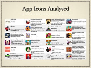
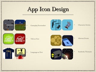
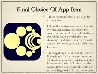


This document discusses app icon design and provides examples. It explains that app icons should be simple yet engaging designs given their small size. Icons work best when they clearly suggest what the app is through imagery and a distinctive logo. Contrasting colors that focus the eye are important, as are borders that make the icon pop out. Bright colors can also draw attention. The document analyzes several app icons and provides tips on creating effective app icon designs.


![1. fmp initial plans [autosaved] finished](https://cdn.slidesharecdn.com/ss_thumbnails/1-180524130038-thumbnail.jpg?width=640&height=640&fit=bounds)