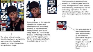
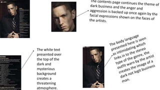
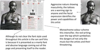
This Subheading is presented to the
audience of Grime/Rap/R&B research
shows these genres are rather physical
and threatening which explains why the
subheading is presented in a rather
intimidating way calling out the other
artists claiming everyone is afraid of 50
cent.
The main image of this magazine
carries of the imagery and
stereotype of the music being
alarming to anyone involved.
The eye contact given by the
image means the audience feel
threated as the image looks into
your soul. This type on genre
has the target audience of early
teens to the age of even 35+
The colour scheme is easily
identified and works well with the
aggressive style, the yellow
appeals as a hazard sign and the
red symbolises danger.
This is the inclusion of
aggressive language
again which will back
up the tone of the
genre which may even
create a negative
image in the heads of
those who do not
follow the type of
Music.
The white text
presented over
the top of the
dark and
mysterious
background
creates a
threatening
atmosphere.
Aggressive nature showing
masculinity, the tattoos
are a warning sign to
anyone and the facial
expression identifies the
power and capabilities of
this artist
Monochrome colour scheme
this intensifies the red writing
over the top which symbolises
the dangers of not only the
music but the artists and their
threatening.
Although its not clear the font style used
throughout this article is the san serif this
is because it is presented as a manly font
and abusive language coming out of the
page and presenting itself to the reader.

Front page breakdown

  • 1.
    This Subheading ispresented to the audience of Grime/Rap/R&B research shows these genres are rather physical and threatening which explains why the subheading is presented in a rather intimidating way calling out the other artists claiming everyone is afraid of 50 cent. The main image of this magazine carries of the imagery and stereotype of the music being alarming to anyone involved. The eye contact given by the image means the audience feel threated as the image looks into your soul. This type on genre has the target audience of early teens to the age of even 35+ The colour scheme is easily identified and works well with the aggressive style, the yellow appeals as a hazard sign and the red symbolises danger. This is the inclusion of aggressive language again which will back up the tone of the genre which may even create a negative image in the heads of those who do not follow the type of Music.
  • 2.
    The white text presentedover the top of the dark and mysterious background creates a threatening atmosphere.
  • 3.
    Aggressive nature showing masculinity,the tattoos are a warning sign to anyone and the facial expression identifies the power and capabilities of this artist Monochrome colour scheme this intensifies the red writing over the top which symbolises the dangers of not only the music but the artists and their threatening. Although its not clear the font style used throughout this article is the san serif this is because it is presented as a manly font and abusive language coming out of the page and presenting itself to the reader.