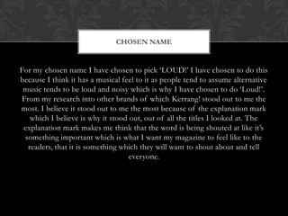
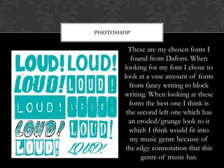
BRAINSTORMING NAME IDEAS
HOW I WILL GO ABOUT
                    THINKING OF NAMES


When thinking of names for my music magazine I decided to go
 down the route of thinking of names which have connotations
 of my chosen genre. The music genre I have chosen is the Post
     hardcore/Alternative music genre so which to me has
 connotations of edgy and rebellious. When looking for names
 for my music magazine I have used a thesaurus and I have also
looked through my iPod for songs which have that connotation.
NAMES I CAME UP WITH

             •            Anthem
                     •      Beat
                 •         Loud!
             •            Rhythm
             •            Ellipses
             •            Illusions
             •             Let Go
                 •         Listen
         •               Live today

     •               Instrumental

     •                   Monumental

         •               Obsession

             •            Paradox

             •            Untitled

                 •         Enjoy!
CHOSEN NAME


For my chosen name I have chosen to pick ‘LOUD!’ I have chosen to do this
because I think it has a musical feel to it as people tend to assume alternative
 music tends to be loud and noisy which is why I have chosen to do ‘Loud!’.
 From my research into other brands of which Kerrang! stood out to me the
most. I believe it stood out to me the most because of the explanation mark
    which I believe is why it stood out, out of all the titles I looked at. The
 explanation mark makes me think that the word is being shouted at like it’s
  something important which is what I want my magazine to feel like to the
   readers, that it is something which they will want to shout about and tell
                                    everyone.
COLOUR SCHEME


    For my colour scheme I wanted a
    colour which would appeal to my
  audiences which is male and females
   between the ages of 16-18 as from
  my questionnaire that was the most
   popular age. For my colours I have
     chosen to do a teal and a white
     together as I believe that these
  colours are colours which appeal to
         both male and females.
FONTS


    When choosing my font for my magazine I
 looked at both the fonts on Photoshop and the
fonts on a popular font website called Dafont. To
  create my fonts on Dafont I print screened the
font and edited the colours and background using
            Illustrator and Photoshop.
PHOTOSHOP


         These are my chosen fonts I
          found from Dafont. When
       looking for my font I chose to
       look at a vase amount of fonts
         from fancy writing to block
       writing. When looking at these
         fonts the best one I think is
        the second left one which has
         an eroded/grunge look to it
         which I think would fit into
         my music genre because of
        the edgy connotation that this
             genre of music has.
PHOTOSHOP FONTS


            These are my chosen fonts
             I found from Photoshop.
                The fonts I found on
            Photoshop were a lot more
              similar than the ones of
              Dafont which had a lot
              more to chose from and
            were very different. These
            fonts were more bold and
            out there in comparison to
                the ones of Dafont.
CHOSEN FONT


   This is my chosen font for my magazine. For my font I have
  chosen to pick one off of Dafont. I think this font shows the
   grunge/edgy look which would fit for my magazine and the
music genre for my magazine. I like the fast speed look it has to it
as well as if the font has been captured quickly. I think the colour
  works for the audience because it’s a colour which is for both
                              genders.

Brainstorming name ideas

  • 1.
  • 2.
    HOW I WILLGO ABOUT THINKING OF NAMES When thinking of names for my music magazine I decided to go down the route of thinking of names which have connotations of my chosen genre. The music genre I have chosen is the Post hardcore/Alternative music genre so which to me has connotations of edgy and rebellious. When looking for names for my music magazine I have used a thesaurus and I have also looked through my iPod for songs which have that connotation.
  • 3.
    NAMES I CAMEUP WITH • Anthem • Beat • Loud! • Rhythm • Ellipses • Illusions • Let Go • Listen • Live today • Instrumental • Monumental • Obsession • Paradox • Untitled • Enjoy!
  • 4.
    CHOSEN NAME For mychosen name I have chosen to pick ‘LOUD!’ I have chosen to do this because I think it has a musical feel to it as people tend to assume alternative music tends to be loud and noisy which is why I have chosen to do ‘Loud!’. From my research into other brands of which Kerrang! stood out to me the most. I believe it stood out to me the most because of the explanation mark which I believe is why it stood out, out of all the titles I looked at. The explanation mark makes me think that the word is being shouted at like it’s something important which is what I want my magazine to feel like to the readers, that it is something which they will want to shout about and tell everyone.
  • 5.
    COLOUR SCHEME For my colour scheme I wanted a colour which would appeal to my audiences which is male and females between the ages of 16-18 as from my questionnaire that was the most popular age. For my colours I have chosen to do a teal and a white together as I believe that these colours are colours which appeal to both male and females.
  • 6.
    FONTS When choosing my font for my magazine I looked at both the fonts on Photoshop and the fonts on a popular font website called Dafont. To create my fonts on Dafont I print screened the font and edited the colours and background using Illustrator and Photoshop.
  • 7.
    PHOTOSHOP These are my chosen fonts I found from Dafont. When looking for my font I chose to look at a vase amount of fonts from fancy writing to block writing. When looking at these fonts the best one I think is the second left one which has an eroded/grunge look to it which I think would fit into my music genre because of the edgy connotation that this genre of music has.
  • 8.
    PHOTOSHOP FONTS These are my chosen fonts I found from Photoshop. The fonts I found on Photoshop were a lot more similar than the ones of Dafont which had a lot more to chose from and were very different. These fonts were more bold and out there in comparison to the ones of Dafont.
  • 9.
    CHOSEN FONT This is my chosen font for my magazine. For my font I have chosen to pick one off of Dafont. I think this font shows the grunge/edgy look which would fit for my magazine and the music genre for my magazine. I like the fast speed look it has to it as well as if the font has been captured quickly. I think the colour works for the audience because it’s a colour which is for both genders.