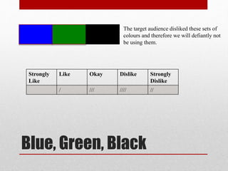
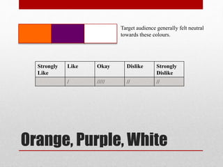
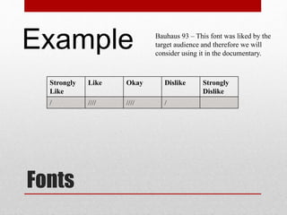
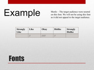
Focus Groups
Documentary
The following is a focus group conducted with our target
audience. We asked a group of ten young adults aged from
16-21 both female and male. We did this, as we wanted to
gain an understanding of what our target audience wanted
and therefore asked their opinions on a range of colours,
fonts and textual language.
Red, Black and White
We showed these colours to our target
audience and they were highly liked.
Strongly
Like
Like Okay Dislike Strongly
Dislike
///// /// //
Blue, Green, Black
The target audience disliked these sets of
colours and therefore we will defiantly not
be using them.
Strongly
Like
Like Okay Dislike Strongly
Dislike
/ /// //// //
Orange, Purple, White
Target audience generally felt neutral
towards these colours.
Strongly
Like
Like Okay Dislike Strongly
Dislike
/ ///// // //
Blue, White, Black
Target audience generally felt neutral
towards these colours.
Strongly
Like
Like Okay Dislike Strongly
Dislike
//// //// //
Fonts
Impact- The target audience strongly liked
this font. Therefore we may use this in the
documentary.
Example
Strongly
Like
Like Okay Dislike Strongly
Dislike
////// // //
Fonts
Apple Chancery – Peoples opinion on this
font was very varied ranging from strongly
liked to strongly disliked. Therefore we
may not use this font as not all of the
target audience are attracted to it.
Exampl
eStrongly
Like
Like Okay Dislike Strongly
Dislike
/ // // // ///
Fonts
Bauhaus 93 – This font was liked by the
target audience and therefore we will
consider using it in the documentary.
Example
Strongly
Like
Like Okay Dislike Strongly
Dislike
/ //// //// /
Fonts
Menlo – The target audience were neutral
on this font. We will not be using this font
as it did not appeal to the target audience.
Example
Strongly
Like
Like Okay Dislike Strongly
Dislike
// ////// //

Focus group documenatry

  • 1.
    Focus Groups Documentary The followingis a focus group conducted with our target audience. We asked a group of ten young adults aged from 16-21 both female and male. We did this, as we wanted to gain an understanding of what our target audience wanted and therefore asked their opinions on a range of colours, fonts and textual language.
  • 2.
    Red, Black andWhite We showed these colours to our target audience and they were highly liked. Strongly Like Like Okay Dislike Strongly Dislike ///// /// //
  • 3.
    Blue, Green, Black Thetarget audience disliked these sets of colours and therefore we will defiantly not be using them. Strongly Like Like Okay Dislike Strongly Dislike / /// //// //
  • 4.
    Orange, Purple, White Targetaudience generally felt neutral towards these colours. Strongly Like Like Okay Dislike Strongly Dislike / ///// // //
  • 5.
    Blue, White, Black Targetaudience generally felt neutral towards these colours. Strongly Like Like Okay Dislike Strongly Dislike //// //// //
  • 6.
    Fonts Impact- The targetaudience strongly liked this font. Therefore we may use this in the documentary. Example Strongly Like Like Okay Dislike Strongly Dislike ////// // //
  • 7.
    Fonts Apple Chancery –Peoples opinion on this font was very varied ranging from strongly liked to strongly disliked. Therefore we may not use this font as not all of the target audience are attracted to it. Exampl eStrongly Like Like Okay Dislike Strongly Dislike / // // // ///
  • 8.
    Fonts Bauhaus 93 –This font was liked by the target audience and therefore we will consider using it in the documentary. Example Strongly Like Like Okay Dislike Strongly Dislike / //// //// /
  • 9.
    Fonts Menlo – Thetarget audience were neutral on this font. We will not be using this font as it did not appeal to the target audience. Example Strongly Like Like Okay Dislike Strongly Dislike // ////// //