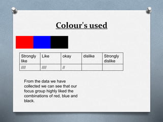
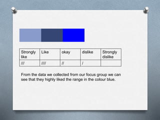
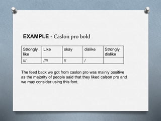
Magazine focus group
The following is a focus group conducted
with our target audience. We asked a group
of ten young adults aged 17-21 both
females and males. We did this, as we
wanted to gain an understanding of what out
the target audience wanted and therefore
asked their opinions on a range of color's,
fonts and textual language.
Colour's used
Strongly
like
Like okay dislike Strongly
dislike
//// //// //
From the data we have
collected we can see that our
focus group highly liked the
combinations of red, blue and
black.
Strongly
like
Like okay dislike Strongly
dislike
/ // //// ///
From the data we collected we can see that our focus
group did not like the colour scheme of black yellow and
green.
Strongly
like
Like okay dislike Strongly
dislike
/// //// // /
From the data we collected from our focus group we can
see that they highly liked the range in the colour blue.
Strongly
like
Like okay dislike Strongly
dislike
// // //// / /
From the feed back we have collected we can see that
the feedback varied in what they liked of having a
combination of green, blue and red.
FONT
IDEAS
EXAMPLE - Caslon pro bold
Strongly
like
Like okay dislike Strongly
dislike
/// //// // /
The feed back we got from caslon pro was mainly positive
as the majority of people said that they liked calson pro and
we may consider using this font.
EXAMPLE - IMPACT
Strongly
like
Like okay dislike Strongly
dislike
///// //// /
The font impact had also given positive feed as the
majority of people said that they liked the font. We will
most definitely consider this font.
EXAMPLE-American Typewriter
Strongly
like
Like okay dislike Strongly
dislike
// // /// // /
American typewriter has got a range of ratings, however
3 people said they did not like American typewriter.
EXAMPLE - Century Gothic
Strongly
like
Like okay dislike Strongly
dislike
/// / // ////
Century gothic had go a range of ratings however 4
people have strongly disliked century gothic and we
may not use in out double page spread.

Focus group

  • 1.
  • 2.
    The following isa focus group conducted with our target audience. We asked a group of ten young adults aged 17-21 both females and males. We did this, as we wanted to gain an understanding of what out the target audience wanted and therefore asked their opinions on a range of color's, fonts and textual language.
  • 3.
    Colour's used Strongly like Like okaydislike Strongly dislike //// //// // From the data we have collected we can see that our focus group highly liked the combinations of red, blue and black.
  • 4.
    Strongly like Like okay dislikeStrongly dislike / // //// /// From the data we collected we can see that our focus group did not like the colour scheme of black yellow and green.
  • 5.
    Strongly like Like okay dislikeStrongly dislike /// //// // / From the data we collected from our focus group we can see that they highly liked the range in the colour blue.
  • 6.
    Strongly like Like okay dislikeStrongly dislike // // //// / / From the feed back we have collected we can see that the feedback varied in what they liked of having a combination of green, blue and red.
  • 7.
  • 8.
    EXAMPLE - Caslonpro bold Strongly like Like okay dislike Strongly dislike /// //// // / The feed back we got from caslon pro was mainly positive as the majority of people said that they liked calson pro and we may consider using this font.
  • 9.
    EXAMPLE - IMPACT Strongly like Likeokay dislike Strongly dislike ///// //// / The font impact had also given positive feed as the majority of people said that they liked the font. We will most definitely consider this font.
  • 10.
    EXAMPLE-American Typewriter Strongly like Like okaydislike Strongly dislike // // /// // / American typewriter has got a range of ratings, however 3 people said they did not like American typewriter.
  • 11.
    EXAMPLE - CenturyGothic Strongly like Like okay dislike Strongly dislike /// / // //// Century gothic had go a range of ratings however 4 people have strongly disliked century gothic and we may not use in out double page spread.