The usability study found that:
1) The homepage was cluttered and confusing for new users to navigate, with too much competing for attention.
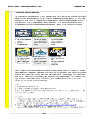
2) It was difficult to distinguish fantasy news from fantasy products on the site.
3) The fantasy football commissioner product was seen as robust but too expensive, especially for new users.
4) The payment submission process asked for unnecessary security information, introducing obstacles.
![Fantasy Football Commissioner – Usability Study November 2008
Initial Feedback
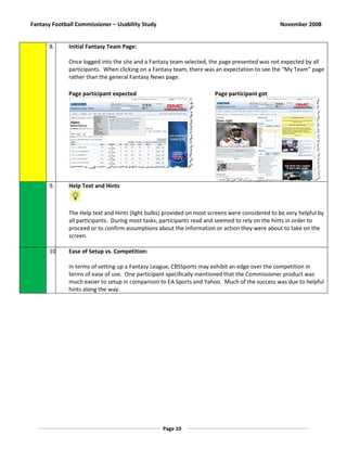
Overview: A total of 10 participants took part in a usability study of the Fantasy Football Commissioner product
on November 18-19, 2008. Approximately half of the participants were experienced Fantasy players (2+ years
using a Fantasy product of some sort) the other half had little or no experience but were interested in Fantasy
sports. The goal of this study was to examine the user experience of visiting CBSSports.com, finding the Fantasy
Football product offerings, creating a Commissioner League, and then setting up and managing teams.
Usability
Rating
# Top Level Observations and Findings
1. Registration:
Participants regarded general site Registration as simple and straightforward – standard.
Note: One of the main errors encountered during registration was choosing a site ID – one that was
not already used by another user. Providing a “Check Availability” option would be helpful. Also,
field by field error checking could be beneficial. Error prompting on page reloads (the action
invoked by the user after completing the registration form) received some negative reaction from
participants.
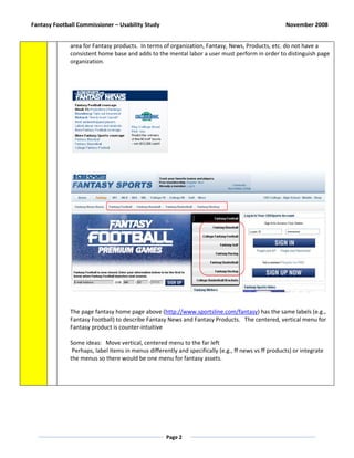
2. Home Page Clutter:
A general theme observed during usability sessions was that the Home page was cluttered -
especially for a first time visitor. It takes mental and visual effort to absorb the Home page and
determine the lay of the land. Users have a point of comparison about Home page layout and given
the exposure to other Sports web sites, it is important to examine how to improve the first time visit
on CBSSports.com in the future.
Comments from two of the participants:
Question: Your first impression?
Answer: “It’s pretty cluttered… there’s a lot of things going on at the same time.”
… “But [the site] is comprehensive about all the sports”.
Question: Your first impression?
Answer: “There’s a lot going on … little pictures that, a lot of text, giant ads, like…
I’m trying to decipher what is an ad and what is not… for the first time there’s a lot
on the page” … “hard to tell content from advertising.”
3. Fantasy Products Realization on Home Page:
Participants quickly ascertained that CBSSports offers Fantasy products. The button labeled
“Fantasy” near the top left of the Home page was frequently the first navigation option taken by
participants. Large product ads were also noticed.
Nonetheless, some participants mistakenly thought that the Fantasy News section was the main
Page 1](https://image.slidesharecdn.com/finalinitialfeedback-commissionerusabilitystudy-docx-111129114108-phpapp02/85/Final-initial-feedback-commissioner-usability-study-docx-1-320.jpg)
![Fantasy Football Commissioner – Usability Study November 2008
Initial Feedback
Overview: A total of 10 participants took part in a usability study of the Fantasy Football Commissioner product
on November 18-19, 2008. Approximately half of the participants were experienced Fantasy players (2+ years
using a Fantasy product of some sort) the other half had little or no experience but were interested in Fantasy
sports. The goal of this study was to examine the user experience of visiting CBSSports.com, finding the Fantasy
Football product offerings, creating a Commissioner League, and then setting up and managing teams.
Usability
Rating
# Top Level Observations and Findings
1. Registration:
Participants regarded general site Registration as simple and straightforward – standard.
Note: One of the main errors encountered during registration was choosing a site ID – one that was
not already used by another user. Providing a “Check Availability” option would be helpful. Also,
field by field error checking could be beneficial. Error prompting on page reloads (the action
invoked by the user after completing the registration form) received some negative reaction from
participants.
2. Home Page Clutter:
A general theme observed during usability sessions was that the Home page was cluttered -
especially for a first time visitor. It takes mental and visual effort to absorb the Home page and
determine the lay of the land. Users have a point of comparison about Home page layout and given
the exposure to other Sports web sites, it is important to examine how to improve the first time visit
on CBSSports.com in the future.
Comments from two of the participants:
Question: Your first impression?
Answer: “It’s pretty cluttered… there’s a lot of things going on at the same time.”
… “But [the site] is comprehensive about all the sports”.
Question: Your first impression?
Answer: “There’s a lot going on … little pictures that, a lot of text, giant ads, like…
I’m trying to decipher what is an ad and what is not… for the first time there’s a lot
on the page” … “hard to tell content from advertising.”
3. Fantasy Products Realization on Home Page:
Participants quickly ascertained that CBSSports offers Fantasy products. The button labeled
“Fantasy” near the top left of the Home page was frequently the first navigation option taken by
participants. Large product ads were also noticed.
Nonetheless, some participants mistakenly thought that the Fantasy News section was the main
Page 1](https://image.slidesharecdn.com/finalinitialfeedback-commissionerusabilitystudy-docx-111129114108-phpapp02/75/Final-initial-feedback-commissioner-usability-study-docx-1-2048.jpg)