Captivating Charm: Exploring Marseille's Hillside Villas with Our 3D Architec...
WSJ Professional
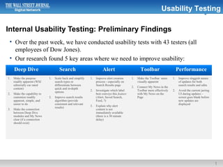
1. Internal Usability Testing: Preliminary Findings
1
Usability Testing
• Over the past week, we have conducted usability tests with 43 testers (all
employees of Dow Jones).
• Our research found 5 key areas where we need to improve usability:
Deep Dive Search Alert Toolbar Performance
1. Make the purpose
readily apparent (WSJ
editorially cur rated
content)
2. Make the capability to
customize readily
apparent, simple, and
easier to do
3. Make the connection
between Deep Dive
modules and My News
clear (if a connection
should exist)
1. Scale back and simplify
search types or
differentiate between
quick and in-depth
options
2. Improve search results
algorithm (provide
consistent and relevant
results)
1. Improve alert creation
process - especially on
Search Results page
2. Investigate which label
best conveys this feature
(Alert, Saved Search,
Feed, ?)
3. Explain why alert
content is not
immediately available
(there is a 30 minute
delay)
1. Make the Toolbar more
visually apparent
2. Connect My News in the
Toolbar more effectively
with My News on the
Page
1. Improve sluggish nature
of updates for both
search results and edits
2. Avoid the current jarring
UI during updates –
screen goes blank before
new updates are
displayed
3. Deep Dive functionality satisfaction rated on a scale of 1-3
3
Usability Testing
• Reported satisfaction ratings for
functionality ranged from 1 to 2
indicating room for UI improvements
• Purpose of module is unclear -
participants did not distinguish it from a
typical headline module offered
elsewhere online
• Participants were mostly unaware that
Deep Dive modules could be customized
• Functionality for adding a customized
search (an alert) to Deep Dive received
the lowest satisfaction rating [1.68] – it
was not understood
• Refining Search results to a single source
was extremely difficult – not intuitive
• There is confusion about the relationship
between Deep Dive and My News.
Scale:
3 Very Satisfied
2 Satisfied
1 Not Satisfied
4. 4
Usability Testing
1
4
5
3
2
Deep Dive My News
User clicks Edit.
Edit panel exposed.
User chooses Industry option;
User has no existing Industry
customization and is prompted
to Add an Industry to “My
News” .
Note: This is where the
confusion between Deep Dive
and My News begins.
User is taken outside of Deep
Dive for edit functionality and
adds “IBM” as a company in My
News.
IBM is added to the user’s list
of companies in My News but
is oriented at the bottom of
the list (which happens to be
out of view on a monitor)
which gives the impression
that the user selection was
not saved.
Note: Users are confused
about the connection
between Deep Dive and My
News.
What’s the Relationship ?
5. Deep Dive customization ease of use rated on a scale of 1-3
5
Usability Testing
• The process of customization seemed
tedious
− One by One module edits not
efficient
− Click & Drag reordering of topics,
industries, or companies is
preferred
• “Edit” link to customize commonly
missed by participants
• The ability to add a customized Search
(an alert) was rated lowest (1.55) terms
of ease of use
Scale:
3 Very Satisfied
2 Satisfied
1 Not Satisfied
6. Deep Dive – Select Comments:
6
Usability Testing
Purpose and Functionality Not Clear:
• “My question is, why am I presented with these Deep Dives (AIG, Eni, News Corp., etc.) and not Deep
Dives based on other topics. Will the presentation be customized based on how a person uses wsj.com?
Or based on searches the user performs?”
• “I have no idea how to customize on a level that drills further down than picking an industry or
company. I found no way to enter a specific word or name - I felt only limited to the ticker symbol
function and the given industry list.”
Great Concept But Not User Friendly:
• “It feels like a really useful tool but actually using it isn't so easy. all I want to do is make sure the topics
I care about show up there every time I log on, but the process of customizing left me confused. …[in
order to customize] you have to edit the individual models which is hugely time-consuming.”
• “I love the "deep dive" concept, but I thought it was tough to find the general "edit" button for the Deep
Dives. It looked, to me, like it was just related to the finance deep dive, b/c it was in that box. …”.
8. Search functionality rated on a scale of 1-3
8
Usability Testing
• Participants recognized this was powerful
Search tool… but
• The Search algorithm may need to be
tweaked – results were not always
consistent or seemingly relevant
• The concept of “saving a search” needs to
be explained better – participants were
not always clear where it was saved to
and where they could view it
• Participants did not differentiate between
a “Quick Search” and an “In-Depth”
Search
Scale:
3 Very Satisfied
2 Satisfied
1 Not Satisfied
9. Search ease of use rated on a scale of 1-3
9
Usability Testing
• Finding and saving an article and then
saving a search were rated lowest
• Although narrowing a search to a single
source was rated [2.12] – Satisfied –
observations and verbal feedback
indicated that this was a very difficult
task
• Creating a portfolio was often confusing
and not readily apparent how to create
Scale:
3 Very Satisfied
2 Satisfied
1 Not Satisfied
10. Search – Select Comments :
10
Usability Testing
Great Potential:
• "The WSJ site and the new professional edition is amazing but it feels like you are drinking from a fire hose."
• “Lots of results, lots of ways to find results and tailor searches.”
• "Got better as I fiddled with the site, but the initial learning curve was difficult at times.“
• “It feels like a really useful tool but actually using it isn't so easy. all I want to do is make sure the topics I care about show
up there every time I log on, but the process of customizing left me confused”
Algorithm Issues:
• "Did a search for Ereader first time. Narrowed search for Steve Haber. It gave 9 results, ... I clicked on it and I recv'd a
black screen ... Went back to home, redid search. This time Haber did not even show up on the executive list (last time he
was ranked 1st). Additionally, it only showed 1 article for him this time.“
• "No Results were found for [the] query for "pigs""
Frustration - Find Articles and Saving a Search:
• "Saving is not really intuitive, nor are the search queries. It's frustrating because I wish I could customize a search like the
way I'm used to customizing it in NexisLexis or Factiva.“
• "Couldn't find how to save an article that's not wsj. for the wsj article, I couldn't easily find where to view it, and once I did,
the article wasn't there...just a 4 digit code“
• “I could not figure out any way to search only one source.”
• "Search among a group of sources is slow since when you add a source it refreshes the source each time."
Frustration creating a Portfolio
• “I found the Google stock quote pretty easily. I did not see any place to create a portfolio. I looked in the dock and under
Personal Finance.”
12. My News and Alerts functionality rated on a scale of 1-3.
12
Usability Testing
• Alerting capability was seen as valuable
to participants… but
• Intermittent system errors were observed
• The Factiva driven 30 minute delay for a
“Search” presents a negative impression
• The name “alerts” suggests email – not
necessarily a positive
Scale:
3 Very Satisfied
2 Satisfied
1 Not Satisfied
13. ‘My News’ ease of use rated on a scale of 1-3.
13
Usability Testing
Scale:
3 Very Satisfied
2 Satisfied
1 Not Satisfied
• Customization not intuitive enough
• Participants need more direction to create
keyword alerts and understand where they
could view them
14. My News & Alerts – Select Comments :
14
Usability Testing
Positive Feedback:
• “The dragging and dropping of different companies was really cool, intuitive.”
• “This works well, but it's hard to figure out how to get to it.“
System Errors:
• " It looked easy to save a keyword alert, but when I tried, it said "We are unable to process your request
at this time. Please try again in a few minutes.”
• “I am having trouble creating and saving a new keyword alert. It says "We are unable to process your
request at this time. Please try again in a few minutes." I tried it three times with different searches but
got same error.”
• “The back button won't take me back to my search results?”
Delay When Creating an Alert:
• " I think it is problematic to have a 30-minute delay on new search results for an alert."
Frustration with Customization
• "Not sure how to customize to show news I'm specifically interested in. Couldn't figure it out. In
general, a bit unclear the differences between Edit Alert and Go To Settings."
• "This also got easier the more I fiddled with it. Customizing the My News tabs felt sleeker than
customizing My Alerts."
16. Toolbar functionality rated on scale of 1-3
16
Usability Testing
• Very positive reaction to the Toolbar
• Not seen on the page by most
participants… or, it simply was not
engaged with until prodded
• Simple and effective.
• The connection between My News on the
page and My News on the Toolbar is not
crystal clear
Scale:
3 Very Satisfied
2 Satisfied
1 Not Satisfied
17. Toolbar ease of use rated on scale of 1-3
17
Usability Testing
• Simple interface, easier to use than other
areas of the site
Scale:
3 Very Satisfied
2 Satisfied
1 Not Satisfied
18. Toolbar – Select Comments :
18
Usability Testing
Positive Feature Offering:
• “The "My News" search bar at the bottom is really, really helpful. I wish all news sites had the "saved"
option. It made bookmarking and retrieving an article really easy.”
• “This is the coolest part. Very handy.”
Not Seen by Participants :
• "Didn't even notice the My News toolbar until somebody pointed it out."
• “Totally easy to miss at the bottom of the page. I'm not used to looking for anything there.”
What is the Toolbar do? :
• "It seems that it [alerts, saved articles] will automatically show up on the toolbar as long as I create the
feeds and save the search. Is there anything I'm missing?"
• "Seems like a great tool, but wasn't immediately obvious to me how much it could be used, or how
thoroughly it could change the way I interact with the website."
Disconnect Between My News (Page) and My News (Toolbar)
• “It's nice that the toolbar and my news are in sync but not always clear that is the case...getting pushed
back and forth from the tool bar to my news can be confusing"
• "Something weird: when you click "new alert" in "keyword alerts" from the dock, it takes you out of the
dock and into another search screen. That was just weird, I expected to stay in the dock throughout the
search screen."