Final Ideas
•Download as PPTX, PDF•
0 likes•137 views
The document discusses the design choices made for a magazine flat plan. It describes choosing a darker purple color based on feedback that it would be more gender neutral than lilac. It also explains using mid-shots on the cover to create a personal connection with readers and make them want to buy the magazine. A range of studio and live shots are used for the contents page to showcase the magazine's variety and appeal to more of the target audience. Photographs are selected for the double page spread to interact with each other and feel connected.
Report
Share
Report
Share

Recommended
Evaluation 5
This document discusses how the magazine attracted and addressed its audience. [1] The magazine used conventions from other professional magazines in its layout and mise-en-scene to attract the audience. [2] Language, layout, fonts, and models were chosen to communicate with and appeal to the intended young audience. [3] Audience research found the magazine should include topics that appeal to both male and female readers, as well as promote its social media presence to interact with readers.
Evaluation Question 1 - Front Cover
This document discusses how the media product, a music magazine called Pyramid, uses and develops conventions of real music magazines in its design. It has a close-up front cover image that challenges conventions by having the subject look away from the camera. It uses a single bright color like indie magazines. There is limited catchy text on the cover following conventions. The masthead is centered at the top like other magazines and the name Pyramid references the music scene and targets hipster fashion trends.
Drawn design sheets
The document discusses the design of a magazine, including:
1) The masthead will use bright colors like yellow or orange with dark text to stand out.
2) The background color will be grey to allow other elements to stand out with bright fonts.
3) A double page spread will use typical magazine colors of white, grey, and black and include a full-body photo and article about Macklemore.
How did you attract your audience
The document discusses various design choices made to attract an indie music target audience to an indie music magazine. Bold headings, indie fonts, bright contrasting colors like red and yellow, traditional indie colors of red, black and white, informal writing style, simple front cover layout, table of contents, listing of music tour dates, and non-mainstream music advertisements were used to make the magazine appealing to the target indie audience. These design elements aimed to attract the audience by looking authentic to indie styles, being eye-catching while organized, using a tone the audience could relate to, and providing relevant information about music.
Q2
The document represents a 16-24 year old audience in its media product. It uses sophisticated but not too bright colors that would appeal to both males and females of this age range. The font is from the classic Mario Bros video game, which most people in this demographic would recognize. Images of musicians posing with guitars give the magazine a professional look common in this music genre. The writing aims for an informal, relaxed and sometimes sarcastic tone to effectively connect with this target audience.
Evaluation Q3
The document discusses strategies for attracting and addressing an indie audience in a magazine. It suggests using large prominent photographs on the cover that feature people who represent the indie genre to help readers identify with them. It also recommends using a large masthead across the cover and highlighting artist names in larger font to draw attention to the featured content. The text aims to make readers feel like they are part of an exclusive yet social indie group by directly addressing them, using possessive pronouns, and providing content that helps build their personal and social identities within that community.
How did you attract and address your audience
The document discusses how the magazine addresses and attracts its audience through direct mode of address, color scheme and fonts, and informal language. The front cover uses direct eye contact to focus the reader's attention on the main article. The color scheme of red, yellow, black, and white was chosen based on audience research and helps the colors "clash" and stand out. Common fonts like "zombified" create a rock magazine feel while "birth of a hero" provides readability. The informal language and quotes are meant to engage readers and portray the magazine as hard-hitting.
How does this attract the reader
This cover story aims to gratify personal identity and cultivate personal relationships among readers. It does so by featuring a potential celebrity that readers will want to know more about, which could lead them to explore that artist's content and form connections through shared interests. Additionally, the informal language is meant to create a comfortable reading experience and closer bond between the magazine and its audience.
little white lies analysis
The document analyzes the magazine cover design of "Little white lies" magazine. It notes that placing the recognizable logo in the middle makes it identifiable. Using a different color for the featured film title and distinctive font helps the title stand out against the black and white background. The cover image uses a mid-shot portrait of an actor from the film in a drawn, non-direct style that makes the magazine stand out while still identifying what film is featured inside.
Colour schemes
The document discusses the color scheme selection process for a rock music magazine. The author chose to use gold as the primary color based on the results of a survey of the target audience. Gold received the most votes and represents the genre of rock music. It also alludes to a classic 1980s song appealing to the older target demographic. Burgundy and light blue were also considered but did not stand out as much against the background colors.
Double page magazine spread
This document analyzes several magazine double-page spreads to gather ideas for creating their own. Key elements noted across the spreads include: a prominent main image related to the topic; one or more smaller secondary images; an attention-grabbing title in a bold, catchy font; short descriptive text; and use of color and layout to guide the reader's eye. Analyzing these examples provided lessons on making important elements stand out while maintaining a clear structure for readers.
Evaluation 1
This document summarizes how the media product, a magazine, uses and develops conventions of real music magazines. It discusses taking inspiration from the layout of Fader magazine, including the double page spread style and column text. It also summarizes the inspiration for the magazine's title from other music magazines and how it fits conventions. The document discusses keeping a simple, stripped back graphical and layout style while still making everything purposeful. It also summarizes how the magazine's costumes, photos, and color scheme fit conventions in an unconventional way to suit the magazine's style.
Images I Have Not Used
The document discusses several photos that were considered but ultimately not used in a magazine. Each photo is analyzed in 1-2 sentences. Common reasons for not using the photos included the subject looking away from the camera, lighting issues, not fitting with the intended magazine style or theme, or the subject not being the main story focus.
In what way does my media product use
This document summarizes how the author's media product uses and challenges conventions of real magazines. The masthead is centered at the top of the front cover rather than left-aligned. The title "UNCUT" was chosen to appeal to an older, more mature audience seeking truthful stories. The front cover features a model in a winter-themed outfit along with other design elements like a snowflake icon. While including a story about a pop song, the magazine challenges pop magazine genres by using girly fonts and pastel colors rather than focusing on boys and gossip. The goal is to keep the target audience interested with a variety of subjects.
Rhys qu 2
Taz was chosen as the model for the magazine because he had a rock and edgy look that fit the position well. The inspiration came from a magazine where a Muse band member posed as a serious model that engaged readers. Taz is a younger version that type of model, allowing the magazine to target younger readers. Contrasting images are mentioned to further emphasize the central image.
evaluation - conventions
The document discusses the conventions and design choices made for a magazine. It follows conventions like using a masthead, barcode, cover lines, date, price, and straplines. However, it aims to appeal to younger audiences unlike similar magazines. While major magazines use obvious 3-column text layouts, the document spreads text and images more which could be improved. Photos were edited in Photoshop to improve quality and match the vintage color scheme. Font and image editing were chosen to portray an authentic vintage style while still appealing to younger readers. Cinematography conventions like medium close-ups were used but the front cover featured a long shot of a band to challenge conventions.
Presentation3
The document discusses how to attract and address an audience for a magazine. It suggests playing on the audience's stereotypes, using appealing layouts, fonts, colors and imagery. The magazine should provide role models for the audience to emulate and give them a sense of belonging, group identity and self-confidence by sharing knowledge about a particular style. It also aims to be a substitute for real-life companionship, allowing the audience to escape problems and relax through entertainment.
Evaluation 1
The document discusses how the author's media product compares to conventions of real music magazines in its design and layout. It analyzes the masthead, cover image, exclusive features notice, contents listing, pull quotes, and artist profiles. The masthead uses shadowing like NME magazine. The cover image names the artist like Kerrang. An exclusive features notice and barcode add realism. The contents listing has unique spacing. Pull quotes are used consistently. Large titles introduce artist profiles as in NME. Overall it aims to emulate conventions of real music magazines while adding some original elements.
Newspaper research
To design a poster advertising their newspaper, the document discusses researching other newspaper posters for inspiration. It describes a poster that uses a purple color scheme throughout to catch readers' eyes, features a hand holding tourist attractions of London linked to the slogan "grab", and prominently displays the newspaper's name and issues it will cover to inform potential buyers. The discussed poster places its logo centrally, includes its catch phrase on the printed paper, and uses blurred background images to make the bold title stand out.
Why and how music magazines use conventions
This document summarizes some of the key conventions used in music magazines to appeal to readers and promote content. It discusses using colorful fonts and sell lines on the front cover to attract attention. The house style uses basic colors consistently throughout the magazine to appeal to casual readers. Box outs, masterheads, and strap lines are used to highlight and identify important information at a glance. Pictures are accompanied by anchorage to provide context without covering the image. Spreading text across a page in kerning draws attention to significant stories.
Question 2
The document discusses the target audience and design of a magazine. The target audience is teenagers and young adults who enjoy a range of music genres like Oasis and Justin Bieber. A mood board was created to help design the magazine to appeal to this audience. The front cover features a female model smiling directly at the camera to represent purity and innocence. Neutral colors and clothing were chosen so as not to distract from the content and sell lines. While primarily aimed at women, the magazine hopes to appeal to both genders through inclusion of various topics and avoidance of stereotyping.
Question 2
The document discusses representation in media and how the creator chose to represent their magazine cover model. Specifically:
- The model is represented as a 16-year-old white heterosexual female, which the creator felt would be most relatable to their target audience.
- The model wears a tight dress and has her hair down, posing with her hand on her hip in what is described as a "sassy" pose, meant to portray confidence and a rebellious attitude relatable to teenagers.
- Efforts were made to portray the model as "innocent" yet elegant, through her facial expression and minimized makeup.
- The layout and design aim to keep the focus on the model,
Evaluation question 1
This document discusses how the media product uses and develops conventions from real magazines. It examines case studies of XXL and Vibe magazines to understand typical conventions like three-color schemes, large mastheads, cover stars featured throughout. The product challenges conventions by using a longer shot on the cover instead of a close-up. It also develops conventions by appropriately clothing the cover star rather than showing bare skin, and using a Q&A interview format on the double page spread.
Nicole magazine cover analysis
The document provides an analysis of several magazine covers representing the horror genre. It discusses the effective use of color schemes, fonts, images and other design elements in capturing audience attention and conveying the intended tone. Specifically, it praises a cover's gradual shift from bright yellow to black as reflecting the progression of events in a film from happy to dark. However, it criticizes one cover for having an overwhelming amount of information and for another's immature and unprofessional representation of the genre through childish fonts and minimalist artwork.
Otro Tipo De Sociedad Es Posible.
El documento propone imaginar una sociedad en la que todas las personas tengan los mismos derechos, independientemente de sus capacidades. Se mencionan varios derechos fundamentales como el derecho al trabajo, la educación, el ocio, la vivienda y el acceso a la tecnología, entre otros. Se presentan ejemplos concretos de iniciativas e innovaciones para promover la inclusión y accesibilidad de las personas con discapacidad.
Educacion tradicional vs sociedad del conocimiento
IMPLICACIONES QUE TIENE PARA NUESTRA PRACTICA DOCENTE EL MODELO DEL CONOCIMIENTO TRADICIONAL Y EL DE LA SOCIEDAD DEL CONOCIMIENTO
TEORIAS MODERNAS DE LA ADMINISTRACION
Este documento resume varias teorías clave de la administración. Define la administración como una función que se desarrolla bajo el mando de otro, con servicio y subordinación como elementos principales. Luego describe las funciones básicas de la administración y las teorías de la burocracia de Weber, incluidas sus ventajas y características. También resume brevemente la teoría del comportamiento, la teoría de los dos factores de Herzberg y la teoría X y Y de McGregor, contrastando concepciones tradicionales y
Tipos de sociedades
Este documento describe los diferentes tipos de sociedades, incluyendo sociedad simple, sociedad política monetaria, sociedad comprometida, sociedad publicitaria, sociedad conyugal y sociedad colectiva. Define cada tipo de sociedad y proporciona detalles sobre sus características principales.
Tipos de empresas
Este documento describe los diferentes tipos de empresas, incluyendo empresas industriales, comerciales, de servicios, agropecuarias, privadas, públicas, mixtas, unipersonales, colectivas, cooperativas, de responsabilidad limitada, anónimas y pequeñas, medianas y grandes empresas.
Tipos de sociedades
El documento describe los diferentes tipos de sociedades comerciales en Perú. Explica que existen siete tipos principales: la sociedad anónima, la sociedad de responsabilidad limitada, la empresa individual de responsabilidad limitada, la sociedad colectiva, la sociedad en comandita, la sociedad civil y las uniones de empresas. Para cada tipo describe características como el número de socios/accionistas, su responsabilidad, órganos de gobierno y otros detalles clave.
More Related Content
What's hot
little white lies analysis
The document analyzes the magazine cover design of "Little white lies" magazine. It notes that placing the recognizable logo in the middle makes it identifiable. Using a different color for the featured film title and distinctive font helps the title stand out against the black and white background. The cover image uses a mid-shot portrait of an actor from the film in a drawn, non-direct style that makes the magazine stand out while still identifying what film is featured inside.
Colour schemes
The document discusses the color scheme selection process for a rock music magazine. The author chose to use gold as the primary color based on the results of a survey of the target audience. Gold received the most votes and represents the genre of rock music. It also alludes to a classic 1980s song appealing to the older target demographic. Burgundy and light blue were also considered but did not stand out as much against the background colors.
Double page magazine spread
This document analyzes several magazine double-page spreads to gather ideas for creating their own. Key elements noted across the spreads include: a prominent main image related to the topic; one or more smaller secondary images; an attention-grabbing title in a bold, catchy font; short descriptive text; and use of color and layout to guide the reader's eye. Analyzing these examples provided lessons on making important elements stand out while maintaining a clear structure for readers.
Evaluation 1
This document summarizes how the media product, a magazine, uses and develops conventions of real music magazines. It discusses taking inspiration from the layout of Fader magazine, including the double page spread style and column text. It also summarizes the inspiration for the magazine's title from other music magazines and how it fits conventions. The document discusses keeping a simple, stripped back graphical and layout style while still making everything purposeful. It also summarizes how the magazine's costumes, photos, and color scheme fit conventions in an unconventional way to suit the magazine's style.
Images I Have Not Used
The document discusses several photos that were considered but ultimately not used in a magazine. Each photo is analyzed in 1-2 sentences. Common reasons for not using the photos included the subject looking away from the camera, lighting issues, not fitting with the intended magazine style or theme, or the subject not being the main story focus.
In what way does my media product use
This document summarizes how the author's media product uses and challenges conventions of real magazines. The masthead is centered at the top of the front cover rather than left-aligned. The title "UNCUT" was chosen to appeal to an older, more mature audience seeking truthful stories. The front cover features a model in a winter-themed outfit along with other design elements like a snowflake icon. While including a story about a pop song, the magazine challenges pop magazine genres by using girly fonts and pastel colors rather than focusing on boys and gossip. The goal is to keep the target audience interested with a variety of subjects.
Rhys qu 2
Taz was chosen as the model for the magazine because he had a rock and edgy look that fit the position well. The inspiration came from a magazine where a Muse band member posed as a serious model that engaged readers. Taz is a younger version that type of model, allowing the magazine to target younger readers. Contrasting images are mentioned to further emphasize the central image.
evaluation - conventions
The document discusses the conventions and design choices made for a magazine. It follows conventions like using a masthead, barcode, cover lines, date, price, and straplines. However, it aims to appeal to younger audiences unlike similar magazines. While major magazines use obvious 3-column text layouts, the document spreads text and images more which could be improved. Photos were edited in Photoshop to improve quality and match the vintage color scheme. Font and image editing were chosen to portray an authentic vintage style while still appealing to younger readers. Cinematography conventions like medium close-ups were used but the front cover featured a long shot of a band to challenge conventions.
Presentation3
The document discusses how to attract and address an audience for a magazine. It suggests playing on the audience's stereotypes, using appealing layouts, fonts, colors and imagery. The magazine should provide role models for the audience to emulate and give them a sense of belonging, group identity and self-confidence by sharing knowledge about a particular style. It also aims to be a substitute for real-life companionship, allowing the audience to escape problems and relax through entertainment.
Evaluation 1
The document discusses how the author's media product compares to conventions of real music magazines in its design and layout. It analyzes the masthead, cover image, exclusive features notice, contents listing, pull quotes, and artist profiles. The masthead uses shadowing like NME magazine. The cover image names the artist like Kerrang. An exclusive features notice and barcode add realism. The contents listing has unique spacing. Pull quotes are used consistently. Large titles introduce artist profiles as in NME. Overall it aims to emulate conventions of real music magazines while adding some original elements.
Newspaper research
To design a poster advertising their newspaper, the document discusses researching other newspaper posters for inspiration. It describes a poster that uses a purple color scheme throughout to catch readers' eyes, features a hand holding tourist attractions of London linked to the slogan "grab", and prominently displays the newspaper's name and issues it will cover to inform potential buyers. The discussed poster places its logo centrally, includes its catch phrase on the printed paper, and uses blurred background images to make the bold title stand out.
Why and how music magazines use conventions
This document summarizes some of the key conventions used in music magazines to appeal to readers and promote content. It discusses using colorful fonts and sell lines on the front cover to attract attention. The house style uses basic colors consistently throughout the magazine to appeal to casual readers. Box outs, masterheads, and strap lines are used to highlight and identify important information at a glance. Pictures are accompanied by anchorage to provide context without covering the image. Spreading text across a page in kerning draws attention to significant stories.
Question 2
The document discusses the target audience and design of a magazine. The target audience is teenagers and young adults who enjoy a range of music genres like Oasis and Justin Bieber. A mood board was created to help design the magazine to appeal to this audience. The front cover features a female model smiling directly at the camera to represent purity and innocence. Neutral colors and clothing were chosen so as not to distract from the content and sell lines. While primarily aimed at women, the magazine hopes to appeal to both genders through inclusion of various topics and avoidance of stereotyping.
Question 2
The document discusses representation in media and how the creator chose to represent their magazine cover model. Specifically:
- The model is represented as a 16-year-old white heterosexual female, which the creator felt would be most relatable to their target audience.
- The model wears a tight dress and has her hair down, posing with her hand on her hip in what is described as a "sassy" pose, meant to portray confidence and a rebellious attitude relatable to teenagers.
- Efforts were made to portray the model as "innocent" yet elegant, through her facial expression and minimized makeup.
- The layout and design aim to keep the focus on the model,
Evaluation question 1
This document discusses how the media product uses and develops conventions from real magazines. It examines case studies of XXL and Vibe magazines to understand typical conventions like three-color schemes, large mastheads, cover stars featured throughout. The product challenges conventions by using a longer shot on the cover instead of a close-up. It also develops conventions by appropriately clothing the cover star rather than showing bare skin, and using a Q&A interview format on the double page spread.
Nicole magazine cover analysis
The document provides an analysis of several magazine covers representing the horror genre. It discusses the effective use of color schemes, fonts, images and other design elements in capturing audience attention and conveying the intended tone. Specifically, it praises a cover's gradual shift from bright yellow to black as reflecting the progression of events in a film from happy to dark. However, it criticizes one cover for having an overwhelming amount of information and for another's immature and unprofessional representation of the genre through childish fonts and minimalist artwork.
What's hot (16)
Viewers also liked
Otro Tipo De Sociedad Es Posible.
El documento propone imaginar una sociedad en la que todas las personas tengan los mismos derechos, independientemente de sus capacidades. Se mencionan varios derechos fundamentales como el derecho al trabajo, la educación, el ocio, la vivienda y el acceso a la tecnología, entre otros. Se presentan ejemplos concretos de iniciativas e innovaciones para promover la inclusión y accesibilidad de las personas con discapacidad.
Educacion tradicional vs sociedad del conocimiento
IMPLICACIONES QUE TIENE PARA NUESTRA PRACTICA DOCENTE EL MODELO DEL CONOCIMIENTO TRADICIONAL Y EL DE LA SOCIEDAD DEL CONOCIMIENTO
TEORIAS MODERNAS DE LA ADMINISTRACION
Este documento resume varias teorías clave de la administración. Define la administración como una función que se desarrolla bajo el mando de otro, con servicio y subordinación como elementos principales. Luego describe las funciones básicas de la administración y las teorías de la burocracia de Weber, incluidas sus ventajas y características. También resume brevemente la teoría del comportamiento, la teoría de los dos factores de Herzberg y la teoría X y Y de McGregor, contrastando concepciones tradicionales y
Tipos de sociedades
Este documento describe los diferentes tipos de sociedades, incluyendo sociedad simple, sociedad política monetaria, sociedad comprometida, sociedad publicitaria, sociedad conyugal y sociedad colectiva. Define cada tipo de sociedad y proporciona detalles sobre sus características principales.
Tipos de empresas
Este documento describe los diferentes tipos de empresas, incluyendo empresas industriales, comerciales, de servicios, agropecuarias, privadas, públicas, mixtas, unipersonales, colectivas, cooperativas, de responsabilidad limitada, anónimas y pequeñas, medianas y grandes empresas.
Tipos de sociedades
El documento describe los diferentes tipos de sociedades comerciales en Perú. Explica que existen siete tipos principales: la sociedad anónima, la sociedad de responsabilidad limitada, la empresa individual de responsabilidad limitada, la sociedad colectiva, la sociedad en comandita, la sociedad civil y las uniones de empresas. Para cada tipo describe características como el número de socios/accionistas, su responsabilidad, órganos de gobierno y otros detalles clave.
Teoria de la burocracia
La burocracia es una forma de organización caracterizada por procedimientos explícitos y regularizados, división de responsabilidades y especialización del trabajo, jerarquía y relaciones impersonales. Max Weber definió la burocracia como un conjunto de técnicas para racionalizar la realidad exterior y controlarla de forma estandarizada. Las organizaciones burocráticas buscan la máxima eficiencia a través de la previsión de su funcionamiento y el cumplimiento de normas.
Tipos de sociedad
La sociedad actual está marcada por fenómenos sociales, políticos y económicos complejos que es importante comprender de forma contextualizada.
Tipos de sociedad
Las diferentes formas de sociedades incluyen la sociedad anónima, sociedad de responsabilidad limitada, sociedad comandita, sociedad colectiva, sociedad comunitaria y sociedad cooperativa.
Tipos sociedades
El documento describe los diferentes tipos de sociedades que pueden formarse para emprender un negocio, ya sea de manera individual o con otros socios. Las opciones incluyen constituirse como persona natural comerciante, empresa unipersonal, sociedad por acciones simplificada, sociedad limitada, sociedad colectiva, sociedad en comandita simple, sociedad anónima y sociedad en comandita por acciones. Cada tipo tiene diferentes requisitos en términos de responsabilidad de los socios y forma de administración.
Tipos de sociedades
Este documento describe diferentes tipos de sociedades mercantiles en España, incluyendo la sociedad colectiva, sociedad de responsabilidad limitada, sociedad comanditaria simple, sociedad comanditaria por acciones y la empresa unipersonal. Explica características clave como la responsabilidad de los socios, requisitos de constitución, órganos de gobierno y ventajas y desventajas de cada tipo de sociedad.
Tipos de sociedades
Este documento describe los principales tipos de sociedades comerciales. Estas incluyen la sociedad por acciones que requiere al menos 5 accionistas y su capital está dividido en acciones, la sociedad de responsabilidad limitada donde la responsabilidad de los socios está limitada a sus aportes de capital, y la sociedad anónima donde el capital está dividido en acciones y al menos un socio se encarga de la administración. También se mencionan la sociedad unipersonal que puede ser constituida por un solo socio, y la sociedad en comandita que divide socios
Resumen tipos de sociedades
Este documento proporciona una comparación de las características legales de diferentes tipos de sociedades reconocidas en Colombia. Describe las sociedades de personas, de capitales y de naturaleza mixta, detallando aspectos como su constitución, situación jurídica, número de socios, fondo social, responsabilidad de los socios, negociabilidad de las participaciones, razón social, administración, funciones de los socios, distribución de utilidades, reservas, duración y causales de disolución. En resumen, provee una visión
Teoria de la burocracia
Este documento presenta la teoría de la burocracia de Max Weber. Explica que Weber desarrolló su teoría en la década de 1940 para proveer un modelo organizacional más racional y completo. Describe las características clave de la burocracia según Weber, incluyendo su naturaleza legal, formal, racional, jerárquica, impersonal y basada en reglas. Finalmente, señala que la burocracia busca predecir el comportamiento de sus miembros para alcanzar máxima eficiencia.
Tipos de sociedad en colombia
Exposición que nos habla sobre que es una sociedad y las diferentes clasificaciones, que estas tienen en una empresa.
Burocracia
El documento describe los conceptos de burocracia y tipos de poder y autoridad según Max Weber. Explica que la burocracia es una forma de organización humana basada en la racionalidad legal o racional, con autoridades formales meritocráticas. También presenta un modelo de burocracia que muestra la relación entre la rigidez en la supervisión, la motivación de los empleados y la eficiencia de la organización.
Tipos de sociedades
Este documento describe los principales tipos de sociedades en Colombia, incluyendo sus características de constitución, número de socios/accionistas, responsabilidad de los propietarios, y requisitos de revisor fiscal. Describe sociedades anónimas, de responsabilidad limitada, por acciones simplificadas, colectivas, comanditarias y comanditarias por acciones.
Diana lyda burocracia
Este documento presenta los conceptos clave de la teoría de la burocracia de Max Weber, incluyendo los tipos de autoridad, racionalidad burocrática y ventajas y desventajas de las organizaciones burocráticas. Se explica que la burocracia es la forma más racional y eficiente de organización, basada en normas impersonales, jerarquías claras y especialización funcional.
Charla Legal, Tipos de sociedades en Chile
Existen varios tipos de sociedades en Chile para emprendedores. La Microempresa Familiar o MEF permite operar una pequeña empresa en la casa de la persona con menos de 5 empleados. La Empresa Individual de Responsabilidad Limitada o EIRL separa el patrimonio personal del empresario del de la empresa. La Sociedad de Responsabilidad Limitada permite asociarse con otros socios pero cada uno responde solo hasta su aporte. La Sociedad por Acciones combina características de la Sociedad Limitada y las Sociedades Anónimas. Y la Sociedad Anónima es una
Viewers also liked (20)
Educacion tradicional vs sociedad del conocimiento
Educacion tradicional vs sociedad del conocimiento
Similar to Final Ideas
Final Ideas
This document provides details on the design choices for a magazine cover and contents page. The author chose a deeper purple color based on feedback that it would appear more gender neutral. For the cover, a mid-shot portrait was selected as research found this helps readers feel connected to the person featured. The contents page includes a range of studio and live shots to showcase the variety of articles. Photographs of different angles were used to give readers insight into the bands from multiple perspectives.
Question 5
This document discusses the design choices for various elements of a magazine aimed at a female target audience interested in pop music and celebrities. For the front cover, the main image features an engaging model to attract readers and represent the target market. The masthead and "touring special" text highlight this as a special issue. The contents page maintains consistency with a pink color scheme and includes images of celebrities to appeal to readers. The double-page spread features a large celebrity image using rule of thirds composition and bricks in the background to represent the artists' journey from streets to fame. Text is separated to distinguish questions from answers in the interview article. Abbreviated artist names and an exclusive quote are intended to attract readers.
Media evaluation proper
This document summarizes and evaluates the front cover and double page spread of a student-created magazine focused on pop music. On the front cover, the student uses bright pink and blue colors in the masthead and cover lines to match the pop genre. Images of musicians and cover lines about celebrities are used to appeal to the target teenage female audience. Bold anchorage text introduces the main artists. On the double page spread, black and white images of the artists scrolling along the top provide contrast. A pink masthead and quote box in the center engage readers in the interview content. Overall, the document analyzes design choices and how they appeal to and attract the intended readership.
Evaluation
The document is an evaluation of a magazine created by the author. It discusses various conventions used in real magazines and how the author employed or challenged these conventions in their own magazine. Specifically, it covers conventions around mastheads, fonts, color schemes, photography, date lines, pull quotes, and watermarks. The author analyzes how they applied each convention and why to best suit their target audience and make their magazine appealing and readable.
Portfolio Evaluation
Tom Ibbott evaluated his magazine project. He analyzed how his magazine used and developed conventions from real magazines in its content, layouts, and formats. He represented various social groups like teenagers, EDM fans, and the middle class. He challenged some stereotypes about these groups. Finally, he discussed that Bauer Media, BBC/Immediate Media, or Time Inc. UK would be suitable media institutions to distribute his magazine because of their experience producing similar magazines.
Media evaluation proper
The document describes the design choices for the masthead, cover images, text blocks, and double page spread of a magazine cover and interior page. Key points:
- The bright pink and black masthead is meant to represent the "pop" genre and stand out on the left side of the cover.
- The main cover image shows two young males in trendy clothing shot from a high angle, positioned in the center to draw attention.
- Cover lines on the left use different fonts and colors to highlight headlines and integrate with the design.
- The double page spread continues the color scheme and includes three black and white images of the duo across the top and a large quote in the center.
In what ways does your music magazine use, develop or challenge forms and con...
The document discusses the design choices made for a magazine project, including selecting a unique font for the masthead, taking photos at a golf course with a model holding a guitar, and interviewing popular artists to appeal to the target audience. Conventions from existing magazines were followed for layouts like the contents page but also challenged through creative choices such as large images covering pages. In conclusion, both conforming to and innovating from magazine conventions was seen as important to create a familiar yet distinctive product.
Evaluation
The document is an evaluation of a magazine called RELOAD! created by the author. Some key points:
- The front cover was inspired by DJ Mag in its font, layout, imagery and use of bright colors. Unstaged photos were used to seem more authentic.
- The contents page uses consistent purple headings to aid navigation. Imagery breaks up text and photos seem unstaged like a real night out.
- A double page interview features a play on words title and uses numerous unstaged images along with a Q&A in different fonts for clarity.
Evaluation
The document is an evaluation of a magazine called RELOAD! created by the author. Some key points:
- The front cover was inspired by DJ Mag in its font, layout, imagery and use of bright colors. Unstaged photography was used.
- The contents page uses consistent purple headings to aid navigation and pastel colors to avoid clutter. Imagery breaks up text and looks unstaged to relate to the target audience.
- A double page spread uses wordplay in the title and consistent fonts/layout. Images of DJs playing are included alongside an informal interview.
The magazine aims to represent club/rave culture through its style, colors, and unstaged photography while developing
Evaluation
The document is an evaluation of a magazine called RELOAD! created by the author. Some key points:
- The front cover was inspired by DJ Mag in its font, layout, imagery and use of bright colors. Unstaged photos were used to seem more authentic.
- The contents page uses consistent purple headings to aid navigation. Imagery breaks up the text and photos seem unstaged like a real night out.
- A double page interview features a play on words title and uses various images of the DJ to reinforce the music theme. Questions are green and answers white for clarity.
Audience attraction
The document discusses the layout, design, and content choices made for a magazine. It aimed to create variety, individuality, and vibrancy compared to other magazines in the genre. Key design elements included a central splash image on the cover with minimal text to allow audience interpretation, a three column layout for readability, and vibrant colors and images to excite audiences. Word choice and first person narrative were used to engage and inform readers on music and culture. Photography aimed to create a sense of mystery while showing diversity in the music scene.
Question 2
The document discusses the target audience and design choices for a rock music magazine. The target audience is 15-25 year olds who enjoy rock music. Both genders are targeted as interests have become less gendered. Most survey respondents listened to punk rock and bought magazines monthly, so the magazine will focus on punk bands and be released monthly. The £2.99 price point was chosen to be affordable for the largely student and part-time worker target demographic. The front cover image features a white British model in line with rock music's stereotypical audience.
Evaluation powerpoint
The document summarizes a student's media studies foundation portfolio project creating a hardcore punk music magazine. Some key points:
- The magazine takes a hybrid approach between minimalist and conventional magazine styles to appeal to audiences.
- Feedback indicated people liked the striking images but found the minimalist text approach less appealing.
- The target audience is identified as 16-25 year old white, working to middle class males based on the dominance of this group in the hardcore scene.
- A magazine like Kerrang would be most likely to distribute the product since it covers similar genres like punk and alternative music.
Media Evaluation
The document summarizes the key design elements and choices made in constructing a magazine cover and sample interior pages. These include using large mastheads and images that grab attention without direct eye contact. Color schemes and styles are carried throughout for unity. Layout, images, and relevant information are used to attract the target audience of late teens interested in indie music. Technologies like Photoshop tools for selections, layers, and color adjustments were applied to produce high quality edited images for the magazine.
Evaluation
The document discusses the process of creating a magazine media product. It describes how the creator took inspiration from real magazines for the front cover, contents page, and double page spread layouts. It also discusses the intended teenage audience and how colors, fonts, photos and article topics were chosen to appeal to both male and female readers. The creator reflects on what was learned about technologies like photo editing and layout design in the process of constructing the magazine from their preliminary project.
Evaluation text
The document summarizes the key design elements and choices made in creating a magazine focused on R&B music. These include using the rule of thirds and balanced photographs. Choosing bold yet simple colors of yellow, grey, and black to create a consistent house style. Selecting fonts that fit the genre and are eye-catching. Including images where the subjects make direct eye contact to engage the audience. The target audience is ages 11-25 who are interested in R&B artists and in learning about celebrities. Direct address, relevant artists, and bright colors are used to attract this audience. The document reflects on improvements from the preliminary task, such as a bolder masthead and higher quality images.
Research Into Target Audience
- The document discusses determining the target audience for a magazine and how to appeal to that audience.
- It recommends including images of popular rap artists, information about current music artists, and content about band tours and albums on the front page to attract the target audience.
- Bright colors, images, and filters like black and white are also suggested to appeal to the target audience and break up blocks of text.
Pitch 2
This document provides details on the proposed magazine "Replay" including:
- The magazine will focus on chart music to appeal to a younger audience.
- It will be published monthly to satisfy reader preferences and control costs.
- Name ideas like "Replay" emphasize replaying music.
- The target audience is 17-28 year olds who listen to chart music while driving.
- Photo shoots will include contrasting outfits and a studio setting to look professional.
- Sample covers and layouts emphasize simplicity and focus on images and headlines.
- Prices will be £2.20-4.20 for issues and £7 monthly for online subscriptions.
Matt fullalove q5
The document summarizes design choices made for a magazine cover and contents page to appeal to the target audience. Key points addressed include using simple fonts and layouts without bright colors or many images to attract readers interested in fashion, music and sophistication. Eye contact between models and readers is emphasized to create a connection. Varied formal and informal styles throughout provide contrast while maintaining the magazine's theme.
Evaluation - attract audience
The document discusses various design choices made for a dubstep music magazine to attract its target audience. Cover lines are used to grab attention while leaving intrigue. Referencing other popular artists allows readers to identify if the magazine aligns with their interests. Fonts and photography styles reflect the electronic nature of dubstep music to appeal to readers. Price was set at £1.99 to be accessible but signal quality. Photographing a variety of male and female dubstep artists aims to engage readers without repetition.
Similar to Final Ideas (20)
In what ways does your music magazine use, develop or challenge forms and con...
In what ways does your music magazine use, develop or challenge forms and con...
More from tamsinrwg
Evaluation Q2
My media product represents particular social groups in the following ways:
1) It uses casual language that would appeal to younger generations in order to connect with its target audience.
2) Images and colors were chosen to represent both males and females of middle-class backgrounds who identify with indie music culture.
3) Photographs primarily show white indie people, reflecting the demographic makeup of the local area, though the genre appeals to people of all ethnicities.
Evaluation Q1
My media product uses some conventions of real magazines but also challenges and develops some conventions. It follows conventions like using simple fonts, putting the magazine title and date/price in typical locations, including cover lines and using columns on the contents page. However, it also develops conventions by adding a colored bar behind the masthead and putting the barcode and cover lines in atypical locations. The layout challenges conventions by listing articles on the contents page without categories. Overall, it draws from real magazine conventions but also puts its own spin on some aspects of design and layout.
Evaluation Q3
The document discusses strategies for attracting an indie audience to a magazine. It suggests using cover photos that feature indie musicians to draw in fans. It also recommends using large font for artist names on the cover and contents page to highlight featured content. Additionally, it advises addressing the reader directly using possessive pronouns to make them feel part of the indie community and included in content about music and social issues.
Evaluation q2
The document summarizes how the media product represents particular social groups. It represents young people through casual language typically found in music magazines. It represents both males and females by using gender-neutral and slightly female-oriented colors. It represents middle-class audiences through photographs of white, indie people and rough design elements, appealing to pride in working-class backgrounds.
Evaluation Q2
The document discusses how the media product represents young people through casual language, sporting terms, and colors that appeal to both males and females. It also aims to represent the middle class target audience through a rough design aesthetic and uses photographs that primarily depict white, indie people to represent the typical audience for the genre in the area where it is produced, despite the genre appealing to people of all ethnicities.
Evaluation Q3
The document discusses strategies for attracting and addressing an indie audience in a magazine. It suggests using large photographs of people who represent the indie genre to help readers connect and identify with them. It also recommends using a large masthead on the cover to prominently feature the main artist being covered. Additionally, it advises directly addressing the reader using words like "your" to make them feel included in the indie social group and providing entertaining content to encourage reading.
Evaluation Q2
The document discusses how the media product represents different social groups through design choices. It represents young people through casual language and terms related to sports and energy. Both males and females are represented through the use of colors like purple, black, and off-white that appeal to both genders. The rough design appeals to middle class readers who value humble backgrounds, and photographs primarily show Caucasian indie music fans, as the target area has few ethnic minorities, though the genre appeals more broadly.
Evaluation Q6
The audience for this media product includes both males and females, as evidenced by its gender-neutral color scheme of white, black, and purple. It targets individuals who identify with the indie genre through their clothing, music, and taste for unique vintage items. Examples of indie artists and bands that this audience may listen to are also provided to further define this target demographic.
Evaluation Q4
IPC MEDIA would be a suitable company to distribute the magazine because they have experience distributing similar magazines like NME and have been in business since 1988. IPC publishes a wide variety of magazines internationally and nationally, demonstrating their reliability and ability to distribute the magazine to indie readers worldwide. Their focus on different audiences also makes them a good fit to distribute a gender neutral magazine.
Evaluation Q4
IPC media would be well-suited to distribute the magazine because they have experience distributing similar magazines like NME that target the same audience, and because the magazine's focus on both men and women could help expand IPC's portfolio across gender categories.
Evaluation q4
IPC media would be well-suited to distribute the magazine because they have experience distributing similar magazines like NME that target the same audience, and because the magazine's focus on both men and women could help expand IPC's portfolio across gender categories.
Evaluation q2
The document discusses how the media product represents different social groups through design choices. It represents young people through casual language focused on energy. Both males and females are represented through a purple color that appeals to both genders. The magazine represents a middle-class, white audience through photographs of white indie people and design elements that appeal to those from poorer backgrounds.
Evaluation Q1
The document summarizes how the author's media product uses and develops conventions of real magazines. It follows many conventions such as including a masthead, date, price, and barcode. However, it also challenges some conventions such as placing the taglines across the bottom instead of left and right. Overall, the author strives to make the product look realistic while also adding some personal stylistic choices.
Evaluation q1
The document summarizes how the author's media product uses and develops conventions of real magazines. It follows many conventions such as including a masthead, date, price, and barcode. However, it also challenges some conventions such as placing the taglines across the bottom instead of left and right. Overall, the author strives to make their magazine look realistic while putting their own spin on some design elements.
DPS Images
The document discusses criteria for images to work well together in a double page spread (DPS). It provides examples of images that do and do not work well together. Images that work well together have a visual connection like similar aesthetics, colors, crops, and were taken at the same time. The images provided as examples do not work well together as a DPS because they have different colors, crops, and some are portrait while others are landscape orientation.
Front Cover Image
This document discusses potential front cover photographs for an indie magazine. Three example photographs are presented that would work well, while one is presented that would not work well. The examples that would work well show a model making eye contact, have a plain background, and feature clothing fitting the target audience. The example that would not work has an unattentive model, busy background, and incorrect orientation.
Front Cover Images
The document discusses three potential front cover photograph examples for an indie magazine. For each example, the key points made are:
Example 1: The photo has the subject holding a guitar but is overexposed and he isn't making eye contact.
Example 2: The photo works well because the subject is making eye contact, the background is plain, and his clothes fit the target audience.
Example 3: This photo works best because the subject is making eye contact, the plain white background follows research, his clothes fit the audience, and his black/white attire fits the magazine's color scheme.
Front cover images
The document discusses photographs taken as possibilities for the front cover of a magazine. It notes that all photos were taken in portrait orientation to fit an A4 page size, and used medium shots showing from head to chest. This type of mid-shot was chosen because research found it is commonly used on magazine covers. Three example photos are described, with the third said to work best because the model makes eye contact, has a plain white background, wears clothes fitting the target audience, and his black and white appearance fits the magazine's color scheme.
Example Photographs for Front Cover
The document provides a single direction for filming subjects, instructing photographers to use mid-shots that frame subjects from head to waist. This shot type shows both the subject's upper body and face in the frame without including unnecessary background details or full-body context. In just 3 words, the document succinctly communicates a specific camera angle for portrait photography.
Audience Profile
This audience profile targets 17-25 year olds who enjoy vintage clothing, photography, indie music, and gadgets but dislike mainstream trends. Specifically, Max and Charlotte are image-conscious readers always seeking new fashions and deals to maintain individual styles while living on low incomes. They prioritize buying high-quality sound equipment for enjoying music.
More from tamsinrwg (20)
Final Ideas
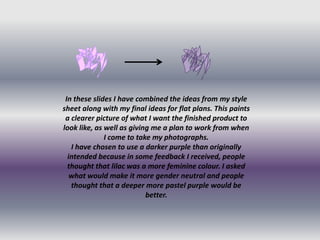
- 1. In these slides I have combined the ideas from my style sheet along with my final ideas for flat plans. This paints a clearer picture of what I want the finished product to look like, as well as giving me a plan to work from when I come to take my photographs. I have chosen to use a darker purple than originally intended because in some feedback I received, people thought that lilac was a more feminine colour. I asked what would make it more gender neutral and people thought that a deeper more pastel purple would be better.
- 2. I chose to use this kind of picture because in my research I found that the majority of front covers us mid-shots of a person/band. They do this so that the reader feels instantly connected to the person on the magazine cover, and therefore with the magazine. This makes it seem more personal to you, making you want to buy it.
- 3. For the contents page I have chosen to use a range of studio and live shots, this is to show the variation of cover lines within the magazine. This helps to show that the magazine isn’t just about one thing, it is variable and has something for everyone. Therefore it appeals to a larger target audience. I have used a range of photos from close up, to long shot. This is so the audience feels like they know the bands from every angle and also gives the magazine more visual variation.
- 4. For the DPS I wanted both pages to feel connected, so I have chosen photographs that interact with each other. I have chosen a variety of shots, ranging from long shots to close up. This gives the reader more visual information about the person they are reading about, so they feel as if they know more about them.