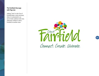
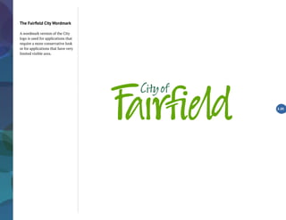
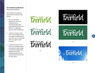
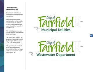
Download as PDF, PPTX


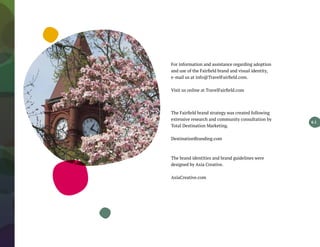

The document serves as a comprehensive brand guideline for Fairfield, Iowa, detailing how to effectively communicate the city's unique identity and experiences to various target audiences. It outlines the brand's essence, promises, pillars, and personality, coupled with visual identity elements such as logos and color schemes. The guidelines aim to unify brand messaging, enhance public perception, and attract visitors, residents, and businesses by promoting Fairfield as a creative and eclectic small city.


