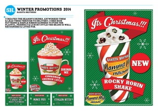
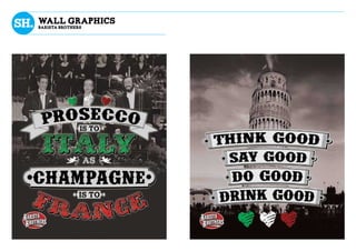
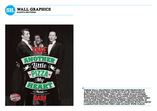
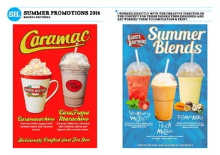
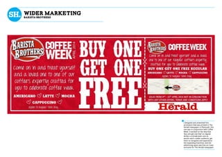
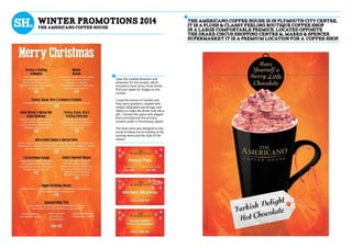
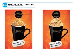
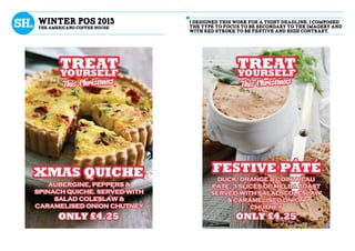
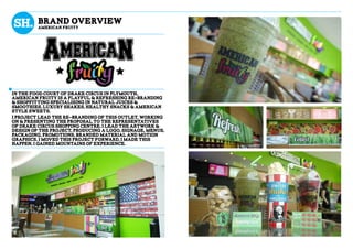
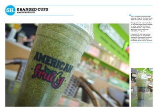
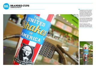
Samy Harford has over 5 years of experience as a graphic designer at Boutique Coffee Brands LTD. He has led the creative process for numerous branding and design projects including The Caffeine Club, Barista Brothers, The Americano Coffee House, and American Fruity. His roles have included concept creation, branding, packaging, print, and motion graphic design.
Our unrivaled experience, creative solutions, and fresh design activate the art and science of place branding for small cities, regions and downtowns. Avia PlaceBrands produces the research, brand identity and design to promote communities as compelling destinations for visitors, investors, shoppers, and new residents.
I grew up in a clothing retail environment, and began experimenting with merchandising at a young age. By my teen years, I was solely responsible for our store windows and mannequins, along with photos for social media.
I worked for Whole Foods for two years in the Prepared Foods Department, where I gained experience with creating appealing food displays. I aided in opening a locally-sourced market, where I worked from March 2016 to November 2017 as Social Media Manager, then Assistant Store Manager. I was responsible for many aspects of the store, including keeping inventory, setting up the product database, social media posts, photography, displays, and signage.
I am currently a sales associate at the largest wine and spirits shop in Memphis, where I have become responsible for all displays, merchandising, and most creative signage.
My current portfolio of graphic design, brand activation and product merchandising campaigns from various agencies I worked at in South Africa from 2004 until present.
2. Boutique Coffee Brands LTD
Jan 2013-Present
Plymouth - devon - uk
As part of the creative team including a creative
director, senior designer, web designer and myself
as a graphic designer, I have been a keystone of the
creative process from concept right through to the
completion of a huge range of commerical projects.
Ba(hons) Graphic Design
Plymouth college of art
sept 2010 - may 2013
Emma Bartlett
Creative director - boutique coffee brands
RIchard dow
senior designer - st.austell brewery
I have been a key role in the setup, project
management and creative direction of new and
franchising brands including The Hyde Park
Microbrewery, American Fruity and Barista
Brothers. My specialties are Branding and
Corporate Identity, Motion Graphics, Packaging
design and Print Design.
What i do
Design history
Education
References
boutique coffee brands ltd
a selection of the brands i worked with
the Caffeine club
24 hour boutique restaurant.
the americano coffee house
South American inspired coffee house.
Barista brothers
Italian inspired coffee house.
Carpe diem
Champagne & cocktail bar.
goodbodys cafe
24 hour all day breakfast restaurant.
The hyde park microbrewery
Traditionally inspired pub & microbrewery
American Fruity
American inspired juices and milkshakes.
Emma cooper
Singer & songwriter.
my skills
digital skills
find my motion graphics showreel at /samy harford
Concept Creation
Hierarchy
Motion graphics
TYPOGRAPHY
storyboarding
illustration
Photography
Print Design
Content Organisation
Artworking
samy harford
I create immersive visuals & great ideas
samy.harford@gmail.comContact me 07592 538 978
richardjdow@hotmail.co.uk
emma.cdnh@hotmail.co.uk
07969 840 081
07795 600 939
3. This was the first project i worked on with the
company & i was still studying, i quickly learned a
lot they did not teach me in university. I worked on
menus, layouts, house styles & branded material. It
has now been open and flourishing with trade for
more than two years, it’s an excellent place to visit.
The caffeine club is a 24 hour restaurant in the
heart of the student hub in the city of plymouth,
right between the city centre & the night life of
north hill, this brand is vibrant, quirky & cheeky,
brand overview
the caffeine club
4. winter day menu 2014
the caffeine club
I collaborated with the senior
designer, a director and a supplier
to define the updates, style and new
offerings for this seasonal menu, I
then artworked the menu and had I
printed on 300gsm semi gloss.
5. winter night menu 2014
the caffeine club
As The Caffiene Club is open all day
and night, the food menus change
for the late and early hours. The
typeface used to title the food items
in much more legible to help the
customers of the early hours.
6. wider marketing
BaRISTA bROTHERS
I had the idea to use a high margin
product for a buy one get one free
promotion, so it would at least
break even. I worked with the media
company for The Herald to get this
advert printed free. This was printed
in the Plymouth Herald newspaper
for four days. I created a simple
map using local landmarks making
directions as simple as possible. This
promotion was hugely successful.
7. I was commissioned to create a
booklet containing all the collected
poetic works of my creative
director’s departed grandmother, as
she has always wanted it to be made
into a book. This was on a very
tight deadline and included vintage
photos with a wealth of handwritten
material. Producing such a personal
piece was a challenge and a
pleasure. I used a softly decorative
and elegant serif to display the large
body of information. I matched the
subject matter of the photography
with the poetry and organised
it in chronological order where
appropriate. The books were given
out at the wake of the funeral.
DOROTHY A. STIMPSON
collected works of poetry
8. Immersive and warming, this
brand was conceived to be for the
community and, somewhere to relax
and lose yourself in. Rich textures,
playful art style, and aspirational
values are always a consideration of
tone of voice when concepting and
artworking for this brand.
This brand, born and grown in plymouth is an italian-
american inspired boutique coffee shop, it has has
expanded to new shop spaces and become franchise.
I worked shop space proposals, wall graphics,
seasonal promotions, branded material & menus.
brand overview
BaRISTA bROTHERS
9. wINTER promotions 2014
BaRISTA bROTHERS
i created the season’s drinks, artworked them
& lead them through to delivery. i used rich
patterns & simple ribbon banners to push the
playful, friendly & luxury style the brand is well
recognised & loved for.
11. wall graphics
BaRISTA bROTHERS
These wall graphics I conceived and produced in
a set of four for the fifth outlet in the Barista
brothers franchise. They are large scale 1000mm
x 1200mm mixing the ideas of classic iconic imagery
with aspirational typographical compositions. They
are in the first shop space where the franchise is
focusing on being a restaurant. Printed with a liquid
lamination coating they are an easy wipe clean.
12. summer promotions 2014
BaRISTA bROTHERS
i worked directly with the creative director on
the concept for these drinks then designed and
artworked them to completion & print.
13. I designed and artworked this
promotion that was printed in The
Herald newspaper in Plymouth, this
one was in conjunction with Coffee
Week. It worked on the idea that
‘buy one get one free’ on regular
drinks is a break-even cost so
would reach a wider audience, get
them to recognise and experience
the expanding franchise, and the
advertising space was free as it was
exclusive for The Herald newspaper.
wider marketing
BaRISTA bROTHERS
16. winter pOS 2013
the americano coffee house
i designed this work for a tight deadline. i composed
the type to focus to be secondary to the imagery and
with red stroke to be festive and high contrast.
17. winter promotions 2013
the americano coffee house
i designed this work for a tight deadline. i composed
the type to focus to be secondary to the imagery and
with red stroke to be festive and high contrast.
18. wider marketing
The Americano coffee house
I designed and artworked this
promotion that was printed in The
Herald newspaper in Plymouth,
this followed the same idea that
had worked for Barista Brothers. I
used a similar interpretation for the
map as i produced for The Caffiene
Club but with the artistic style of
The Americano. This promotion was
hugely popular and effective.
19. STEVE & EMMA
invite you
to join them
Their commitments
to each other
18.10.2014
5PM RECEPTION
18.10.2014
celebration@thebartletts.biz
1 Clarham court, Seymour Rd
Mannamead, PL3 5AU
or by phone on 01752 668888
Please inform us of your company a.s.a.p
R.s.v.p by email @
Modern commitment
Contemporary celebration of love
I was commissioned to produce two
invitations and cocktail menu for a
contemporary wedding for directors
in the company.
I designed the invitations to be DL
letter scale easy posting to guests.
Stylistically I designed the invite for
the ceremony to be simple, elegant
and subtly ornate. For the invite for
the reception was to be referencing
the art deco style and a lot more
decorative.
I created the cocktail menu as a
bespoke laser-cut wooden menu
for the tables and bar. I wanted
to create an item that would be a
memento of the occasion. I gave the
wood a soft stain finish.
20. bRAND OVERVieW
AMERICAN FRUITY
in the food court of drake circus in plymouth,
american fruity is a playful & refreshing re-branding
& shopfitting specialising in natural juices &
smoothies, luxury shakes, healthy snacks & american
style sweets.
I project lead the re-branding of this outlet, working
on & presenting the proposal to the representatives
of drake circus shopping centre. i lead the artwork &
design of the project, producing a logo, signage, menus,
packaging, promotions, branded material and motion
graphics. I moved this project forward, i made this
happen, i gained mountains of experience.
21. sIGNAGE
AMERICAN FRUITY
I created the design for the signage, communicated
with our contractor & made this ideA A mammoth
bespoke piece of signage that not only contends
with, but overshadows the international brands in
direct competition IN THE FOOD COURT.
22. mENU LIGHTBOXS
AMERICAN FRUITY
Here are the menu boards for
smoothies and juices at American
Fruity in Drake Circus. I worked
into the American varsity style by
displaying the information in a
scoreboard format. The boards
themselves are light-boxes, I made
sure light was used through the
surface effectively. The printing
process was that the top layer of
colour vinyl was all applied to the semi
opaque film. The process amplified
the light of the white type.
23. mENU LIGHTBOXS
AMERICAN FRUITY
Above is the super juices and power
shakes board.
These premium products are
juices with supplement shots and
milkshakes with protein powder.
I developed the varsity style
established from the smoothies and
juices boards with the contemporary
styles of HUD’s with a rich black
background to give higher contrast
and vibrancy to the light coming
through the type and set it apart
form the other menus as a premium
product range.
24. mENU LIGHTBOXS
AMERICAN FRUITY
This is the United Shakes of America
menu. This is a sub-brand at
American Fruity and is sold in its
own branded take away cup that I
designed and developed with my
creative director.
This is a playful brand that applies
classic American themes for names
and classic American flavours to
premium milkshakes.
Since launching in summer 2013
this sub brand alone has sold nearly
23,000 units at American Fruity in
Drake Circus, Plymouth.
25. BRANDED CUPS
AMERICAN FRUITY
This is the plastic disposable take-
away cup design for American Fruity.
There are two sizes, 16oz and 20oz.
The logo is bolder and simpler than
for the main brand icon and signage
for better legibility. The colour is
simplified to have a high contrast
against the strong outline and
reduce the printing cost.
I designed this bold logo to go on
the packaging to be recognisable
at distance and maintain the brand
recognition that will have been
established at the point of purchase.
26. BRANDED CUPS
AMERICAN FRUITY
I designed this cup from a brief by
the creative director. Inspired by
the American flag and dollar bill I
artworked it to be playful, fun and
memorable for the bold colour and
illustration of George Washington
happily enjoying a milkshake.
This was the first packaging project
that I had taken artistic lead, I learnt
about the variance of price against
quality, lead times, bleed and trim
on this style of product.
Being the integral part of this
project on all aspects gave me vast
responsibility in the delivery of the
whole project, I grew as a designer.
27. POS motion graphics
AMERICAN FRUITY
i WORKED INTO THE IDEA displaying animations with
ASPIRATIONAL TAG LINES ON OF THE TV SCREENS OF THE
OUTLET, COMMUNICATING THE EXPLOSIVE ENERGY OF THE
HEALThY ALTERNATIVE THAT THEY OFFER,
WATCH THE VIDEOS HERE
/samy harford
28. EMMA COOPER FT. MOXX
i CREATED INTRO & OUTRO TITLES FOR A DUO OF ACOUSTIC
VIDEOS WITH FILM ARTIST BRENT ZILLWOOD SET IN THE
INDEPENDeNT RECORD STORE LAST SHOP STANDING.
WATCH THE VIDEO HERE
29. Working with all the people in this
collaborative process was fascinating
and really enjoyable. I wanted to
play with the simplicity of lines in
the transitions between information,
and balancing the legibility with time
with the transitions of line and type.
EMMA COOPER FT. MOXX
WATCH THE VIDEO HERE
31. tHIS WORK WAS IN CONNECTION TO PITCHING FOR A UNIT
SPACE OPENING IN DErRIFORD HOSPITAL IN PLYMOUTH. I
REDESIGNED THE UNIFORM & LOYALTY CARD AS WELL AS
VISUAL INTERPRITATIONS OF STORE LAYOUT to support the
administrative work the directors wanted to present.
Concept artwork
jUICE MOOSE
32. A microbrewery was built on site in the cellar,
it was a key USP for the pub, as well as locally
sourced produce and historical photography of the
area, This pub celebrated the local area’s quality.
This historic Plymouth pub was saved as a community
asset by Boutique Coffee Brands. The senior designer
& myself were briefed by the directors to create
an identity that echoed the authenticity of the
heritage and to launch the brand.
i worked on the branding, signage, sourcing &
producing food & wine menus, branded glassware,
POS, beer fonts for the microbrewery and invites
for the opening night. i Balanced my time to work on
multiple elements to tight deadlines.
brand overview
the Hyde Park Microbrewery
33. GRENACHE BLANC LES TERRASSES, 2011/12, FRANCE
WHITE FLOWERS, LEMON CAKE WITH INTENSELY RICH FLAVOURS.
175ML £3.95 250ML £4.95 BOTTLE £11.95
GRENACHE BLANC
LES TERRASSES, 2011/12, FRANCE
WHITE FLOWERS, LEMON CAKE WITH INTENSELY
RICH FLAVOURS.
175ML £3.95 250ML £4.95 BOTTLE £11.95
PINOT GRIGIO WATERS EDGE, 2012/13, AUSTRALIA
CRISP CITRUS FLAVOURS BURSTING ON THE TONGUE & A TANGY FINISH.
175ML £3.95 250ML £4.95 BOTTLE £11.95
PLENO BLANCO PRINCIPE DE VIANA, 2012/13. NAVARRA
BRIGHT STRAW YELLOW. IT IS SMOOTH, FRESH, DRY AND WELL BALENCED WITH DELICATE FRUITY
NOTES.
Bottle £14.95
CHENIN BLANC FALSE BAY. 2011/12. SOUTH AFRICA
GENTLE RIPE APPLE AND HONEY AROMAS, FOLLOWED BY DELICIOUS GREENGAGE AND CITRUS
LEMON ACIDITY ON THE LONG FINISH.
Bottle £14.95
SAUVIGNON BLANC SPRING CREEK ESTATE. 2011/12. NZ
CRISP, FRESH AND LIVELY, WITH RIPE PASSION FRUIT, GOOSEBERRY, AND LIME FLAVOURS THAT
FLOW WELL TO A DRY LINGERING FINISH.
Bottle £18.95
CHABLIS DOMAINE SEGUINOT-BORDET. 2011/12. FRANCE
CLEAN CHARDONNAY CHARACTERISTICS WITH FLORAL, HONEY FLAVOURS. STEELY DRY. ONE OF
CHABLIS’ OLDEST ESTATES. AN OUTSTANDING EXAMPLE OF THIS APPELLATION.
Bottle £24.95
CHARDONNAY MOSCATO
MERLOT/GRENACHE LES TERRASSES, 2011/12, FRANCE
SOFT & RIPE RED FRUITS WITH A TOUCH OF SPICE & A SMOOTH FINISH.
175ML £3.95 250ML £4.95 BOTTLE £11.95
FILL YOUR GLASS
WITHOUT EMPTYING
YOUR POCKET
ALL THE FLAVOUR
LESS ALCOHOL
SHIRAZ WATERS EDGE, 2011/12, AUSTRALIA
SOFT & ROUND RIPE BERRY FRUIT FLAVOURS & A LIGHT SPICY FINISH.
175ML £3.95 250ML £4.95 BOTTLE £11.95
PINOT NOIR LOS GANSOS, 2012/13, CHILE
AROMAS OF BERRIES, BLACK CHERRIES AND SWEET FRUITS MIX WITH HINTS OF TOASTY OAK.
FINE TANNINS GIVE A RICH TEXTURE IN THE MOUTH.
BOTTLE £14.95
RIOJA VEGA 2010/11, SEMI-CRIANZA, SPAIN
A CAREFUL BLEND OF EQUAL PARTS OF GARNACHA AND GRACIANO PRODUCES THIS
FLAVOURSOME BALANCED WINE. SMOOTH, DELICIOUS AND STYLISH.
BOTTLE £14.95
COTES DU RHONE DOMAINE BERTHET-RAYNE, 2010/11, FRANCE
A VERY FINE DARK RED WINE WITH A FRUITY NOSE REMINISCENT OF RIPE FRUIT. SMOOTH
PALATE, SPICY FINISH WITH A HINT OF VANILLA. ORGANIC PRODUCTION.
BOTTLE £18.95
FLEURIEDOMAINE DE LA PRESLE. 2011/12. FRANCE
ELEGANT, FULL BODIED AND VELVETY SMOOTH. DELIGHTFULLY FRAGRANT AND FRUITY, WITH
AROMAS OF VIOLETS, ROSES AND IRIS, TOGETHER WITH A GARNET COLOUR.
BOTTLE £24.95
CABERNET SAUVIGNON
PIER 42 MERLOT PIER 42 SAUVIGNON BLANC
CABERNET SHIRAZ
"Enough Of This and You'll Become Attractive
"
"The Lady in Red, Full Bodied and Smooth
" "Given Enough, I Could Rule the World
"
"Some People Name Their Children After This Stuff
"
GRENACHE/SYRAH ROSE
LES TERRASSES. 2011/12. FRANCE
FRESH, DELICIOUSLY DRY BERRY FRUITS.
175ML £3.95 250ML £4.95 BOTTLE £11.95
"Perfectly Matched
with our Goats Cheese Salad
"
"Delightfully Paired
with our Wholetail Scampi
"
HOUSE RECOMMENDSHOUSE RECOMMENDS
175ML £3.50 250ML £4.50 BOTTLE £9.95 175ML £3.50 250ML £4.50 BOTTLE £9.95
CLASSIC FAVOURITES
175ML £4.25 250ML £5.25 BOTTLE £14.95 175ML £4.25 250ML £5.25 BOTTLE £14.95
CLASSIC FAVOURITES CLASSIC FAVOURITES
UNDER £10 UNDER £10
175ML £2.50 250ML £3.50 BOTTLE £7.95 175ML £2.50 250ML £3.50 BOTTLE £7.95
LIGHT CHOICE - 3 MILLS RED 8% LIGHT CHOICE - 3 MILLS WHITE 8%
8%8%
PROSÉCCO DOC TREVISO. LA PIEVE. ITALY.
LIGHT STYLE WITH A GENTLY AROMATIC NOSE, AND
CRISP, DELICATE FRESH APPLE FLAVOURS.
125ML £3.50 175ML £4.50
BOTTLE £16.95
BABYCHAM
IT’S TIME TO GET IN THE GROOVE WITH A FUNKY BLAST
FROM THE PAST BECAUSE BABYCHAM, THE ORIGINAL
GIRLIE DRINK IS READY TO PARTY.
BABY BOTTLE £1.95 BIG BOTTLE £7.95
MIONETTO VIVO ROSE ITALY.
REFRESHINGLY LIGHT CHARACTERS OF WILD
STRAWBERRIES. WELL BALANCED, LONG FINISH.
BOTTLE £18.95
PROSÉCCO EMOTIVO ITALY.
THIS HAS A BRIGHT SHIMMERING COLOUR WITH
LIVELY AROMAS OF INTENSE VINE FRUITS.
BOTTLE £18.95
HOUSE CHAMPAGNE N.V. BRUT. FRANCE.
THIS STYLISH HOUSE CHAMPAGNE OFFERS EXCELLENT
QUALITY AND CHARACTER.
BOTTLE £29.95
MOET ET CHANDONBRUT IMPERIAL.
DISTINGUISHED BY ITS BRIGHT FRUITINESS, ITS
SEDUCTIVE PALATE AND ITS ELEGANT MATURITY.
BOTTLE £44.95
LOUIS ROEDERER BRUT PREMIER. FRANCE.
A CHAMPAGNE OF OUTSTANDING QUALITY, THE
LIGHT, FIRM AND ABUNDANT MOUSSE REVEALS
LASTING STREAMS OF SMALL LIGHT BUBBLES.
BOTTLE £49.95
WINEMENU
GRENACHE/SYRAH ROSE LES TERRASSES. 2011/12. FRANCE
FRESH, DELICIOUSLY DRY BERRY FRUITS.
175ML £3.95 250ML £4.95 BOTTLE £11.95
WHITE ZINFANDEL WATERS EDGE, 2012/13, CALIFORNIA
STRAWBERRIES, POMEGRANATE, FLOWERS AND A HINT OF
SWEETNESS.
175ML £3.95 250ML £4.95 BOTTLE £11.95
ALL OUR HOUSE WINE IS
EXPERTLY SELECTED BY OUR
LOCAL SUPPLIERS
HOUSE RECOMMENDS
175ML £3.50 250ML £4.50 BOTTLE £9.95
175ML £2.50 250ML £3.50 BOTTLE £7.95
WHITE GRENACHEMERLOT ROSE
PIER 42 PINOT GRIGIO ROSE
LIGHT CHOICE - 3 MILLS ROSE 8%
"Summer in a Bottle ,Sunshine in a Glass
"
"Birthday ,Anniversary or
Divorce ,Celebrate in Style
"
"Pop the Cork on Your Special Occasion ,
Ask At the Bar For Our Landlords Specials
"
"The Wine for Cheeky and Lighthearted People
"
175ML £4.25 250ML £5.25 BOTTLE £14.95
CLASSIC FAVOURITES
UNDER £10
8%
Wine Menu
The Hyde Park Microbrewery
i broke THE BLOCK CONTENT down IN DECORATIVE
STRUCTURE, this was fun. Decoding how products should
be communicated in hiearchy, that was fascinating.
I sourced the wine from a variety
of suppliers, both locally and
nationally. I then interpreted the
information with a decorative tone
of voice to make the quantity of
content feel palletable. I added
illustrations and tasting pairs with
the food menu. I collaborated with
the senior designer to match styles
with the food menu and brand we
had created.
34. I created concecpts for the onsite microbrewery,
artworked them, made them print ready, organised
them with the printers and implemetned them on
site. i really enjoyed creating these products.
Beer Fonts
the Hyde Park Microbrewery
MANNAMEADMANNAMEAD
35. i designed this menu with elements of the house
styles with a decorative christmas twist and
scaled to sit cosy inside the existing food menu.
Christmas 2014 Menu
The Hyde Park Microbrewery
36. Carpe Diem is a premium cocktail and champagne bar
on north hill, the heart of student night life in
plymouth.
I designed this print promotion to be distributed at
the freshers fair of the university & at key footfall
points in the student populated areas. I kept the
information simple, so it could be easily retained.
I created the map with the simplest points of
reference for the area & kept it in line with the style
of lines in the rest of the print.
Print promotion
Carpe diem