Download to read offline

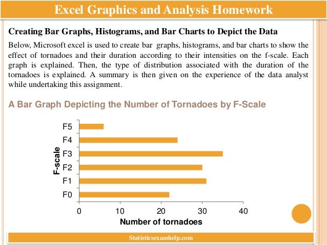


The document provides a comprehensive guide on creating various statistical graphs and analyzing tornado data using Microsoft Excel. It details the relationships between tornado intensity, duration, and the resulting fatalities, concluding that more severe tornadoes significantly increase death counts. Additionally, it highlights the impact of community size on tornado-related deaths, suggesting that tornadoes are more likely to strike rural areas.