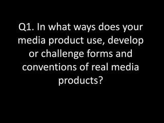
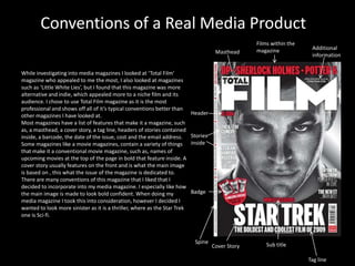
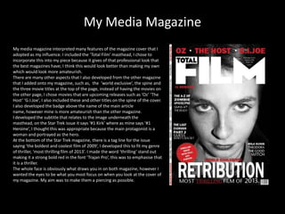
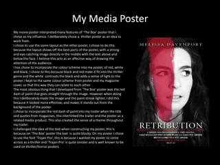
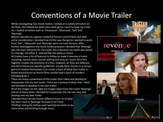
Q1. In what ways does your
media product use, develop
  or challenge forms and
 conventions of real media
        products?
Conventions of a Real Media Product
                                                                                                   Films within the
                                                                                                   magazine            Additional
                                                                                      Masthead
                                                                                                                       information


While investigating into media magazines I looked at ‘Total Film’
magazine who appealed to me the most, I also looked at magazines
such as ‘Little White Lies’, but I found that this magazine was more
alternative and indie, which appealed more to a niche film and its
audience. I chose to use Total Film magazine as it is the most
professional and shows off all of it’s typical conventions better than
other magazines I have looked at.                                          Header
Most magazines have a list of features that make it a magazine, such
as, a masthead, a cover story, a tag line, headers of stories contained
inside, a barcode, the date of the issue, cost and the email address.      Stories
Some magazines like a movie magazines, contain a variety of things         inside
that make it a conventional movie magazine, such as, names of
upcoming movies at the top of the page in bold that feature inside. A
cover story usually features on the front and is what the main image
is based on , this what the issue of the magazine is dedicated to.
There are many conventions of this magazine that I liked that I
decided to incorporate into my media magazine. I especially like how
the main image is made to look bold confident. When doing my               Badge
media magazine I took this into consideration, however I decided I
wanted to look more sinister as it is a thriller, where as the Star Trek
one is Sci-fi.


                                                                            Spine                      Sub title
                                                                                     Cover Story

                                                                                                                      Tag line
My Media Magazine
My media magazine interpreted many features of the magazine cover that I
adopted as my influence. I included the ‘Total Film’ masthead, I chose to
incorporate this into my piece because it gives of that professional look that
the best magazines have; I think this would look better than making my own
which would look more amateurish.
There are many other aspects that I also developed from the other magazine
that I added onto my magazine, such as, the ‘world exclusive’, the spine and
the three movie titles at the top of the page, instead of having the movies on
the other page, I chose movies that are upcoming releases such as ‘Oz’ ‘The
Host’ ‘G.I.Joe’, I also included these and other titles on the spine of the cover.
I also developed the badge above the name of the main article
name, however mine is more amateurish than the other magazine.
I developed the subtitle that relates to the image underneath the
masthead, on the Star Trek issue it says ‘#1 Kirk’ where as mine says ‘#1
Heroine’, I thought this was appropriate because the main protagonist is a
woman and portrayed as the hero.
At the bottom of the Star Trek magazine, there is a tag line for the issue
saying ‘the boldest and coolest film of 2009’, I developed this to fit my genre
of thriller, ‘most thrilling film of 2013’. I made the word ‘thrilling’ stand out
making it a strong bold red in the font ‘Trajan Pro’, this was to emphasise that
it is a thriller.
The whole face is obviously what draws you in on both magazine, however I
wanted the eyes to be what you most focus on when you look at the cover of
my magazine. My aim was to make them a piercing as possible.
Conventions of a Movie Poster
                                                                                                           Main Actor
                                                                                      Main
                                                                                      Image

While investigating into movie posters I looked at a variety of
posters on the trailers that I had researched into I purposely chose
to research into Thriller posters as they will have obvious thriller
features, such as text that looks thrilling such as ‘Trajan Pro’.
I looked at several posters, but two posters stood out to me, these
are ‘The Box’ and ‘Salt’ the reason I liked these two posters because
their main image was focused on the face, the reason why I like this
is because it is the best way to portray emotion and because my
trailer is based on a thriller, this was the most effective factor I
needed to include in my poster. In the end I chose ‘The Box’ as the
main influence of my poster. ‘The Box’ shows off the conventions            Eye
better than other posters I have looked at.                                 catching
Most posters have a list of features that make it a poster, such as,        image
the main image which is usually in the centre, the main
actor/actress’ name somewhere on the poster, the name of the
movie, a tag line, movie website, release date, additional
information located somewhere at the bottom of the page.
There are many conventions of this magazine that I liked that I
decided to incorporate into my media poster.                                 Movie
                                                                             Title
                                                                        Tag Line


                                                                                   Additional
                                                                                   information   Movie     Release date
                                                                                                 Website
My Media Poster
My movie poster interpreted many features of ‘The Box’ poster that I
chose as my influence. I deliberately chose a thriller poster as an idea to
work from.
I chose to use the same layout as the other poster, I chose to do this
because the layout shows off the best parts of the poster, with a strong
and eye-catching image directly in the middle with the text above and
below the face. I believe this acts as an affective way of drawing the
attention of the audience.
I too chose to incorporate the colour scheme into my poster, of red, white
and black; I chose to this because black and red make it fit into the thriller
genre and the white contrasts the black and adds a sense of light to the
poster. I kept to the same colour scheme from poster and my magazine
cover, so that this way they can relate to each other.
The most obvious thing that I developed from ‘The Box’ poster was the red
dash of paint that goes straight through the image. However when doing
this I deliberately made the image and the paint streak lighter, I did this
because it looked more effective, and makes it stands out from the
background of the poster.
I chose to incorporate the red dash of paint into my trailer when the title
and quotes from magazines, this interlinked the trailer and the poster as a
related media product. This also created the sense of a theme throughout
my trailer.
I challenged the idea of the text when constructing my poster, this is
because on ‘The Box’ poster the text is quite blocky. On my poster I chose
to use the font ‘Trajan Pro’, this is because I wanted my poster to come
across as a thriller and ‘Trajan Pro’ is quite sinister and is well known to be
used on thriller/horror posters.
Conventions of a Movie Trailer
While investigating into movie trailers I looked at a variety of trailers on
YouTube, this helped me determine what genre I want to base my trailer
on, I looked at trailers such as ‘Possession’, ‘Obsessed’, ‘Salt’ and
‘Revenge’.
Before I decided on a genre I looked at horrors and thrillers, but after
some consideration I decided that thriller was the genre I wanted to work
from ‘Salt ‘, ‘Obsessed’ and ‘Revenge’ were my main focuses. After
further investigations into these media products I decided that ‘Revenge’
was the main influence for my trailer, this is because my trailer was based
on revenge, therefore it seemed like the obvious choice.
All trailers have a list of features to follow to make it become a trailer
including, camera shots, sound, editing and mise-en-scene, all of this
together creates the elements of a film. However, all films are different
and don’t follow any specific guidelines. Usually films choose to a certain
genre to involve themselves in to create a basis of what their trailer is
based around.(such as horror films usually have a basis of murder/
kidnapping etc.)
There are many conventions of this trailer that I liked and decided to
incorporate into my own trailer. There are a variety of shots that I liked
and decided to develop in my own trailer.
All of the images on the right are images taken from the trailer ‘Revenge’,
and all of these shots I decided to incorporate into my own idea and
develop into my own trailer.
I decided that I would choose different music to of what
has been used in ‘Revenge’ because it isn’t that
‘thrilling’ and quite mellow and I wanted my trailer to be
more tense and thrilling through music .
My Media Trailer
My media trailer interpreted many features of the trailer ‘Revenge’, there are
some shots that I chose to incorporate into my own trailer, I deliberately
chose this trailer to work from because it is a thriller and also based on
revenge, so it is an easy trailer to relate to.
I chose a variety of shots from the trailer ‘Revenge’ and decided to develop
them into my own idea and include in my own trailer. I chose to do an ident
and a title that doesn’t particularly relate to my chosen trailer. However, I did
use the colour scheme of red, white and black and used this to make my
title. I used the red paint strike through the title on the trailer like the one on
the poster, this is so that they are easy to relate and act as a theme of my
media product.
In the trailer ‘Revenge’ there are many close up’s used this is to emphasize
emotion and expression of the character. I thought that this was a clever
technique to incorporate into my trailer.
There is a quick shot on the trailer ‘Revenge’ of a girl running in an open area
, I again used this in my trailer.
There is also a theme of a gun being used in ‘Revenge’, I decided to
incorporate this into my own trailer to emphasize the genre and the idea of
‘Revenge’.
However I challenged the idea of location because the location of ‘Revenge’
is near the sea, where as mine is located in a village using the streets and
fields located round Gloucester, this made my trailer more gritty.
I decided that I wanted my trailer to be less dramatic than
‘Revenge’, and I decided that I wanted my trailer to be more of a
sense of violence than ‘Revenge’.
There is a voiceover used in ‘Revenge’ and I decided to use this
instead of speech in my trailer, because it has a more tense affect
when it is combined with music.

In what ways does your media prod

  • 1.
    Q1. In whatways does your media product use, develop or challenge forms and conventions of real media products?
  • 2.
    Conventions of aReal Media Product Films within the magazine Additional Masthead information While investigating into media magazines I looked at ‘Total Film’ magazine who appealed to me the most, I also looked at magazines such as ‘Little White Lies’, but I found that this magazine was more alternative and indie, which appealed more to a niche film and its audience. I chose to use Total Film magazine as it is the most professional and shows off all of it’s typical conventions better than other magazines I have looked at. Header Most magazines have a list of features that make it a magazine, such as, a masthead, a cover story, a tag line, headers of stories contained inside, a barcode, the date of the issue, cost and the email address. Stories Some magazines like a movie magazines, contain a variety of things inside that make it a conventional movie magazine, such as, names of upcoming movies at the top of the page in bold that feature inside. A cover story usually features on the front and is what the main image is based on , this what the issue of the magazine is dedicated to. There are many conventions of this magazine that I liked that I decided to incorporate into my media magazine. I especially like how the main image is made to look bold confident. When doing my Badge media magazine I took this into consideration, however I decided I wanted to look more sinister as it is a thriller, where as the Star Trek one is Sci-fi. Spine Sub title Cover Story Tag line
  • 3.
    My Media Magazine Mymedia magazine interpreted many features of the magazine cover that I adopted as my influence. I included the ‘Total Film’ masthead, I chose to incorporate this into my piece because it gives of that professional look that the best magazines have; I think this would look better than making my own which would look more amateurish. There are many other aspects that I also developed from the other magazine that I added onto my magazine, such as, the ‘world exclusive’, the spine and the three movie titles at the top of the page, instead of having the movies on the other page, I chose movies that are upcoming releases such as ‘Oz’ ‘The Host’ ‘G.I.Joe’, I also included these and other titles on the spine of the cover. I also developed the badge above the name of the main article name, however mine is more amateurish than the other magazine. I developed the subtitle that relates to the image underneath the masthead, on the Star Trek issue it says ‘#1 Kirk’ where as mine says ‘#1 Heroine’, I thought this was appropriate because the main protagonist is a woman and portrayed as the hero. At the bottom of the Star Trek magazine, there is a tag line for the issue saying ‘the boldest and coolest film of 2009’, I developed this to fit my genre of thriller, ‘most thrilling film of 2013’. I made the word ‘thrilling’ stand out making it a strong bold red in the font ‘Trajan Pro’, this was to emphasise that it is a thriller. The whole face is obviously what draws you in on both magazine, however I wanted the eyes to be what you most focus on when you look at the cover of my magazine. My aim was to make them a piercing as possible.
  • 4.
    Conventions of aMovie Poster Main Actor Main Image While investigating into movie posters I looked at a variety of posters on the trailers that I had researched into I purposely chose to research into Thriller posters as they will have obvious thriller features, such as text that looks thrilling such as ‘Trajan Pro’. I looked at several posters, but two posters stood out to me, these are ‘The Box’ and ‘Salt’ the reason I liked these two posters because their main image was focused on the face, the reason why I like this is because it is the best way to portray emotion and because my trailer is based on a thriller, this was the most effective factor I needed to include in my poster. In the end I chose ‘The Box’ as the main influence of my poster. ‘The Box’ shows off the conventions Eye better than other posters I have looked at. catching Most posters have a list of features that make it a poster, such as, image the main image which is usually in the centre, the main actor/actress’ name somewhere on the poster, the name of the movie, a tag line, movie website, release date, additional information located somewhere at the bottom of the page. There are many conventions of this magazine that I liked that I decided to incorporate into my media poster. Movie Title Tag Line Additional information Movie Release date Website
  • 5.
    My Media Poster Mymovie poster interpreted many features of ‘The Box’ poster that I chose as my influence. I deliberately chose a thriller poster as an idea to work from. I chose to use the same layout as the other poster, I chose to do this because the layout shows off the best parts of the poster, with a strong and eye-catching image directly in the middle with the text above and below the face. I believe this acts as an affective way of drawing the attention of the audience. I too chose to incorporate the colour scheme into my poster, of red, white and black; I chose to this because black and red make it fit into the thriller genre and the white contrasts the black and adds a sense of light to the poster. I kept to the same colour scheme from poster and my magazine cover, so that this way they can relate to each other. The most obvious thing that I developed from ‘The Box’ poster was the red dash of paint that goes straight through the image. However when doing this I deliberately made the image and the paint streak lighter, I did this because it looked more effective, and makes it stands out from the background of the poster. I chose to incorporate the red dash of paint into my trailer when the title and quotes from magazines, this interlinked the trailer and the poster as a related media product. This also created the sense of a theme throughout my trailer. I challenged the idea of the text when constructing my poster, this is because on ‘The Box’ poster the text is quite blocky. On my poster I chose to use the font ‘Trajan Pro’, this is because I wanted my poster to come across as a thriller and ‘Trajan Pro’ is quite sinister and is well known to be used on thriller/horror posters.
  • 6.
    Conventions of aMovie Trailer While investigating into movie trailers I looked at a variety of trailers on YouTube, this helped me determine what genre I want to base my trailer on, I looked at trailers such as ‘Possession’, ‘Obsessed’, ‘Salt’ and ‘Revenge’. Before I decided on a genre I looked at horrors and thrillers, but after some consideration I decided that thriller was the genre I wanted to work from ‘Salt ‘, ‘Obsessed’ and ‘Revenge’ were my main focuses. After further investigations into these media products I decided that ‘Revenge’ was the main influence for my trailer, this is because my trailer was based on revenge, therefore it seemed like the obvious choice. All trailers have a list of features to follow to make it become a trailer including, camera shots, sound, editing and mise-en-scene, all of this together creates the elements of a film. However, all films are different and don’t follow any specific guidelines. Usually films choose to a certain genre to involve themselves in to create a basis of what their trailer is based around.(such as horror films usually have a basis of murder/ kidnapping etc.) There are many conventions of this trailer that I liked and decided to incorporate into my own trailer. There are a variety of shots that I liked and decided to develop in my own trailer. All of the images on the right are images taken from the trailer ‘Revenge’, and all of these shots I decided to incorporate into my own idea and develop into my own trailer. I decided that I would choose different music to of what has been used in ‘Revenge’ because it isn’t that ‘thrilling’ and quite mellow and I wanted my trailer to be more tense and thrilling through music .
  • 7.
    My Media Trailer Mymedia trailer interpreted many features of the trailer ‘Revenge’, there are some shots that I chose to incorporate into my own trailer, I deliberately chose this trailer to work from because it is a thriller and also based on revenge, so it is an easy trailer to relate to. I chose a variety of shots from the trailer ‘Revenge’ and decided to develop them into my own idea and include in my own trailer. I chose to do an ident and a title that doesn’t particularly relate to my chosen trailer. However, I did use the colour scheme of red, white and black and used this to make my title. I used the red paint strike through the title on the trailer like the one on the poster, this is so that they are easy to relate and act as a theme of my media product. In the trailer ‘Revenge’ there are many close up’s used this is to emphasize emotion and expression of the character. I thought that this was a clever technique to incorporate into my trailer. There is a quick shot on the trailer ‘Revenge’ of a girl running in an open area , I again used this in my trailer. There is also a theme of a gun being used in ‘Revenge’, I decided to incorporate this into my own trailer to emphasize the genre and the idea of ‘Revenge’. However I challenged the idea of location because the location of ‘Revenge’ is near the sea, where as mine is located in a village using the streets and fields located round Gloucester, this made my trailer more gritty. I decided that I wanted my trailer to be less dramatic than ‘Revenge’, and I decided that I wanted my trailer to be more of a sense of violence than ‘Revenge’. There is a voiceover used in ‘Revenge’ and I decided to use this instead of speech in my trailer, because it has a more tense affect when it is combined with music.