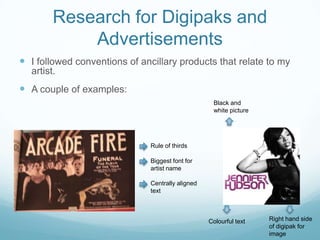
Question 1
In what ways does you media products use, develop or
challenge forms and conventions of real media products?
Vernallis
After researching Vernallis’ theories for what
makes music video different to a film, my group
and I have used frequent edits in the editing
process so that it keeps the viewer interested.
Our Music video also fits the disjuncture style
category, as there is no obvious narrative; there is
a bigger focus on stylistic features such as slow/
fast motion editing, as well as the main focus
being on the singer.
Goodwin
Looking back at Goodwin’s theory, I realise this has
influenced my music video as the main focus is on the
singer as a narrator and character as the artist looks
directly at the camera as an extension of the performance
to try to engage the audience. Our music video also
makes use of repetition of certain scenes to make them
familiar to the audience.
Intertextuality
Intertextuality of some mise en scene features have influenced my
groups video, especially to relate to the target audience, through urban
locations and rhythms in other songs can highlight a specific genre.
However we have challenged the idea of intertextualising through
rhythms, as we edit on the beat of the base line, as well as often crosscutting in terms of the lyrical rhythm.
Pop videos and songs have a form of closure; as the song ends it
builds to a climax or to a constant repetition before fading away. Our
music video corresponds to this as it is more heavily edited towards the
end of the song as it builds to a climax.
Similar artist inspirations
Some of the particular videos that have influenced our music video
are dub-step videos such as Datsik ‘Fully blown’, as we have used
similar stylistic features for editing as there is editing match cuts with
the singer/ character at the same distance away from the camera but
in front of a different background. This is in order to appeal to viewers
that like the dub-step genre and the visual style of this genre.
Also the female singer as the main focus in front of the camera has
been an influence by Jessie j and Azealia Banks so this can relate to
the target audience of young adult, females. As well as Olly Murs and
Azealia Banks in terms of locations to appeal to viewers that live in
urban locations.
Links to Similar artist
influences
1. http://www.youtube.com/watch?v=i3Jv9fNPjgk

2. http://www.youtube.com/watch?v=pOf3kYtwASo
3. http://www.youtube.com/watch?v=vlaAhikR4Rg
4. http://www.youtube.com/watch?v=j5dFe-WKuPs
How conventional is your digipak
and advertisement?
I think my ancillary products are very conventional as I
have used the rule of thirds for my advertisement in terms
of the layout; the image takes up two thirds of the advert
and the other third contains information about the
artist, release date... Also I have made sure that the text is
clearly spaced out, in the same font and colour on both
the digipak and advertisement.
What conventions of both genres
did you decide to use?
I have used intertextuality for my artist identity to become
familiar and recognisable to fans/ audience. I have achieved
this through repeating images of the artist, the graffiti wall from
the music video, as well as the same text style. The graffiti wall
promotes the urban genre of the artist. The close up of the
artists face with eye contact allows this new artist to connect to
the audience and they can recognise the artist's face. The
colours reflect the style of the artist as quite intense with black
and white, but with also a burst of colour that suggests a more
dance-music style. On the ancillary products, the artists name
is the text in the biggest size to stand out.
Through this I have followed all of the conventions of common
ancillary products.
Research for Digipaks and
Advertisements
 I followed conventions of ancillary products that relate to my
artist.

 A couple of examples:
Black and
white picture

Rule of thirds
Biggest font for
artist name
Centrally aligned
text

Colourful text

Right hand side
of digipak for
image
Which did you decide to
challenge in some ways?
In some ways I have challenged the conventions of my
artist's music genre (dub-step/ garage) by putting a close
up image of the artists face on the ancillary
products, usually this genre puts a focus more on the
music than the artist. However I feel this image is most
effective because I am trying to promote a new artist, so
in order to get the audience familiar with the artist initially I
think that this is necessary.
Final cut pro – Images of influential
videos/ ancillary compared to my own

Evaluation Question 1 Esme

  • 1.
    Question 1 In whatways does you media products use, develop or challenge forms and conventions of real media products?
  • 3.
    Vernallis After researching Vernallis’theories for what makes music video different to a film, my group and I have used frequent edits in the editing process so that it keeps the viewer interested. Our Music video also fits the disjuncture style category, as there is no obvious narrative; there is a bigger focus on stylistic features such as slow/ fast motion editing, as well as the main focus being on the singer.
  • 4.
    Goodwin Looking back atGoodwin’s theory, I realise this has influenced my music video as the main focus is on the singer as a narrator and character as the artist looks directly at the camera as an extension of the performance to try to engage the audience. Our music video also makes use of repetition of certain scenes to make them familiar to the audience.
  • 5.
    Intertextuality Intertextuality of somemise en scene features have influenced my groups video, especially to relate to the target audience, through urban locations and rhythms in other songs can highlight a specific genre. However we have challenged the idea of intertextualising through rhythms, as we edit on the beat of the base line, as well as often crosscutting in terms of the lyrical rhythm. Pop videos and songs have a form of closure; as the song ends it builds to a climax or to a constant repetition before fading away. Our music video corresponds to this as it is more heavily edited towards the end of the song as it builds to a climax.
  • 6.
    Similar artist inspirations Someof the particular videos that have influenced our music video are dub-step videos such as Datsik ‘Fully blown’, as we have used similar stylistic features for editing as there is editing match cuts with the singer/ character at the same distance away from the camera but in front of a different background. This is in order to appeal to viewers that like the dub-step genre and the visual style of this genre. Also the female singer as the main focus in front of the camera has been an influence by Jessie j and Azealia Banks so this can relate to the target audience of young adult, females. As well as Olly Murs and Azealia Banks in terms of locations to appeal to viewers that live in urban locations.
  • 7.
    Links to Similarartist influences 1. http://www.youtube.com/watch?v=i3Jv9fNPjgk 2. http://www.youtube.com/watch?v=pOf3kYtwASo 3. http://www.youtube.com/watch?v=vlaAhikR4Rg 4. http://www.youtube.com/watch?v=j5dFe-WKuPs
  • 8.
    How conventional isyour digipak and advertisement? I think my ancillary products are very conventional as I have used the rule of thirds for my advertisement in terms of the layout; the image takes up two thirds of the advert and the other third contains information about the artist, release date... Also I have made sure that the text is clearly spaced out, in the same font and colour on both the digipak and advertisement.
  • 9.
    What conventions ofboth genres did you decide to use? I have used intertextuality for my artist identity to become familiar and recognisable to fans/ audience. I have achieved this through repeating images of the artist, the graffiti wall from the music video, as well as the same text style. The graffiti wall promotes the urban genre of the artist. The close up of the artists face with eye contact allows this new artist to connect to the audience and they can recognise the artist's face. The colours reflect the style of the artist as quite intense with black and white, but with also a burst of colour that suggests a more dance-music style. On the ancillary products, the artists name is the text in the biggest size to stand out. Through this I have followed all of the conventions of common ancillary products.
  • 10.
    Research for Digipaksand Advertisements  I followed conventions of ancillary products that relate to my artist.  A couple of examples: Black and white picture Rule of thirds Biggest font for artist name Centrally aligned text Colourful text Right hand side of digipak for image
  • 11.
    Which did youdecide to challenge in some ways? In some ways I have challenged the conventions of my artist's music genre (dub-step/ garage) by putting a close up image of the artists face on the ancillary products, usually this genre puts a focus more on the music than the artist. However I feel this image is most effective because I am trying to promote a new artist, so in order to get the audience familiar with the artist initially I think that this is necessary.
  • 12.
    Final cut pro– Images of influential videos/ ancillary compared to my own