SlideShare a Scribd company logo
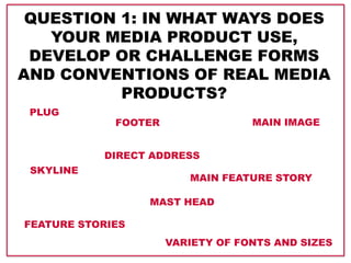
QUESTION 1: IN WHAT WAYS DOES
YOUR MEDIA PRODUCT USE,
DEVELOP OR CHALLENGE FORMS
AND CONVENTIONS OF REAL MEDIA
PRODUCTS?
PLUG
SKYLINE
FOOTER
FEATURE STORIES
MAIN FEATURE STORY
MAIN IMAGE
DIRECT ADDRESS
MAST HEAD
VARIETY OF FONTS AND SIZES
Mast head
Plug
Skyline
Feature stories
Main image
Direct mode of address
Main feature story
Barcode
Footer
Colour scheme
Page title
Feature stories
Page numbers
Sub headings
Main feature story
Main image
Feature story image
Social media
Plug
Pull quote
Issue number
Price
Date
Contact information
Page title
Page number
Pull quote
Main image
More images
Body text
Stand first
Direct mode of address
Drop cap
CONVENTIONS I HAVE USED:
As the two previous slides demonstrated, I have used a variety of
conventions on my front cover, contents page and double page
spread, and since I have followed forms and conventions of
existing magazines, the look of my magazine is very traditional and
conventional.
I have made sure to ensure the continuity between my front cover,
contents page and double page spread. I have done this by making
the same font types reappear on all three. The colour scheme I
have used is the same on the front cover, contents page and double
page spread, which also ensures continuity.
In terms of page numbers, I have made sure that what it said in the
contents matched the page numbers on the double page spread
ensuring continuity.
The font that I used for my mast head is the font as I used for the
contents page title. I have used the ‘E’ from ECHO in the review
section on my contents page. I have also used my mast head on the
double page spread. The repeated use of my mast head and mast
head font ensures continuity throughout the magazine.
I have used the same artist for the main image on my front cover,
contents page and also double page spread. This means that all
throughout the magazine the same artist is the main focus, which
is conventional at the same time as it is ensuring continuity.
The plug on this NME
front cover is placed in
the upper right corner,
and I thought it looked
quite good
Also on NME, there
is used a plus to list
feature stories. I
liked the idea about
using a plus, so I put
one in the middle of
my plug behind the
text, which I think
gives a good effect.
On this Q magazine front cover, the main feature
story goes across the main image at the bottom
of the page. I liked that feature, because it
allows the main feature story to get more
attention than the feature stories, and it also
gives a nice framing of the main image.
The very conventional way of
listing feature stories with a
variety of fonts and sizes,
which I have used on my front
cover, can also be seen on this
Q magazine front cover. Q
magazine is not the only
magazine doing it, I just saw
this particular front cover and
got inspired by the listing of
feature stories.
For my main image, I used a medium shot.
A medium close up would have been more
conventional, but after seeing some
examples of a medium close ups as the
main image, I decided to use that as well. I
think a medium long shot looks really good
in this case, and it gives a nice framing of
the front cover, since the feature stories
can go around my artist’s body.
HOW I HAVE FOLLOWED FORMS AND CONVENTIONS
FROM EXISTING MAGAZINES:
When doing my contents page,
I looked at Q magazine’s
contents page layout.
I used headlines
to separate the
feature stories.
I used the same review box under the
main image. However, the text in my
box in a bit different, and I have also
put social media logos in the box.
I liked the fact that Q magazine has used its
logo, so I decided to do the same.
The position of the main image is the same,
however, my main image is slightly smaller due to
the fact that my text is bigger.
As seen here, they have
used a box on the main
image to tell what page the
article is on as well as they
have given a small
description of that article. I
did the same in my
magazine, however, I used
two separate boxes instead
of one, as I believe it looks
better when I have used the
pull quote.
I got the idea about putting several images
next to each other after seeing this NME
double page spread.
A drop cap is very
conventional to use on a
double page spread. The
use of drop caps can be
seen in this NME article
Pull quotes from the
main body text in the
article is also very
conventional. This
example of a pull quote
from an existing
magazine is from NME.
On this Q magazine double
page spread, a pull quote is
used as the title. I thought it
was a good way of getting
the reader’s attention, so I
decided to do the same on
my double page spread.

More Related Content

What's hot (17)

Double Page Spread Plan
Double Page Spread PlanDouble Page Spread Plan
Double Page Spread Plan
 
Final magazine images
Final magazine imagesFinal magazine images
Final magazine images
 
Eval q 1
Eval q 1 Eval q 1
Eval q 1
 
Evaluation: Question 1
Evaluation: Question 1Evaluation: Question 1
Evaluation: Question 1
 
Evaluation question 1
Evaluation question 1Evaluation question 1
Evaluation question 1
 
Evaluation question 1
Evaluation question 1Evaluation question 1
Evaluation question 1
 
Flatplans
FlatplansFlatplans
Flatplans
 
Creation of my school magazine contents page
Creation of my school magazine contents pageCreation of my school magazine contents page
Creation of my school magazine contents page
 
question 1
question 1question 1
question 1
 
Evaluation powerpoint - Q1
Evaluation powerpoint - Q1Evaluation powerpoint - Q1
Evaluation powerpoint - Q1
 
Evaluation 5
Evaluation 5Evaluation 5
Evaluation 5
 
Analysis of double page spread
Analysis of double page spreadAnalysis of double page spread
Analysis of double page spread
 
Double page spread links to cover
Double page spread links to coverDouble page spread links to cover
Double page spread links to cover
 
Presentation2[1]
Presentation2[1]Presentation2[1]
Presentation2[1]
 
Design brief
Design briefDesign brief
Design brief
 
Evaluation powerpoint
Evaluation powerpointEvaluation powerpoint
Evaluation powerpoint
 
Flat plan
Flat planFlat plan
Flat plan
 

Viewers also liked (7)

Kommunikasjon og mening
Kommunikasjon og meningKommunikasjon og mening
Kommunikasjon og mening
 
Evaluation Question 7
Evaluation Question 7Evaluation Question 7
Evaluation Question 7
 
Zapatos marte
Zapatos marteZapatos marte
Zapatos marte
 
Evaluation question 1 øøøøøøøø
Evaluation question 1 øøøøøøøøEvaluation question 1 øøøøøøøø
Evaluation question 1 øøøøøøøø
 
A kelompok 8 minggu 13
A kelompok 8 minggu 13A kelompok 8 minggu 13
A kelompok 8 minggu 13
 
Neorealisme vs Neoliberalisme
Neorealisme vs NeoliberalismeNeorealisme vs Neoliberalisme
Neorealisme vs Neoliberalisme
 
Market your brand on social media
Market your brand on social mediaMarket your brand on social media
Market your brand on social media
 

Similar to Evaluation Q tuestion 1 (20)

In what ways does your media product use, develop or challenge forms and conv...
In what ways does your media product use, develop or challenge forms and conv...In what ways does your media product use, develop or challenge forms and conv...
In what ways does your media product use, develop or challenge forms and conv...
 
Evaluation; Question 1
Evaluation; Question 1 Evaluation; Question 1
Evaluation; Question 1
 
Evaluation question 1
Evaluation question 1Evaluation question 1
Evaluation question 1
 
Q1
Q1Q1
Q1
 
Question 1
Question 1Question 1
Question 1
 
Evaluation question 1
Evaluation question 1Evaluation question 1
Evaluation question 1
 
Evaluation question 1
Evaluation question 1Evaluation question 1
Evaluation question 1
 
Q1
Q1Q1
Q1
 
Question 1
Question 1 Question 1
Question 1
 
Question 1
Question 1Question 1
Question 1
 
Statement of intent for double page spread
Statement of intent for double page spreadStatement of intent for double page spread
Statement of intent for double page spread
 
Question 1
Question 1Question 1
Question 1
 
1
11
1
 
1
11
1
 
Presentation to upload onto slideshare q1
Presentation to upload onto slideshare q1Presentation to upload onto slideshare q1
Presentation to upload onto slideshare q1
 
Evaluation question 1
Evaluation question 1Evaluation question 1
Evaluation question 1
 
Evaluation question 1
Evaluation question 1Evaluation question 1
Evaluation question 1
 
Evaluation of my magazine2
Evaluation of my magazine2Evaluation of my magazine2
Evaluation of my magazine2
 
Evaluation of my magazine2
Evaluation of my magazine2Evaluation of my magazine2
Evaluation of my magazine2
 
Question 1
Question 1Question 1
Question 1
 

Evaluation Q tuestion 1

  • 1. QUESTION 1: IN WHAT WAYS DOES YOUR MEDIA PRODUCT USE, DEVELOP OR CHALLENGE FORMS AND CONVENTIONS OF REAL MEDIA PRODUCTS? PLUG SKYLINE FOOTER FEATURE STORIES MAIN FEATURE STORY MAIN IMAGE DIRECT ADDRESS MAST HEAD VARIETY OF FONTS AND SIZES
  • 2. Mast head Plug Skyline Feature stories Main image Direct mode of address Main feature story Barcode Footer Colour scheme Page title Feature stories Page numbers Sub headings Main feature story Main image Feature story image Social media Plug Pull quote Issue number Price Date Contact information Page title Page number Pull quote Main image More images Body text Stand first Direct mode of address Drop cap CONVENTIONS I HAVE USED:
  • 3.
  • 4. As the two previous slides demonstrated, I have used a variety of conventions on my front cover, contents page and double page spread, and since I have followed forms and conventions of existing magazines, the look of my magazine is very traditional and conventional. I have made sure to ensure the continuity between my front cover, contents page and double page spread. I have done this by making the same font types reappear on all three. The colour scheme I have used is the same on the front cover, contents page and double page spread, which also ensures continuity. In terms of page numbers, I have made sure that what it said in the contents matched the page numbers on the double page spread ensuring continuity. The font that I used for my mast head is the font as I used for the contents page title. I have used the ‘E’ from ECHO in the review section on my contents page. I have also used my mast head on the double page spread. The repeated use of my mast head and mast head font ensures continuity throughout the magazine. I have used the same artist for the main image on my front cover, contents page and also double page spread. This means that all throughout the magazine the same artist is the main focus, which is conventional at the same time as it is ensuring continuity.
  • 5. The plug on this NME front cover is placed in the upper right corner, and I thought it looked quite good Also on NME, there is used a plus to list feature stories. I liked the idea about using a plus, so I put one in the middle of my plug behind the text, which I think gives a good effect. On this Q magazine front cover, the main feature story goes across the main image at the bottom of the page. I liked that feature, because it allows the main feature story to get more attention than the feature stories, and it also gives a nice framing of the main image. The very conventional way of listing feature stories with a variety of fonts and sizes, which I have used on my front cover, can also be seen on this Q magazine front cover. Q magazine is not the only magazine doing it, I just saw this particular front cover and got inspired by the listing of feature stories. For my main image, I used a medium shot. A medium close up would have been more conventional, but after seeing some examples of a medium close ups as the main image, I decided to use that as well. I think a medium long shot looks really good in this case, and it gives a nice framing of the front cover, since the feature stories can go around my artist’s body. HOW I HAVE FOLLOWED FORMS AND CONVENTIONS FROM EXISTING MAGAZINES:
  • 6. When doing my contents page, I looked at Q magazine’s contents page layout. I used headlines to separate the feature stories. I used the same review box under the main image. However, the text in my box in a bit different, and I have also put social media logos in the box. I liked the fact that Q magazine has used its logo, so I decided to do the same. The position of the main image is the same, however, my main image is slightly smaller due to the fact that my text is bigger. As seen here, they have used a box on the main image to tell what page the article is on as well as they have given a small description of that article. I did the same in my magazine, however, I used two separate boxes instead of one, as I believe it looks better when I have used the pull quote.
  • 7. I got the idea about putting several images next to each other after seeing this NME double page spread. A drop cap is very conventional to use on a double page spread. The use of drop caps can be seen in this NME article Pull quotes from the main body text in the article is also very conventional. This example of a pull quote from an existing magazine is from NME. On this Q magazine double page spread, a pull quote is used as the title. I thought it was a good way of getting the reader’s attention, so I decided to do the same on my double page spread.