Top Rated Pune Call Girls Dehu road ⟟ 6297143586 ⟟ Call Me For Genuine Sex S...
Evaluation Question 7
1. QUESTION 7: LOOKING BACK AT YOUR
PRELIMINARY TASK, WHAT DO YOU
FEEL YOU HAVE LEARNT IN THE
PROGRESSION FROM IT TO THE FULL
PRODUCT?
HOW TO USE CONVENTIONS
LAYOUT OF A FRONT COVER
TECHNICAL KNOWLEDGE
COMPOSITION OF A PHOTO
PHOTOGRAPHY TERMINOLOGY
PLANNING AND RESEARCH
PHOTOSHOP
PUBLISHER
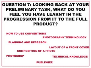
3. For my preliminary task, I had to do a college magazine front cover to prepare myself for
the creation of my final product. I have made this figure, showing what I learned from the
preliminary task.
Ideology
Close up
Medium close up
Medium shot
Long shot
Composition
Medium long shot
Terminology
Mast head
Skyline
Pull quote
Feature story
Footer
Main feature story
Plug
Photography
terminology
Planning
and
researchMood board
Existing products
LIIAR analysis Spider diagram
Conventions analysis
4. When looking at these two front covers, I think I have improved a lot. When doing my college magazine, I had little understanding of
conventions and how to use them, whereas on my music magazine, conventions are used much better, and I think I have much better
understanding of how to use them now.
The feature stories go
across the main image,
and it is also hard to tell
which one of them, is the
main feature story.
On this one, the main image has
been framed by the feature
stories, so they go around the
sides of the image. It is easy to
tell which one is the main
feature story, as it is much
bigger and takes up much more
focus than the feature stories
do.
In both of these front covers, I think I have
shown a good understanding of how to use
colours and how to make a nice colour
scheme. However, the colour scheme on
my college magazine are all a bit pale, and
not attention seeking at all, whereas the
colour scheme on my music magazine gets
much more focus from an audience.
The plug on my
college magazine
is not used
effectively; the
text goes slightly
out over the
edge, and it does
not catch much
attention.
The plug on this
front cover
looks much
better, I think,
since all the text
is inside the
plug, the placing
of the plug is
more
conventional,
and also, the
plug gets more
attention.
Whilst there is a lot of wasted
space on the college magazine,
especially in the upper right corner,
no space has been wasted on my
music magazine.
5. IF I WAS DOING MY COLLEGE
MAGAZINE AGAIN, I WOULD…
Spend more time on doing research, and look at existing products; and not just
college magazines, but magazines in general, which would have given me a better
understanding of how to use conventions in general, as well as it would have inspired
me.
Take a better image that would allow me to frame the feature stories around the
main image, as well as put the model more in focus.
Use a skyline and a footer, which would make the framing of my magazine look much
better.
I would avoid leaving empty, unused spaces, as this makes the front cover look very
unprofessional.
The colour scheme could have been with more strong colours, and not two shades of
the same colour, which gives a really boring look to the front cover.
I wouldn’t let the feature stories go across the main image as much as they do on
that front cover.
6. IT WAS USEFUL TO DO THE COLLEGE
MAGAZINE BECAUSE…
It introduced me to Photoshop and how to use the basic tools. The tools I learned to
use was: move tool, quick selection tool, eyedropper tool, magic eraser tool, paint
bucket tool, horizontal type tool, rectangle tool and custom shape tool. It also taught
me how to work in layers and what settings to use as the main settings when opening
a new Photoshop document.
It showed me how much hard work I need to put into producing a front cover.
It gave me an initial understanding of how to use conventions, and I could from then
on develop my understanding further.
My research gave me an understanding of what to include in a college magazine and
also what not to include; it gave me an understanding of what type of pictures I should
be using as my main image; what type of props what appropriate to use in a college
magazine, and it also gave me a brief understanding on how to frame my main image,
so that the feature stories could fit around it.
It introduced me to useful webpages when producing a magazine, e.g. dafont.com
which I have used for my mast head, page numbers, page titles and the pull quote on
my double page spread.