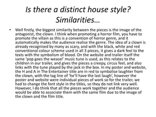
EVALUATION NOTES
Is there a distinct house style?
                  Similarities…
• Well firstly, the biggest similarity between the pieces is the image of the
  antagonist, the clown. I think when promoting a horror film, you have to
  promote the villain as this is a convention of horror genre, and it
  automatically makes the audience realise the genre. The idea of a clown is
  already recognised by many as scary, and with the black, white and red
  conventional colour scheme used in all 3 pieces, it gives a dark feel to the
  texts with the symbolism of blood. On the website and trailer itself the
  same ‘pop goes the weasel’ music tune is used, as this relates to the
  children in our trailer, and gives the pieces a creepy, circus feel, and also
  links with the tune played by the jack in the box. In my poster and website,
  the H and A in The Entertainer title are in red to symbolise laughter from
  the clown, with the tag line of ‘he’ll have the last laugh’, however the
  poster and website were individual pieces of work so for the trailer, we
  had to change the font style in the titles, so they do not link very well.
  However, I do think that all the pieces work together and the audience
  would be able to associate them with the same film due to the image of
  the clown and the film title.
Has your original poster/website
 influenced/changed the development
          of the final trailer?
• I don’t think so, I think rather than looking back to the
  poster and website when filming, we used the
  storyboard and animatic to remind us of
  ideas/structure of how we wanted the trailer to look.
  The poster and website don’t really give much of the
  story away, just that the antagonist is a clown, and the
  synopsis on the website gives an idea of the story of
  the whole film. We used the synopsis to help plan the
  storyboard, and then when it came to filming we used
  the storyboard to help plan the trailer. I don’t think it
  changed anything, but it influenced the ‘pop goes the
  weasel’ music we included in the trailer because we
  had already used it in our website.
How would they work together/or not
       in promoting the film?
• I think they would work together really well, all 3 pieces connect to
  different audiences, you have the poster which can be advertised
  on billboards, buses, bus stops etc.. the website, which can be
  linked on social networking sites such as twitter, facebook etc.. and
  the trailer can be advertised on television, in the cinema etc… so
  the whole package reaches lots of different people and different
  types of audiences such as a younger technological audience as well
  as adults who drive past/get the bus and see the film advertised. I
  think they all connect, they all have similar style, images, etc.. so
  the audience will see they work together to promote the film. As
  well, if the same audience member sees all 3 pieces, the film will be
  remembered as they notice it everywhere, making them more likely
  to want to see it.
Which clearly targets the intended
          audience and why?
• I think the website targets the intended audience the most
  because it’s the most interactive and from my research, I
  found that the most popular age range to see horror films is
  18-24, so I think this age range uses the internet the most,
  and social networking the most so they are most likely to
  have facebook/twitter/youtube accounts etc.. so can
  like/follow/link the pieces and website and share it with
  their friends and followers. The website can also include
  many different things, such as backstage gallery, synopsis,
  up to date newsfeeds, as well as including the other pieces,
  the poster and trailer, so I think the website would appeal
  to the audience the most as you can see everything to do
  with the film!
Which elements were you proud of?
• I was proud of a lot of things in my 3 pieces, firstly in the poster, I was
  proud of the layout as it wasn’t conventional title at the top etc.. the
  image and text were nicely laid out I thought, and also I was proud of
  manipulating the image of the clown as before I started the poster I had
  never used Adobe Photoshop before, so I was proud of what I achieved
  with the poster to say I had never used that software before. With the
  website, again I had never used Weebly before, so I was proud of learning
  how to use that successfully, and I had never used Adobe Flash before
  either, so I was proud of the rollover image I created on the homepage
  where if you roll over the image with the mouse the clown pops up behind
  the wardrobe. In the trailer, I again had never used Adobe Premier before,
  so I was proud learning to use that, my favourite bit of the trailer is the
  arcing shot in the woods around the protagonist Jennifer so I was very
  proud of that shot. Also I think the trailer was edited very well, and I was
  proud of the ideas I had for the trailer story when creating the storyboard,
  such as the clown character, the party scene, running down the stairs, the
  clown creeping up behind the boy etc..
Is one piece stronger than another?
• To be honest, I think the poster is the weakest of the 3
  pieces, just because it does the least, I think the trailer
  is the strongest as it includes many different things
  such as different types of shots, special effects, editing,
  includes all the different characters, music which builds
  the tension throughout, establishes where the film is
  set, explains the story, leaves the audience wanting to
  see more and actually go out and watch the film, is the
  most scary out the 3 as the clown comes to life, it
  includes titles, star names etc, so yeah just because it
  includes the most variety of things, I think the trailer is
  the strongest as it will visually engage the audience the
  most and entertain them the most.
If you had to make improvements to
     one, which would it be and why?
• As I said, I think the poster is the weaker of the 3, so I
  would make the image stand out more, maybe highlight the
  background around it, include more of the colour red,
  maybe include the knife to follow conventions of the
  antagonist holding a weapon, maybe include an image of
  the protagonist Jennifer screaming or something. However
  I could make improvements to all 3, the trailer could be
  edited better and fit the music better, the voice over could
  be creepier, the news reporter made to look more realistic
  by playing the video on a television and then recording
  that. I think the website could also include a link to a
  facebook page for the film, include more things on the
  home page
How have your skills developed over
     the course of the portfolio?
• I think over the course of the advanced portfolio
  my skills have developed greatly. I’ve learnt how
  to use all types of software such as Adobe
  Premiere to edit the trailer and animatic, Adobe
  Photoshop to create the poster, Adobe Flash to
  include an animation in the website, Weebly to
  create the website and so on.. I’ve also learnt
  how to use equipment such as the camera,
  microphone, tripod etc.. I’ve also learnt the
  conventions of horror film trailers, posters and
  websites so that I am able to create my own.

Evaluation Notes

  • 1.
  • 2.
    Is there adistinct house style? Similarities… • Well firstly, the biggest similarity between the pieces is the image of the antagonist, the clown. I think when promoting a horror film, you have to promote the villain as this is a convention of horror genre, and it automatically makes the audience realise the genre. The idea of a clown is already recognised by many as scary, and with the black, white and red conventional colour scheme used in all 3 pieces, it gives a dark feel to the texts with the symbolism of blood. On the website and trailer itself the same ‘pop goes the weasel’ music tune is used, as this relates to the children in our trailer, and gives the pieces a creepy, circus feel, and also links with the tune played by the jack in the box. In my poster and website, the H and A in The Entertainer title are in red to symbolise laughter from the clown, with the tag line of ‘he’ll have the last laugh’, however the poster and website were individual pieces of work so for the trailer, we had to change the font style in the titles, so they do not link very well. However, I do think that all the pieces work together and the audience would be able to associate them with the same film due to the image of the clown and the film title.
  • 3.
    Has your originalposter/website influenced/changed the development of the final trailer? • I don’t think so, I think rather than looking back to the poster and website when filming, we used the storyboard and animatic to remind us of ideas/structure of how we wanted the trailer to look. The poster and website don’t really give much of the story away, just that the antagonist is a clown, and the synopsis on the website gives an idea of the story of the whole film. We used the synopsis to help plan the storyboard, and then when it came to filming we used the storyboard to help plan the trailer. I don’t think it changed anything, but it influenced the ‘pop goes the weasel’ music we included in the trailer because we had already used it in our website.
  • 4.
    How would theywork together/or not in promoting the film? • I think they would work together really well, all 3 pieces connect to different audiences, you have the poster which can be advertised on billboards, buses, bus stops etc.. the website, which can be linked on social networking sites such as twitter, facebook etc.. and the trailer can be advertised on television, in the cinema etc… so the whole package reaches lots of different people and different types of audiences such as a younger technological audience as well as adults who drive past/get the bus and see the film advertised. I think they all connect, they all have similar style, images, etc.. so the audience will see they work together to promote the film. As well, if the same audience member sees all 3 pieces, the film will be remembered as they notice it everywhere, making them more likely to want to see it.
  • 5.
    Which clearly targetsthe intended audience and why? • I think the website targets the intended audience the most because it’s the most interactive and from my research, I found that the most popular age range to see horror films is 18-24, so I think this age range uses the internet the most, and social networking the most so they are most likely to have facebook/twitter/youtube accounts etc.. so can like/follow/link the pieces and website and share it with their friends and followers. The website can also include many different things, such as backstage gallery, synopsis, up to date newsfeeds, as well as including the other pieces, the poster and trailer, so I think the website would appeal to the audience the most as you can see everything to do with the film!
  • 6.
    Which elements wereyou proud of? • I was proud of a lot of things in my 3 pieces, firstly in the poster, I was proud of the layout as it wasn’t conventional title at the top etc.. the image and text were nicely laid out I thought, and also I was proud of manipulating the image of the clown as before I started the poster I had never used Adobe Photoshop before, so I was proud of what I achieved with the poster to say I had never used that software before. With the website, again I had never used Weebly before, so I was proud of learning how to use that successfully, and I had never used Adobe Flash before either, so I was proud of the rollover image I created on the homepage where if you roll over the image with the mouse the clown pops up behind the wardrobe. In the trailer, I again had never used Adobe Premier before, so I was proud learning to use that, my favourite bit of the trailer is the arcing shot in the woods around the protagonist Jennifer so I was very proud of that shot. Also I think the trailer was edited very well, and I was proud of the ideas I had for the trailer story when creating the storyboard, such as the clown character, the party scene, running down the stairs, the clown creeping up behind the boy etc..
  • 7.
    Is one piecestronger than another? • To be honest, I think the poster is the weakest of the 3 pieces, just because it does the least, I think the trailer is the strongest as it includes many different things such as different types of shots, special effects, editing, includes all the different characters, music which builds the tension throughout, establishes where the film is set, explains the story, leaves the audience wanting to see more and actually go out and watch the film, is the most scary out the 3 as the clown comes to life, it includes titles, star names etc, so yeah just because it includes the most variety of things, I think the trailer is the strongest as it will visually engage the audience the most and entertain them the most.
  • 8.
    If you hadto make improvements to one, which would it be and why? • As I said, I think the poster is the weaker of the 3, so I would make the image stand out more, maybe highlight the background around it, include more of the colour red, maybe include the knife to follow conventions of the antagonist holding a weapon, maybe include an image of the protagonist Jennifer screaming or something. However I could make improvements to all 3, the trailer could be edited better and fit the music better, the voice over could be creepier, the news reporter made to look more realistic by playing the video on a television and then recording that. I think the website could also include a link to a facebook page for the film, include more things on the home page
  • 9.
    How have yourskills developed over the course of the portfolio? • I think over the course of the advanced portfolio my skills have developed greatly. I’ve learnt how to use all types of software such as Adobe Premiere to edit the trailer and animatic, Adobe Photoshop to create the poster, Adobe Flash to include an animation in the website, Weebly to create the website and so on.. I’ve also learnt how to use equipment such as the camera, microphone, tripod etc.. I’ve also learnt the conventions of horror film trailers, posters and websites so that I am able to create my own.