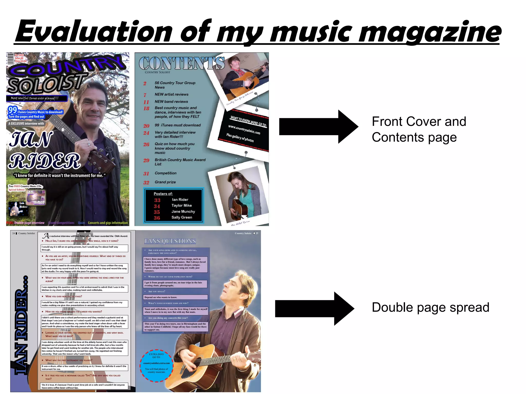
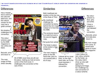
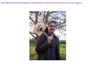
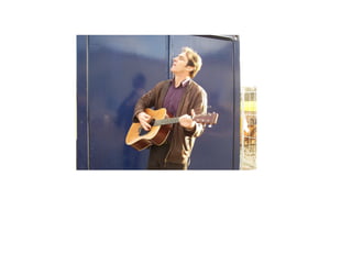
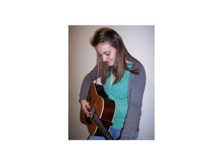
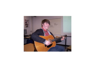
The document analyzes conventions used in music magazine covers and contents pages by comparing an existing magazine to the student's own "Country Soloist" magazine cover and contents page. It identifies similarities and differences between the layouts in terms of placement of images, text, logos and use of color schemes. The student challenges some conventions by placing the masthead behind the cover image rather than in front, and using a photo with a prop to indicate the music genre rather than a casual portrait.