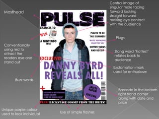
Evaluation
Central image of singular male facing forward looking straight forward making eye contact with the audienceMastheadPlugsConventionally using red to attract the readers eye and stand outSlang word ‘hottest’ relates back to audienceExclamation mark used for enthusiasmBuzz wordsBarcode in the bottom right hand corner along with date and priceUnique purple colour used to look individualUse of simple flashes
Masthead continued in contents page to keep the image fresh in the audience mindConventional big, bold title with issue number and date underneath in smaller writingConventional editors note, makes it feel personal to the audience with handwritten style signature enhancing this effect. Pronoun ‘we’ used to make the reader feel involved and part of a community.Black and white keeping it simple and alternative. Black and white are simple colours which contrast and stand out against each otherGraphic features to interest the audience and attract themUnique purple colour followed through from front cover to follow the themeOffer exclusive to readers making them feel significant. Page number conventionally bottom right hand corner.Conventional red colour used
Masthead in the top left hand corner to keep the image fresh in the audiences mindBuzz word, exclusive to pull in the readersImage overlapping wording and shapes to make it stand out to the audienceMain heading at the top in bold lettering Conventional red colour scheme which is bold and stands out the red colour attracts the readers eye.Conventional Short description of text to interest the readersWhite text on a black background two simple colours which contrasts and stands out. Conventional drop capital letter to make it clear where the text starts. Text in columns to break up the text and make it more approachable looking to the audiencePage numbers conventionally in the bottom corners

Evaluation

  • 1.
  • 2.
    Central image ofsingular male facing forward looking straight forward making eye contact with the audienceMastheadPlugsConventionally using red to attract the readers eye and stand outSlang word ‘hottest’ relates back to audienceExclamation mark used for enthusiasmBuzz wordsBarcode in the bottom right hand corner along with date and priceUnique purple colour used to look individualUse of simple flashes
  • 3.
    Masthead continued incontents page to keep the image fresh in the audience mindConventional big, bold title with issue number and date underneath in smaller writingConventional editors note, makes it feel personal to the audience with handwritten style signature enhancing this effect. Pronoun ‘we’ used to make the reader feel involved and part of a community.Black and white keeping it simple and alternative. Black and white are simple colours which contrast and stand out against each otherGraphic features to interest the audience and attract themUnique purple colour followed through from front cover to follow the themeOffer exclusive to readers making them feel significant. Page number conventionally bottom right hand corner.Conventional red colour used
  • 4.
    Masthead in thetop left hand corner to keep the image fresh in the audiences mindBuzz word, exclusive to pull in the readersImage overlapping wording and shapes to make it stand out to the audienceMain heading at the top in bold lettering Conventional red colour scheme which is bold and stands out the red colour attracts the readers eye.Conventional Short description of text to interest the readersWhite text on a black background two simple colours which contrasts and stands out. Conventional drop capital letter to make it clear where the text starts. Text in columns to break up the text and make it more approachable looking to the audiencePage numbers conventionally in the bottom corners