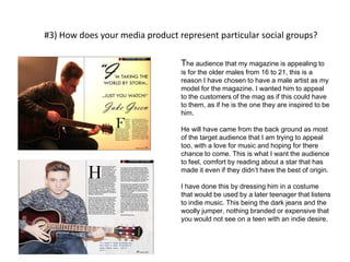
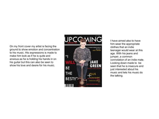
Kieran Givens
Evaluation
#2) How did you attract/address your audience?
As my audience is set
for a 16 to 20 age group
I have tried to set my
work to address that
specific age group. Also
my work is very male
based when look within
the mag so that is
concentrated on also.
The first thing I have
tried to relate to the
audience is the cover
star. My star of the mag
is someone who my
magazine is hoping to
look out too. The late
teenage male with the
love for soft acoustic
music, with an indie
image set about them.
I have also decided to
address my audience in
a future tense. This was
intended to create a lot
of optimism and
appreciation for my
magazine. Words such
as my title “UPCOMING”
and also cell line saying
“Bringing out the new!” I
want people to feel as if
they are going to see the
music and artists that
will fulfil there lives in the
future, first in my
magazine. My intentions
for my magazine is to
make the audience feel
that they will be missing
out of the future stars
and the future of music if
they do not read it, this
is another way I feel I
have to address my
audience.
All the artists that I have used are
designed to be at the age of the reader. A
18-20 year old male who has made it in
the indie world and is featuring in my
magazine. This will then hopefully be
seen as a idol and role model for the
buyers and they will hope to succeed in
their music.
I have aimed to entertain
as well as make it
interesting for the
audience. I have used
language that is of a high
level but with very informal
aspects, as if I am
addressing friend rather
than a serious conversation
with the audience because
I want them to be relaxed
as well as inspired to read
about the music in my mag.
Also the mention of new
and well known artists
such as Jake Bugg, The
Artic Monkeys and Ed
Sheeran will bring
familiarity with the male
audience as they would be
fans of their music, hence
the reason for reading my
magazine, for the articles
about their lives and
music.
I have decided to add a quote by my
19 year old artist stating above “I'm
taking the world by storm, just you
watch!” I felt it was necessary to do
this to give him attitude and arrogance
that is used by late male teens. So I
want this attitude to relate to my
audience. With his confidence it helps
the audience take it off him and use it
in their music. That is what I have
decided to address on my audience.
For my audience as well I felt it was
best to give my artist a dark,
downwards stare at the guitar to
make it a glare of concentration ,
showing commitment and
dedication to his music, passion
also. This would appeal to my
audience that he loves his music
and adores performing on his
guitar, hopefully a similar situation
the reader is in.
I have decided to fashion my artist
as I believe this is the current
trend for higher end teens which
are into indie music and style like
their icons growing up. I want this
to welcome and comfort the
audience to feel that they could be
in the same situation as my artist,
helping them feel that they could
also have a chance to succeed. I
have done this using messed up
styled hair with a jumper and
jeans promoting the indie look I'm
trying to give.
I wanted to address the audience
in a way that they are not always
used to. Most magazines have
their artists looking away from the
camera to create a realistic and
comforting picture. But to create
that difference in the picture and
giving it that indie element I have
chosen to have him looking
directly at the camera to make it
feel as if he is addressing the
audience face on. I wanted a
stand out image that would even
make the customer unease when
seeing it to create that feel that
they are reading something indie
and unique.
#3) How does your media product represent particular social groups?
The audience that my magazine is appealing to
is for the older males from 16 to 21, this is a
reason I have chosen to have a male artist as my
model for the magazine. I wanted him to appeal
to the customers of the mag as if this could have
to them, as if he is the one they are inspired to be
him.
He will have came from the back ground as most
of the target audience that I am trying to appeal
too, with a love for music and hoping for there
chance to come. This is what I want the audience
to feel, comfort by reading about a star that has
made it even if they didn’t have the best of origin.
I have done this by dressing him in a costume
that would be used by a later teenager that listens
to indie music. This being the dark jeans and the
woolly jumper, nothing branded or expensive that
you would not see on a teen with an indie desire.
Here I have artists that the
audience of my magazine
would be interested in.
stars like Ed sheeran, Jack
Johnson and Bon Iver.
You can see that all of the artists
have a passionate expression on
their face. A face that shows they
love music and that is what I have
tried to do in my photography. Also
the clothes worn are dark and
symbolise that the name of the
brand doesn’t matter to them, just
the music. On the left shows the
inspiration to my photo of Jack
Johnson and then my picture next
to it to show what I have aimed to
do with it.
On all
three of the
artists here
you can
see the
passion in
their faces,
something
I have tried
to put into
my artist.
On my front cover my artist is facing the
ground to show emotion and concentration
to his music. His expressions is made to
make him look as if he is quite and
anxious as he is holding his hands in on
his guitar but this can also be seen to
show his love and desire for his music.
I have aimed also to have
him wear the appropriate
clothes that an indie
teenager would wear at this
age. With his jeans and
jumper, a common
connotation of an indie male.
Looking down made to be
seen that he is insecure and
just interested about his
music and lets his music do
the talking.
#4) What have you learnt about technology while making your magazine?
Before
After
The first example of a technology that I used to
complete and perfect my magazine was Adobe
Photoshop. This allowed me to polish off and
define any picture that I took so it looks perfect.
This could have been as easy as increasing the
brightness to add life or something a bit more
technical such as using the clone stamp to
remove unwanted parts of the picture that
disrupt the photo.
Increase of
brightness
Use of the
clone stamp
This can be seen in the two images to the left.
The first picture was the original that I took when
doing the photo-shoot. I didn’t like the look of
how the picture was presented but I did like the
picture its self and I wanted to use it for the
magazine. By using to 2 styles that I had learnt I
was able to heighten the brightness to add more
freshness and so it was visible to see the artist,
his emotion and the guitar its self. However I did
still have to remove the shelf that was in the way
whilst taking the shoot. So to do this is used the
clone stamp tool on Photoshop and whipped the
shelf out of the way and help it appear that it was
just a continuation of the dark wall. These both
helped me get my picture perfect so I was able to
use it in the magazine.
Another technology that I
have used in my magazine
was Adobe InDesign. This is
used by most of the editing
teams on most of the recent
magazines that we see on the
shelf's today. It is used to give
me the outline of where I want
the tools on my page. It helps
me design the magazine the
way I want it, whilst giving me
a helping hand by providing
me boarders and outlines.
This is an example here of the outlines
from InDesign. It lets me know where
everything is set and it helps me move it
around to the best place.
Another technology
would be blogger.
Blogger has helped me
through the whole
course of this
magazine. It allowed
me to set a diary to
keep me organised
through the design and
research of my
magazine. Without
blogger it would have
been very difficult to
keep a plan of my
research to then
actually make a
magazine that it to
standard of the British
selves. That’s what I
aimed to do.
#5) in what way does your media magazine use, develop or challenge form and
conventions of real media products?
To ensure that I was going to create a decent magazine I knew the best
thing to do was a long with my research and planning, I also had to look
up already professional magazines to see how they produced their
magazines, so I am able to see how others are created. So the first thing I
did was look up on the internet and see the front covers, contents pages
and double page spreads. After this I went out to as many magazine
shops as well to see even more examples of professionally made
magazines. The main two that I saw where NME and Q Magazine. These
two both fitted my magazine theme best I felt and this is why I chose
them two. On the following slides I will show you what I have took from
the other magazines and used them to make mine as professionally as I
can.
These are the two magazines that I looked at to get inspiration for my magazines and straight away
you will see techniques that I have used in my mag. However I have gave it my personal flavour and
made it as unique and mine as possible. The first technique that I took was a indie male in late teens
standing with a guitar, with little emotion in the face. This is something that I liked and looked out at
my target audience that I have mentioned. This is what I took from the right from Q. Another
technique that I took from these magazines is the “+” symbol used on the NME copy on the left. I felt
that this was a interesting way of expressing “plus” having a big plus sign to emphasise what else is
going to be in my magazine. This is something I liked. Another thing was the colour scheme. I tried to
use the colours of the Q magazine but in a different way. So the colours such as red, gold, black and
white appear on both Q and my magazine but I did want to approach I in a different way. Finally is the
blank space used by both magazines is something I liked, so it wasn’t too clammy or filled with
information I felt that it was just a right amount information to space ratio.
I liked the look of the Q magazines contents page a lot so this is something that I have
put to my work. As you can probably see, my magazine contents is very similar to that
of Q and I have used the same types of techniques. The first thing I took was the Q in
the top left corner but changed it round to make it a U for Upcoming. I did this
because your eyes are drawn to the only white on the page which was an interesting
technique used in my eyes. Also I liked that there where two sections on the contents
page as if its split in 2. the left hand side, the bigger part, has all the main segments
that make up the mag with a small description of what to expect and of course the
page number. Then on the left hand side I used that space to talk about albums and a
reviewing of it. Finally again I really liked the colour scheme of the bright red and white
, so this is something that I wanted to put into my magazine.
On the previous slide was the double page spread that I took my research from, on Q
magazine with both of my double page spreads. Again I liked how Jake Bugg was
presented by Q magazine. The first thing I took from my magazine research was the
little side bar with “Q: Cover Story Jake Bugg” this is something I liked because it
makes you think that this is what the magazine is about, this is the main story, that’s
why I liked it. So I chose to put that in with Jake Green (my star). Another technique
that I took which I found unusual was the 2 column technique that was used. I felt
that this was better because it looked more spread out and easy to read than three so
this is something that I chose to but into my magazine as well, along with the drop cap
of the A in Q I used a H. Finally I used the technique of my star looking directly into
that camera as I felt it makes it more direct as if you are friendly with that
character, and he looks innocent. This is something that I liked from Q and I wanted to
take and put it into my magazine for good effect.
#6) what type of media institution might publish your media
product and why?
The biggest and most popular distributing
company is IPC Media according to my research,
this is why I believe it would be best for them to
distribute my magazine due to my magazine
being new and not known in the media eye. Their
popularity would help boost the sales for
upcoming from day one. With the right marketing
and advertisement there would be no reason to
why my magazine would not be a success.
Another reason to why I chose IPC Media is that
they are the distributers of the very successful
NME, a magazine very similar to mine. This in
mind I feel that they would be able to do the same
job they did to NME and the success they had, to
mine.
I would like to distribute my magazine both physically in the shops
and also the over the internet digitally. I would like to price my
magazine at £3.99 for the shops such as WHSmith, HMV,
Waterstones and more. Maybe also supermarkets such as ASDA
and Tesco. Then also being able to buy the magazine to read on the
computer from the home or workplace for the same price, the
magazine would be stored in a computer file, opened when ever
desired. But I will also but my magazine on the app store for android
and apple devices. This would be at a price of £3.59. this would
allow the public to buy the magazine then have it on there phone,
iPod or tablets ad able to read when ever they wanted.
#7) Looking back at the preliminary task, what do you feel you have learnt in
the progression from it to the media magazine?
Prelim front cover Prelim contents
At the very start of the course I was
asked to do a prelim task for a school
magazine. This was to test my new skills
of Photoshop and InDesign, see if I
could produce a decent front cover and
contents (shown on the slide previous)
this would then be able to set me
forward for the music magazine that I
have now completed. So this was my
practise for my main product.
For my prelim task I didn’t have any
knowledge about both Photoshop and
InDesign so I had decided to research
them both and find out key tools and
techniques. This helped me on my prelim
task but as you an see by my completed
school magazine I had much more to learn.
I also realised that the best idea to do was
to look for recent school magazines and
see how they set out there work. From
there I took out what I felt was best and
used it in my school magazine, but still
wasn’t up to scratch.
After my prelim task I have made
sure that I keep practising my
Photoshop skills and my InDesign
skills so my magazine can reach
its full potential and not be held
back because my lack of practise
and knowledge of the technology.
To help me I decided to put a draft
of my music magazine on my blog
and received peer assessment to
help make my magazine better
than my first try. This was to make
sure that it is as good as I can get
it whilst keeping to my research
and also making sure it fits my
target audience perfectly.
I feel that after practising the tools
over and over again helped a lot.
However I feel the best thing I did to
improve my magazine was the
research I made because looking at
professional magazines really helped
me design a decent magazine
because it shows me how high the
bar is set. As you can see from these
picture the difference from prelim on
the left to the right, you can see huge
improvements and changes all
because I feel the research of other
magazines helped me have a better
imagination towards the design of it.
On my front cover, the changes have
been that I now place the right text in
the right places rather than my prelim.
Looking at the contents also, the
white space looks awful so now I
have tried to use each space fro a
specific reason and I know that its
necessary, this was all because of my
research I knew what was prohibited.

Evaluation

  • 1.
  • 2.
    #2) How didyou attract/address your audience? As my audience is set for a 16 to 20 age group I have tried to set my work to address that specific age group. Also my work is very male based when look within the mag so that is concentrated on also. The first thing I have tried to relate to the audience is the cover star. My star of the mag is someone who my magazine is hoping to look out too. The late teenage male with the love for soft acoustic music, with an indie image set about them. I have also decided to address my audience in a future tense. This was intended to create a lot of optimism and appreciation for my magazine. Words such as my title “UPCOMING” and also cell line saying “Bringing out the new!” I want people to feel as if they are going to see the music and artists that will fulfil there lives in the future, first in my magazine. My intentions for my magazine is to make the audience feel that they will be missing out of the future stars and the future of music if they do not read it, this is another way I feel I have to address my audience.
  • 3.
    All the artiststhat I have used are designed to be at the age of the reader. A 18-20 year old male who has made it in the indie world and is featuring in my magazine. This will then hopefully be seen as a idol and role model for the buyers and they will hope to succeed in their music. I have aimed to entertain as well as make it interesting for the audience. I have used language that is of a high level but with very informal aspects, as if I am addressing friend rather than a serious conversation with the audience because I want them to be relaxed as well as inspired to read about the music in my mag. Also the mention of new and well known artists such as Jake Bugg, The Artic Monkeys and Ed Sheeran will bring familiarity with the male audience as they would be fans of their music, hence the reason for reading my magazine, for the articles about their lives and music. I have decided to add a quote by my 19 year old artist stating above “I'm taking the world by storm, just you watch!” I felt it was necessary to do this to give him attitude and arrogance that is used by late male teens. So I want this attitude to relate to my audience. With his confidence it helps the audience take it off him and use it in their music. That is what I have decided to address on my audience.
  • 4.
    For my audienceas well I felt it was best to give my artist a dark, downwards stare at the guitar to make it a glare of concentration , showing commitment and dedication to his music, passion also. This would appeal to my audience that he loves his music and adores performing on his guitar, hopefully a similar situation the reader is in. I have decided to fashion my artist as I believe this is the current trend for higher end teens which are into indie music and style like their icons growing up. I want this to welcome and comfort the audience to feel that they could be in the same situation as my artist, helping them feel that they could also have a chance to succeed. I have done this using messed up styled hair with a jumper and jeans promoting the indie look I'm trying to give. I wanted to address the audience in a way that they are not always used to. Most magazines have their artists looking away from the camera to create a realistic and comforting picture. But to create that difference in the picture and giving it that indie element I have chosen to have him looking directly at the camera to make it feel as if he is addressing the audience face on. I wanted a stand out image that would even make the customer unease when seeing it to create that feel that they are reading something indie and unique.
  • 5.
    #3) How doesyour media product represent particular social groups? The audience that my magazine is appealing to is for the older males from 16 to 21, this is a reason I have chosen to have a male artist as my model for the magazine. I wanted him to appeal to the customers of the mag as if this could have to them, as if he is the one they are inspired to be him. He will have came from the back ground as most of the target audience that I am trying to appeal too, with a love for music and hoping for there chance to come. This is what I want the audience to feel, comfort by reading about a star that has made it even if they didn’t have the best of origin. I have done this by dressing him in a costume that would be used by a later teenager that listens to indie music. This being the dark jeans and the woolly jumper, nothing branded or expensive that you would not see on a teen with an indie desire.
  • 6.
    Here I haveartists that the audience of my magazine would be interested in. stars like Ed sheeran, Jack Johnson and Bon Iver. You can see that all of the artists have a passionate expression on their face. A face that shows they love music and that is what I have tried to do in my photography. Also the clothes worn are dark and symbolise that the name of the brand doesn’t matter to them, just the music. On the left shows the inspiration to my photo of Jack Johnson and then my picture next to it to show what I have aimed to do with it. On all three of the artists here you can see the passion in their faces, something I have tried to put into my artist.
  • 7.
    On my frontcover my artist is facing the ground to show emotion and concentration to his music. His expressions is made to make him look as if he is quite and anxious as he is holding his hands in on his guitar but this can also be seen to show his love and desire for his music. I have aimed also to have him wear the appropriate clothes that an indie teenager would wear at this age. With his jeans and jumper, a common connotation of an indie male. Looking down made to be seen that he is insecure and just interested about his music and lets his music do the talking.
  • 8.
    #4) What haveyou learnt about technology while making your magazine? Before After The first example of a technology that I used to complete and perfect my magazine was Adobe Photoshop. This allowed me to polish off and define any picture that I took so it looks perfect. This could have been as easy as increasing the brightness to add life or something a bit more technical such as using the clone stamp to remove unwanted parts of the picture that disrupt the photo. Increase of brightness Use of the clone stamp This can be seen in the two images to the left. The first picture was the original that I took when doing the photo-shoot. I didn’t like the look of how the picture was presented but I did like the picture its self and I wanted to use it for the magazine. By using to 2 styles that I had learnt I was able to heighten the brightness to add more freshness and so it was visible to see the artist, his emotion and the guitar its self. However I did still have to remove the shelf that was in the way whilst taking the shoot. So to do this is used the clone stamp tool on Photoshop and whipped the shelf out of the way and help it appear that it was just a continuation of the dark wall. These both helped me get my picture perfect so I was able to use it in the magazine.
  • 9.
    Another technology thatI have used in my magazine was Adobe InDesign. This is used by most of the editing teams on most of the recent magazines that we see on the shelf's today. It is used to give me the outline of where I want the tools on my page. It helps me design the magazine the way I want it, whilst giving me a helping hand by providing me boarders and outlines. This is an example here of the outlines from InDesign. It lets me know where everything is set and it helps me move it around to the best place.
  • 10.
    Another technology would beblogger. Blogger has helped me through the whole course of this magazine. It allowed me to set a diary to keep me organised through the design and research of my magazine. Without blogger it would have been very difficult to keep a plan of my research to then actually make a magazine that it to standard of the British selves. That’s what I aimed to do.
  • 11.
    #5) in whatway does your media magazine use, develop or challenge form and conventions of real media products? To ensure that I was going to create a decent magazine I knew the best thing to do was a long with my research and planning, I also had to look up already professional magazines to see how they produced their magazines, so I am able to see how others are created. So the first thing I did was look up on the internet and see the front covers, contents pages and double page spreads. After this I went out to as many magazine shops as well to see even more examples of professionally made magazines. The main two that I saw where NME and Q Magazine. These two both fitted my magazine theme best I felt and this is why I chose them two. On the following slides I will show you what I have took from the other magazines and used them to make mine as professionally as I can.
  • 12.
    These are thetwo magazines that I looked at to get inspiration for my magazines and straight away you will see techniques that I have used in my mag. However I have gave it my personal flavour and made it as unique and mine as possible. The first technique that I took was a indie male in late teens standing with a guitar, with little emotion in the face. This is something that I liked and looked out at my target audience that I have mentioned. This is what I took from the right from Q. Another technique that I took from these magazines is the “+” symbol used on the NME copy on the left. I felt that this was a interesting way of expressing “plus” having a big plus sign to emphasise what else is going to be in my magazine. This is something I liked. Another thing was the colour scheme. I tried to use the colours of the Q magazine but in a different way. So the colours such as red, gold, black and white appear on both Q and my magazine but I did want to approach I in a different way. Finally is the blank space used by both magazines is something I liked, so it wasn’t too clammy or filled with information I felt that it was just a right amount information to space ratio.
  • 13.
    I liked thelook of the Q magazines contents page a lot so this is something that I have put to my work. As you can probably see, my magazine contents is very similar to that of Q and I have used the same types of techniques. The first thing I took was the Q in the top left corner but changed it round to make it a U for Upcoming. I did this because your eyes are drawn to the only white on the page which was an interesting technique used in my eyes. Also I liked that there where two sections on the contents page as if its split in 2. the left hand side, the bigger part, has all the main segments that make up the mag with a small description of what to expect and of course the page number. Then on the left hand side I used that space to talk about albums and a reviewing of it. Finally again I really liked the colour scheme of the bright red and white , so this is something that I wanted to put into my magazine.
  • 15.
    On the previousslide was the double page spread that I took my research from, on Q magazine with both of my double page spreads. Again I liked how Jake Bugg was presented by Q magazine. The first thing I took from my magazine research was the little side bar with “Q: Cover Story Jake Bugg” this is something I liked because it makes you think that this is what the magazine is about, this is the main story, that’s why I liked it. So I chose to put that in with Jake Green (my star). Another technique that I took which I found unusual was the 2 column technique that was used. I felt that this was better because it looked more spread out and easy to read than three so this is something that I chose to but into my magazine as well, along with the drop cap of the A in Q I used a H. Finally I used the technique of my star looking directly into that camera as I felt it makes it more direct as if you are friendly with that character, and he looks innocent. This is something that I liked from Q and I wanted to take and put it into my magazine for good effect.
  • 16.
    #6) what typeof media institution might publish your media product and why? The biggest and most popular distributing company is IPC Media according to my research, this is why I believe it would be best for them to distribute my magazine due to my magazine being new and not known in the media eye. Their popularity would help boost the sales for upcoming from day one. With the right marketing and advertisement there would be no reason to why my magazine would not be a success. Another reason to why I chose IPC Media is that they are the distributers of the very successful NME, a magazine very similar to mine. This in mind I feel that they would be able to do the same job they did to NME and the success they had, to mine.
  • 17.
    I would liketo distribute my magazine both physically in the shops and also the over the internet digitally. I would like to price my magazine at £3.99 for the shops such as WHSmith, HMV, Waterstones and more. Maybe also supermarkets such as ASDA and Tesco. Then also being able to buy the magazine to read on the computer from the home or workplace for the same price, the magazine would be stored in a computer file, opened when ever desired. But I will also but my magazine on the app store for android and apple devices. This would be at a price of £3.59. this would allow the public to buy the magazine then have it on there phone, iPod or tablets ad able to read when ever they wanted.
  • 18.
    #7) Looking backat the preliminary task, what do you feel you have learnt in the progression from it to the media magazine? Prelim front cover Prelim contents
  • 19.
    At the verystart of the course I was asked to do a prelim task for a school magazine. This was to test my new skills of Photoshop and InDesign, see if I could produce a decent front cover and contents (shown on the slide previous) this would then be able to set me forward for the music magazine that I have now completed. So this was my practise for my main product. For my prelim task I didn’t have any knowledge about both Photoshop and InDesign so I had decided to research them both and find out key tools and techniques. This helped me on my prelim task but as you an see by my completed school magazine I had much more to learn. I also realised that the best idea to do was to look for recent school magazines and see how they set out there work. From there I took out what I felt was best and used it in my school magazine, but still wasn’t up to scratch. After my prelim task I have made sure that I keep practising my Photoshop skills and my InDesign skills so my magazine can reach its full potential and not be held back because my lack of practise and knowledge of the technology. To help me I decided to put a draft of my music magazine on my blog and received peer assessment to help make my magazine better than my first try. This was to make sure that it is as good as I can get it whilst keeping to my research and also making sure it fits my target audience perfectly.
  • 20.
    I feel thatafter practising the tools over and over again helped a lot. However I feel the best thing I did to improve my magazine was the research I made because looking at professional magazines really helped me design a decent magazine because it shows me how high the bar is set. As you can see from these picture the difference from prelim on the left to the right, you can see huge improvements and changes all because I feel the research of other magazines helped me have a better imagination towards the design of it. On my front cover, the changes have been that I now place the right text in the right places rather than my prelim. Looking at the contents also, the white space looks awful so now I have tried to use each space fro a specific reason and I know that its necessary, this was all because of my research I knew what was prohibited.