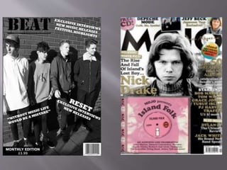
Cordelia Langstaff
In my media product I used many forms and conventions that I saw
in my initial research however I also developed and challenged these
conventions to create my own unique product. For example I
challenged the front cover of MOJO as they fill theirs fully with a lot
of information how ever I left mine fairly simple as I think that
keeping my front cover simple would attract my customers as in my
questionnaire they answered that they would prefer pictures instead
of a lot of writing.
My music magazine uses the typical position of the masthead up in
the corner of the front cover. In bold and large text this makes it easily
recognisable, this is a positive thing as on shelves this will make
people notice my magazine first.
My media product represents the social group of teenagers and young
adults who like to listen to alternative rock music, sometimes
described as “indie” music. I achieved this look through my images,
layout of the magazine and the informal language that I used to
connect with my customer. I feel that by using certain techniques I
connected and represented this particular social group well.
I feel that my magazine is appropriate for all genders as this is who I
aimed at through my photos and contents of my magazine. I aimed
for both genders as I feel this gave me a wider audience and more of
an opportunities for my magazine to sell.
Through my research I understood what people wanted from “indie
rock” magazines so based my articles and photos on what I found out
from my research.
I feel that many media institutions are likely to distribute my media
product, such as;
 Online through digital publishers
 At gigs and festivals
 Retailers- supermarkets
 Magazine and music stores.
These media institutions would be likely to distribute my media
product as through my previous research I know that they already
provide similar products, which sells well so gives me hope that my
product would also sell. I feel that social media and online marketing
has become increasingly popular, so I feel that publishing and
advertising my product online would help my product become more
popular and help it sell more.
My target audience for my media product would be the same as the
audiences for magazines such as Q and NME. People who I would
aim my product for can be any gender and have to be interested in
indie rock genre of music. Its can also be read by any age however the
theme of the magazine it typically aged at the younger generation,
teenagers.
I used many techniques to create my magazine to be aimed at the
certain target audience that I desired. Such as the band I used for my
front cover, they are a young boy band that would attract both males
and females. I used a specific colour scheme of black, white and red
which matched the theme and appealed to the type of people I feel
would buy my magazine.
As you can see from my final products I used the same colour scheme
throughout my magazine including the themes of the pictures that I
took. I felt this was very important in both attracting and addressing
the audience as it helped the magazine flow easily and made it more
enjoyable for the reader. I choose the colours red, white and black as
individually the are very bold and together they all stand out
attracting the reader.
My models for the photos throughout my magazine are “young” and
“hipster” appealing to the majority of the youth today and attracting
the type of audience that I would like to read my magazine.
I used a range of buzzwords from “exclusive” and “new” to attract
the reader into buying my magazine as this makes them feel that they
are getting more for their money.
Throughout this process I used many software's such as Adobe
Photoshop and Microsoft PowerPoint and word, I also used InDesign
with the production of my magazine, to publish my progress on my
coursework I used blogger.
It took my a while to develop my skills on these different software’s
as some, for example Photoshop I had little experience with. I did this
by making draft copies and seeing how each tool affected my work,
and in time I was able to create a copy I was happy with.
Blogger was easy to use and understand as it was a step to step
progress, to show my final piece of work I uploaded my blogs in the
chronological order in which I also followed in production so, front
cover first then my contents page and finally my double page spread.
Looking back at my preliminary I feel like I have been able to greatly
develop my skills in different software’s used to edit such as
Photoshop and InDesign. I also feel that I’ve been able to identify and
become acquainted with the internal workings of different magazines
through my research process.
I feel I have become more confident with the use of a camera and
studio, I also feel my skills in this area have developed greatly. I have
been able to shoot photos in natural environments and in studios
which has allowed me to understand more about certain lightings and
angles.
My creative skill have also improved greatly from my preliminary
task as I now know how to colour coordinate things such as my font
so that they match and are able to look acceptable when placed
together on a front cover or somewhere in a magazine.

Evaluation

  • 1.
  • 3.
    In my mediaproduct I used many forms and conventions that I saw in my initial research however I also developed and challenged these conventions to create my own unique product. For example I challenged the front cover of MOJO as they fill theirs fully with a lot of information how ever I left mine fairly simple as I think that keeping my front cover simple would attract my customers as in my questionnaire they answered that they would prefer pictures instead of a lot of writing. My music magazine uses the typical position of the masthead up in the corner of the front cover. In bold and large text this makes it easily recognisable, this is a positive thing as on shelves this will make people notice my magazine first.
  • 4.
    My media productrepresents the social group of teenagers and young adults who like to listen to alternative rock music, sometimes described as “indie” music. I achieved this look through my images, layout of the magazine and the informal language that I used to connect with my customer. I feel that by using certain techniques I connected and represented this particular social group well. I feel that my magazine is appropriate for all genders as this is who I aimed at through my photos and contents of my magazine. I aimed for both genders as I feel this gave me a wider audience and more of an opportunities for my magazine to sell. Through my research I understood what people wanted from “indie rock” magazines so based my articles and photos on what I found out from my research.
  • 5.
    I feel thatmany media institutions are likely to distribute my media product, such as;  Online through digital publishers  At gigs and festivals  Retailers- supermarkets  Magazine and music stores. These media institutions would be likely to distribute my media product as through my previous research I know that they already provide similar products, which sells well so gives me hope that my product would also sell. I feel that social media and online marketing has become increasingly popular, so I feel that publishing and advertising my product online would help my product become more popular and help it sell more.
  • 6.
    My target audiencefor my media product would be the same as the audiences for magazines such as Q and NME. People who I would aim my product for can be any gender and have to be interested in indie rock genre of music. Its can also be read by any age however the theme of the magazine it typically aged at the younger generation, teenagers. I used many techniques to create my magazine to be aimed at the certain target audience that I desired. Such as the band I used for my front cover, they are a young boy band that would attract both males and females. I used a specific colour scheme of black, white and red which matched the theme and appealed to the type of people I feel would buy my magazine.
  • 7.
    As you cansee from my final products I used the same colour scheme throughout my magazine including the themes of the pictures that I took. I felt this was very important in both attracting and addressing the audience as it helped the magazine flow easily and made it more enjoyable for the reader. I choose the colours red, white and black as individually the are very bold and together they all stand out attracting the reader. My models for the photos throughout my magazine are “young” and “hipster” appealing to the majority of the youth today and attracting the type of audience that I would like to read my magazine. I used a range of buzzwords from “exclusive” and “new” to attract the reader into buying my magazine as this makes them feel that they are getting more for their money.
  • 8.
    Throughout this processI used many software's such as Adobe Photoshop and Microsoft PowerPoint and word, I also used InDesign with the production of my magazine, to publish my progress on my coursework I used blogger. It took my a while to develop my skills on these different software’s as some, for example Photoshop I had little experience with. I did this by making draft copies and seeing how each tool affected my work, and in time I was able to create a copy I was happy with. Blogger was easy to use and understand as it was a step to step progress, to show my final piece of work I uploaded my blogs in the chronological order in which I also followed in production so, front cover first then my contents page and finally my double page spread.
  • 9.
    Looking back atmy preliminary I feel like I have been able to greatly develop my skills in different software’s used to edit such as Photoshop and InDesign. I also feel that I’ve been able to identify and become acquainted with the internal workings of different magazines through my research process. I feel I have become more confident with the use of a camera and studio, I also feel my skills in this area have developed greatly. I have been able to shoot photos in natural environments and in studios which has allowed me to understand more about certain lightings and angles. My creative skill have also improved greatly from my preliminary task as I now know how to colour coordinate things such as my font so that they match and are able to look acceptable when placed together on a front cover or somewhere in a magazine.