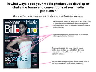
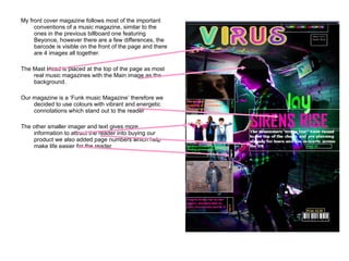
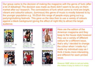
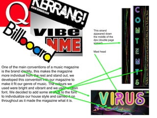
EVALUATION question 1 By Megan Szram
In what ways does your media product use develop or challenge forms and conventions of real media products? Some of the most common conventions of a real music magazine Mast head on the top of the page (in this case it was a special edition therefore the edition was printed above the mast head to target the audience for that months issue) Issue number and price (there doesn’t seem to be a bar code therefore it could be on the back?) One main image in this case the only image on the page as it’s a special edition, Beyonce was voted woman of the year, and this is a woman's edition Other important/interesting  information that will be included in the magazine to attract the buyers
My front cover magazine follows most of the important conventions of a music magazine, similar to the ones in the previous billboard one featuring Beyonce, however there are a few differences, the barcode is visible on the front of the page and there are 4 images all together. The Mast Head is placed at the top of the page as most real music magazines with the Main image as the background. Our magazine is a ‘Funk music Magazine’ therefore we decided to use colours with vibrant and energetic connotations which stand out to the reader The other smaller imager and text gives more information to attract the reader into buying our product we also added page numbers which help make life easier for the reader
Our group came to the decision of making the magazine with the genre of funk (after a lot of debating!) The decision was made as there didn’t seem to be any on them market after our research, The connotations of funk which come to mind are bright, vibrant and colourful colours, (luminous) this genre of music is mostly listened to by the younger population e.g. 16-25 ish  this range of people enjoy going out e.g. partying/clubbing festivals. This gave us the idea then to use a variety of colours against a black background (giving the effect of night life) to attract the target audience. Here are the edition of the American magazine and they keep to the house style however they use a variety of different colours for a different issue, that’s why I decided to change the colour when I made my I made my individual copy as I think it looks more interesting, and different for each printed issue. However NME sticks to red and white, this makes it easy to notice it in shops
One of the main conventions of a music magazine is the brand identity, this makes the magazine more individual from the rest and stand out, we developed this convention into our magazine to make it fit our genre of music. The colours we used were bright and vibrant and we used a neon font. We decided to add some strands to the font to individualize our house style and carried it on throughout as it made the magazine what it is. This strand appeared down the middle of the dps (double page spread) Mast head
Feedback  Our group decided that they wanted to get some feedback to improve our magazine, some members of the group came up with the idea of producing a focus group and even upload our magazine ideas onto face book and get feedback from people that fitted the target audience, this was successful however there were a few individuals that put down our ideas, so you have to be careful which way you do this. However we did get positive feedback that was very useful to us, as we challenged the convetion of using a different genre of music which isnt big in the market at the moment
 

Evaluation

  • 1.
    EVALUATION question 1By Megan Szram
  • 2.
    In what waysdoes your media product use develop or challenge forms and conventions of real media products? Some of the most common conventions of a real music magazine Mast head on the top of the page (in this case it was a special edition therefore the edition was printed above the mast head to target the audience for that months issue) Issue number and price (there doesn’t seem to be a bar code therefore it could be on the back?) One main image in this case the only image on the page as it’s a special edition, Beyonce was voted woman of the year, and this is a woman's edition Other important/interesting information that will be included in the magazine to attract the buyers
  • 3.
    My front covermagazine follows most of the important conventions of a music magazine, similar to the ones in the previous billboard one featuring Beyonce, however there are a few differences, the barcode is visible on the front of the page and there are 4 images all together. The Mast Head is placed at the top of the page as most real music magazines with the Main image as the background. Our magazine is a ‘Funk music Magazine’ therefore we decided to use colours with vibrant and energetic connotations which stand out to the reader The other smaller imager and text gives more information to attract the reader into buying our product we also added page numbers which help make life easier for the reader
  • 4.
    Our group cameto the decision of making the magazine with the genre of funk (after a lot of debating!) The decision was made as there didn’t seem to be any on them market after our research, The connotations of funk which come to mind are bright, vibrant and colourful colours, (luminous) this genre of music is mostly listened to by the younger population e.g. 16-25 ish this range of people enjoy going out e.g. partying/clubbing festivals. This gave us the idea then to use a variety of colours against a black background (giving the effect of night life) to attract the target audience. Here are the edition of the American magazine and they keep to the house style however they use a variety of different colours for a different issue, that’s why I decided to change the colour when I made my I made my individual copy as I think it looks more interesting, and different for each printed issue. However NME sticks to red and white, this makes it easy to notice it in shops
  • 5.
    One of themain conventions of a music magazine is the brand identity, this makes the magazine more individual from the rest and stand out, we developed this convention into our magazine to make it fit our genre of music. The colours we used were bright and vibrant and we used a neon font. We decided to add some strands to the font to individualize our house style and carried it on throughout as it made the magazine what it is. This strand appeared down the middle of the dps (double page spread) Mast head
  • 6.
    Feedback Ourgroup decided that they wanted to get some feedback to improve our magazine, some members of the group came up with the idea of producing a focus group and even upload our magazine ideas onto face book and get feedback from people that fitted the target audience, this was successful however there were a few individuals that put down our ideas, so you have to be careful which way you do this. However we did get positive feedback that was very useful to us, as we challenged the convetion of using a different genre of music which isnt big in the market at the moment
  • 7.