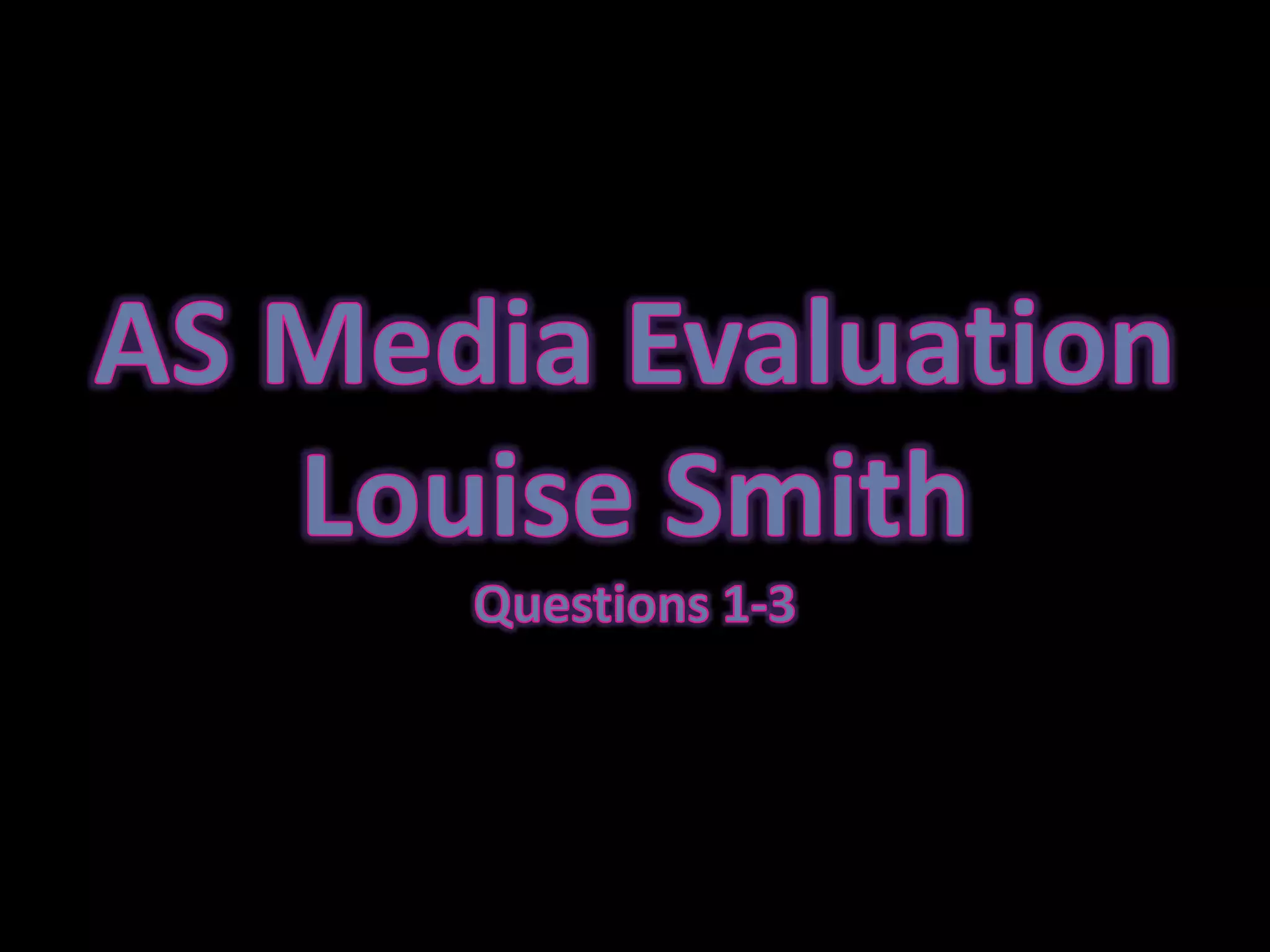
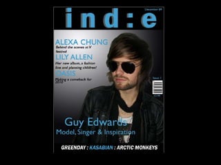
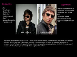
AS Media EvaluationLouise Smith Questions 1-3
1. In what ways does your media product use, develop or challenge forms and conventions of real media products.
My magazine follows numerous conventions of real media products…Front cover includes: the large title, the left-side third, cover lines, a large mid-shot of a model, barcode, price and issue date.Contents includes: large heading saying ‘contents’, various sub headings, many features listed, multiple pictures of a variety of shots, issue date and ident.  Double page spread includes: large photograph, big heading, pull quote, columns and the article has an introduction.I have also done a random blue strip with the name of my magazine in across the top of my contents and double page spread. This is so it ties my pages together to make the magazine have consistency. As my ident isn’t very big, I thought this would be a good idea to link my pages in a more obvious way.
Title: I chose Ind:e for my title as it is short and original. I thought it was an unique way of spelling the genre of the magazine and would appeal to my younger audience. Graphology: I used the left-side third convention layout for my front cover. I feel this looks neat and tidy and is where the audience would expect the important features to be listed. My contents layout is simple and in a vertical list to keep things simple and nicely spaced. My dp spread  is half picture/half article like the example on the previous slide. I feel this is a common theme in magazines and gives you a chance to include a larger picture of the artist.Costume: Front cover - I dressed my model in sunglasses, a leather jacket, an Allsaints top, scarf and necklace. I did this as this is a stereotypical outfit that an Indie person would wear and feel is fashionable. Contents- Jack (top), Hayley and Rob (middle) and Mel and Kate (bottom) are all dressed fashionable in a style indie dressers would also style themselves. DP – Rob is dressed in converse and a trench coat and once again sunglasses. This  gives him a smart indie look, a more mature approach that would appeal to slightly older members of my target audience. Fonts: I have used Maiandra GD for my main font that goes throughout all 3 pages. This is because it is clear to read and quite modern. I didn't want anything too fancy that would deter my audience from reading it, or something so simple or swirly that it looked like a pop magazine font. Genre/Artist Representation: An indie vibe is shown throughout my magazine. By using suitable clothes and models who reflect indie through their own personal style it makes it clear that my audience is for people who enjoy Indie. The way my model is posing on the double page spread by being in a rural area but still looking smart also hints at this. Colour scheme: Although simple, I feel it does appeal to both males and females. The grey and white areas appeal to the girls and the medium blue is neutral for both sexes – any darker and it probably would of put females off. I chose black white and blue as I feel they compliment each other and are suitable for my genre.
2. How does your media product represent particular social groups.
SimilaritiesDifferencesHair
Sunglasses

Evaluation

  • 1.
    AS Media EvaluationLouiseSmith Questions 1-3
  • 5.
    1. In whatways does your media product use, develop or challenge forms and conventions of real media products.
  • 9.
    My magazine followsnumerous conventions of real media products…Front cover includes: the large title, the left-side third, cover lines, a large mid-shot of a model, barcode, price and issue date.Contents includes: large heading saying ‘contents’, various sub headings, many features listed, multiple pictures of a variety of shots, issue date and ident. Double page spread includes: large photograph, big heading, pull quote, columns and the article has an introduction.I have also done a random blue strip with the name of my magazine in across the top of my contents and double page spread. This is so it ties my pages together to make the magazine have consistency. As my ident isn’t very big, I thought this would be a good idea to link my pages in a more obvious way.
  • 10.
    Title: I choseInd:e for my title as it is short and original. I thought it was an unique way of spelling the genre of the magazine and would appeal to my younger audience. Graphology: I used the left-side third convention layout for my front cover. I feel this looks neat and tidy and is where the audience would expect the important features to be listed. My contents layout is simple and in a vertical list to keep things simple and nicely spaced. My dp spread is half picture/half article like the example on the previous slide. I feel this is a common theme in magazines and gives you a chance to include a larger picture of the artist.Costume: Front cover - I dressed my model in sunglasses, a leather jacket, an Allsaints top, scarf and necklace. I did this as this is a stereotypical outfit that an Indie person would wear and feel is fashionable. Contents- Jack (top), Hayley and Rob (middle) and Mel and Kate (bottom) are all dressed fashionable in a style indie dressers would also style themselves. DP – Rob is dressed in converse and a trench coat and once again sunglasses. This gives him a smart indie look, a more mature approach that would appeal to slightly older members of my target audience. Fonts: I have used Maiandra GD for my main font that goes throughout all 3 pages. This is because it is clear to read and quite modern. I didn't want anything too fancy that would deter my audience from reading it, or something so simple or swirly that it looked like a pop magazine font. Genre/Artist Representation: An indie vibe is shown throughout my magazine. By using suitable clothes and models who reflect indie through their own personal style it makes it clear that my audience is for people who enjoy Indie. The way my model is posing on the double page spread by being in a rural area but still looking smart also hints at this. Colour scheme: Although simple, I feel it does appeal to both males and females. The grey and white areas appeal to the girls and the medium blue is neutral for both sexes – any darker and it probably would of put females off. I chose black white and blue as I feel they compliment each other and are suitable for my genre.
  • 11.
    2. How doesyour media product represent particular social groups.
  • 12.
  • 13.