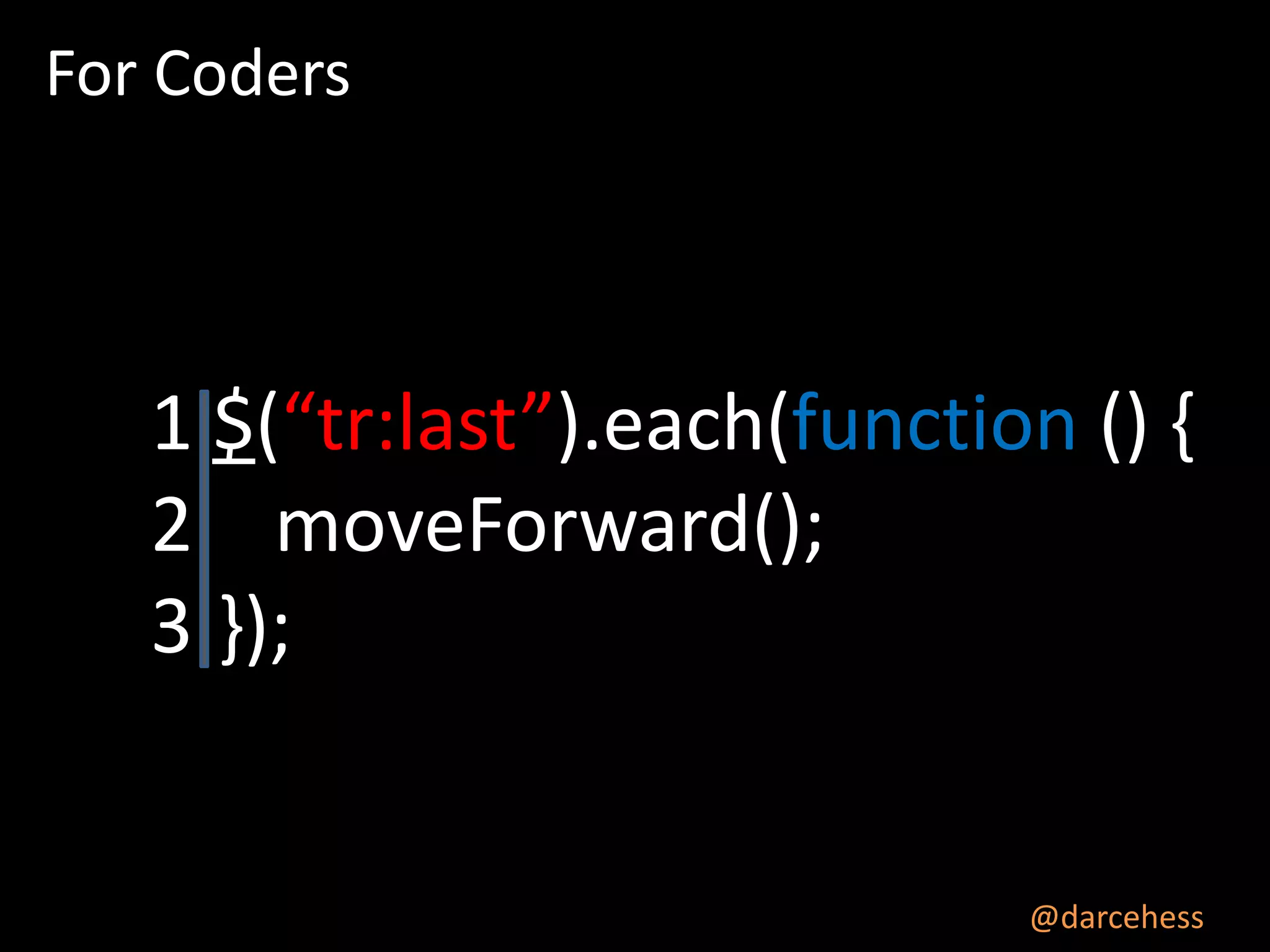
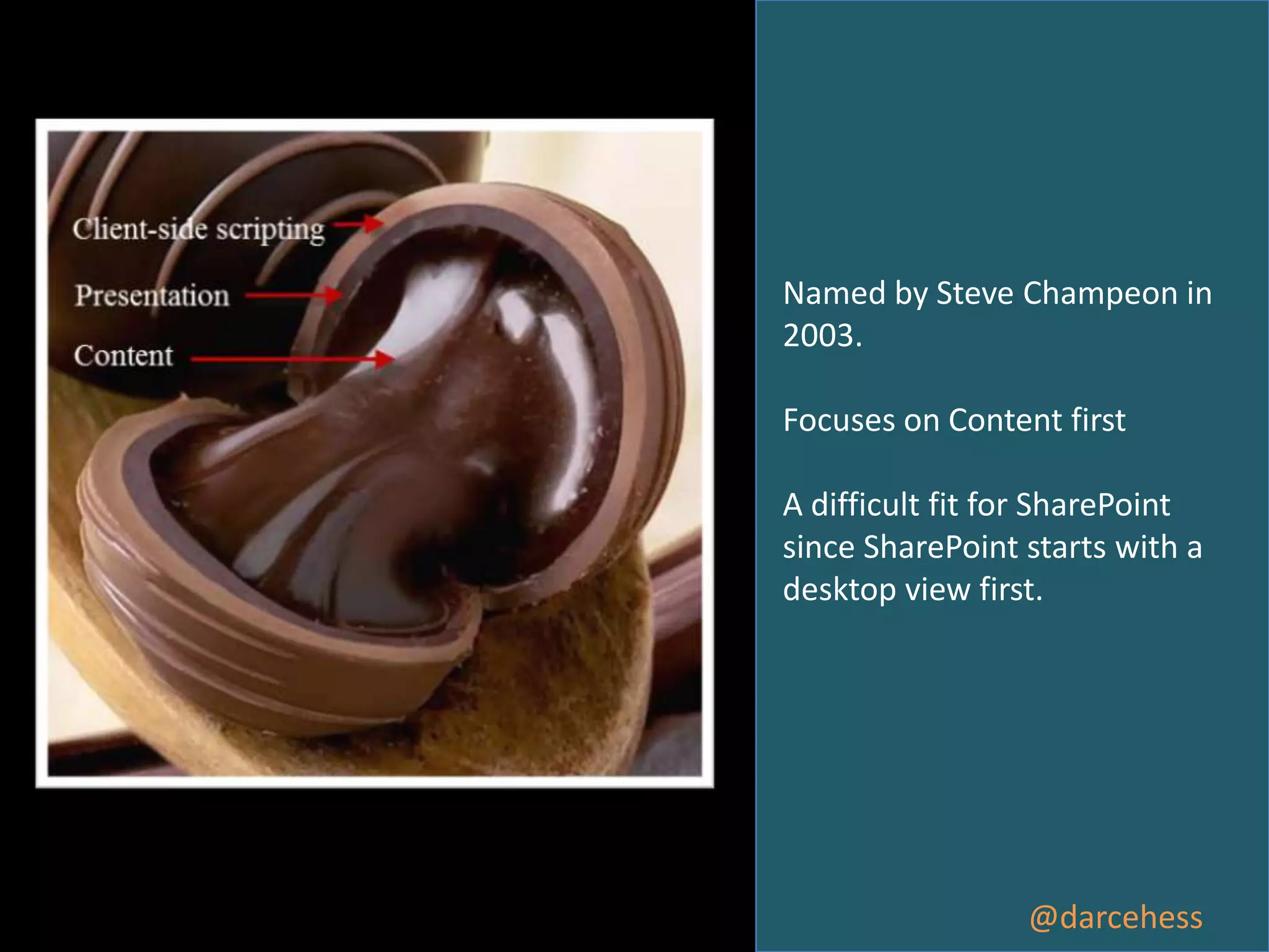
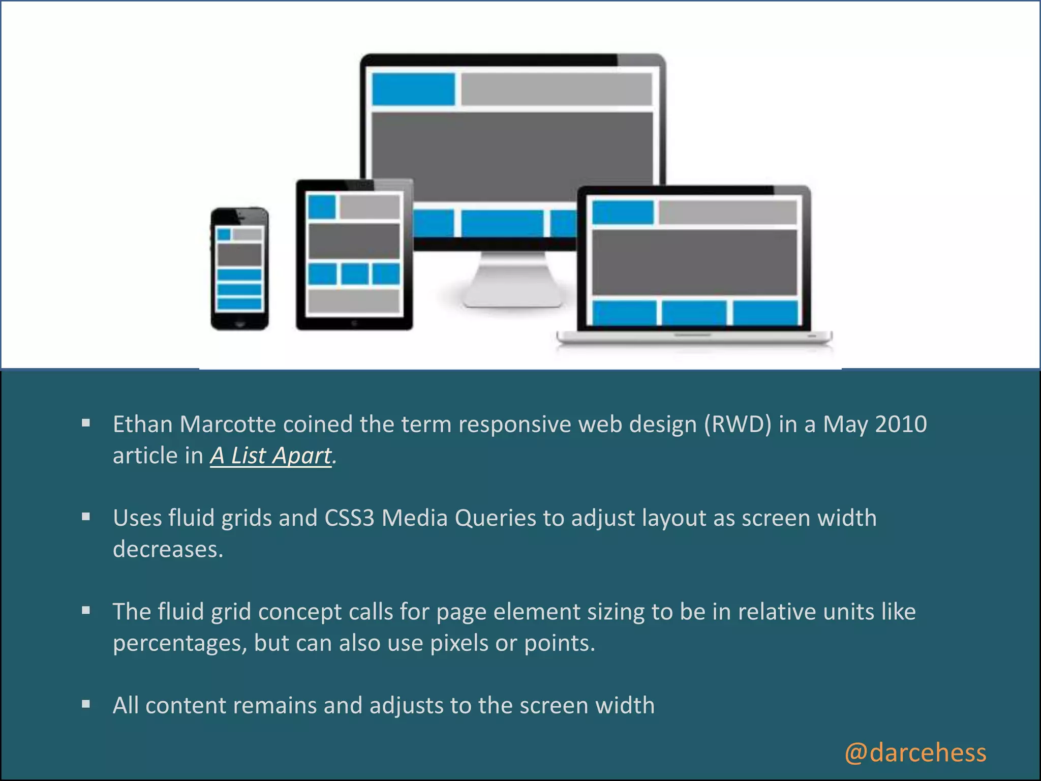
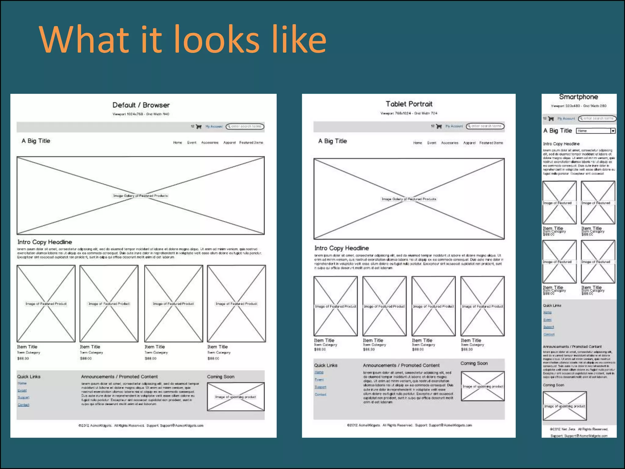
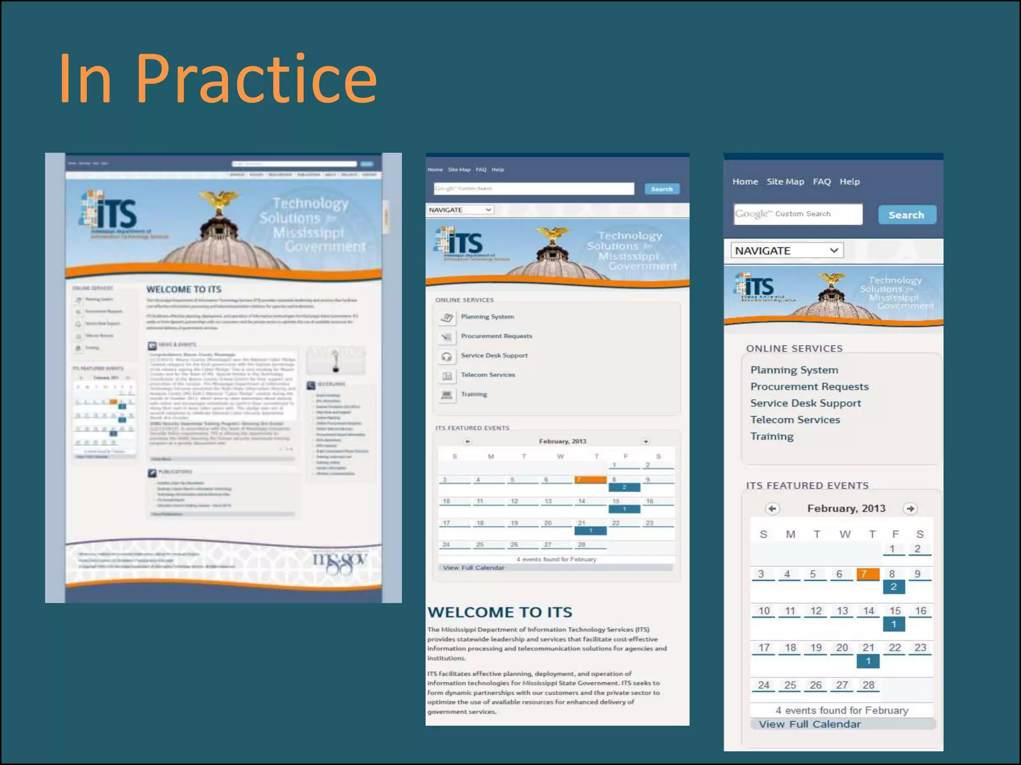
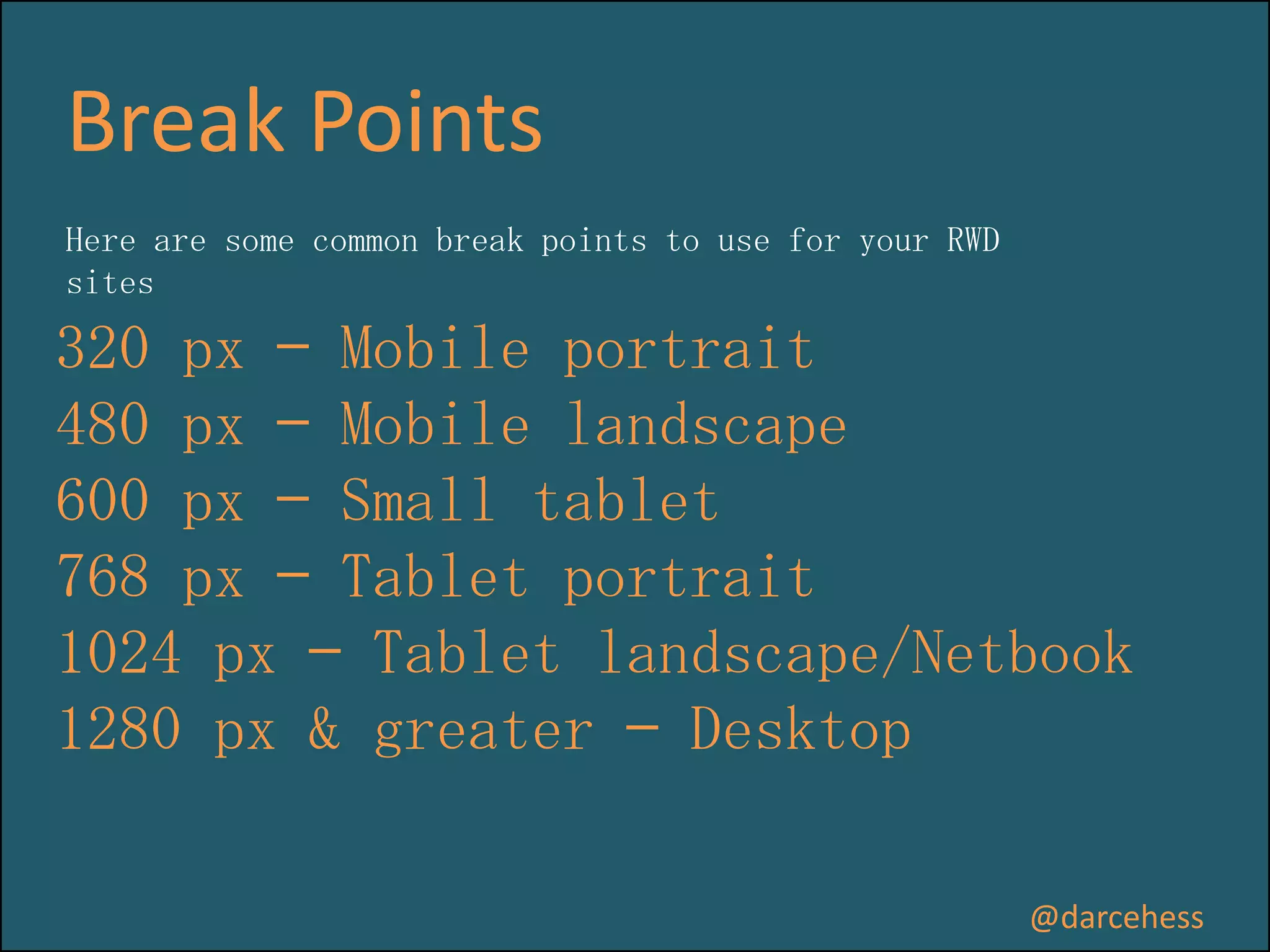
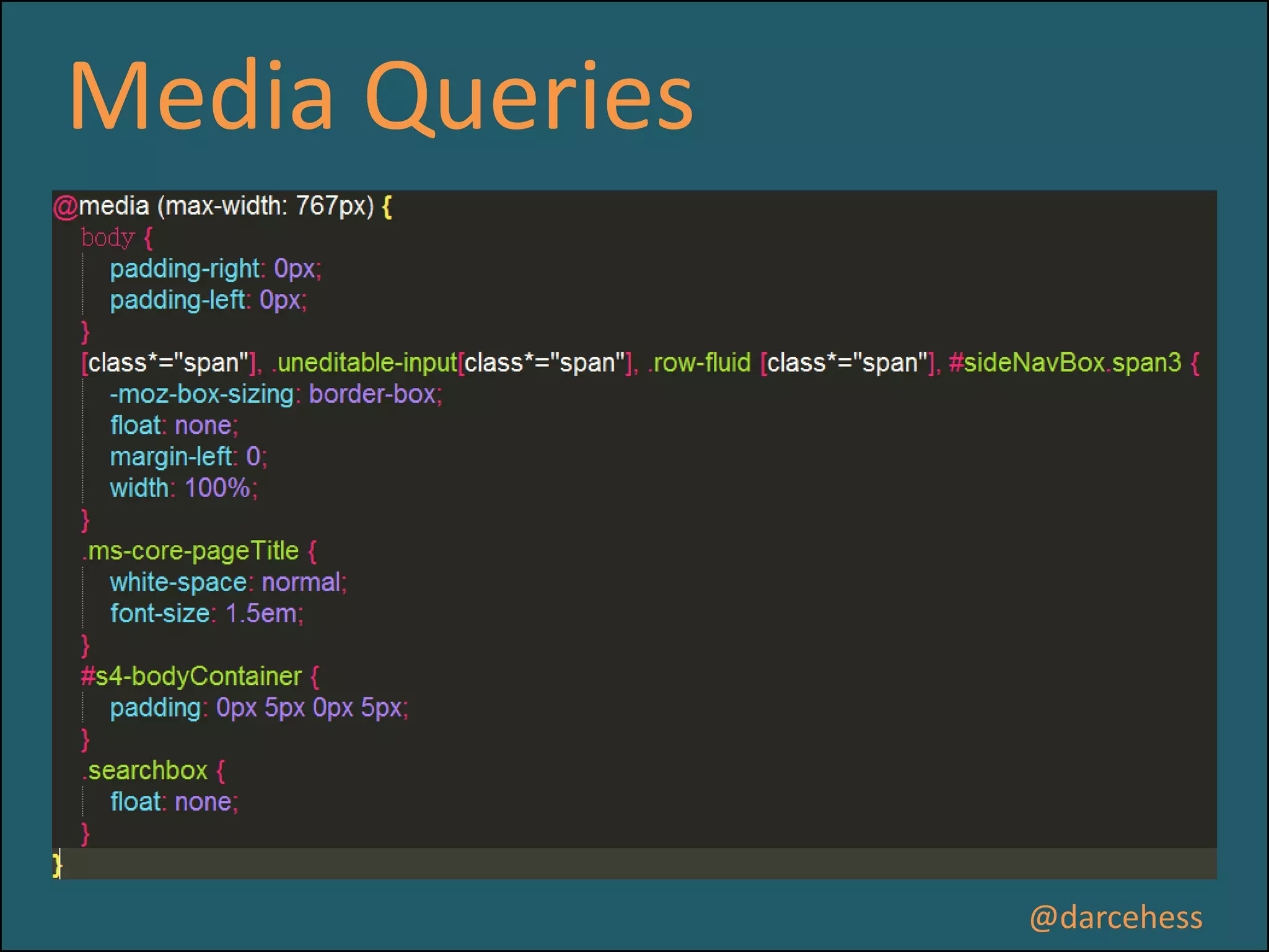
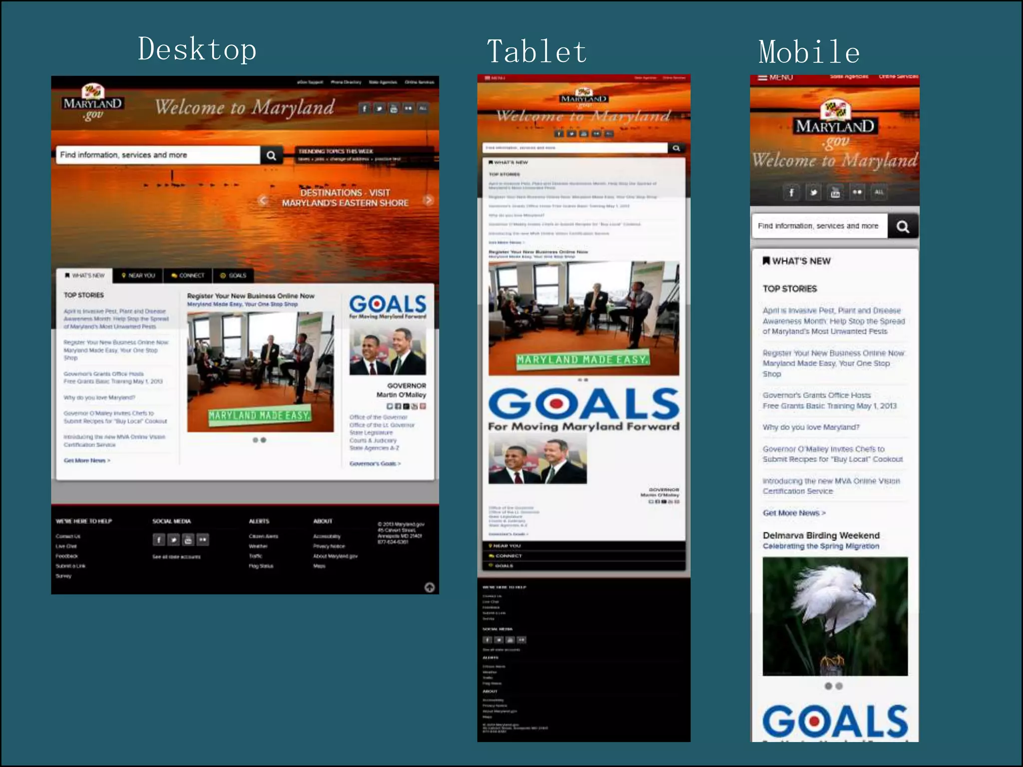
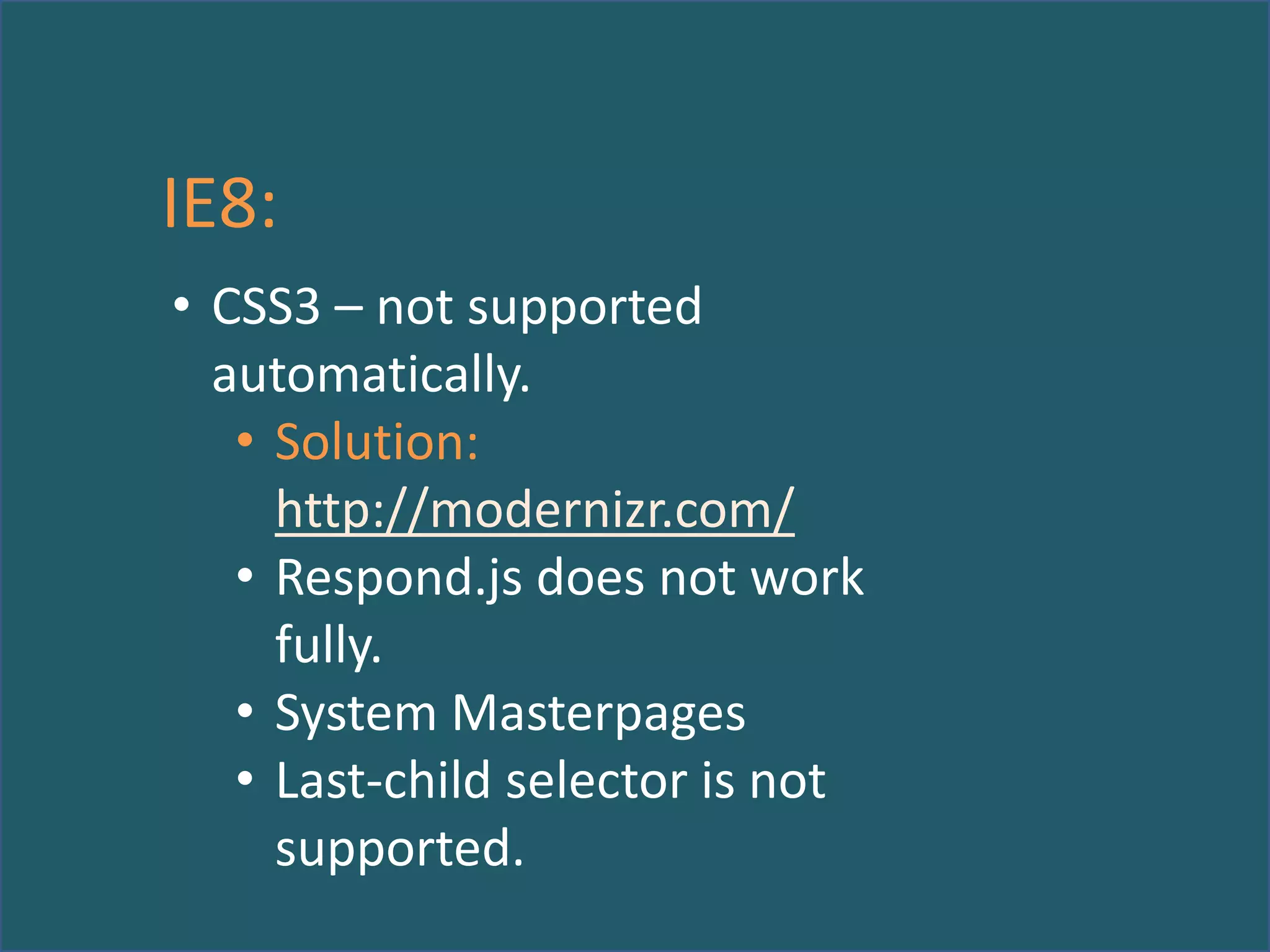
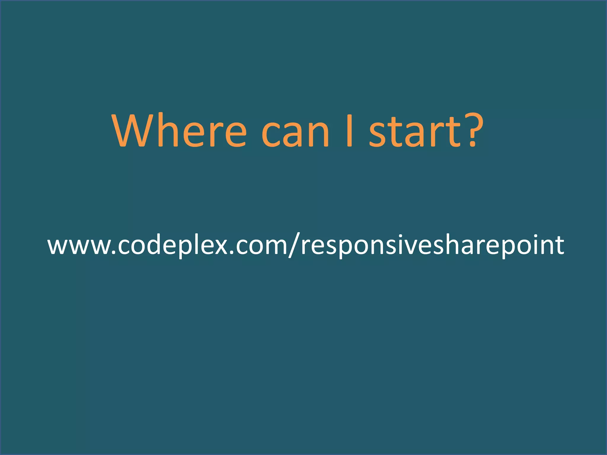
p
g
Responsive Design & SharePoint
Is it right for you?

SharePoint Saturday St. Louis 1/11/2014 #SPSSTL
The Test

1 .Back_Row{
2 move to front
3}
@darcehess
For Coders

1 $(“tr:last”).each(function () {
2 moveForward();
3 });

@darcehess
Who am I?
D’arce Hess
Developer, Athlete and Musician
PixelMill
Blog: www.thebrandingbutterfly.com
Website: www.pixelmill.com
Email: dhess@pixelmill.com
@darcehess

www.linkedin.com/in/darcehess/
http://www.youtube.com/user/DarceHess
Please send feedback
Mobile App:
http://spsaturday.azurewebsites.net/SPSSTL
Session Evaluations
Schedule and evaluate each session you attend via our
mobile app that can be used across devices at
http://spsaturday.cloudapp.net

You will be able to evaluate a session 25 minutes before the
scheduled end time
Evaluations are stored anonymously and your feedback is
appreciated
The app will be the only method available to submit session
evaluations for the event and we hope you find it intuitive
and convenient
Developing
SharePoint
solutions since
2004

SharePoint
Branding and UI
Specialists

Developer of
Cost effective
SharePoint
Templates

Your
SharePoint
Branding
Experts
The
Dilemma
Have you looked up a
website on your mobile
device and had to pinch the
screen to expand the
content to reach the
information you need?

@darcehess
Mobile Users
Anonymous
1. Is this you?
2. Admit you have a
UI/UX problem
3. Seek help
4. Have better
experience
@darcehess

5. Win the lottery!
Why
Consider
Mobile?
Users accessed information
using a single device.
Used Keyboard and a mouse
to deliver user experience.

@darcehess
Device Channels

•

Allowed for individual master
pages to target specific devices.

•

Allowed for a unique viewing
experience

•

Required users to maintain multiple
master pages in order to provide
unified experience for users.

•

Only available in SharePoint 2013
Publishing Sites.

•

Can have a maximum of 10 device
channels.

@darcehess
Progressive
Enhancement
Named by Steve Champeon in
2003.
Focuses on Content first
A difficult fit for SharePoint
since SharePoint starts with a
desktop view first.

@darcehess
Responsive Design
 Ethan Marcotte coined the term responsive web design (RWD) in a May 2010
article in A List Apart.
 Uses fluid grids and CSS3 Media Queries to adjust layout as screen width
decreases.

 The fluid grid concept calls for page element sizing to be in relative units like
percentages, but can also use pixels or points.
 All content remains and adjusts to the screen width

@darcehess
Fluid Grids
The fluid grid system uses percentages
instead of pixels for column widths
ensuring proper proportions for key screen
resolutions and devices.

@darcehess
Desktop View
Phone View

Tablet View
Demo
http://www.calguard.ca.gov/
What it looks like
In Practice
Break Points
Here are some common break points to use for your RWD
sites

320 px — Mobile portrait
480 px — Mobile landscape
600 px — Small tablet
768 px — Tablet portrait
1024 px — Tablet landscape/Netbook
1280 px & greater — Desktop
@darcehess
Media Queries

@darcehess
Adaptive Design
Definition:
Adaptive – “Serving
or Able to adapt, like
the coloring of a
chameleon.”

@darcehess
Focuses more on presentation
than on content.
Items may selected to be hidden
or not presented as screen width
decreases. i.e. Banner images or
columns.

@darcehess
Desktop

Tablet

Mobile
Dealing with
legacy browsers
IE8:
• CSS3 – not supported
automatically.
• Solution:
http://modernizr.com/
• Respond.js does not work
fully.
• System Masterpages
• Last-child selector is not
supported.
Where can I start?
www.codeplex.com/responsivesharepoint
Choose one:
1)Question?
2)I am completely lost….help?

3)Would like more information.
Housekeeping
• Follow SharePoint Saturday St. Louis on Twitter
@spsstlouis and hashtag #spsstl
• Play “Sponsor Bingo” to register for your chance to win
one of the many great giveaways at the end of the day
• Schedule and evaluate each session you attend via our
mobile app that can be used across devices at
http://spsaturday.cloudapp.net
Thanks to Our Sponsors!

Responsive Design & SharePoint - Is it right for you?

  • 1.
    p g Responsive Design &SharePoint Is it right for you? SharePoint Saturday St. Louis 1/11/2014 #SPSSTL
  • 2.
    The Test 1 .Back_Row{ 2move to front 3} @darcehess
  • 3.
    For Coders 1 $(“tr:last”).each(function() { 2 moveForward(); 3 }); @darcehess
  • 4.
    Who am I? D’arceHess Developer, Athlete and Musician PixelMill Blog: www.thebrandingbutterfly.com Website: www.pixelmill.com Email: dhess@pixelmill.com @darcehess www.linkedin.com/in/darcehess/ http://www.youtube.com/user/DarceHess
  • 5.
    Please send feedback MobileApp: http://spsaturday.azurewebsites.net/SPSSTL
  • 6.
    Session Evaluations Schedule andevaluate each session you attend via our mobile app that can be used across devices at http://spsaturday.cloudapp.net You will be able to evaluate a session 25 minutes before the scheduled end time Evaluations are stored anonymously and your feedback is appreciated The app will be the only method available to submit session evaluations for the event and we hope you find it intuitive and convenient
  • 7.
    Developing SharePoint solutions since 2004 SharePoint Branding andUI Specialists Developer of Cost effective SharePoint Templates Your SharePoint Branding Experts
  • 8.
    The Dilemma Have you lookedup a website on your mobile device and had to pinch the screen to expand the content to reach the information you need? @darcehess
  • 9.
    Mobile Users Anonymous 1. Isthis you? 2. Admit you have a UI/UX problem 3. Seek help 4. Have better experience @darcehess 5. Win the lottery!
  • 10.
  • 11.
    Users accessed information usinga single device. Used Keyboard and a mouse to deliver user experience. @darcehess
  • 12.
    Device Channels • Allowed forindividual master pages to target specific devices. • Allowed for a unique viewing experience • Required users to maintain multiple master pages in order to provide unified experience for users. • Only available in SharePoint 2013 Publishing Sites. • Can have a maximum of 10 device channels. @darcehess
  • 13.
  • 14.
    Named by SteveChampeon in 2003. Focuses on Content first A difficult fit for SharePoint since SharePoint starts with a desktop view first. @darcehess
  • 15.
  • 16.
     Ethan Marcottecoined the term responsive web design (RWD) in a May 2010 article in A List Apart.  Uses fluid grids and CSS3 Media Queries to adjust layout as screen width decreases.  The fluid grid concept calls for page element sizing to be in relative units like percentages, but can also use pixels or points.  All content remains and adjusts to the screen width @darcehess
  • 17.
    Fluid Grids The fluidgrid system uses percentages instead of pixels for column widths ensuring proper proportions for key screen resolutions and devices. @darcehess
  • 18.
  • 19.
  • 20.
  • 21.
  • 22.
    Break Points Here aresome common break points to use for your RWD sites 320 px — Mobile portrait 480 px — Mobile landscape 600 px — Small tablet 768 px — Tablet portrait 1024 px — Tablet landscape/Netbook 1280 px & greater — Desktop @darcehess
  • 23.
  • 24.
  • 25.
    Definition: Adaptive – “Serving orAble to adapt, like the coloring of a chameleon.” @darcehess
  • 26.
    Focuses more onpresentation than on content. Items may selected to be hidden or not presented as screen width decreases. i.e. Banner images or columns. @darcehess
  • 27.
  • 28.
  • 29.
    IE8: • CSS3 –not supported automatically. • Solution: http://modernizr.com/ • Respond.js does not work fully. • System Masterpages • Last-child selector is not supported.
  • 30.
    Where can Istart? www.codeplex.com/responsivesharepoint
  • 31.
    Choose one: 1)Question? 2)I amcompletely lost….help? 3)Would like more information.
  • 32.
    Housekeeping • Follow SharePointSaturday St. Louis on Twitter @spsstlouis and hashtag #spsstl • Play “Sponsor Bingo” to register for your chance to win one of the many great giveaways at the end of the day • Schedule and evaluate each session you attend via our mobile app that can be used across devices at http://spsaturday.cloudapp.net
  • 33.
    Thanks to OurSponsors!