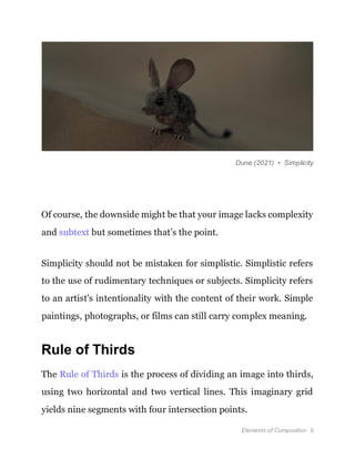
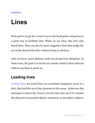
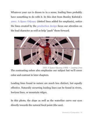
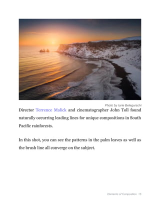
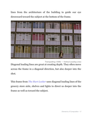
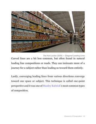
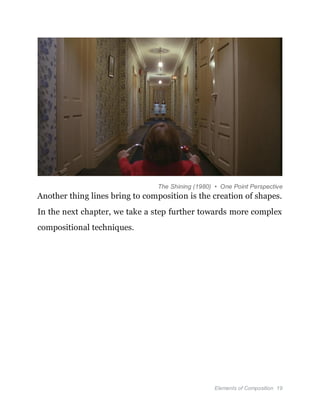
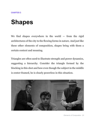
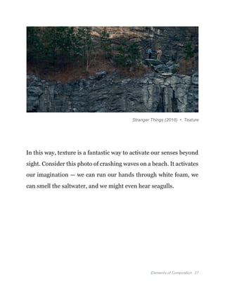
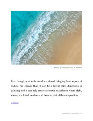
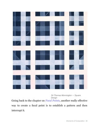
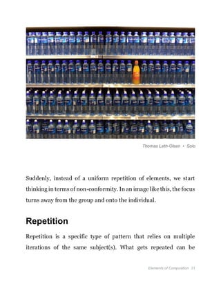
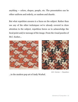
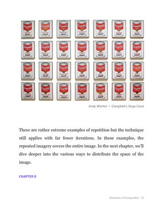
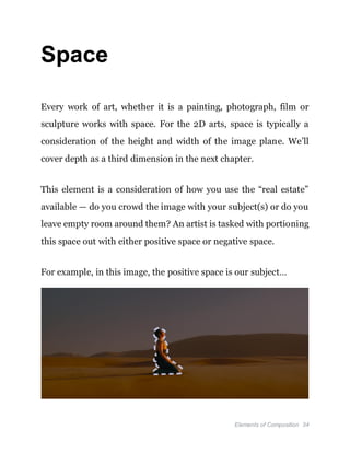
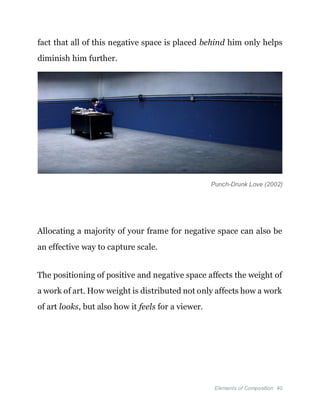
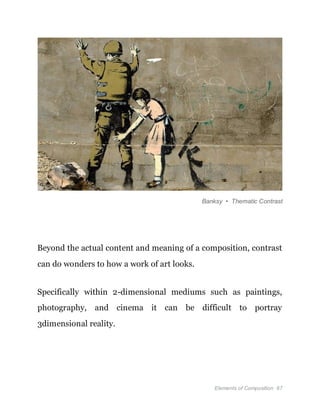
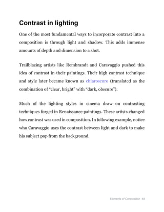
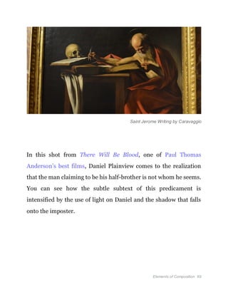
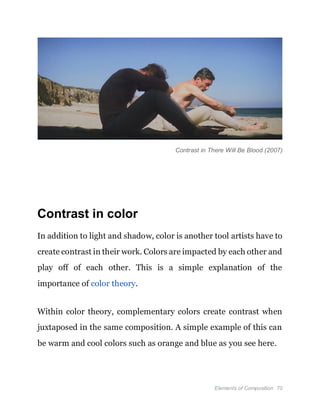
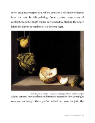
This document provides an overview of compositional elements for art, photography, and film. It discusses key elements such as focal points, lines, shapes, textures, patterns, space, depth, balance, contrast, color, tone, angle, and more. The goal is to lay out foundational concepts of composition to help creators develop their own approach to visual storytelling through intentional arrangement and design. Mastery of composition allows artists, photographers, and filmmakers to convey meaning, emotion, and ideas through a single image.
3. Video on composition : https://uii.io/1p5LD
CONTENTS
Introduction 4
What is Composition? 5
Focal points 7
Lines 13
Shapes 20
Textures 25
Patterns 29
Space 34
Depth 44
Balance 51
Contrast 64
Color 72
Tone 76
Angle 82
Conclusion 88
4. More Books 89
Foreword
The impetus behind StudioBinder was simple — to create a holistic
production management solution that could handle everything
from screenwriting and storyboards, to shooting schedules and call
sheets.
But once this was done, it became clear that creating the software
wasn't enough, we had to educate as well. Navigating the world of
advertising, filmmaking, photography, music videos, etc. is a
daunting task full of jargon, new technologies, and moving pieces.
The StudioBinder Blog, which hosts over two thousand articles and
millions of readers every month, and our YouTube channel,
5. Elements of Composition 2
which is well beyond 1 million subscribers, were born out of this
goal to educate.
StudioBinder’s business and educational aspirations have aligned
in ways that continually inspires me. And it has been a real honor
and joy to watch the StudioBinder community grow.
Which brings us to this latest resource: Elements of Composition in
Art, Photography & Film — The Complete Guide. Composition can
be a rather subjective and elusive concept — more intuitive than
prescriptive — and every image maker approaches it differently.
No matter if you’re an artist, photographer or filmmaker,
composition is an imperative aspect of the craft. Even if you’ve
never studied composition, the “rules” and techniques are very
accessible. In fact, you’ve probably utilized these concepts every
time you snap a photo or sketch out a storyboard. In many ways,
composition is instinctual.
Our goal in this book is lay out the basic foundational elements of
composition. Not for the purpose of memorization but to give you
a head start as you develop your own approach. We hope you
6. Elements of Composition 3
enjoy the book and that it inspires a new way to visualize your
next image.
Robert Kiraz, CEO
StudioBinder
7. Elements of Composition 4
CHAPTER 1
Introduction
How do you tell a story in a single image? For many artists,
photographers and filmmakers, this is the ultimate question.
Granted, telling a story is not a pre-requisite for an image — a
simple landscape can be just as evocative and resonant as anything.
But even then there is still a story to be found.
Composition is a catchall concept that guides the image maker on
their journey to tell a story, convey a message, or evoke an idea. Art
is communication between the maker and the observer. Sometimes
the language used is clear and familiar, other times it is obtuse and
cryptographic. It all depends on the goals of the artist.
Image makers working today should understand than anyone
consuming their work has a lifetime of experience “reading”
images. Even if they can’t articulate it, they intuitively understand
8. Elements of Composition 5
what “looks good” and what “looks bad” when it comes to
composition.
And if the artist wants to take control of the reception of their work,
they need to consider how composition works and how it can be
used.
What follows is an introduction to composition, the basic elements
and how they work in combination. These aren’t dogmatic rules
that must be followed; merely guiding principles that have worked
for centuries to create some universally accepted ideas about
images, their meanings and interpretations.
CHAPTER 2
What is Composition?
Composition is the arrangement of elements within an image. It is
a means for an artist to convey specific emotions, stories, or
meanings within a singular arrangement. It is where you place your
9. Elements of Composition 6
subject(s) in relation to each other. It is how you use color to create
contrast. It is the size of your subject compared to the empty space
around them.
And that’s just the beginning.
While there are no absolute rules for composition, there are various
principles that artists utilize to create compositions that convey
what they desire. In many ways, you already understand these
principles on a gut level.
Whether you were aware or not, you’ve spent your life looking at
and “reading” images. And since these same principles have been
studied, utilized and passed down through the centuries, you’re
already well-versed. Now it’s just time to give these concepts
names.
Each chapter in this book is dedicated to one of the many elements
of composition, along with some relevant techniques. Depending
on your personal aesthetic, some of these elements may be
irrelevant while others you might come to embrace.
10. Elements of Composition 7
And, of course, all art is subjective and there are no claims here that
following these guidelines will guarantee the perfect image.
Consider this more of an inspirational guide and less of a strict set
of rules.
CHAPTER 3
Focal points
To start, let’s talk about focal points. As the name suggests, this is a
point of focus — where you want the eye to go. Often this point is
the main subject or idea of the image, the thing that matters most
in how the image is read. This sounds pretty simple but it can get
complicated very quickly.
For example, if you have multiple points of focus, which is more
important? What can you do with composition to make sure “Focal
Point A” carries more weight than “Focal Point B”?
11. Elements of Composition 8
Luckily, there are a few composition techniques to help establish
and prioritize these points of focus.
Simplicity
Simplicity is the philosophy and practice of creating only what is
necessary within a work of art. Simplicity depends greatly on both
the artist and what they are exploring or expressing through their
medium.
The artist must decide what is absolutely necessary within their
work of art and what is not. By discarding what is unnecessary, the
artist strives for simplicity.
It makes a lot of sense — if you want the subject of your image to be
clear and definitive, leave everything else off. Don’t distract the
viewer with extra “stuff,” just keep it plain and simple.
12. Elements of Composition 9
Dune (2021) • Simplicity
Of course, the downside might be that your image lacks complexity
and subtext but sometimes that’s the point.
Simplicity should not be mistaken for simplistic. Simplistic refers
to the use of rudimentary techniques or subjects. Simplicity refers
to an artist's intentionality with the content of their work. Simple
paintings, photographs, or films can still carry complex meaning.
Rule of Thirds
The Rule of Thirds is the process of dividing an image into thirds,
using two horizontal and two vertical lines. This imaginary grid
yields nine segments with four intersection points.
13. Elements of Composition 10
When you position the most important elements of your image at
these intersection points, you produce a much more natural image.
It is also suggested that the horizon is placed on either the top or
bottom horizontal lines.
2001: A Space Odyssey (1968) • Rule of Thirds
Off-center composition is pleasing to the eye because it’s typically
where the eyes go first. When there is a subject or object offcenter,
it also gives viewers the ability to interact with that space between
them.
This allows for interpretation and conversation between the subject
and the background, as opposed to a fully centered subject.
This compositional rule is perhaps the most well-known and
commonly-employed technique. The rule provides a reliable
14. Elements of Composition 11
guideline for framing your shots and an excellent starting point for
beginners who hope to dip their toes into the many rules of
composition.
Golden Triangle
The Golden Triangle is another way to create balanced focal points
in an image. This is done by drawing a diagonal line across the
image, with two additional lines from the remaining corners
intersecting the first line at 90 degrees.
In this example from Pulp Fiction, you can see how this is done.
Jules and Honey Bunny land perfectly on these intersections with
that main diagonal marking a natural eyeline, especially for Vincent
aiming in the middle.
15. Elements of Composition 12
Pulp Fiction (1994) • The Golden Triangle
The key with the Golden Triangle is that it creates a balanced
composition. Instead of simply a balance between “left and right,”
we also get “top and bottom” of the frame, all at the same time.
Points are a basic element of composition and a natural starting
point. In the next chapter, we’ll look another element that helps to
draw the eye to those points: lines.
16. Elements of Composition 13
CHAPTER 4
Lines
If the goal is to get the viewer’s eye to the focal point, using lines is
a great way to facilitate that. When we say lines, this isn’t only
literal lines. They can also be more suggestive lines that nudge the
eye in the desired direction without being so obvious.
And, of course, more abstract works can forego lines altogether. In
those cases, the goal is to let the eye wander which is best achieved
without any lines to guide us.
Leading lines
Leading lines are actual lines (or sometimes imaginary ones) in a
shot, that lead the eye to key elements in the scene. Artists use this
technique to direct the viewer’s eye but they also use it to connect
the character to essential objects, situations, or secondary subjects.
17. Elements of Composition 14
Whatever your eye is drawn to in a scene, leading lines probably
have something to do with it. In this shot from Stanley Kubrick’s
2001: A Space Odyssey (dotted lines added for emphasis), notice
the lines created by the production design focus our attention on
the lead character as well as help “push” them forward.
2001: A Space Odyssey (1968) • Leading Lines
The contrasting colors also emphasize our subject but we’ll cover
color and contrast in later chapters.
Leading lines found in nature are much less distinct, but equally
effective. Naturally occurring leading lines can be found in rivers,
horizon lines, or mountain ridges.
In this photo, the slope as well as the waterline curve our eyes
directly towards the natural focal point (the sun).
18. Elements of Composition 15
Photo by Iurie Belegurschi
Director Terrence Malick and cinematographer John Toll found
naturally occurring leading lines for unique compositions in South
Pacific rainforests.
In this shot, you can see the patterns in the palm leaves as well as
the brush line all converge on the subject.
19. Elements of Composition 16
The Thin Red Line (1998) • Leading Lines
Artificial or man made structures produce the most distinct leading
lines. Things like streets, fences, buildings, and bridges all have
very distinguished features and lines that can be used in your
compositions.
Horizontal leading lines move across the frame from left to right.
They are precisely horizontal and parallel with the top and bottom
of the frame.
Vertical leading lines guide the viewer's eye upward or downward
in the frame. This shot from the film Trainspotting uses the vertical
20. Elements of Composition 17
lines from the architecture of the building to guide our eye
downward toward the subject at the bottom of the frame.
Trainspotting (1996) • Vertical Leading Lines
Diagonal leading lines are great at creating depth. They often move
across the frame in a diagonal direction, but also deeper into the
shot.
This frame from The Hurt Locker uses diagonal leading lines of the
grocery store aisle, shelves and lights to direct us deeper into the
frame as well as toward the subject.
21. Elements of Composition 18
The Hurt Locker (2009) • Diagonal Leading Lines
Curved lines are a bit less common, but often found in natural
leading line compositions or roads. They can insinuate more of a
journey for a subject rather than leading us toward them entirely.
Lastly, converging leading lines from various directions converge
toward one space or subject. This technique is called one-point
perspective and it was one of Stanley Kubrick’s most common types
of composition.
22. Elements of Composition 19
The Shining (1980) • One Point Perspective
Another thing lines bring to composition is the creation of shapes.
In the next chapter, we take a step further towards more complex
compositional techniques.
23. Elements of Composition 20
CHAPTER 5
Shapes
We find shapes everywhere in the world — from the rigid
architectures of the city to the flowing forms in nature. And just like
these other elements of composition, shapes bring with them a
certain context and meaning.
Triangles are often used to illustrate strength and power dynamics,
suggesting a hierarchy. Consider the triangle formed by the
blocking in this shot and how even though the subject in the middle
is center-framed, he is clearly powerless in this situation.
24. Elements of Composition 21
In Cold Blood (1967) • Triangle Blocking
Circles can bring an entirely different dynamic to a composition. In
some cases, a sense of calm orderliness or, in this shot from Kill Bill
Vol. 1, being surrounded on all sides by the enemy.
Kill Bill Vol. 1 (2003) • Circle Blocking
Beyond pure geometry of literal circles and squares, we can also
think in terms of how shapes are created by the relationship
between subjects or between the subject and the background. One
of these techniques involves creating a secondary frame within the
frame.
25. Elements of Composition 22
Frame within a frame
There are certain compositional techniques that make a shot
visually beautiful. There are other compositional techniques that
are effective at visually telling a story. The frame within a frame
does both.
Creating a frame within a frame is as simple as finding any shape
or visual element in your scene that can frame your subject within
the shot. This can be set pieces like doorways, windows, or
furniture.
For example, this iconic frame within a frame from The Graduate
uses a leg to frame the main character, Ben. It’s pretty obvious what
this composition is aiming for.
Mrs. Robinson is setting a trap, walling him into an uncomfortable
situation he can’t escape. But she’s also seducing him and the bare
leg is the perfect symbol for it.
26. Elements of Composition 23
The Graduate (1967) • Frame Within a Frame
Though it can be effective, you don’t always need to use foreground
elements to create a frame within a frame. In the following shot, the
translucent drapes create a vertical, rectangular frame around the
subject, isolating him from his surroundings and guiding our eyes
directly to him.
27. Elements of Composition 24
The Master (2012) • Frame Within a Frame
The frame within a frame is an incredibly effective and versatile
compositional technique that can be created in a variety of ways.
It has created some of the most iconic shots in cinema because of
both its aesthetic qualities and narrative function.
CHAPTER 6
28. Elements of Composition 25
Textures
Texture is an interesting aspect of composition because it’s less
about “arrangement” and more about the tactile aspects of an
image. This element gives the composition a tangible aspect by
appealing to our sense of touch.
Especially in terms of painting, where paint can be applied to give
the surface of the canvas a third dimension. For example, when the
globules of paint bulge off of the canvas and actual brushstrokes
can be seen.
29. Elements of Composition 26
Paintings by Lisa Elley
But this effect can still be achieved in 2D media like film and
photography — it all comes down to what you’re shooting.
In this shot from Stranger Things, notice how the texture of the
rocks and trees interact with the subjects. This does a couple of
things for us — it gives us a clear sense of location and the natural
world surrounding the subjects.
30. Elements of Composition 27
Stranger Things (2016) • Texture
In this way, texture is a fantastic way to activate our senses beyond
sight. Consider this photo of crashing waves on a beach. It activates
our imagination — we can run our hands through white foam, we
can smell the saltwater, and we might even hear seagulls.
31. Elements of Composition 28
Photo by Rabih Shasha • Texture
Even though most art is two-dimensional, bringing these aspects of
texture can change that. It can be a literal third dimension in
painting and it can help create a sensual experience where sight,
sound, smell and touch can all become part of the composition.
CHAPTER 7
32. Elements of Composition 29
Patterns
Humans are pattern-seeking animals. And so, composing an image
with patterns has an immediate effect to draw us in.
But other than focus, why else would an image maker use patterns?
For one, they can create a sense of rhythm in an image. Even
without music, you can see in the image below how the intermittent
stripes, boxes, and rectangles generate a rhythm.
33. Elements of Composition 30
Sir Thomas Monnington • Square
Design
Going back to the chapter on Focal Points, another really effective
way to create a focal point is to establish a pattern and then
interrupt it.
34. Elements of Composition 31
Thomas Leth-Olsen • Solo
Suddenly, instead of a uniform repetition of elements, we start
thinking in terms of non-conformity. In an image like this, the focus
turns away from the group and onto the individual.
Repetition
Repetition is a specific type of pattern that relies on multiple
iterations of the same subject(s). What gets repeated can be
35. Elements of Composition 32
anything — colors, shapes, people, etc. The presentation can be
either uniform and orderly, or random and chaotic.
But what repetition ensures is a focus on the subject. Rather than
use any of the other techniques we’ve already covered to draw
attention to the subject, repetition forces us to acknowledge the
focal point and/or message of the image. From the visual puzzles of
M.C. Escher…
M.C. Escher • Repetition
…to the modern pop art of Andy Warhol.
36. Elements of Composition 33
Andy Warhol • Campbell’s Soup Cans
These are rather extreme examples of repetition but the technique
still applies with far fewer iterations. In these examples, the
repeated imagery covers the entire image. In the next chapter, we’ll
dive deeper into the various ways to distribute the space of the
image.
CHAPTER 8
37. Elements of Composition 34
Space
Every work of art, whether it is a painting, photograph, film or
sculpture works with space. For the 2D arts, space is typically a
consideration of the height and width of the image plane. We’ll
cover depth as a third dimension in the next chapter.
This element is a consideration of how you use the “real estate”
available — do you crowd the image with your subject(s) or do you
leave empty room around them? An artist is tasked with portioning
this space out with either positive space or negative space.
For example, in this image, the positive space is our subject…
38. Elements of Composition 35
Positive Space • Mad Max: Fury Road (2015)
…and the negative space is the desert surrounding her.
Negative Space • Mad Max: Fury Road (2015)
Positive space and negative space are two sides of the same coin.
One does not have as much impact without the other one existing.
Let’s take a look at these concepts to better understand how they
work together.
39. Elements of Composition 36
Positive space
Positive space is a term used to refer to the areas of interest and
focus in a piece of artwork. This is often the subject of a work of art
such as a person, landscape, or object. Even in abstract art where
there may not be a definitive subject, shapes and patterns can
become positive space.
Creating positive space might sound simple. After all, most of the
positive space in a piece of artwork is simply the subject. Consider
this iconic painting by French post-Impressionist artist Georges
Seurat.
The painting, appropriately titled A Sunday Afternoon on the
Island of La Grande Jatte creates positive space in a unique way.
The painting does not have a singular point of positive space, but
various subjects and areas of positive space that paint the scene of
a busy park.
40. Elements of Composition 37
“A Sunday Afternoon…” by Georges Seurat
Your eye might initially be the couple to the right of the frame in
shadow. But you soon find that your eyes wander from person to
person as if you are people watching at a park during a leisurely
Sunday. This is the function of creating positive space in an image.
It creates points of engagement for the viewer.
As you can see, positive space is a powerful tool that can be created
in various ways. The distinction of positive space as simply the
41. Elements of Composition 38
subject of a work or art can be misleading. Rather, use positive
space as points of interest that engage the viewer whether it is a
subject or something else.
Negative Space
Negative space is a term used in art to describe the space
surrounding a subject. Also called white space, it is typically empty
and lacks details as to simplify an image.
Negative space can be used for psychological effect making it a
great storytelling device. When using negative space, many
photographers and cinematographers frame the subject from
further away. This makes them smaller in the frame and creates
space around them.
Notice how in Christina’s World by Andrew Wyeth, the empty
space around the subject becomes just as meaningful in the
composition as the subject herself.
42. Elements of Composition 39
Christina’s World by Andrew Wyeth
Small areas of positive space, commonly a person or subject, can be
encompassed by negative space to reflect the internal state of the
subject. This emotional state is often loneliness or isolation that is
portrayed through the emptiness around them.
Look at this shot from PT Anderson’s Punch-Drunk Love and look
how the negative space surrounds and dominates our subject. The
43. Elements of Composition 40
fact that all of this negative space is placed behind him only helps
diminish him further.
Punch-Drunk Love (2002)
Allocating a majority of your frame for negative space can also be
an effective way to capture scale.
The positioning of positive and negative space affects the weight of
a work of art. How weight is distributed not only affects how a work
of art looks, but also how it feels for a viewer.
44. Elements of Composition 41
Fill the frame
Filling the frame is the technique of composing an image so that
positive space takes up most or all of the frame. This technique is
often used to draw immediate and direct attention toward a
subject.
In this technique, a single subject is framed close up so that it
literally fills the frame. Filling the frame can be accomplished by
getting closer to a subject, using zoom lenses, macro lenses, or
cropping an image during editing.
In cinema, filling the frame with positive space is most commonly
achieved with the extreme close up shot. Learn more about this
shot and more in our breakdown of every type of camera shot.
When filling the frame, the positive space takes up most or all of
the frame. This leaves no negative space for the viewer’s eyes to
wander.
45. Elements of Composition 42
Photo by Michael Davis
This use of positive space will immediately demand the viewer’s
focus. When a subject is a person, filling the frame with their face
can create a deeper emotional connection between audience and
subject.
46. Elements of Composition 43
Simplicity
Simplicity is the philosophy and practice of creating only what is
necessary within a work of art. By discarding what is unnecessary,
the artist strives for simplicity.
Simplicity should not be mistaken for simplistic, which refers to the
use of rudimentary techniques or subjects. Simple paintings,
photographs, or films can still carry complex meaning.
In regards to space, this concept of simplicity actually works
towards both positive and negative space. Filling the frame
eliminates all other subjects, which is the definition of simplicity.
Similarly, when a single subject is surrounded by negative space,
we can also discuss the composition in terms of simplicity. By
showing the empty space around the subject, we still think in terms
of simplicity, but a context and meaning is added.
Simplicity in cinematography allows sophisticated themes,
narratives, or characters to be more digestible to an audience
leaving them more immersed and engaged in the film.
47. Elements of Composition 44
American Beauty (1999) • Simplicity
This concept of space is usually discussed in terms of two
dimensions — height and width — but in the next chapter, we’ll
explain how to bring a third dimension into your compositions.
CHAPTER 9
Depth
Despite being a 2D medium, most art, photography, and film
depicts 3D space. The way this is achieved is through depth — the
illusion of space created along the z-axis.
48. Elements of Composition 45
Aiding in this process is the use of the foreground, middle ground,
and background. This layering of subjects and elements in an image
can do wonders at creating this illusion.
Another technique is to use a vanishing point. The simplest
explanation is to make things smaller the “further” away you get.
And going back to our earlier chapter on Lines, leading lines are
indispensable in selling the illusion.
Vanishing Point by Paul (Dex)
49. Elements of Composition 46
Now, let’s go into a couple more techniques that help create the
illusion of depth in a little more detail.
Foreground elements
Foreground elements are visual elements that are positioned
between the camera and the subject. They are used in painting,
photography, and cinematography to add depth, provide context,
or create unique compositions.
The middle ground is often (but not always) where the subject is
positioned. The background is what falls behind the subject. And
the foreground is between the camera and the subject.
Creating depth in two-dimensional mediums can be challenging.
Adding a simple foreground element is perhaps the easiest and
most immediate way to add depth to an image.
Foreground elements give the viewer a better perception of space
within the image. This painting titled Paris Street; Rainy Day by
Gustave Caillebotte shows how a simple foreground element can
add depth to an image.
50. Elements of Composition 47
Paris Street; Rainy Day by Gustave Caillebotte
Our eyes are drawn to the couple under the umbrella. Their
placement within the Rule of Thirds makes them a natural subject.
Caillebotte utilizes the left portion of the frame to fill out the
background creating depth and providing the context of a rainy day
in Paris.
51. Elements of Composition 48
Deep space composition
In many images, the foreground and background are there simply
for context around the subject in the middle ground. But not all
images need to be so exclusive. With deep space composition, all
three planes are represented, in focus, and included in the “story.”
Citizen Kane's famous deep focus shots are still some of the best. In
this scene, director Orson Welles positions the characters at
different depths, while all four stay in focus.
52. Elements of Composition 49
Citizen Kane (1941) • Deep Space Composition
The different depths are indicative of what is going on with each
character. The little boy appears far away, but in frame, to remind
us that he is going to be out of the picture soon, once they send him
away.
So far, we’ve covered many elements and considerations when
compositing an image. But finding the perfect balance between
53. Elements of Composition 50
them all is a challenge unto itself. Let’s learn more about balance in
the next chapter.
54. Elements of Composition 51
CHAPTER 10
Balance
There is something incredibly satisfying about balance in art. While
you may not be able to define it (yet), most people know it when
they see it. From architecture to paintings to photography to
cinema, balance is a tool used by artists of all mediums.
The concept of balance has many applications in composition. You
might have spatial balance between areas of the image but then the
color scheme, shapes, or tones might be off-balanced.
So, we can consider whether specific elements are individually
balanced or whether the entire image overall has found its own
holistic balance. Symmetry is one such way to approach balance in
composition.
55. Elements of Composition 52
Symmetrical balance
Symmetrical balance is achieved in work of art when visual
elements are arranged on both sides of either a horizontal or
vertical center line in equal weight.
Symmetrical balance is difficult to achieve by accident. When
artists incorporate symmetry into their work, it is with direct
intention. Why would an artist base their entire composition
around symmetrical balance?
The visual nature of symmetrical balance draws attention toward
itself. While this can take away from the naturalism or realism of a
composition, it can be an effective tool to direct the viewer’s eye to
a focal point.
56. Elements of Composition 53
Image by Roc Isern
The equally balanced weight on both sides of a composition will
more often than not direct their eye toward the center of the frame.
57. Elements of Composition 54
Wes Anderson, one of the masters of symmetrical balance in
cinema, uses symmetry for this effect in his work. In nearly all of
Anderson's best films, you can find a shot that uses symmetrical
balance to draw focus toward a character. In fact, it is one of the key
characteristics of Anderson’s directing style.
Moonrise Kingdom (2012) • Symmetrical Balance
Within art, symmetrical balance can have its pros and cons. The
effects we mentioned above can benefit an artist’s work depending
on what they are trying to create and communicate.
58. Elements of Composition 55
On the other hand, a symmetrical composition can be rather
predictable and push the area of boring. If one side of the
composition is exactly like the other, then one half of the frame is
redundant. Instead, many modern artists have leaned into the use
of asymmetrical balance.
Asymmetrical balance
Asymmetry might simply seem to be the opposite of symmetry.
However, there is much more to it than that. Asymmetrical balance
is the technique of using differing visual elements of unequal
weight on both sides of a composition to achieve a sense of balance.
The nature of asymmetrical compositions is characterized by visual
variety as a way to evoke a sense movement by allowing differing
elements to carry the eye.
In this iconic painting, the power and movement of the colossal
wave can almost be felt because of the asymmetrical balance.
59. Elements of Composition 56
The Great Wave off Kanagawa by Katsushika Hokusai
The left side of the frame is filled with the positive space of the
wave. The right side is filled with empty negative space, creating a
sense of movement of where the wave is moving toward.
By creating balance between differing visual elements, artists tend
to create a connection between them. The juxtaposition of two
unlike things makes viewers innately want to compare and contrast
them.
60. Elements of Composition 57
In Arrival, one of Denis Villeneuve’s best films, asymmetrical
balance is in a shot’s composition used to capture the emotions
between humans and aliens.
Arrival (2016) • Asymmetrical Balance
Note how asymmetrical compositions are used to underscore the
barrier between the alien species and humans. The asymmetry
creates tension, yet a connection at the same time.
This technique can be used for specific effects two create a sense of
balance, movement, and variety in a composition. Besides
symmetrical and asymmetrical, there is yet another form of balance
to consider.
61. Elements of Composition 58
Radial balance
Radial balance is the arrangement of visual elements around a
central point. Radial balance is often a type of symmetrical balance
that is circular in nature.
The circle is perhaps the shape that humans have been drawn to the
most throughout history. One of the best ways to apply the circle in
art is through radial balance.
As the visual elements radiate, they form an orderly pattern in an
image that can add depth, evoke a sense of movement, and create a
point of focus in an image.
62. Elements of Composition 59
Rose Window • Notre Dame Cathedral
Photographers have found ways to utilize long exposure to create
radial balance from the light emitting from stars as the Earth
rotates.
63. Elements of Composition 60
Photo by Bartosz Wojczyński
The result is an image that captures the visual direction of the
Earth’s rotational movement in space.
Golden ratio
As a mathematical and artistic principle of mythical scale, the
64. Elements of Composition 61
Golden Ratio is often misunderstood and mislabeled. Based on a
ratio found in many places, artists using this ratio are often after
perhaps the most “natural” balance to their compositions.
Renaissance art works, ancient architectural designs, and even
fruits have all been observed as taking on the Golden Ratio. But
what is it exactly?
The ratio itself is an irrational number starting as 1.618, otherwise
known as “phi” (pronounced “fee”). The ratio (1.618:1) is a way to
measure the relational distance between things. As a rectangle, it
looks like this.
65. Elements of Composition 62
The Golden Spiral
And if you continue to divide that rectangle by the Golden Ratio,
you can create a swirling line through each division. This is known
as the Golden Spiral.
In this painting, Salvador Dalí composed the image using these
spirals as a way to combine the divine with the scientific.
66. Elements of Composition 63
The Sacrament of the Last Supper • Salvador Dalí
Using the Golden Ratio and the Golden Spiral in your compositions
is certainly an advanced technique and it’s not for every artist nor
every image. It’s just another tool to have in your back pocket,
should the occasion arise.
Balance (or the lack thereof) can be a way to bring dynamics into
your compositions. In the next chapter, we’ll explore a similar
strategy that creates relationships within the visuals using contrast.
67. Elements of Composition 64
CHAPTER 11
Contrast
Contrast in art is the technique of using unlike visual elements in
juxtaposition to create meaning and intensify the characteristics of
the work. Artists utilize various elements at their disposal to create
contrast such as shadows, light, color, size, shapes, and more.
Contrast has often been called the golden rule for creating art as it
is one of the best tools to engage a viewer and create meaning.
First and foremost, contrast is a simple and efficient way to create
meaning. When we see two unlike in juxtaposition next to each
other, our mind automatically compares and contrasts them. As
mentioned, just about anything can be used for contrast when
composing an image. Let’s look at a couple popular elements.
68. Elements of Composition 65
Contrast in subjects
Sometimes, contrast is not meant to be subtle, it’s meant to make a
statement. One of the more head-on ways to use contrast in your
work is to use contrasting subjects. What these subjects may be and
how they contrast depends on what point, concept, or story you are
trying to communicate.
Using contrasting subjects is especially effective in telling a story
when it comes to still photography. Still photography does not have
the luxury of communicating information through movement or
sound like cinema.
But a lot of meaning can be drawn from the subjects you choose and
contrast between them.
In this process, we can interpret the meaning the artist is trying to
communicate. In addition to telling a story, contrast can be used to
reinforce a story's theme.
For example, the title of this photograph is “Old & Young” and you
can see why. The shot is literally divided into two, the children
together in the background, while the old woman sits in solitude.
69. Elements of Composition 66
Old & Young by Soumyendra Saha
Consider the image below from Banksy and how subverted
expectations of the subject matter creates rich contrast on a
thematic level.
70. Elements of Composition 67
Banksy • Thematic Contrast
Beyond the actual content and meaning of a composition, contrast
can do wonders to how a work of art looks.
Specifically within 2-dimensional mediums such as paintings,
photography, and cinema it can be difficult to portray
3dimensional reality.
71. Elements of Composition 68
Contrast in lighting
One of the most fundamental ways to incorporate contrast into a
composition is through light and shadow. This adds immense
amounts of depth and dimension to a shot.
Trailblazing artists like Rembrandt and Caravaggio pushed this
idea of contrast in their paintings. Their high contrast technique
and style later became known as chiaroscuro (translated as the
combination of “clear, bright” with “dark, obscure”).
Much of the lighting styles in cinema draw on contrasting
techniques forged in Renaissance paintings. These artists changed
how contrast was used in composition. In following example, notice
who Caravaggio uses the contrast between light and dark to make
his subject pop from the background.
72. Elements of Composition 69
Saint Jerome Writing by Caravaggio
In this shot from There Will Be Blood, one of Paul Thomas
Anderson’s best films, Daniel Plainview comes to the realization
that the man claiming to be his half-brother is not whom he seems.
You can see how the subtle subtext of this predicament is
intensified by the use of light on Daniel and the shadow that falls
onto the imposter.
73. Elements of Composition 70
Contrast in There Will Be Blood (2007)
Contrast in color
In addition to light and shadow, color is another tool artists have to
create contrast in their work. Colors are impacted by each other and
play off of each other. This is a simple explanation of the
importance of color theory.
Within color theory, complementary colors create contrast when
juxtaposed in the same composition. A simple example of this can
be warm and cool colors such as orange and blue as you see here.
74. Elements of Composition 71
Color Contrast • Mad Max: Fury Road (2015)
Color contrast can be a powerful tool that holds meaning and makes
an image much more striking. Complementary colors not only
creates more contrast, but adds visual variety to your composition.
Whether you use contrasting subjects, colors, or exposure in your
composition it’s important to be intentional with what you are
using contrast for.
We’ve just scratched surface that color plays in composition. In the
next chapter, we’ll explore this idea more detail.
CHAPTER 12
75. Elements of Composition 72
Color
The role of color in any image cannot be overstated. For many
artists, color is an extremely powerful tool in rendering their vision.
This is not to discredit black and white presentations, which have
their own well-regarded aesthetic.
There is a lot to consider with color. Once you’ve locked in on a
color, there are secondary choices to be made related to the
saturation, brightness, and especially how that color might interact
with any other colors. Color theory is fascinating area of study and
if you’d like an introduction, you can download our previous E-
book, How to Use Color in Film. But with a basic understanding of
the color wheel, bringing meaningful color in your work is certainly
worthwhile.
76. Elements of Composition 73
Color schemes
There are a few established color schemes to give you a head start
as you explore the world of color. Each has their unique visual
storytelling attributes. Complementary color schemes provide the
most amount of contrast because they fall on opposite sides of the
color wheel.
Amelie (2001) • Complementary Colors
Triadic color schemes are created between three colors of equal
distance or position on the color wheel. In this example from Jean-
77. Elements of Composition 74
Luc Godard’s Pierrot le Fou, a triadic combination using saturated,
primary colors helps create images that really pop on screen.
Pierre le Fou (1965) • Triadic Colors
Analogous colors sit next to each other on the color wheel. These
combinations yield a more consistent color palette without slipping
into a full monochromatic scheme, which utilizes gradations of a
single color.
78. Elements of Composition 75
Traffic (2000) • Analogous Colors
Like everything in art, color can be wildly subjective. Some artists
prefer maximum saturation while others thrive on the absence of
color. There is a lot of symbolism with color but there are always
exceptions to the rules.
The next chapter is about tone and how to think about color and
light in much more specific terms.
CHAPTER 13
79. Elements of Composition 76
Tone
Tone is a consideration of bright and dark, both in terms of light
and color. In general, tone has much less to do with the content of
the image and more about the feeling it exudes. An overly bright
image with saturated colors will have a markedly different tone
than an image bathed in shadows and muted colors.
Likewise, a gradient of tones is what helps give an image depth and
life. If you’re after Realism, capturing a spectrum of tones is almost
required.
Tonal contrast is similar to using light and shadow for contrast. The
difference is that rather than focusing on exposure, tonal contrast
is geared specifically toward the tones of black, white, and
everything in between in a composition.
When it comes to tonal contrast, there are few artists you can learn
more from than the legendary photographer Ansel Adams.
80. Elements of Composition 77
Ansel Adams • The Tetons and the Snake River
If you plan to use tonal contrast in your black and white work to
create more dimension, be sure to learn about Ansel Adams’ zone
system. Adams developed the zone system as a means of creating
more range and detail within a black and white image despite the
lack of color.
Tone is also used to suggest the emotional qualities of an image. No
matter the subject matter, the tonalities we see can sway an image
in a multitude of emotional directions. Think of these descriptors
81. Elements of Composition 78
for the types of colors used — warm, cold, bright, dull — and you
can imagine the feeling an artist is going for.
Types of tone
We can think of tone in two ways — global tone and local tone.
Global tone looks at the entire image, which might be a consistent
color or a combination of many.
Van Gogh’s Sunflowers has an obvious and consistent global tone
with a dynamic range of yellow tones.
82. Elements of Composition 79
Vincent Van Gogh • Sunflowers
Local tone is more specific, focusing only on a portion of the image.
This is more applicable when there’s greater contrast (lighting,
83. Elements of Composition 80
color, etc.) in a composition, where one area is distinctly different
from the rest. In this painting, Cotan creates many areas of
contrast, from the bright quince surrounded by black in the upper
left to the darker cucumber on the bottom right.
Juan Sanchez Cotan • Quince, Cabbage, Melon and Cucumber
As you can see, tone can have an immense impact on how you might
compose an image. Once you’ve settled on your subject, the
84. Elements of Composition 81
decisions then become about presentation and how tone will
contribute should be high on your list of priorities.
85. Elements of Composition 82
CHAPTER 14
Angle
Assuming you’ve made all your decisions regarding “what” we see
in a composition, let’s finish with one last consideration — “how”
we see it. In this context, angle specifically refers to the point of
view given to the viewer on whatever image you’re presenting them.
This perspective can have a dramatic effect on the composition. A
photograph looking down the side of skyscraper is a very specific
point of view. A low angle shot in a movie looking up at the subject
is another angle loaded with meaning.
Let’s run through some of the basic angles and how they interact,
evolve or complicate the other elements of composition.
86. Elements of Composition 83
Parallel angles
When an angle is parallel, this simply means parallel to the ground.
The height of the camera can vary greatly but the perspective is
always aligned with the ground.
Eye-level shots are extremely common, especially for portraits.
This is ideal for capturing a “neutral” perspective on the subject.
The artist presents them “as they are,” letting the viewer make their
own judgements.
Photo by Marc Ducrest
87. Elements of Composition 84
While you can’t change the angle of the camera, you can experiment
with different camera heights for different effects. A ground level
shot, for example, might be just enough of a perspective shift to
emphasize the composition.
Perpendicular angles
Perpendicular angles intersect the ground at 90 degrees, either
looking straight up or straight down. These are more extreme
angles with which to compose an image because they are perhaps
the least “natural.”
The overhead shot, which looks down on the subject at 90 degrees
to the ground, is often used to create an omniscient but neutral
perspective.
88. Elements of Composition 85
Kundun (1997) • God’s Eye View
Sometimes called the “God’s eye view,” we are given a unique
viewpoint but perhaps without any judgement or bias in either
direction.
Diagonal angles
In between parallel and perpendicular angles, we have what we will
call diagonal angles. Somewhere between zero and 90 degrees to
the ground, these angles can give the image an extra layer of
perspective.
89. Elements of Composition 86
Whereas both parallel and perpendicular angles are relatively
“neutral” when it comes to framing the entire image, there is much
more opportunity to create a bias with diagonal angles.
For example, a low angle looking up towards the subject is often
used to give them a sense of power or authority. The following shot
from Se7en is fascinating because serial killer, John Doe, is a
captive prisoner, yet this angle lets us know that he actually holds
all he power in this situation.
Se7en (1995) • Low Angle
Likewise, a high angle looking down on the subject can do the
opposite, making them vulnerable or powerless.
90. Elements of Composition 87
Dune (2021) • High Angle
No matter your medium, the angle you choose will have an
unspoken influence on how the image is read. By choosing a
specific angle, make sure it aligns with the story, message, or idea
you’re trying to get across.
91. Elements of Composition 88
CHAPTER 15
Conclusion
As you can see, there is a lot to consider in composition. Or perhaps
it’s better to say that there is a lot you can consider. While there are
a lot of concepts out there, don’t let them interrupt your creative
process.
Instead, the goal is to familiarize yourself enough with these
techniques so that they become a natural extension of your process.
You might just find yourself automatically considering scale,
contrast, and shapes.
As you develop your own aesthetic, you will naturally gravitate to
one or more of these compositional elements. Again, studying
composition isn’t about forcing yourself and your work to meet
external expectations — it’s merely a way to help you organize and
strategize how to get the vision in your head out into the world.
92. Elements of Composition 89
More Resources
Now that you’ve finished reading this guide, don’t stop there! If
you’re craving more resources on filmmaking, film theory and
production how-to’s, visit the StudioBinder Blog, our YouTube
Channel, and our Free Resources & Templates.
BONUS
More Books
Be sure to check out our other free ebooks below.
93. Elements of Composition 90
Camera Lenses Explained
Not all camera lenses are created
equal. This guide to camera lenses
covers every type to help you find
the perfect lens for every shot.
Download Ebook →
Exposure: The
Ultimate Guide
Mastering exposure means
mastering the Exposure
Triangle. In this guide, we cover
aperture, ISO, shutter speed,
and more.
Download Ebook →
94. Elements of Composition 91
Irony Explained: The
Ultimate Guide
A breakdown of the various types of
irony, and how to incorporate them
to create more layered and
subtextual stories.
Download Ebook →
Color in Film
Color theory is a critical way to
create mood. We cover the
psychological effects of color and
how they can be used strategically.
Download Ebook →
95. Elements of Composition 92
A Filmmaker’s Guide to
Scheduling
Creating a shooting schedule is a
complicated process with a myriad
of considerations. This guide
breaks down the entire process.
Download Ebook →
A Filmmaker’s Guide to
Script Breakdowns
Decode how to prep a shoot, from
cast, locations, wardrobe, props,
and everything else you’ll need to
execute a seamless production.
Download Ebook →