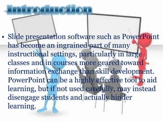
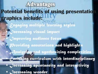
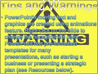
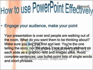
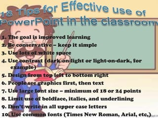
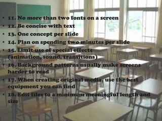
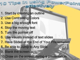
• Slide presentation software such as PowerPoint
  has become an ingrained part of many
  instructional settings, particularly in large
  classes and in courses more geared toward
  information exchange than skill development.
  PowerPoint can be a highly effective tool to aid
  learning, but if not used carefully, may instead
  disengage students and actually hinder
  learning.
Potential benefits of using presentation
graphics include:
  •   Engaging multiple learning styles
  •   Increasing visual impact
  •   Improving audience focus
  •   Providing annotations and highlights
  •   Analyzing and synthesizing complexities
  •   Enriching curriculum with interdisciplinary
  •   Increasing spontaneity and interactivity
  •   Increasing wonder
• the name of a proprietary commercial software
  presentation program developed by Microsoft.
  It was developed by Microsoft and officially
  launched on May 22, 1990. It is part of
  the Microsoft Office suite, and runs
  on Microsoft windows and Apple's Mac
  OSX operating system. The current versions
  are Microsoft Office PowerPoint 2010 for
  Windows and Microsoft Office PowerPoint 2011
  for Mac.
• Office Button
        – Replaces the File Menu found in the previous versions of
          PowerPoint.

• Quick Access Toolbar
        – Contains common commands such as Save, Undo, and
          Print. You can add more commands as well.
• Title Bar
        – Displays the name of the program you are using and the
          name of the presentation you are currently working on.

• Close Button
        – Click here to close the current presentation. If only one
          presentation is open, clicking this button will close the
          PowerPoint as well.
• Ribbon
        – The tabs on the Ribbon replaces the menus and toolbars
          found in the previous versions of PowerPoint.
• Slide Pane
       – Displays the slide you are currently working on.

• Notes Pane
       – Types any note you want to use during a presentation here.
• Status Bar
       – Displays information about your presentation, such as your
         current location in the presentation. Right-click the status
         bar to specify what information is shown.

• Outline Tab
       – Focuses on the content of your information rather than its
         appearance. Use the outline tab when you want to add
         large amounts of text to a presentation.
1. Open Microsoft PowerPoint. The first item presented is a
   slide. It contains a title (large box) and subtitle (smaller box)
   section.
2. Type "The First Presentation" in the "Title" section. Under it--
   the "Subtitle" section--type your name. This is the first slide of
   the presentation.
3. Insert an additional slide with the "Title and Content" layout.
   As an example, type "Buy a Car" in the "Title" section. Type
   "Finance" and "Size" in the "Content" section. After each
   topic in the "Content" section, hit the "Enter" key. This
   ensures that each topic has a bullet point.
4. Insert a new slide with the "Title and Content" layout. In the
   "Title" section, type "Finance." Click in the "Content" section
   and go to "Insert" and "Clip Art." Double-click on any picture
   of money to insert it into the slide.

5. Insert another slide with the "Comparison" layout. Type
   "Size" in the "Title" section. Type "Large" in the left heading
   title and "Small" in the right heading title. Under each
   section, type the benefits of having a large car as compared
   to a small car.
6. Press the F5 key to view the presentation, which PowerPoint
   also calls the "Slide Show." Press the down arrow key to
   advance to the next slide.
• Engage your audience, make your point

 Your presentation is over and people are walking out of
 the room. What do you want them to be thinking about?
 Make sure you say that first and last. You're the one
 telling the story, not the slides. Look at every element on
 each slide as a graphic--text and images alike. Avoid
 complete sentences: use bullet-point lists of single words
 and short phrases.
• Basics of slide construction

 Remember the contrast: dark on light, light on dark. Stick with
 two or three font styles and sizes, none too small for people in
 the back row to read. No italics, no serifs, and no blinking--ever.
 Use drop shadows and other text effects sparingly.
 Play it safe by embedding everything in your presentation:
 fonts, images, other graphics. This will increase the size of the
 presentation file, but today's hardware should handle it.
 Besides, 16GB USB flash drives cost less than $20. (See below
 for instructions on compressing embedded videos and other
 graphics in PowerPoint 2010.)
 Keep diagrams simple. If a chart or table has more than a
 dozen elements, break it up or consider printing it and
 distributing it as a handout or posting it online.
Timing is everything--keep a brisk pace, but not too brisk. The
 key to maintaining the right pace is practice, practice, practice.
 Avoid slide fatigue by averaging two or three slides per minute
 at most.
 A notable exception to this guideline was one of the best
 PowerPoint presentations I've ever seen: a quick succession of
 single-word slides timed perfectly with the presenter's speech.
 The effect was hypnotic. An audience of a thousand techies
 was riveted for a solid 15 minutes and burst into applause at the
 conclusion.
• Use video and images that enhance your
  message
 Cropping the background out of a picture is almost automatic
 when you use PowerPoint 2010's aptly named Remove
 Background feature. Simply select the image, choose the
 Format tab under Picture Tools on the ribbon, and click
 Remove Background in the Adjust section to the far left.
You'll probably have to manually tweak the background crop by
dragging the borders of the portion of the image PowerPoint
selects for you, and by using the Mark Areas to Keep and Mark
Areas to Remove buttons. The feature can't match the precision
of Adobe Photoshop and other image editors, but for most
presentations, it does well enough.
To make the cropped image a slide background, right-click it
and select Send to Back. You can then insert a text box that will
appear on top of the image. Make sure there's plenty of contrast
between the text and the underlying image so everyone in the
audience will be able to read them.
You can reduce the size of your presentation by using
PowerPoint's Compress Media option: select File > Info >
Compress Media and choose one of the three quality options. If
PowerPoint finds media in the presentation that may cause
compatibility problems, the option to Optimize Compatibility will
be available on the Info tab.
• Don't forget the dress rehearsal
 Even if the presentation runs without a hitch back at the office
 or in the hotel room, always test it beforehand at the actual
 venue on the hardware you'll use to present it. Think about the
 people sitting in the back row--and the front row and on either
 side of the room, for that matter.
 Sometimes the most thorough preparations won't prevent
 disaster. Always have a backup plan in mind if the presentation
 goes belly up. You may actually have to make eye contact with
 the audience. This is when your rehearsals in front of the mirror
 will pay off.
1. The goal is improved learning
2. Be conservative – keep it simple
3. Use lots of white space
4. Use contrast (dark-on-light or light-on-dark, for
    example)
5. Design from top left to bottom right
6. People see graphics first, then text
7. Use large font size – minimum of 18 or 24 points
8. Limit use of boldface, italics, and underlining
9. Don’t write in all upper case letters
10. Use common fonts (Times New Roman, Arial, etc,)
• 11. No more than two fonts on a screen
• 12. Be concise with text
• 13. One concept per slide
• 14. Plan on spending two minutes per slide
• 15. Limit use of special effects
  (animation, sound, transitions)
• 16. Background patterns usually make screens
  harder to read
• 17. When creating original media, use the best
  equipment you can find
• 18. Edit files to a minimum meaningful length and
  size
1. Start by creating an outline
2. Use Contrasting Colors
3. Use a big enough font
4. Stop the moving text
5. Turn the pointer off
6. Use visuals instead of text slides
7. Have Slides at the End of Your Presentation
8. Be able to Jump to Any Slide
9. Blank the screen
10.Draw on the screen during a presentation
• http://www.fctl.ucf.edu/teachingandlearningresources/t
  echnology/PowerPoint/index.php
• http://learning.nd.edu/powerpoint/designtips.pdf
• http://eglobiotraining.com/
• http://www.ehow.com/how_4473883_use-
  powerpoint.html
• http://www.thinkoutsidetheslide.com/articles/ten_secre
  ts_for_using_powerpoint.htm
• http://howto.cnet.com/8301-11310_39-20104882-
  285/how-to-use-powerpoint-effectively/
Effective use of

Effective use of

  • 2.
    • Slide presentationsoftware such as PowerPoint has become an ingrained part of many instructional settings, particularly in large classes and in courses more geared toward information exchange than skill development. PowerPoint can be a highly effective tool to aid learning, but if not used carefully, may instead disengage students and actually hinder learning.
  • 3.
    Potential benefits ofusing presentation graphics include: • Engaging multiple learning styles • Increasing visual impact • Improving audience focus • Providing annotations and highlights • Analyzing and synthesizing complexities • Enriching curriculum with interdisciplinary • Increasing spontaneity and interactivity • Increasing wonder
  • 4.
    • the nameof a proprietary commercial software presentation program developed by Microsoft. It was developed by Microsoft and officially launched on May 22, 1990. It is part of the Microsoft Office suite, and runs on Microsoft windows and Apple's Mac OSX operating system. The current versions are Microsoft Office PowerPoint 2010 for Windows and Microsoft Office PowerPoint 2011 for Mac.
  • 6.
    • Office Button – Replaces the File Menu found in the previous versions of PowerPoint. • Quick Access Toolbar – Contains common commands such as Save, Undo, and Print. You can add more commands as well. • Title Bar – Displays the name of the program you are using and the name of the presentation you are currently working on. • Close Button – Click here to close the current presentation. If only one presentation is open, clicking this button will close the PowerPoint as well. • Ribbon – The tabs on the Ribbon replaces the menus and toolbars found in the previous versions of PowerPoint.
  • 7.
    • Slide Pane – Displays the slide you are currently working on. • Notes Pane – Types any note you want to use during a presentation here. • Status Bar – Displays information about your presentation, such as your current location in the presentation. Right-click the status bar to specify what information is shown. • Outline Tab – Focuses on the content of your information rather than its appearance. Use the outline tab when you want to add large amounts of text to a presentation.
  • 8.
    1. Open MicrosoftPowerPoint. The first item presented is a slide. It contains a title (large box) and subtitle (smaller box) section. 2. Type "The First Presentation" in the "Title" section. Under it-- the "Subtitle" section--type your name. This is the first slide of the presentation. 3. Insert an additional slide with the "Title and Content" layout. As an example, type "Buy a Car" in the "Title" section. Type "Finance" and "Size" in the "Content" section. After each topic in the "Content" section, hit the "Enter" key. This ensures that each topic has a bullet point.
  • 9.
    4. Insert anew slide with the "Title and Content" layout. In the "Title" section, type "Finance." Click in the "Content" section and go to "Insert" and "Clip Art." Double-click on any picture of money to insert it into the slide. 5. Insert another slide with the "Comparison" layout. Type "Size" in the "Title" section. Type "Large" in the left heading title and "Small" in the right heading title. Under each section, type the benefits of having a large car as compared to a small car. 6. Press the F5 key to view the presentation, which PowerPoint also calls the "Slide Show." Press the down arrow key to advance to the next slide.
  • 11.
    • Engage youraudience, make your point Your presentation is over and people are walking out of the room. What do you want them to be thinking about? Make sure you say that first and last. You're the one telling the story, not the slides. Look at every element on each slide as a graphic--text and images alike. Avoid complete sentences: use bullet-point lists of single words and short phrases.
  • 12.
    • Basics ofslide construction Remember the contrast: dark on light, light on dark. Stick with two or three font styles and sizes, none too small for people in the back row to read. No italics, no serifs, and no blinking--ever. Use drop shadows and other text effects sparingly. Play it safe by embedding everything in your presentation: fonts, images, other graphics. This will increase the size of the presentation file, but today's hardware should handle it. Besides, 16GB USB flash drives cost less than $20. (See below for instructions on compressing embedded videos and other graphics in PowerPoint 2010.) Keep diagrams simple. If a chart or table has more than a dozen elements, break it up or consider printing it and distributing it as a handout or posting it online.
  • 13.
    Timing is everything--keepa brisk pace, but not too brisk. The key to maintaining the right pace is practice, practice, practice. Avoid slide fatigue by averaging two or three slides per minute at most. A notable exception to this guideline was one of the best PowerPoint presentations I've ever seen: a quick succession of single-word slides timed perfectly with the presenter's speech. The effect was hypnotic. An audience of a thousand techies was riveted for a solid 15 minutes and burst into applause at the conclusion. • Use video and images that enhance your message Cropping the background out of a picture is almost automatic when you use PowerPoint 2010's aptly named Remove Background feature. Simply select the image, choose the Format tab under Picture Tools on the ribbon, and click Remove Background in the Adjust section to the far left.
  • 14.
    You'll probably haveto manually tweak the background crop by dragging the borders of the portion of the image PowerPoint selects for you, and by using the Mark Areas to Keep and Mark Areas to Remove buttons. The feature can't match the precision of Adobe Photoshop and other image editors, but for most presentations, it does well enough. To make the cropped image a slide background, right-click it and select Send to Back. You can then insert a text box that will appear on top of the image. Make sure there's plenty of contrast between the text and the underlying image so everyone in the audience will be able to read them. You can reduce the size of your presentation by using PowerPoint's Compress Media option: select File > Info > Compress Media and choose one of the three quality options. If PowerPoint finds media in the presentation that may cause compatibility problems, the option to Optimize Compatibility will be available on the Info tab.
  • 15.
    • Don't forgetthe dress rehearsal Even if the presentation runs without a hitch back at the office or in the hotel room, always test it beforehand at the actual venue on the hardware you'll use to present it. Think about the people sitting in the back row--and the front row and on either side of the room, for that matter. Sometimes the most thorough preparations won't prevent disaster. Always have a backup plan in mind if the presentation goes belly up. You may actually have to make eye contact with the audience. This is when your rehearsals in front of the mirror will pay off.
  • 16.
    1. The goalis improved learning 2. Be conservative – keep it simple 3. Use lots of white space 4. Use contrast (dark-on-light or light-on-dark, for example) 5. Design from top left to bottom right 6. People see graphics first, then text 7. Use large font size – minimum of 18 or 24 points 8. Limit use of boldface, italics, and underlining 9. Don’t write in all upper case letters 10. Use common fonts (Times New Roman, Arial, etc,)
  • 17.
    • 11. Nomore than two fonts on a screen • 12. Be concise with text • 13. One concept per slide • 14. Plan on spending two minutes per slide • 15. Limit use of special effects (animation, sound, transitions) • 16. Background patterns usually make screens harder to read • 17. When creating original media, use the best equipment you can find • 18. Edit files to a minimum meaningful length and size
  • 18.
    1. Start bycreating an outline 2. Use Contrasting Colors 3. Use a big enough font 4. Stop the moving text 5. Turn the pointer off 6. Use visuals instead of text slides 7. Have Slides at the End of Your Presentation 8. Be able to Jump to Any Slide 9. Blank the screen 10.Draw on the screen during a presentation
  • 19.
    • http://www.fctl.ucf.edu/teachingandlearningresources/t echnology/PowerPoint/index.php • http://learning.nd.edu/powerpoint/designtips.pdf • http://eglobiotraining.com/ • http://www.ehow.com/how_4473883_use- powerpoint.html • http://www.thinkoutsidetheslide.com/articles/ten_secre ts_for_using_powerpoint.htm • http://howto.cnet.com/8301-11310_39-20104882- 285/how-to-use-powerpoint-effectively/