Downloaded 132 times


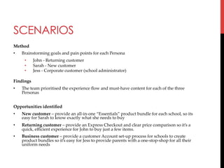
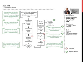
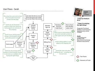
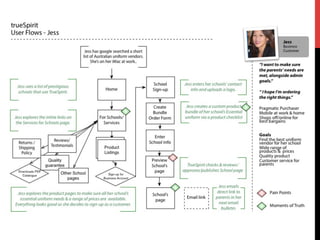
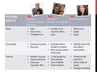
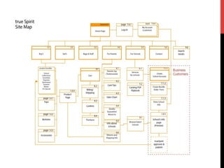
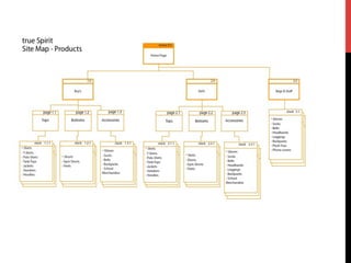
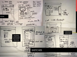
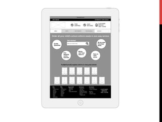
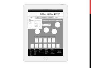
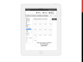
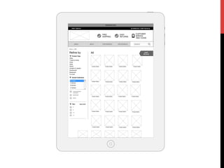
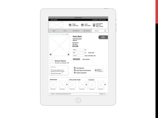
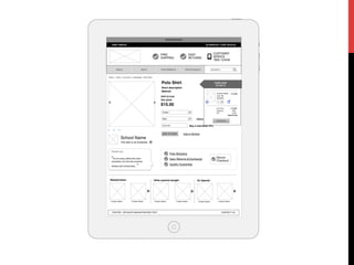
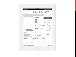
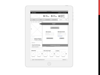
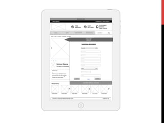
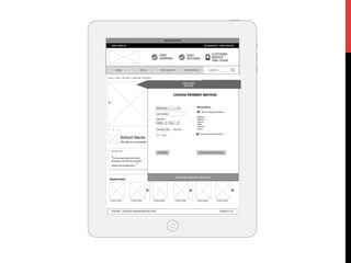

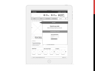
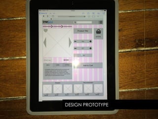
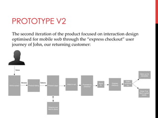
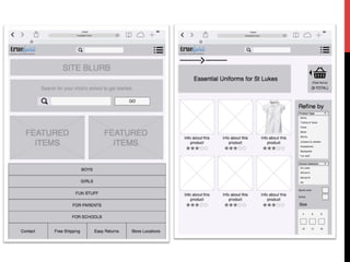
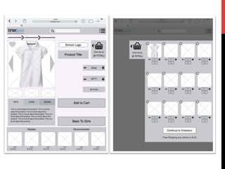
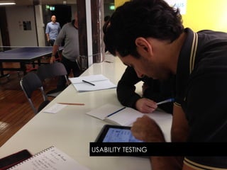
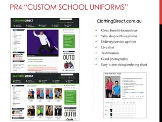


The document outlines Amanda Wise's student project to design a mobile-optimized e-commerce store for a fictional school uniform retailer called True Spirit. It describes her process of researching competitors, creating user personas and scenarios, designing user flows and prototypes, and testing usability. The goal was to present a modern experience that makes purchasing uniforms easy for busy parents on mobile devices.


