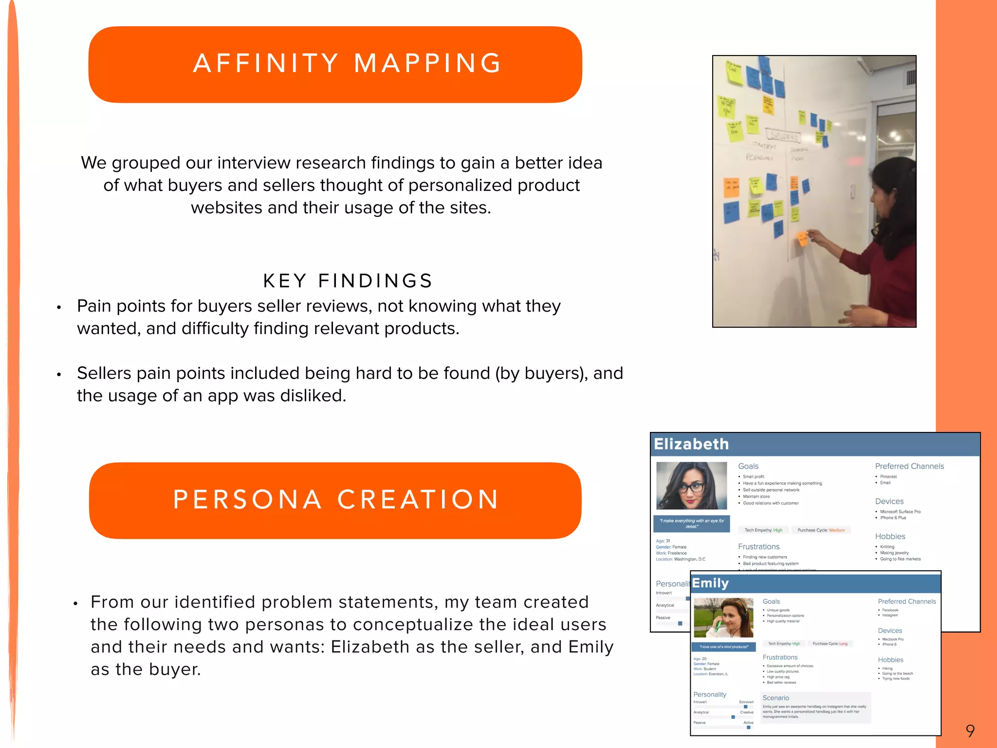
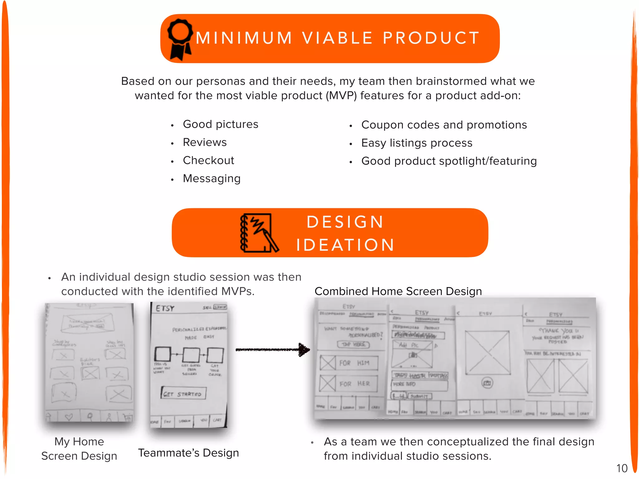
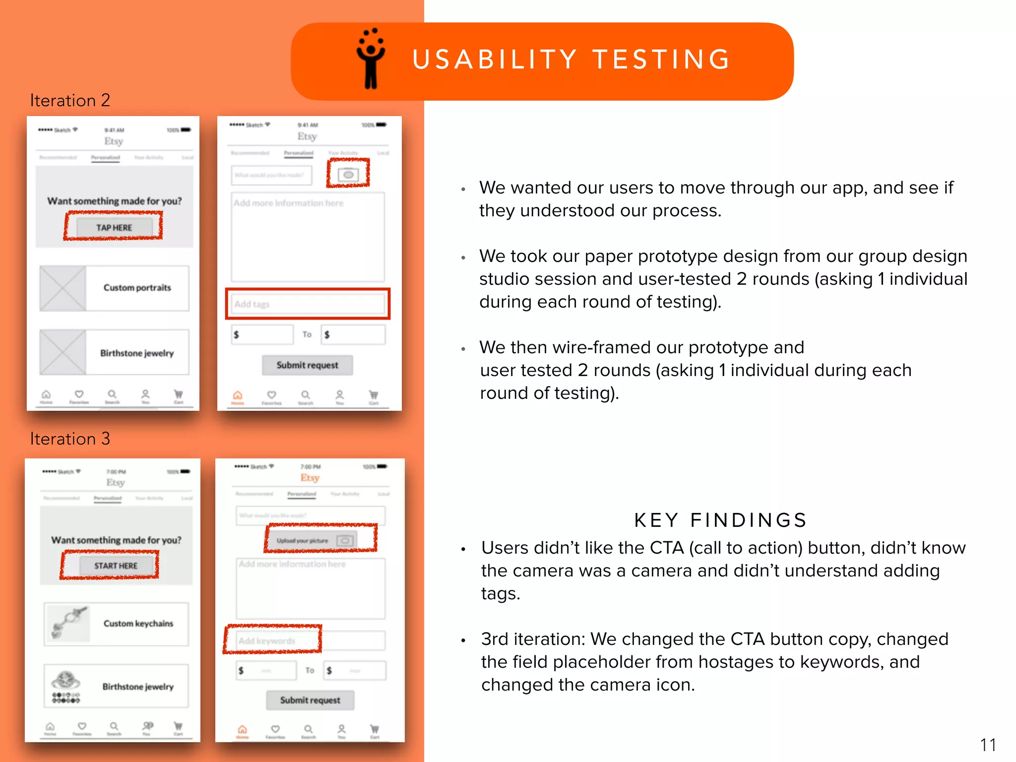
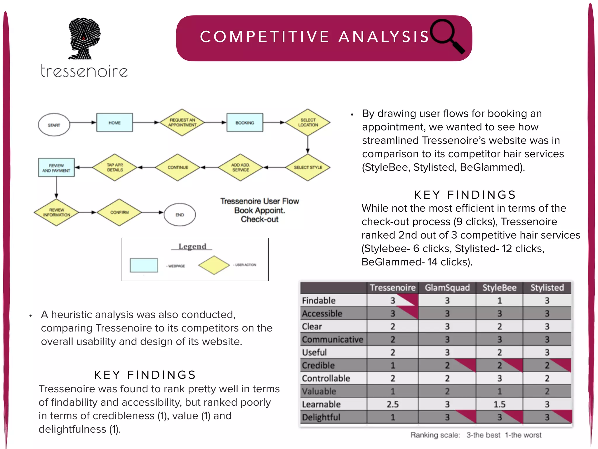
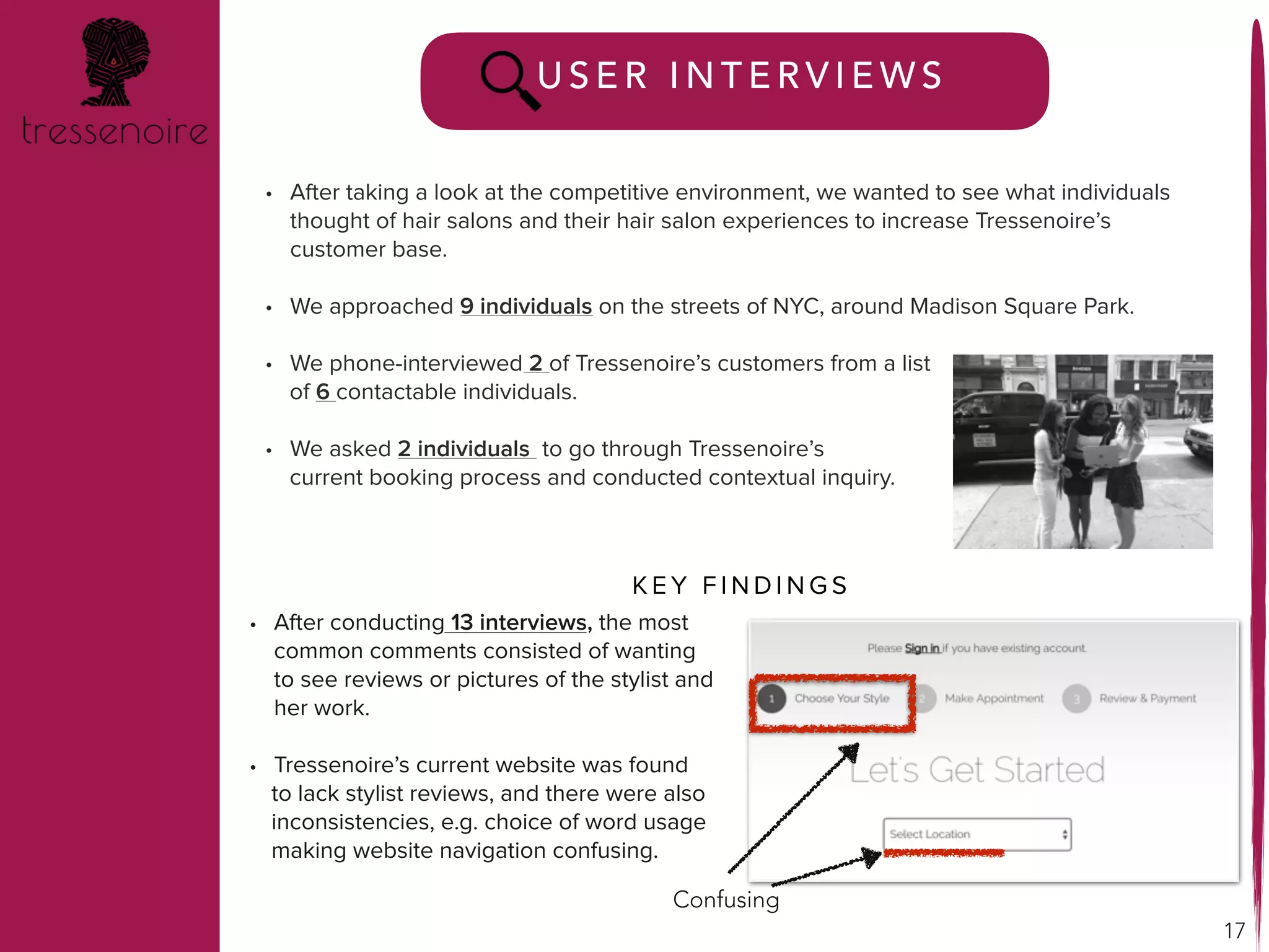
H E L L O
I ’ M L U C Y
P E O P L E - C E N T E R E D , F I N D I N G
S I M P L E , E F F I C I E N T S O L U T I O N S .
New York, New York
wu.lucym@gmail.com
301-318-0378
TA B L E O F C O N T E N T S
A B O U T M E … . P G . 3
M Y U X P R O C E S S … . P G . 4
P R O J E C T S
E T S Y
P R O D U C T F E AT U R E A D D - O N … . P G . 5
T R E S S E N O I R E
C L I E N T P R O J E C T … . P G . 1 3
3
ABOUT ME
ABOUT ME
As a marketing major in college, I found a deep and profound
interest in learning how consumer products are marketed and
advertised for consumption. I was greatly interested in learning
about consumer perception as well.
My background and work experiences in marketing and public
health emphasize the need to better understand and learn
about users and how to create better products to improve
quality of life.
M Y U X P R O C E S S
4
Iterate- Iterations happens
during the entire
project lifecycle, and
are constantly ongoing.
1. Research- Understanding the
problem, understanding the
users.
2. Design- Brainstorm many possible
solutions and sketch, ideate and
wire-frame.
3. Test- Find users and potential
users to test designs and identify
possible design flaws.
Overview …. pg.6
Research …. pg.7
Design …. pg.10
Test …. pg.11
Prototype …. pg.12
5
Project Goal-To create a feature that would allow customers to post requests for
personalized products and for sellers to respond to those requests, a feature for both
buyers and sellers.
Research Goal- To find out how users and sellers communicate with each other.
My Role- I was a part of a 3-person team as a designer. As a designer my task was to
come up with concepts for a mobile product feature add-on, and iterate on those
designs after user testing. I also assisted with the creation of low and medium-fidelity
wireframes and a working prototype.
6
7
• We first took a look at the user flow and
competitive environment for personalized
products requests. We wanted to see how
to make our product feature add-on the
most user-friendly with the least number of
steps.
• We also took a look at the competitors for
Etsy as an e-commerce website. Most sites
had buyer and seller functions and one login
account for both parties. Communication
was conducted through email or a chat.
C O M P E T I T I V E A N A LY S I S
Competitors
User Flow
• Of 4 competitors, Lands’ End (11 steps), Rogue
(7 steps), Custom Made (9 steps), and Custom
Swagg Ts (5 steps), Custom Swagg Ts was the
least number of clicks for a product request
(<5 steps) and most user-friendly.
K E Y F I N D I N G S
U S E R S U R V E Y
8
• In order to design our product feature add-on, we
wanted to know what individuals thought of
personalized products and how buyers and
sellers communicate with each other.
• A survey questionnaire form was created for both
buyers and sellers.
U S E R I N T E R V I E W S
• Sellers sell mostly through desktop. They care
less about profit because they have a genuine
passion in their hobbies or side-business.
However, they are not easily discovered by
potential customers.
• Buyers cared a lot about price points and the
quality of pictures. They found it easier to browse
on a laptop/desktop.
• Both buyers and sellers preferred to use their
desktop to browse for or sell products.
• Most communication was through messaging
followed by email.
K E Y F I N D I N G S
• We then sought out individuals for a more in-
depth interview and insight into the behavior of
purchasing and selling personalized products.
K E Y F I N D I N G S
A F F I N I T Y M A P P I N G
9
We grouped our interview research findings to gain a better idea
of what buyers and sellers thought of personalized product
websites and their usage of the sites.
K E Y F I N D I N G S
• Pain points for buyers seller reviews, not knowing what they
wanted, and difficulty finding relevant products.
• Sellers pain points included being hard to be found (by buyers), and
the usage of an app was disliked.
P E R S O N A C R E AT I O N
• From our identified problem statements, my team created
the following two personas to conceptualize the ideal users
and their needs and wants: Elizabeth as the seller, and Emily
as the buyer.
10
• Good pictures
• Reviews
• Checkout
• Messaging
• Coupon codes and promotions
• Easy listings process
• Good product spotlight/featuring
Based on our personas and their needs, my team then brainstormed what we
wanted for the most viable product (MVP) features for a product add-on:
• An individual design studio session was then
conducted with the identified MVPs. Combined Home Screen Design
D E S I G N
I D E AT I O N
• As a team we then conceptualized the final design
from individual studio sessions.
My Home
Screen Design Teammate’s Design
M I N I M U M V I A B L E P R O D U C T
U S A B I L I T Y T E S T I N G
11
• Users didn’t like the CTA (call to action) button, didn’t know
the camera was a camera and didn’t understand adding
tags.
• 3rd iteration: We changed the CTA button copy, changed
the field placeholder from hostages to keywords, and
changed the camera icon.
K E Y F I N D I N G S
• We wanted our users to move through our app, and see if
they understood our process.
• We took our paper prototype design from our group design
studio session and user-tested 2 rounds (asking 1 individual
during each round of testing).
• We then wire-framed our prototype and
user tested 2 rounds (asking 1 individual during each
round of testing).
Iteration 2
Iteration 3
P R O T O T Y P E
12
Please click here to walk through our prototype.
Your name is Emily, you are a 20-year-old college student, and you
want to request a monogrammed handbag!
Responses to requests are
viewable under an individual “You” account
located on the bottom navigational bar.
Our working user-tested and high-fidelity
prototype consists of a buyer feature
where an individual would ask for a
product and see seller responses under
a personalization tab.
13
Client Project: Redesigning the Booking Flow
Overview …. pg.14
Research …. pg.15
Design …. pg.19
Test …. pg.19
Prototype …. pg.20
Client- Tressenoire is a start-up company founded to set itself apart from the
current market of personalized hair services, e.g. GlamSquad and Prive. Their
business model is to target and meet the needs of African American women to get
boxed braids and weave-ins in the comfort of their own home.
Problem- Tressenoire has a problem with the current booking flow of their
website. Often times clients call instead of booking online. Users spend more than
2 minutes on the checkout page without checking out. The client would like to
reduce the number of phone calls and increase the number of bookings through its
website.
My Role- I was a part of a 3-person team as a user researcher. As a user
researcher, my task was to come up with and formulate user interview questions. I
conducted in-person interviews as well as analyzed Tressenoire’s current
competitive market. I also assisted with the creation of personas and low-fidelity
wireframes.
14
R E S E A R C H
15
• As a team, we first met with our client to identify client needs and
what the client wanted.
• We then proceeded to outline what kind of research we wanted to
conduct and identified our goals as a team and to our client.
Research Goal
We wanted to identify and discover what problems users have with the current
check-out process, and to increase conversion rate and decrease phone calls.
We knew we needed to know the following:
1. What kind of problems are current users having with the check-out process?
2. What kind of information would users need or want to know in order to book
an appointment for an in-home service?
16
C O M P E T I T I V E A N A LY S I S
• A heuristic analysis was also conducted,
comparing Tressenoire to its competitors on the
overall usability and design of its website.
• By drawing user flows for booking an
appointment, we wanted to see how
streamlined Tressenoire’s website was in
comparison to its competitor hair services
(StyleBee, Stylisted, BeGlammed).
Tressenoire was found to rank pretty well in terms
of findability and accessibility, but ranked poorly
in terms of credibleness (1), value (1) and
delightfulness (1).
K E Y F I N D I N G S
While not the most efficient in terms of the
check-out process (9 clicks), Tressenoire
ranked 2nd out of 3 competitive hair services
(Stylebee- 6 clicks, Stylisted- 12 clicks,
BeGlammed- 14 clicks).
17
U S E R I N T E R V I E W S
• After conducting 13 interviews, the most
common comments consisted of wanting
to see reviews or pictures of the stylist and
her work.
• Tressenoire’s current website was found
to lack stylist reviews, and there were also
inconsistencies, e.g. choice of word usage
making website navigation confusing.
• After taking a look at the competitive environment, we wanted to see what individuals
thought of hair salons and their hair salon experiences to increase Tressenoire’s
customer base.
• We approached 9 individuals on the streets of NYC, around Madison Square Park.
• We phone-interviewed 2 of Tressenoire’s customers from a list
of 6 contactable individuals.
• We asked 2 individuals to go through Tressenoire’s
current booking process and conducted contextual inquiry.
K E Y F I N D I N G S
Confusing
18
P E R S O N A C R E AT I O N
• We then created two potential users, Shenice and
Natasha, from our demographic data, to identify user
pain points with Tressenoire and how we could better
serve them.
• To create a better website, we consolidated all of
our user interview information to identify any
potential trends amongst the users to see why
they didn’t book online.
R E S E A R C H S Y N T H E S I S
• From MOSCOW, we identified some of the
must-have features for Tressnoire’s website.
Users want to see styles for inspiration, and
clear pricing information.
• From our user interviews, our team discovered that
interviewees preferred hair salon services because
hair stylists know their hair, and they enjoyed the
salon experience.
K E Y F I N D I N G S
• We utilized the MOSCOW method and
identified the minimum viable product
(MVP) features for Tressenoire to have on
its website to encourage more bookings.
D E S I G N
I D E AT I O N
• A group design studio session was conducted with
the identified MVPs from the MOSCOW method.
• Our designs were then sketched out and wire-framed.
19
U S A B I L I T Y T E S T I N G
• We came up with 3 design options and conducted
A/B Testing, testing with 12 individuals on different
design iterations.
K E Y F I N D I N G S
• From the 3 design options and testing with 12 individuals, we
found that 31% of individuals liked option 1, with 62% preferring
option 2 and the least liked was option 3, with 8% liking a 2-row
home page screen.
C L I E N T D E L I V E R A B L E S
20
P R O T O T Y P E
We presented the following deliverables for our client:
• A research report
• Design recommendations and suggested features
• Product sketches, wireframes and annotated wireframes
• A clickable prototype
Please click here to walk through our prototype.
You’re looking to book a customized hair service for an upcoming
function.
I ’ M L O O K I N G F O R WA R D T O H E A R I N G F R O M Y O U !
C O N TA C T M E
THANK YOU!
E M A I L : W U . L U C Y M @ G M A I L . C O M
P H O N E : 3 0 1 - 3 1 8 - 0 3 7 8
L I N K E D I N : H T T P S : / / W W W. L I N K E D I N . C O M / I N / L U C Y- M -
W U - 7 0 9 9 2 B 1 8

Portfolio

  • 1.
    H E LL O I ’ M L U C Y P E O P L E - C E N T E R E D , F I N D I N G S I M P L E , E F F I C I E N T S O L U T I O N S . New York, New York wu.lucym@gmail.com 301-318-0378
  • 2.
    TA B LE O F C O N T E N T S A B O U T M E … . P G . 3 M Y U X P R O C E S S … . P G . 4 P R O J E C T S E T S Y P R O D U C T F E AT U R E A D D - O N … . P G . 5 T R E S S E N O I R E C L I E N T P R O J E C T … . P G . 1 3
  • 3.
    3 ABOUT ME ABOUT ME Asa marketing major in college, I found a deep and profound interest in learning how consumer products are marketed and advertised for consumption. I was greatly interested in learning about consumer perception as well. My background and work experiences in marketing and public health emphasize the need to better understand and learn about users and how to create better products to improve quality of life.
  • 4.
    M Y UX P R O C E S S 4 Iterate- Iterations happens during the entire project lifecycle, and are constantly ongoing. 1. Research- Understanding the problem, understanding the users. 2. Design- Brainstorm many possible solutions and sketch, ideate and wire-frame. 3. Test- Find users and potential users to test designs and identify possible design flaws.
  • 5.
    Overview …. pg.6 Research…. pg.7 Design …. pg.10 Test …. pg.11 Prototype …. pg.12 5
  • 6.
    Project Goal-To createa feature that would allow customers to post requests for personalized products and for sellers to respond to those requests, a feature for both buyers and sellers. Research Goal- To find out how users and sellers communicate with each other. My Role- I was a part of a 3-person team as a designer. As a designer my task was to come up with concepts for a mobile product feature add-on, and iterate on those designs after user testing. I also assisted with the creation of low and medium-fidelity wireframes and a working prototype. 6
  • 7.
    7 • We firsttook a look at the user flow and competitive environment for personalized products requests. We wanted to see how to make our product feature add-on the most user-friendly with the least number of steps. • We also took a look at the competitors for Etsy as an e-commerce website. Most sites had buyer and seller functions and one login account for both parties. Communication was conducted through email or a chat. C O M P E T I T I V E A N A LY S I S Competitors User Flow • Of 4 competitors, Lands’ End (11 steps), Rogue (7 steps), Custom Made (9 steps), and Custom Swagg Ts (5 steps), Custom Swagg Ts was the least number of clicks for a product request (<5 steps) and most user-friendly. K E Y F I N D I N G S
  • 8.
    U S ER S U R V E Y 8 • In order to design our product feature add-on, we wanted to know what individuals thought of personalized products and how buyers and sellers communicate with each other. • A survey questionnaire form was created for both buyers and sellers. U S E R I N T E R V I E W S • Sellers sell mostly through desktop. They care less about profit because they have a genuine passion in their hobbies or side-business. However, they are not easily discovered by potential customers. • Buyers cared a lot about price points and the quality of pictures. They found it easier to browse on a laptop/desktop. • Both buyers and sellers preferred to use their desktop to browse for or sell products. • Most communication was through messaging followed by email. K E Y F I N D I N G S • We then sought out individuals for a more in- depth interview and insight into the behavior of purchasing and selling personalized products. K E Y F I N D I N G S
  • 9.
    A F FI N I T Y M A P P I N G 9 We grouped our interview research findings to gain a better idea of what buyers and sellers thought of personalized product websites and their usage of the sites. K E Y F I N D I N G S • Pain points for buyers seller reviews, not knowing what they wanted, and difficulty finding relevant products. • Sellers pain points included being hard to be found (by buyers), and the usage of an app was disliked. P E R S O N A C R E AT I O N • From our identified problem statements, my team created the following two personas to conceptualize the ideal users and their needs and wants: Elizabeth as the seller, and Emily as the buyer.
  • 10.
    10 • Good pictures •Reviews • Checkout • Messaging • Coupon codes and promotions • Easy listings process • Good product spotlight/featuring Based on our personas and their needs, my team then brainstormed what we wanted for the most viable product (MVP) features for a product add-on: • An individual design studio session was then conducted with the identified MVPs. Combined Home Screen Design D E S I G N I D E AT I O N • As a team we then conceptualized the final design from individual studio sessions. My Home Screen Design Teammate’s Design M I N I M U M V I A B L E P R O D U C T
  • 11.
    U S AB I L I T Y T E S T I N G 11 • Users didn’t like the CTA (call to action) button, didn’t know the camera was a camera and didn’t understand adding tags. • 3rd iteration: We changed the CTA button copy, changed the field placeholder from hostages to keywords, and changed the camera icon. K E Y F I N D I N G S • We wanted our users to move through our app, and see if they understood our process. • We took our paper prototype design from our group design studio session and user-tested 2 rounds (asking 1 individual during each round of testing). • We then wire-framed our prototype and user tested 2 rounds (asking 1 individual during each round of testing). Iteration 2 Iteration 3
  • 12.
    P R OT O T Y P E 12 Please click here to walk through our prototype. Your name is Emily, you are a 20-year-old college student, and you want to request a monogrammed handbag! Responses to requests are viewable under an individual “You” account located on the bottom navigational bar. Our working user-tested and high-fidelity prototype consists of a buyer feature where an individual would ask for a product and see seller responses under a personalization tab.
  • 13.
    13 Client Project: Redesigningthe Booking Flow Overview …. pg.14 Research …. pg.15 Design …. pg.19 Test …. pg.19 Prototype …. pg.20
  • 14.
    Client- Tressenoire isa start-up company founded to set itself apart from the current market of personalized hair services, e.g. GlamSquad and Prive. Their business model is to target and meet the needs of African American women to get boxed braids and weave-ins in the comfort of their own home. Problem- Tressenoire has a problem with the current booking flow of their website. Often times clients call instead of booking online. Users spend more than 2 minutes on the checkout page without checking out. The client would like to reduce the number of phone calls and increase the number of bookings through its website. My Role- I was a part of a 3-person team as a user researcher. As a user researcher, my task was to come up with and formulate user interview questions. I conducted in-person interviews as well as analyzed Tressenoire’s current competitive market. I also assisted with the creation of personas and low-fidelity wireframes. 14
  • 15.
    R E SE A R C H 15 • As a team, we first met with our client to identify client needs and what the client wanted. • We then proceeded to outline what kind of research we wanted to conduct and identified our goals as a team and to our client. Research Goal We wanted to identify and discover what problems users have with the current check-out process, and to increase conversion rate and decrease phone calls. We knew we needed to know the following: 1. What kind of problems are current users having with the check-out process? 2. What kind of information would users need or want to know in order to book an appointment for an in-home service?
  • 16.
    16 C O MP E T I T I V E A N A LY S I S • A heuristic analysis was also conducted, comparing Tressenoire to its competitors on the overall usability and design of its website. • By drawing user flows for booking an appointment, we wanted to see how streamlined Tressenoire’s website was in comparison to its competitor hair services (StyleBee, Stylisted, BeGlammed). Tressenoire was found to rank pretty well in terms of findability and accessibility, but ranked poorly in terms of credibleness (1), value (1) and delightfulness (1). K E Y F I N D I N G S K E Y F I N D I N G S K E Y F I N D I N G S While not the most efficient in terms of the check-out process (9 clicks), Tressenoire ranked 2nd out of 3 competitive hair services (Stylebee- 6 clicks, Stylisted- 12 clicks, BeGlammed- 14 clicks).
  • 17.
    17 U S ER I N T E R V I E W S • After conducting 13 interviews, the most common comments consisted of wanting to see reviews or pictures of the stylist and her work. • Tressenoire’s current website was found to lack stylist reviews, and there were also inconsistencies, e.g. choice of word usage making website navigation confusing. • After taking a look at the competitive environment, we wanted to see what individuals thought of hair salons and their hair salon experiences to increase Tressenoire’s customer base. • We approached 9 individuals on the streets of NYC, around Madison Square Park. • We phone-interviewed 2 of Tressenoire’s customers from a list of 6 contactable individuals. • We asked 2 individuals to go through Tressenoire’s current booking process and conducted contextual inquiry. K E Y F I N D I N G S Confusing
  • 18.
    18 P E RS O N A C R E AT I O N • We then created two potential users, Shenice and Natasha, from our demographic data, to identify user pain points with Tressenoire and how we could better serve them. • To create a better website, we consolidated all of our user interview information to identify any potential trends amongst the users to see why they didn’t book online. R E S E A R C H S Y N T H E S I S • From MOSCOW, we identified some of the must-have features for Tressnoire’s website. Users want to see styles for inspiration, and clear pricing information. • From our user interviews, our team discovered that interviewees preferred hair salon services because hair stylists know their hair, and they enjoyed the salon experience. K E Y F I N D I N G S • We utilized the MOSCOW method and identified the minimum viable product (MVP) features for Tressenoire to have on its website to encourage more bookings.
  • 19.
    D E SI G N I D E AT I O N • A group design studio session was conducted with the identified MVPs from the MOSCOW method. • Our designs were then sketched out and wire-framed. 19 U S A B I L I T Y T E S T I N G • We came up with 3 design options and conducted A/B Testing, testing with 12 individuals on different design iterations. K E Y F I N D I N G S • From the 3 design options and testing with 12 individuals, we found that 31% of individuals liked option 1, with 62% preferring option 2 and the least liked was option 3, with 8% liking a 2-row home page screen.
  • 20.
    C L IE N T D E L I V E R A B L E S 20 P R O T O T Y P E We presented the following deliverables for our client: • A research report • Design recommendations and suggested features • Product sketches, wireframes and annotated wireframes • A clickable prototype Please click here to walk through our prototype. You’re looking to book a customized hair service for an upcoming function.
  • 21.
    I ’ ML O O K I N G F O R WA R D T O H E A R I N G F R O M Y O U ! C O N TA C T M E THANK YOU! E M A I L : W U . L U C Y M @ G M A I L . C O M P H O N E : 3 0 1 - 3 1 8 - 0 3 7 8 L I N K E D I N : H T T P S : / / W W W. L I N K E D I N . C O M / I N / L U C Y- M - W U - 7 0 9 9 2 B 1 8