DVX: Designing Data Visualizations for Immersive Experiences

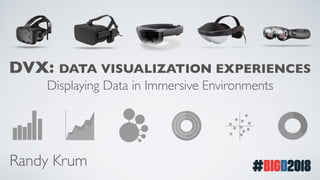
Presented at Big Design 2018 DVX: Data Visualization Experiences Displaying Data in Immersive Environments As VR and AR platforms become more mainstream, more and more use cases involving the display of data in this new format are emerging; health data, navigational directions, product information, weather data, restaurant ratings and shopping prices. For entertainment, manufacturing and healthcare professionals, uses of mixed reality environments will all include visualizing data to provide information to the viewer. The temptation is to make these new data visualizations bright, 3D and flashy, using the latest design tools and animations. Often, that will actually make the data harder to perceive and understand for the user. Data visualization professionals have been fine tuning the craft of effective communication by visualizing data for a long time, and there are some core best practices that designers of immersive environments need to understand.

Recommended
Recommended
More Related Content
Similar to DVX: Designing Data Visualizations for Immersive Experiences
Similar to DVX: Designing Data Visualizations for Immersive Experiences (20)
More from Randy Krum
More from Randy Krum (15)
Recently uploaded
Recently uploaded (20)
DVX: Designing Data Visualizations for Immersive Experiences
- 1. DVX: DATA VISUALIZATION EXPERIENCES Displaying Data in Immersive Environments Randy Krum
- 3. In oNewtData Visualization & Infographics ® CONTINUING AND PROFESSIONAL EDUCATION @rtkrum Randy Krum
- 4. DVX: DATAVISUALIZATION EXPERIENCES VR Virtual Reality AR Augmented Reality MR Mixed Reality 360° Photos &Videos
- 5. Wild West forVisualizing Data
- 7. FRAGMENTED MARKET HTCVive Pro Hololens Magic Leap One Meta 2Oculus Rift HTCVive Mira PrismSmartphones Cardboard
- 8. PHASE SHIFT Projected Sales of Head-Mounted Displays MillionsofUnits 0 10 20 30 40 Source: Gartner | WSJ.com 2016 2017 2018 2019 2020
- 9. New Issues: • Full Color Backgrounds • In Motion • ObjectTracking • Point-Of-View • Focal Point • Intrusive • Placement
- 10. DATAVIZ BEST PRACTICES Understand the best practices before you purposely choose to break them
- 11. DATAVIZ IS A SKILL Dashboards Reports Presentations
- 14. 80% OF THE BRAIN IS DEDICATED TO VISUAL PROCESSING University of Rochester, 2004
- 15. PREATTENTIVE ATTRIBUTES Visual aspects your brain can process easily in a fraction of a second Form Color PositionSize
- 17. TEXT VS. CHARTS Social Network Users Facebook 2,167,000,000 YouTube 1,500,000,000 WhatsApp 1,300,000,000 FB Messenger 1,300,000,000 WeChat 980,000,000 Instagram 800,000,000 Tumblr 794,000,000 Twitter 370,000,000 Skype 300,000,000 LinkedIn 260,000,000 Snapchat 255,000,000 Pinterest 200,000,000 Social Network Users Facebook YouTube WhatsApp FB Messenger WeChat Instagram Tumblr Twitter Skype LinkedIn Snapchat Pinterest 200,000,000 255,000,000 260,000,000 300,000,000 370,000,000 794,000,000 800,000,000 980,000,000 1,300,000,000 1,300,000,000 1,500,000,000 2,167,000,000 Data from Statista 2018
- 19. ISSUE #1 TEMPTATION OF 3D CHARTS
- 20. FALSEVISUALIZATIONS TheVisualization Doesn’t Match the Data!
- 21. SCALING SHAPES BY AREA 1X 9X 1X 3X Area = 0.79in2 Diameter = 1in Area = 0.785in2 Diameter = 1in Area = 7.07in2 Diameter = 3in Area = 2.355in2 Diameter = 1.73in WRONG CORRECT
- 22. 3D CHARTS ARE FALSEVISUALIZATIONS
- 23. BAD 3D CHARTS
- 24. toronto
- 25. SCALING 3D SHAPES BYVOLUME Volume = 0.524in3 Diameter = 1in Volume = 14.137in32 Diameter = 3in Volume = 1.570in2 Diameter = 1.44in WRONG CORRECT 1X 3X 1X Volume = 0.524in3 Diameter = 1in 27X
- 28. Microsoft SharePoint Spaces Avoid 3D Temptation! Without values, which is bigger?
- 30. 1X 3X
- 36. COLORS FOR HIGH CONTRAST GoodBad BadGood
- 37. HIGH CONTRAST = BETTER Web Content Accessibility Guidelines (WCAG) 2.1 Released June 2018 4.5:1 - Minimum Contrast Ratio 7:1 - Enhanced Contrast Ratio
- 38. Top Speed 177.6 mph Contrast Ratio 6.31:1
- 41. BRINGYOUR OWN BACKGROUND Semi-transparent backgrounds for data visualizations and text
- 47. Why Every Organization Needs anAugmented Reality Strategy
- 49. HUD CAR SYSTEMS Reflective Film Semi-Transparent Background In Real Life Reflective Screen
- 51. Real Racing 3 Controlled background environment VR
- 52. RAPTOR BIKING SMART GLASSES
- 54. Workout Mode Navigation Mode “Just Ride” Mode Camera Mode
- 58. REDUCEVISUAL NOISE “SIMPLIFY, SIMPLIFY, SIMPLIFY” •ReduceText •Reduce Colors •Reduce Clutter •Reduce Data •Reduce Lines
- 59. MINIMALIST DESIGN Very similar to designing DataViz for small screens Break down the DataViz to the bare essentials
- 63. IDEAL DISTANCE FORTEXT Microsoft Mixed Reality Design Guide
- 64. IDEAL DISTANCE FOR GRAPHICS Microsoft Mixed Reality Design Guide
- 65. 2D 3D Near Far Methods of DataViz
- 66. 2D 3D Near Far Methods of DataViz
- 67. 2D 3D Near Far Methods of DataViz OLD: What are the appropriate types of charts for my data? NEW: Is there an appropriate DataViz for my immersive experience?
- 68. DATAVIZ IN IMMERSIVE ENVIRONMENTS • Avoid 3D DataVisualizations…mostly • High Contrast • Glanceable Information
- 69. DOWNLOAD A FREE CHAPTER! coolinfographics.com/book
- 70. DFW DataVisualization & Infographics DFWDataViz.com