Download to read offline


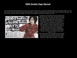

This document summarizes and compares the layout and design of double page spreads from three different music magazines - Mixmag, Kerrang, and NME. Each summary highlights the main article title, featured images, font styles, and color schemes used in the layouts. Overall the document provides analysis of how the visual design and stylistic elements of the spreads work to represent the tone and content of the articles.


